Hi everyone
Victoria back with you today and I'm so excited to share with you my project for the Tinged Blue topic. Blue is one of my go to colours for creating and features heavily in many of my makes, so as soon as I saw this topic, I knew I would be diving in to explore Surf's Up in more detail.Dounia's introduction to the Tinged Blue topic provides a great overview of Surf's Up colour theory and show's the great variety of colour variations you can get from a single colour.
I've been wanting to create some art for a box frame I've had hanging around, for well over a year, so decided to create a project using that. Creating a piece of wall art without a specific final hanging location in mind, I wanted to keep things as neutral and simple as possible, so that it would meld nicely with a range of interior decor. I decided to create a series of background papers, which layered a range of the colour mixes and use these to create some butterflies, providing a modern twist on a specimen display box.

The different elements of this project were so enjoyable. Simple, uncomplicated and playful art which was the grown up version of those colour mixing classes way back in junior school! I love the visual texture the stamping creates when combined with the different colour mixes. So let's take a look at those colours in more detail.

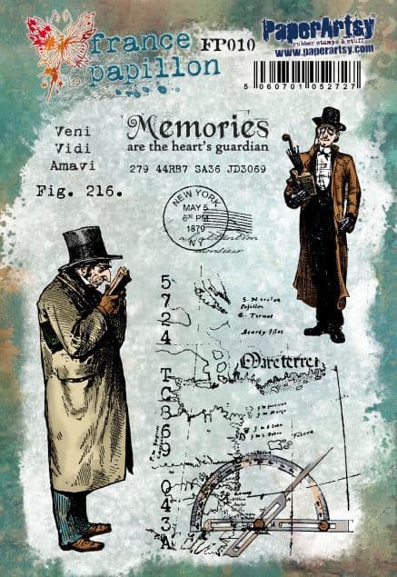
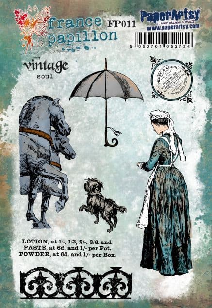
To create my printed papers I selected my PaperArtsy products, a mixing palette and a small gel plate and brayer. Seth Apter's designs are perfect for adding abstract background details to add visual texture without detracting from the main subject of a piece, so his stamp sets ESA35 and ESA36 were a natural choice for this project and helped tie my project into the quarter's theme. With their mix of lines, circles and tiny text the stamps provide the perfect subtle background texture for butterfly wings which don't deviate too far from natures markings. I also selected Sara Naumann's stencil PS122 to trace my butterfly shapes.

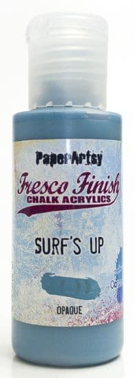
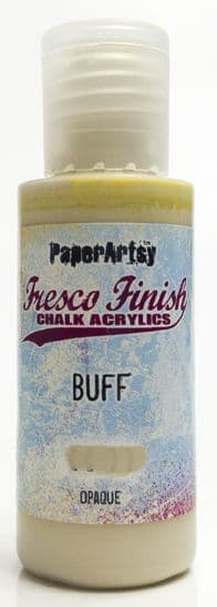
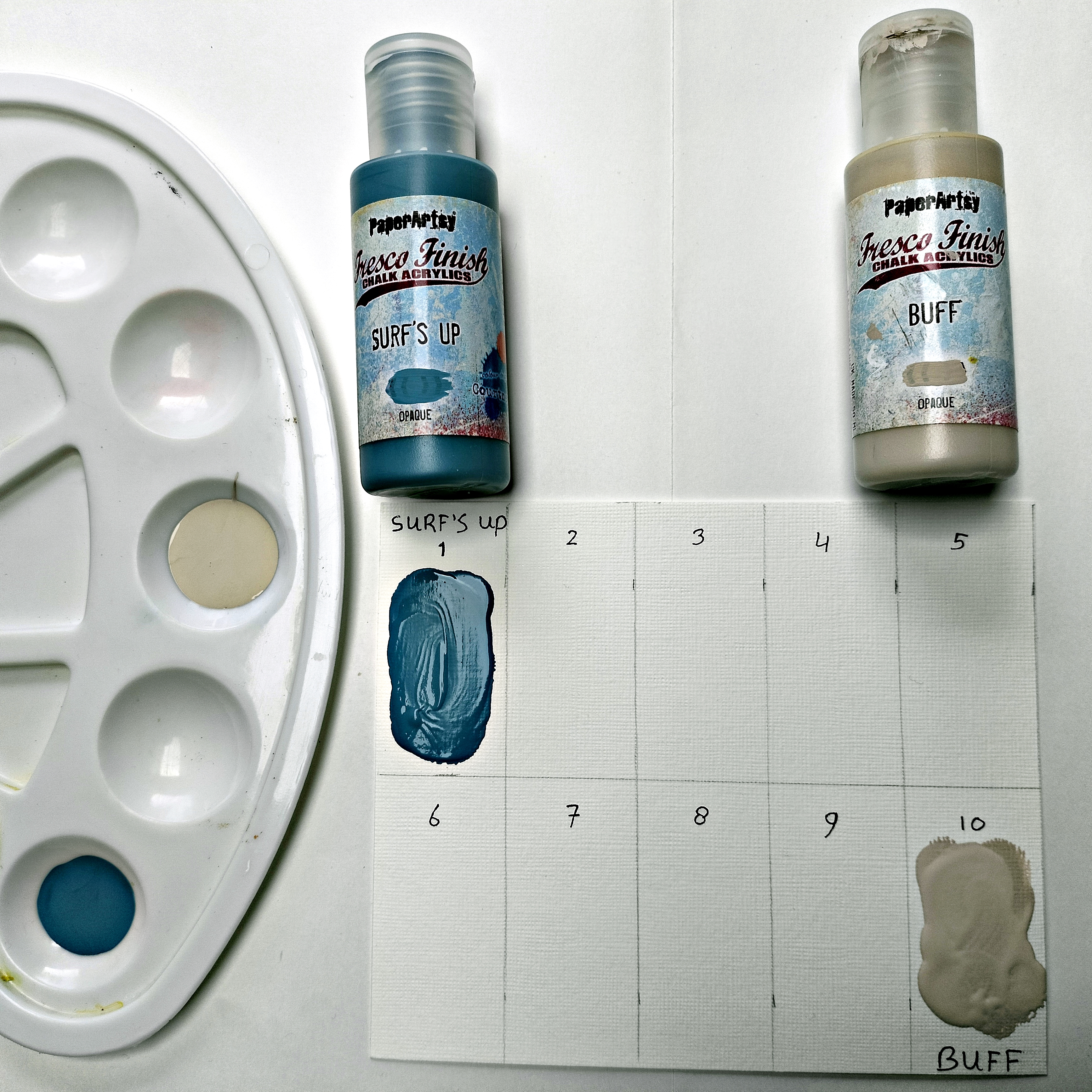
I was tasked with creating a range of different tones with neutral colour mixes, but since I'm always keen to push the boundaries, I decided to go for a coloured grey and coloured neutral as my mixing colours. The PaperArtsy Fresco Finish Chalk Acrylic's I selected (Surf's Up - FF146, Stardust - FF222, Nougat FF39) push the colour mixes towards the blue-green space of the colour wheel.

Colour swatching and mixing colours is such a great way to get the creative juices flowing and spark ideas. A while ago I started to keep a colour journal for this very reason, so before cracking on with my project, I decided to take a closer look at some of the mixes my three colours would create and test out the results on paper, in my journal.

I squeezed out small blobs of each colour into my mixing palette and added varying amounts of Stardust and Nougat to Surf's Up, mixing with my paintbrush.

These are some of the swatches I created from those mixes. The swatches on the top row are the pure colours, straight from the bottle, with the two rows underneath showing the mix of Surf's Up with each of the additional colours in varying quantities. The swatches to the left have the least amount of the 2nd colour added, with the swatches on the right of the page having the most amount added. You can clearly see that as more of the 2nd colour is added, the colour hue of the blue changes, with Stardust creating blue-grey tones, whilst Nougat creates a softer, muddier hue which leans towards sea green.

I can never resist bringing some pretty to my colour swatching, so to see how the different mixes play together, I created some quick loose florals on the adjacent page. The mix of darker and lighter tones work so nicely together and create enough variety to give the composition depth. I was confident that they were going to create a colour scheme pleasing to the eye and restful enough to make a nice interior piece of art.


Next it was time to put some of those colour mixes to use and create my project. The first step was creating the background papers for my butterflies. Rather than premix the colours and then add to the gel plate, I decided to take the lazy approach and let the gel plate do all the work!

I squeezed a small amount of surf's up and stardust onto the plate, mixing as I spread out the colours with the brayer. I like the uneven, random colour mixes this application creates, with the papers have interesting, grungy texture right from the off. I then repeat this process using Surf's Up and Nougat.

With the papers dry, I then used a variety of the mixes to add some stamping details to the papers, using numerous stamps from the sets for more diversity in the patterns.

At this stage I decided that the papers needed another layer of contrast, so I added one final layer of stamping using Archival Ink (Faded Jeans).


I fussy cut these out and then had a little play with composition on a plan piece of card. It was at this stage that I decided to layer the different sizes on top of each other, so I arranged them into sets of three.

I then stitched down the centre to stack the three butterflies on top of each other. By only attaching them in the centre, this allowed the wings to be teased out, creating extra dimension once placed in the frame.

Here are the completed butterflies ready for the final part of the project.

The combination of different colour mixes and stamping details, provides so much contrast, leading the eye through all the details when looking at with these little butterflies. Each one is completely unique, whilst also being similar enough to the others to provide harmony in the final design.

The final part of the project was to create a piece of background card to attached the butterflies to. To tie into the overall colour scheme, I used a range of mixes of Surf's Up, Stardust and Nougat, lightly braying the colours in layers to the outside edges of the card.

A final bit of detail was added with some stamping in Archival Ink (Cornflower Blue).

To complete, I mounted the four butterflies to the centre of the card using foam squares to lift them off the page for extra dimension.

I placed the piece in the box frame and voila, the project was complete!


The final piece is just lovely, if I do say so myself! The little bit of detail to the outer edges of the card, draws the eye right into the butterflies where you are in for a visual treat with lots of subtle colour and textural details. If your budget is a little tight, you could definitely create this using just one of the step sets and you could draw the butterfly (or butterflies by hand). You could mix it up by using different multiples of butterflies in the final piece, changing up the composition for different effects, the possibilities are almost endless!
I hope this has inspired you to give colour mixing a go and demonstrated how easy it is to use that to your advantage in a project. If you're inspired to have a go, I'd love to see what you make, so don't forget to tag me on socials.
Wishing you a creative, happy week!
Victoria

Instagram: www.instagram.com/victoriawildingcreates
Facebook: www.facebook.com/victoriawildingcreates
Pinterest: www.pinterest.com/victoriawildingcreates