Showing posts with label Paper Substrates. Show all posts

Sunday, 27 July 2014

Welcome Back GD: Liesbeth Fidder Project #1 Peeled Paint Hanging Board {Part 1}


"Hi, Liesbeth here, I almost can't believe this is my last week as a PaperArtsy Guest Designer! Time really flies! I've had such a great time playing with the wonderful,high quality PaperArtsy stamps, paints and other products! The first of this week's makes is a wall hanging using (yesss again, love them! :-D ) the newest LynnePerrella Stamps and Fresco Finish paints".


I started by using a hanging chunky board which I painted with three Fresco Finish colours - Cheesecake, Sky and Antarctic, blending the paints a little bit as I go.


I did exactly the same onto a Manila tag size 8, leave to dry well, I then stamped the woman and the houses from Lynne Perrella Collection 028 using Black StazOn Ink.


For a beautiful weathered effect I did a well-known classic technique "Peeled Paint". I still love it very much! I have found it doesn't work with every paint, however Fresco Finish Paints works great with this technique {better than any paint I have tried before}. I rubbed some Petroleum Gelly (Vaseline) here and there on the surface with my finger. Keep in mind that where ever you put the jelly, this is where the paint will peel off and the background will show through. I rubbed most of it onto the face area.


I coated the entire piece with Cinnamon and left it to dry for a few hours.


I wiped off the loose paint with a paper towel, the paint easily lifts away from the background where the gelly was applied.


By using tacky glue or tacky tape, I adhere the tag onto the hanging chunky board, and stamped some text  from LPC028 using Archival Ink Coffee.


Next I applied some more text and structure here and there on the front and the sides of the board with Grunge Paste using a stencil 


I painted some paper flowers and a metal embellishment (corner) with Cinnamon Fresco Paint, then added some shine and colour with Treasure Gold Brass and Sapphire. I finished the flowers with some brads and glued everything on the board as shown.


Next, I added some TreasureGold Brass and Sapphire onto the hanging board itself around the edges and the text.


Something was missing in my opinion at this stage, so tomorrow I'll show you what I did to "really" finish the wall hanging. I do hope you will join me then! :-D


~Liesbeth~


Leandra Says: A classic technique which works so well with the Lynne Perrella images. The added elements of Treasure Gold look fab and add depth to this project.


Gillian Says: Love the blue/brown colour palette which always gives a wonderful aged effect, the peeled paint technique and the addition of Treasure Gold finishes the project perfectly.


If you would like to join in this week's challenge and play along with Liesbeth's techniques, then do link up your creativity here, and go in the draw to win some PA stamps of your choice! You need to link your entry by 17:00, Sunday August 3rd 2014.

Sunday, 13 July 2014

Welcome Back GD: Penny Nuttall Project #1 Art Doll 1

"Hello all, Penny here and welcome back for my next three PaperArtsy projects. I hope you will feel inspired to join in with the challenge this week! Our theme this week is making ART DOLLS. My favourite source of inspiration in art, and often the most challenging, is the face, so naturally I love the Lynne Perrella stamp collections. Over the next three days we will look at three different ways of constructing art dolls to showcase these beautiful faces"

Let's begin with Art Doll #1 ....


The base is a Hanging Chunky Board (large) which I painted first with Stone Fresco Finish Paint and then dry brushed over with Antarctic.


I chose a small-patterned stencil for the broke background in Baltic Blue and blended it into the background with a bit more Antarctic.


The flower stand (LPC028) was stamped using Cobalt Archival Ink. I removed the string and glued in two eyelets. Now the figure. 

I stamped the body form from LPC029 onto a piece of close weave cream cotton fabric in the Cobalt ink, layered it with thin wadding and more fabric, stitched just outside the stamped outline and cut out the shape.


I added a die-cut rosette skirt in printed script card stock. I stamped the tall figure on the same card stock in Cobalt ink.To continue the dimensional look of the figure I glued buttons to the background in head and foot positions and added the cut out face and stand.


The metal embellishments were painted with Baltic Blue and partly wiped off to reveal the raised metal. A ribbon bow and hanging loop and we are done!


I have to say I'm not usually a "blue" person but I love these colours- can feel a quilt
happening......... Back tomorrow with more.

~Penny~

Leandra Says: I was hooked at the gorgeous stencilling! But love how all the elements of the image have been used so cleverly, like deconstructed food, this is deconstructed stamping! LOL (well in my head anyway!)

Gillian Says:Love how you have broken down this image of the doll and created various dimensions ... such a cool art doll. Can't wait to see what else is in store this week.

If you would like to join in this week's challenge and play along with Penny's techniques, then do link up your creativity here, and go in the draw to win some PA stamps of your choice! You need to link your entry by 17:00, Sunday July 20th 2014.

Monday, 7 April 2014

GD: Julie Ann Lee Project #2 A Happy Ending {Part 2}

"Hi there, it's Julie Ann again! Thank you so much for coming back to see the show! Tonight it's 'Curtain Up' on my journal spread".


As you can see, at this stage (sorry!) I have not added my actors: they were cut out ready, but not stuck in. I gave both the cover and the first page a coat of Mermaid Fresco followed by Bora Bora and an edging of South Pacific. I also stuck my first two pages together very carefully with some Heavy Gel Medium. On the left I stamped with the Mini 84 script  stamp in Wendy Vecchi Archival Ink Cornflower Blue. Again I used the stamp without a block to create a worn look. I also allowed the lettering to go over onto the back of the bunting which I had painted blue to match my spread.


I had wound the fibres around the aperture and I loved the effect of their texture and colour against the blue. I added some random stenciling with a Prima flourish stencil. Now the empty blue page was taunting me: what drama was to take place here? One of my favourite Shakespeare plays is 'The Tempest' with its beautiful poetry and its enchanted isle setting. I also love Blake's poetry so I thought my page would be about the enchanted worlds we can find all around us - now isn't there a lovely Lin Brown Eclectica flower sentiment along those lines? An idea was taking shape.


Using the wonderful Smoothy White Stamping Card again, I painted it to look like an old piece of parchment, maybe found on the magical isle, saved from a time long ago? I tore the edges and then rolled them around a cocktail stick. I used Vanilla, Chocolate Pudding and a backing of Mermaid and stamped in Versafine Vintage Sepia to stamp with ELB05.


Ideas were forming as to what I would do with my poem page, but while they were fermenting, I stuck on my figures for the front cover. They looked perfect, but they backs were boring. I decided to turn the reverse side into goddesses rising from the waves, the protectors of the magical isle! I used LPC006 for the towers and the goddesses' faces. Later I added ripples with a blue Sharpie pen!


Now you can see what I decided to do with the other page!


The tissue here is ordinary, everyday white tissue wrap, painted with Mermaid Fresco, a touch of South Pacific and some Hey Pesto. I stuck it to the page with Matte Medium having stamped with the gorgeous feather, Mini 98. I didn't matter if there were wrinkles - the more the better, as this is the effect I was going for ...


When I had fixed my tissue and painted over it with Satin Glaze and it was completely dry, I went in with some White Fire Treasure Gold. The finishing touches are some ornate corners and some punched out leaves painted with Guacamole.


Meet the Queen of the Isle! She's from LPC006 and when she looks about her she really sees the beauty of her magical isle and teaches her subjects to value Nature's Gifts.


Her crown is from LPC003. I wanted to use pearls because they remind me of 'The Tempest' and the piece of gold mesh is something I've been holding onto and not wanting to use! For this journal, I want to have lots of textiles added, so to start with, I dyed some seam-binding with Peacock Feathers Distress Ink and then stamped it with the sun from LPC005


I like to think that the circle around her eye emphasises how when we look and truly see, the world shows us its magic!

 
Thank you so much for returning to see the show. I shall be back tomorrow when the curtain will close on the Last Night, but there will be tickets for a Happy Ending and costumes to try on and all wrapped up - as if by magic - in a tiny tag purse. I'd love you to take your seats for that, if you can! 
Julie Ann x

Leandra Says: Wow Julie Ann, another night with so much wonderful depth incorporated into your project. The scene is being set perfectly for the grand finale tomorrow evening.

Gillian Says: I am completely in love with this theme, again you captured all the details beautifully. Bravo.

If you would like to join in this week's challenge and play along with Julie Ann's techniques, then do link up your creativity here, and go in the draw to win some PA stamps of your choice! You need to link your entry by 17:00, Sunday April 13th 2014

Sunday, 6 April 2014

Welcome Back GD: Julie Ann Lee Project #1 A Happy Ending {Part 1}

"Hi, it's Julie Ann here with my last post as Guest Designer at PaperArtsy. I can't believe how the time has zoomed by! It's been a joy and a privilege to share these projects with you and although Sunday nights at seven have often seen me chewing my rather painty nails as we went live, I've had the time of my life! Thank you for looking and commenting so kindly on my work and for all the wonderful projects you've created in response".

For this last project I've created something that is more of a beginning than an end! Enigmatic? Not really. I've decided to create a journal, using Lynne Perrella stamps: it's a farewell and a new beginning at the same time! Over the next three nights, I'll be showing you how I create my cover, my first spread and my back cover and extra tags to go inside! I'll be using Lynne Perrella stamps, Eclectica (Sara Nauman and Lin Brown) and Ink and the Dog Minis. Warning - there are cartloads of pictures!!! I plan to add pages over on my blog in the future as I explore how versatile these LP images are. If you want to play along this week, though, you don't have to create a big complicated project. You could make a tag using the techniques from my project, a tag envelope or a journal spread - just one or loads, feel free. Here is a peek at my cover.


I've always been fascinated by toy theatres, and there is something so theatrical about Lynne Perrella's wonderful stamps, I wanted to use theatrical colours and evoke the mood of my first ever visit to the theatre. I went to see Cinderella at the Colosseum in London when I was a tot and I'll never forget the impact of those vibrant colours intensified by the stage lights. I had entered a magical world and I intended to return! My journal theatre is a fantasy one of long ago, lit 
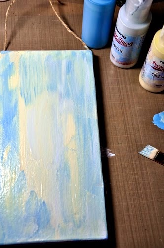
by flickering torches. I started with an armful of Frescos! I chose the opaque Vanilla; translucents like Zesty Zing, Yellow Submarine and Tango; some blues to calm things down - Bora Bora, Mermaid and South Pacific; Spanish Mulberry because it seems so dramatic and Chocolate Pudding and French Roast to age my project. I also added the extra drama of Blood Orange; but that's flung itself off the edge of the image, maybe because it's such a 'Drama Queen'!


I was going to be working with a journal / sketchbook available from PaperArtsy. It has nice strong pages and it's beautifully bound.


I gave it a good coat of Gesso! 


 I wanted to make an aperture in the front of my journal to create the toy theatre effect. This was a scary prospect, as I didn't want to 'ruin' the beautiful binding but I took a deep breath, drew around a box the shape and size I wanted and then cut out my rectangle with a craft knife.


I used a steel ruler along the edges to prevent my knife from slipping and placed a small self-healing craft mat between the covers and pages so that I wouldn't cut through to the paper underneath.


This is a long process and it takes lots of patience! You just have to keep cutting in careful strokes until you can lift out your centre section.
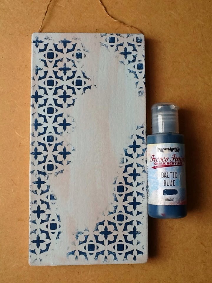

Now you can begin to decorate. I place ancient plastic wallets between the pages of the journal or book for protection when I do this, as they don't stick and spoil your work like even waxed paper can. You don't have to waste them afterwards. You can wipe them off and use them again on future projects. I gave my cover a coat of Vanilla then some Yellow Submarine. I was worried at this point that the journal was going to be way too bright for my taste because I do love neutrals and pastels but I reassured myself that adding layers of different colours and textures would help achieve the effect I was looking for and in the end I loved the effect of those dramatic colours.


I was also going to add images and little figures to my cover, so I had lots of fun painting layers onto Smoothy Card and then using a sanding block to expose different colours before stamping on my background. At this stage I had Vanilla, Yellow Submarine, Tango and Blood Orange. Can you spot Mermaid, Spanish Mulberry, South Pacific and Blood Orange on the smaller strip?


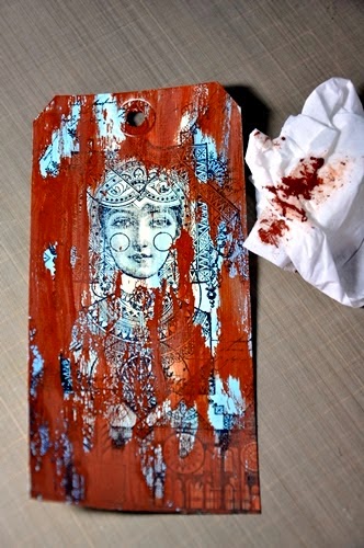
I loved the effect of stamping with Versafine Onyx Black and LP028 here - it gave the illuminated effect I really wanted! The bunting (a blend of Spanish Mulberry and Mermaid) and the suns are from LPC005.  

I find that LP stamps co-ordinate so well that mixing and matching sets is a delight. You can probably see that I stamped several of the suns and stacked them to create depth. I gently sponged and blended darker shades, Tango and 
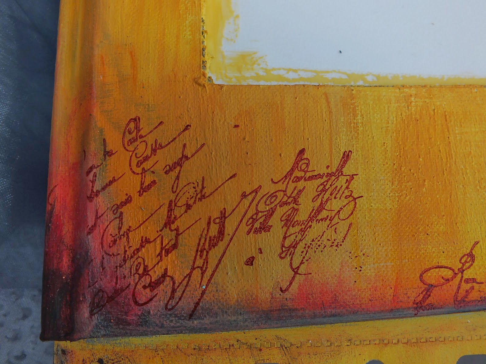
Blood Orange mainly, into my cover and then used Ink and the Dog Mini 84 without a block and Versafine Red Carnation to give the impression of aged script. These mini script stamps are just about the most useful part of my stash, I reckon!


 Now for some texture! I broke open some Grunge Paste mixed it with a tiny blob of Blood Orange and a little water. I wanted it fluid enough to paint with, but to still set properly. This is quite a tricky procedure, I find - I'm not as skilled at it as Liz Borer - but I do love dripping the Grunge Paste from the brush and creating sculpted effects.


Once the Grunge Paste was dry I added Treasure Gold in Florentine and Classic. I built this up with more strokes of Grunge Paste.


I went on adding strands to that tassel, so you can see in later images it looks more detailed!


Adding Treasure Gold makes a huge difference! The tie backs are some scraps of stamped card run through a lace punch. Now do you ever make up too much coloured Grunge Paste? You can't put it back into the container, so what do you do with it? This time I made it into two torches to have at the front of my stage. I took two cocktail sticks and swirled them through the paste left on on my craft mat.


The next step is to ignite that torch with Treasure Gold when it's completely set and dry!


I fixed the torches with heavy gel medium and then added some swirls of Grunge Paste.


I added an Eclectica butterfly chipboard shape, painted with Vanilla, Mermaid and a touch of Zesty Zing to bring it to life. The antennae are two flower centres from my stash. I stamped with the two ladies from LPC015. Finally it was time for my actors to take to the stage!


I chose the ladies from LPC013. They carry whole cities on their heads. Actors through their words and actions have to carry us to new lands, stimulating our imaginations to build magical landscapes so they seemed just right. I also like the way they faced each other like my butterfly ladies, almost mirroring each other.


I added some fibres, a gift from a crafting friend, to enhance the curtains. Please come back tomorrow, when I'll be opening the curtains on the PaperArtsy, Lynne Perrella Show! Here's another look at the curtain about to go up.

 
If you would like to see how I made my little purse from a tag and the bits and pieces inside, I'll be sharing that on Tuesday evening so do please come back then too! If you've liked any of the details so far, or if you've been inspired to create a theatre cover - or even a toy theatre - of your own, do please link up your creativity and join in the fun. You could have a chance to win a wonderful stamp plate of your choice. Thank you so much for looking.
 Julie Ann x.

Leandra Says: Oh la la {said in bestest french voice} this journal is rocking already ... and there's more to come!! These journals are seriously brill to work with, love the aperture you created to the front cover.The torches are such a fab touch .... love love love!

Gillian Says: Magnifique start to the week Julie Ann, the colour palette is exquisite, the added depth of layers from the Grunge Paste, Treasure Gold etc really brings the journal cover to another dimension. J'adore can't wait to see more.

If you would like to join in this week's challenge and play along with Julie Ann's techniques, then do link up your creativity here, and go in the draw to win some PA stamps of your choice! You need to link your entry by 17:00, Sunday April 13th 2014

More Posts to Enjoy