Showing posts with label Duralar. Show all posts

Thursday, 11 July 2024

2024 Topic 5: Ink Pads {by Ann Barnes} on the PaperArtsy Blog


Hi everyone, Ann (aksbarchitect CREATES) here with you today.

I've been keeping busy with my family lately. My youngest just finished high school and will be heading off to college at the end of summer. Along with celebrating her achievements, we have been preparing for the next step and savoring the summer days before she leaves. 

When I heard that inks/ink pads would be the fifth topic for the PaperArtsy blog, I immediately thought of working with alcohol inks and the Alcohol Lift Ink Pad. I love the vibrant colors of alcohol inks and there are so many techniques to play around with. I am also wondering if perhaps my desire to work with the alcohol ink might have something to do with the fact that it is sometimes not easily controlled, you simply need to embrace the beauty of the flow... kind of like having your youngest leave the nest.


For me, Lynne Perrella stamps and bright and bold colors go hand in hand. I have a floating glass frame that I've been holding onto for a while and I think it would make a wonderful sun catcher to hang in a bright spot. I want to combine the beautiful PaperArtsy Lynne Perrella Collection stamps (LPC040) with alcohol ink. I imagine it will be stunning as the sun shines through it during these long summer days. I look forward to sharing some of my experimental play with the alcohol inks during the creation of the piece. I am really pleased with how the piece turned out, giving off a wonderful summer vibe. I already have ideas for creating inserts for different seasons. 

One of my favorite aspects of the piece is how I incorporated the "hidden" theme into the design. 
Using alcohol lift ink, I was able to create a ghosted stamp design in the background. This adds a bit of interest without taking over the focus. I can't wait to share the process with you.


Knowing I was creating something to enjoy this summer, I chose bright vivid colors, opting for yellow, blue, teal, orange, purple and magenta, but I believe that any colors you my have would work splendidly. The Lynne Perrella Collection stamp set 40 (LPC040) has a beautiful detailed sun image that I thought would be wonderful as a focal point. Being in the summer mindset meant that I also would use the fish stamp from the same set.


Knowing the size of the frame I will be using allows me to select different stamp designs that may fit best. You can always use portions of a stamp to fit an area if the overall dimensions don't work out. When I chose the sun stamp, I wanted a blue/teal "sky" color for the background and Tim Holtz Alcohol Ink (Stream) was perfect.


The best alcohol ink results are achieved on a non-porous substrate. For this project, I used Grafics clear Dura-Lar as my base. There are a number of ways to apply ink to the surface, and varying opinions on each. It's always best to try different techniques and decide what works best for you. You can find a bunch of videos on YouTube to help you get started if you have never worked with alcohol inks before. (I really enjoy watching Tim Holtz demo alcohol inks!) I like to create a solid background by using a paint brush with the ink. You can use either alcohol ink blending solution or isopropyl alcohol as your fluid medium. If using alcohol, be sure to always use at least 91% (or higher) alcohol.


When the backgrounds are dry, I will incorporate my "hidden" feature. To do this, I use an alcohol lift ink pad and a stamp. Always be sure to clean the stamp prior to using it with lift ink. Also note that the more vibrant and more heavily inked the base, the better the "lifted" image. A high contrast allows the details to show clearly.

Now to the magic of the alcohol lift ink...

Using the Alcohol Lift Ink pad (by Ranger industries), ink the stamp then stamp onto the background making sure to put even pressure along the entire image. Then, carefully lift the stamp off the background and set aside. Using a clean cloth (or a smooth paper towel) blot the stamped design, constantly turning the towel to a clean area before blotting another section. Essentially what we are doing is removing the lift ink. In order to keep the image crisp, it is important that you do not rub the area and smudge the ink, you want to simply blot and lift the towel then repeat the procedure with a clean area of the towel until all traces of the lift ink are removed and you can see a negative of the image. So instead of seeing a stamped image on the background, you will have the background with the image removed from it.


Once you have completed the blotting process, you can attend to the stamp that is now "inked" with lift ink and the alcohol ink that it removed. This can be stamped onto another substrate. I prefer to stamp this onto Ranger Industries - alcohol ink cardstock. The coating on this paper accepts the alcohol ink beautifully. Once you have stamped the image, wipe off the stamp and start again. It is important that you wipe your stamp clean each time before inking it with the alcohol lift ink.


I created a pattern on the background by repeatedly stamping and blotting the fish image from Lynne Perrella Collection 040 (
LPC040). I love the detailing that is visible upon close inspection.


I had originally envisioned a richly colored background, but had a difficult time getting a smooth, non streaky base layer of alcohol ink, so I ended up using the lighter colored background. Initially I was disappointed; however, once the pattern emerged, I was glad that it played more into the quarterly "hidden" theme. This will give me more opportunity to showcase the focal images with vibrant colors. Having my background established, it was now time to focus on my favorite way to use alcohol inks, painting with them. For me, the easiest way to do this is using a palette of alcohol ink that is essentially dry in wells (or pans). The palette I use is byTim Holtz and contains 36 compartments for different colors.


Using Ranger Archival Ink and a stamping platform, I stamped the images onto the Dur a Lar and allowed it to dry completely. Since the alcohol ink will smear the archival ink, and my base is clear, I will be "painting" the reverse side. I add color to reverse side of each of the images and allow it to dry. If you are not happy with something, alcohol ink is easily removed by using a brush loaded with alcohol and taking up the unwanted ink, then wiping the brush on a paper towel. You can then go back in and re-paint the area.
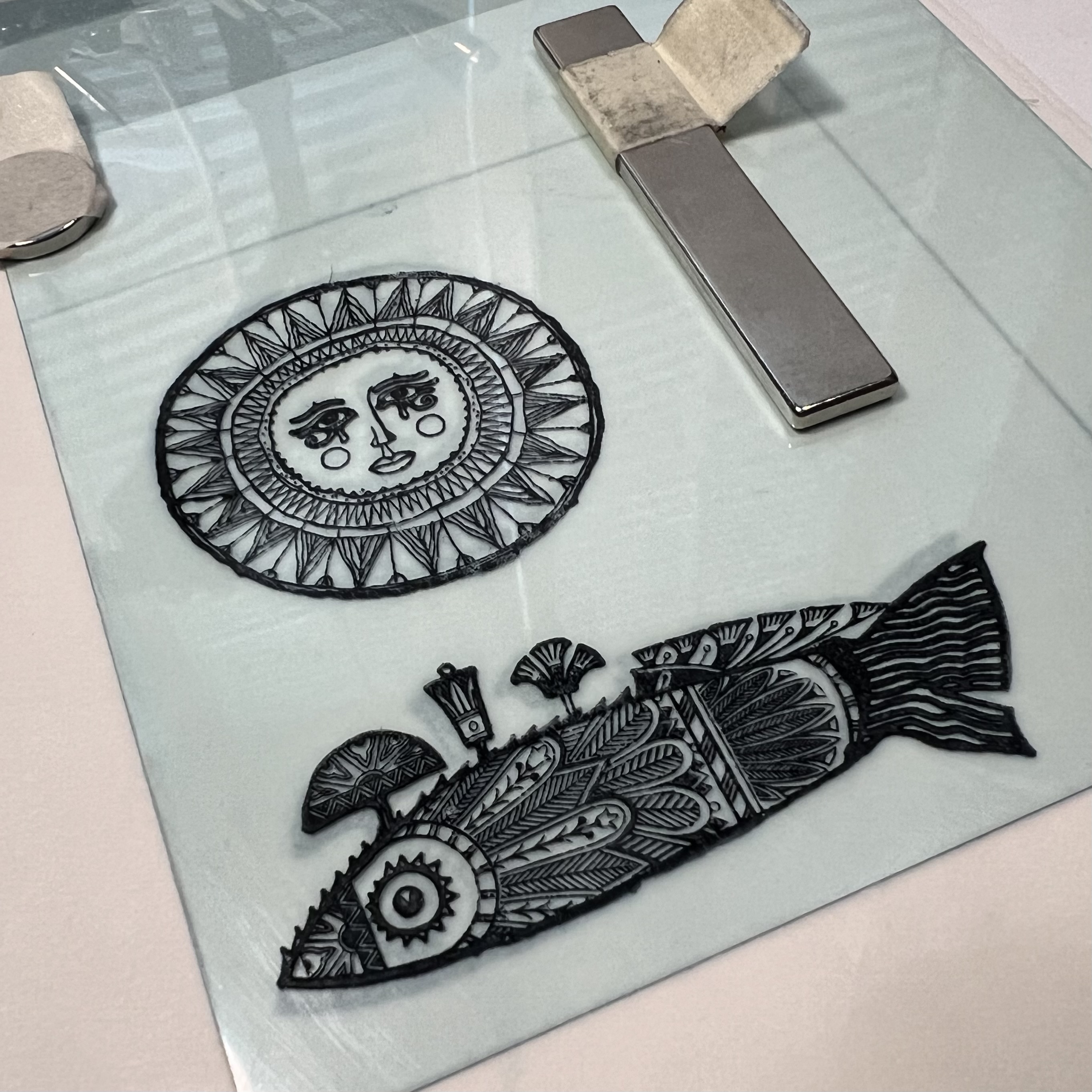

Painting with the alcohol ink takes a bit of practice and a lot of acceptance. Although you can somewhat control the ink, it still sometimes has a mind of its own. Depending on how wet your brush is when you load it will make all the difference as to how much it bleeds once it is brushed onto the substrate. It's a great idea to keep a paper towel beside the palette to absorb some of the alcohol before picking up the color.


I like to keep two small jars of 91% alcohol handy when I am painting with alcohol ink. The first I  try to keep as clean as possible, to use as a fluid medium for painting. The other jar is used to clean my brush between colors. Similar to using watercolor paints, if you mix the pigment with muddy liquid it will affect the color when you got to paint with it. The clearer the alcohol you are mixing with, the truer the ink color will be when you are painting with it.


Once you are satisfied with your painting, allow it to dry. This won't take long, alcohol ink dries very quickly. 


I changed out the original chain that the frame was supposed to hang from with a wire and some trade beads that I had from my stash. Then I trimmed the piece to fit into my frame and voila! I already have ideas for creating different pieces to use in the frame. the PaperArtsy Lynne Perrella Collection has so many beautiful designs, maybe I won't just limit myself to seasons...

Monday, 11 December 2023

2023 Topic 12: Designer Focus: JoFY {by Keren Baker}


Hi everyone, it's Keren with you today continuing with our focus on the fabulous JOFY range. 

I have loved Jo's style for many years now, and she really excels with Christmas themed stamps (in my humble opinion!).
I've had very little time to be creative in the past 6 months and I've really missed it. So when thinking about a Christmas theme I wanted to go simple - we're time poor at this time of year, right?! So I ended up with 5 ways with one stamp set.


The eagle eyed amongst you will have counted 4. It was just easier to photograph them that way!!


I love techniques, but when time is short, we want interest on our projects without too much effort. I also decided to use different colouring mediums rather than paint. I couldn't do without something extra, so added in Grunge Paste to help with texture. I chose the JOFY130 set as I'm a little obsessed with mushrooms - and love that there are some festive images using fungi !


How to start? It was the colour selection that came first. Had to be red- but mushrooms are available in different colours so I added in green and teal. The stars are often gold so that sorted my colour combo without too much effort. Having challenged myself a couple of times to do colours out of my 'norm', I thought I'd head towards my favourite bright colours.

I have to admit that I used to see stamping platforms as cheating, but I've stopped being snobby about them as they come in so useful for many techniques. I knew I'd need it for stamping on shrink plastic later, so used it to get perfect images onto cardstock ready for colouring.


Some people love alcohol marker colouring and I'm definitely one of them. Like many things, it's all about practice and don't forget to stamp with an alcohol friendly ink-pad like Memento ink. Here's the JOFY130 stamp set that I used.


To make my mini cards have more depth, I wanted to add some overlays and flaps. The first one was using some thin acetate and Grunge Paste. 


I combined this with a super versatile stencil PS113 (from Sara Naumann).


Grunge Paste dries pretty quickly. I'd already folded the acetate before adding Grunge Paste and simply added a couple of glue dots to the reverse to secure the overlay to the coloured panel.


I love a good white base, but kraft coloured cardstock was a good contrast and softened the completed project.


At this point, I hadn't decided exactly how many projects I was creating, but loved the overlay idea and decided to try a partial one on the next project but not using a transparent layer.
 

With the Grunge Paste still handy and some glitter (it's Christmas- we're surely allowed glitter!)....I used the 'wish' on the stencil. I'd already coloured in the same image using a different colour scheme but loved the idea of playing with opacity. You can see below how wet the Grunge Paste is initially and adding glitter is easy as it naturally adheres to the paste as it dries.


The challenge with acetate and Duralar Matt is deciding how to anchor them. With the acetate, I simply added tiny dots of glue behind the Grunge Paste 'snow' and pressed them well until dry. With this project, I decided to sew it with a matching coloured thread which adds to the design.


Still focussing on the same image, I had a need for some Christmassy jewellery for a work meal and I thought this would be perfect. Colouring on Shrink Plastic can be a challenge. You need an ink that will dry on the surface so you're looking at StazOn ideally, but that ink will react with alcohol markers and because it's frosted, if you add Alcohol markers to the reverse, it's not easy to see the colours, so I opted for pencil on the surface that I'd stamped on. I've not used Prismacolors with Shrink plastic before, but knew that the colours would intensify once shrunk.


The other thing to keep in mind is that you need to be careful when adding layers of pencils. Pencils like Prismacolors need gradual layering- but they have a tendency to start lifting off if you put too many layers on (when using Shrink plastic), so there's a bit of a learning process. Here's a look at the difference of sizing once shrunk! Don't forget to punch holes before shrinking if you need them connecting to something else. Aren't those intensified colours amazing!


They make an easy gift with a little extra bead and then stamping in a lighter colour onto a cardstock panel and attaching to another cardstock layer. 


I had in my head '5 ways' now, so I just needed two more projects...


To be fair, there weren't many twists and turns- the hardest bit was working out how to sew perfectly mitred corners on my serviettes! The long image is useful for so many things- I nearly made a tag with it, but I thought they'd make sweet serviette holders for your Christmas table (only another 10 to make now!!).


For the next and last project, I wanted to use the other image on the stamp set and also from the stencil. I had visions of hanging the baubles from the twiggy stencil image, partly because that's what I'm doing in my house. I currently have a large piece of dead branch hanging from my ceiling drying out and waiting to have baubles hung from it!!


I added Grunge Paste through the stencil onto Smoothy Cardstock and then once dry, I replaced the stencil back over the paste and coloured through it using alcohol markers. It takes alcohol ink really well. I trimmed out the individual baubles and added them to the base card. I'd coloured through the stencil using alcohol ink to create the snow using blue alcohol. It felt too one dimensional so I added some Nuvo drops over the tops which seemed to do the job.

You can also see the cracked glitter glue. Just manipulate your cardstock once the glitter glue is dried and you'll get something like the cracking below!


I had pretty much done the detailing as I went along- you can see lots of white gel pen details in the photo below. I wanted to add a different coloured card base to the hanging baubles card as it seemed a little stark with just the kraft coloured cardstock.


Sometimes creating feels like a slog. A fun tough challenge, but a slog nonetheless. This was different. I had to stop myself making more which is lovely when that happens. After a bit of a creative hiatus it felt frustrating to stop, but I know that I'll be able to come back to this set and get even more ideas from it.

As this is the last post from me this year, I've left a photo below with 'wish' on it. My wish for you is that you'll manage through the holidays. I know this period of time can be really hard for many and with so many tough things happening in the world right now, I hope that you can find people nearby who will love and support you throughout whatever is going on for you.
Wishing a Happy Christmas to you all.

Keren xx