Showing posts with label Linda Cain. Show all posts

Friday, 3 April 2015

2015 #6 Castle Walls {by Linda Cain}

2015 Theme 6: Grunge Paste

Hi everyone Linda Cain here, joining you this evening with a post about Grungepaste. I've been hooked on Historical programs and books lately and wanted to try to make a background that resembled the walls of a castle or building found in the gorgeous Lynne Perrella stamp set here. 
Step One: Using a small journal, I added a layer of Grungepaste in a random pattern that didn't completely cover the page. Before it dries, stamp images into the paste with stamps that have been lightly misted with water. When dry, add the muted colors of paint. I used Taupe, Stone and French Roast. Sand down when dry.

Step two: Next I added Mocha Mouse and Chutney to some Grungepaste and added it to the pages using a stencil. 


Step three: I added several colors of Treasure Gold and used a baby wipe to remove color in spots. Then I used Archival Inks and a sponge square to push ink into the stamped images, removing the ink from the raised areas with the wipe. You can see the Rose Quartz added a purplish color to the page.


Step four: I used a piece of plain 4x6 inch chipboard and painted it with Snowflake. Then I randomly swiped bright colors of paint in small patterns all over it. Using black archival ink I stamped all of the images from LPC033 on it and cut them out.
LPC033
Here you can see the Snowflake with a harlequin stencil brightened it up, and black archival ink images are stamped in the background for contrast.

I added the stamped images to the page in a pleasing pattern and called it a day. I absolutely love the bright colors of Fresco Paints here with Banana, China, LavenderBougainvillea, Blood Orange, Tinned Peas with Guacamole, and Tangerine Twist. You can see the Treasure Gold here, too.

So I feel that I captured the essence of vintage architecture here with the Grungepaste. It was really fun to add color and remove it with the wipes, then add more and push the envelope to get the color and contrast I wanted without being too overpowering.

I hope you've been inspired to jump in and play with stamping into Grungepaste...I had a blast!!!

Your Friend in ART,

Linda

I hope you'll visit my blog to find more creative fun at: Friends in Art 

I think you created a fantastic wall effect Linda, it really does compliment the stained glass images so well. Especially given the muted tones used , they are the perfect backdrop for all those pop of colour. Your projects are always so full of light, which totally suits this project .

We would love you to join in with challenge #6: Grunge Paste If you are inspired by any of our guests who blog with us over the fortnight, then please join in and link up your creativity HERE. 


NB.  you will get 3 weeks to participate in this challenge, as we will interrupt the usual schedule for our 3UP week which starts April 5th.


All links go in the draw to win a voucher to spend on products of your choice from the PaperArtsy online store. The Grunge Paste link will close 17:00 (London Time) Sunday, April 12th, winner will be announced 2 hours later at 19:00

Friday, 6 March 2015

2015 #4 Miniature Village {by Linda Cain}

2015 Theme 4: Miniature Art

Hi everyone, Linda Cain here, joining you this evening with a post about Miniature Art. I've used phrases from Emma Godfrey's wonderful set EEG02 on a village of tiny masonite houses. Stamping on Shrink Plastic and using the words to decorate the houses was easy and fun. Then painting the background and houses with Fresco Paints made a perfect setting for adding details with contrast stamping. 


This set is great for journaling, but I wanted to take it in a different direction this time. All the new colors of Fresco Paint are to die for, so they were perfect for this bright and sassy little creation. These are all the colors I used on the houses that were first base-coated with Snowflake. I like to do this so the colors come out brighter.

I use several different colors on each house, some for the base and others as shading on the edges. Then I add different words to some of the houses. Here I only wanted one of the words to stamp, so I first ink the stamp, and then add a piece of tissue tape over the unwanted area. 


Next I stamped several of the phrases onto Shrink Plastic and trimmed them. You can color some of them in before shrinking, too.  Use a heat tool to shrink them down.  I always keep a heavy stamp block close to flatten them out once they're completely shrunk and still hot. 


This shows several of the images I used with Red, Brown, and Black Archival Inks on the houses. I also used Ink and the Dog Minis #23, #62 and #72.  I cut a piece of cardboard or grey-board for my background and added Blue Oyster with Inky Pool for the sky, and Guacamole with Hey Pesto for the grass. 

Mini23
Mini 62

Mini72


Then I break out the White pen to add some highlights to each house. The little Newsprint Bubble stamps  on newsprint scrapbook paper are cut out and added with the stamped Bubbles in the sky area. I used tissue wrap on the backs of the houses to cover the windows. You can start gluing your little Shrink Plastic pieces around on the houses where you like.


I stamped up phrases that I thought were perfect for this setting. In the end, "this makes me happy" was exactly how I felt when this was done. It therefore became the theme of my little creation and was layered onto a piece of black mat board and centered on the picture.

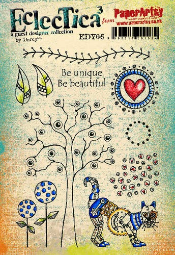
I also used a small stamp from EDY05  by Darcy for adding grass to the bottom of the piece. 
EDY05

I cut a piece of black mat board as a frame so it can be hung on the wall, or you can add an easel back and set it on your desk.


There are lots of little miniature pieces of chipboard out there, or die cuts that you can paint up. Or, just draw and cut out your own little houses. Use your imagination! I loved how some of the Shrink Plastic ended up arched, as you can see on the first house "life is good". The "too funny" just melted that way and turned out perfect. You could also use a white pen to add your own hand-written thoughts around the project. The possibilities are endless....just get started!!!

Your Friend in ART,
Linda 

Visit my blog at http://cain81art.blogspot.com 
Follow me on Facebook as Linda M. Cain
Twitter @cain81
or Instagram @lindamcain

Linda this made me squeal a little when I first saw it... love,love,love this! The colours, the vibrancy and it's houses! what is not to love..the fact it is all teeny tiny just makes it more adorable. Brilliant use of Emma's stamps. Thankyou ~Darcy

We would love you to join in with challenge #4: Miniature Art. If you are inspired by any of our guests who blog with us over the fortnight, then please join in and link up your creativity HERE

All links go in the draw to win a voucher to spend on products of your choice from the PaperArtsy online store. The Miniature Art link will close 17:00 (London Time) Sunday, March 8th, winner will be announced 2 hours later at 19:00.

Wednesday, 20 August 2014

Journal Page { with Eclectica³ Lin Brown Stamps and Stencils by Linda Cain}

Hi everyone! I'm Linda Cain and I'm back for one last spot to share a fun page in a small journal.
There's lots of wonderful stencils used here that create a simple bit of layering. The colors in the background are the real interest here that immediately grab your attention.


The Earth Laughs In Flowers stamp sets the stage for the whimsical flowers and bubbles.


This is a totally random pattern of colors that are sponged onto the journal spread with Opaque paints. They are NOT blended at the edges, but are deliberately made with the defined "sponge square" pattern.


Then I used the PS004 Stencil to draw the stems with black permanent pen, and olive green Archival ink to add the leaves from PS005.

The gorgeous flower pattern from PS005 is sponged on with Snowflake. I cut circles of vintage dictionary pages to glue to the flower centers.


More stenciling with a blue Archival Ink fills in the spaces with the bubbles from PS001 I also added shadows and outlines with pens.


The phrase from ELB06 is stamped and cut on white paper. A bit of Antique Linen Distress Ink adds a smudge of color to tone down the stark whiteness.


ELB06 
More dots and dashes with the pens here and there, and around the edges, frame up the pages.

It's been a wonderful time spent here in the last year. I have enjoyed every moment of it!!! Thanks so much to Leandra and Darcy for EVERYTHING. I, of course, will continue to use my "beloved" Fresco Paints and my stash of stamps to play and create projects on my blog.

I truly hope to hear from you and see all your fun creations as well. Keep in touch!!! XXX
Your Friend in ART,
Linda

A huge thank you to Linda from all at PaperArtsy HQ, it has been such an enormous pleasure having you contribute to the blog and I do hope you will be back in the future. This is a gorgeous project to end with, light and summery . Even though you left the edges of paint 'squared off' they somehow still manage to look blended... must be because those Frescos are just so awesome!


If you would like to join in our weekly challenge with any of this week's guests who have blogged since Sunday night, then join in to link up your creativity HERE you will go in the draw to win PA stamps of your choice! You need to link your entry by17:00 (London time) Sunday 24th Aug2014

Wednesday, 30 July 2014

Birdhouse {with JoFY and Eclectica³ Darcy Stamps by Linda Cain}

Hi there everyone! I'm Linda Cain, and I'm back for another PaperArtsy project!!! I love it here! Such an eclectic group of fun and talented people to play with.

The Birds are going crazy in our garden with all the rain and prospects of worms to grub around with. And if you've known me for very long, you know that houses, be they bird or otherwise, are one of my passions. 


I started with a plain wooden birdhouse that I did my best to sand and make smooth. Then I picked 3 bright, light, and opaque colours to base coat sections of the house. This just shows the testing of whether I liked the colour combo or not. It proved to be a "go."

Here I chose Lilac, Guacamole, and Bora Bora. I used 2 coats to get good coverage.

I added the Crackle Glaze to the blue sections, and when dry, painted on the darker colour Inky Pool. I LOVE the way it crackled!!! I also used a sanding block to take paint off the edges for a more Shabby Chic look. Next I added Eggplant with a dry brush and a sponge to the edges of the Lilac painted areas. It was a bit harsh here, so I sanded it back as well.

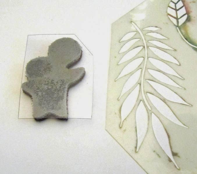
I mixed up some Guacamole and Grunge Paste to use with the Lin Brown stencil PS002 on both roofs.
  

I used the JOFY09 stamp set shown here on the top with olive green archival ink.

JOFY09
Then I rummaged through all my Darcy stamps  EDY05, EDY06, EDY07 and EDY08 for just the right size stamps to fit into each little area of the house on the bottom section.

EDY05
EDY06
Bubbles, Leaves, Butterflies, Flowers....whatever will fit into the area you have. Don't ya love the round stamp that fit around the holes??? Too cute!

EDY07
EDY08
Here's the best tip I can give you:  Cut a piece of left-over plastic packaging to a size that will fit into the area you want to stamp. Use it to stamp your stamps instead of an acrylic block. It lets you get a nice clean stamped image in a tight spot.


The other thing I did was to trim my stencil to fit on the lower roof. Taping it into place was much easier this way.


After everything is stamped up with different colours of archival inks, go back and either paint (I used a bit of Haystack and Claret) or use permanent markers to add more colour.

I also used some of Darcy's minis, EM03 and EM05. 

EM03
EM05. 
I used Black, Red, Blue and Olive Green Archival inks because once dry they are permanent, this means I can spray this with a sealer, drill a hole in the top to add a piece of twine through, and hang this little house in a tree out back.

That's it for me for today. Hope you get some inspiration to make a little birdhouse of your own. They really are fun, easy, and the birds will love you.

Your Friend in ART,

Linda

Huge thanks to Linda From PaperArtsy, this is such a delightful project. cheerful and quirky, what little birdie could resist. Great tips on how to work in awkward to reach areas too. 

If you would like to join in our weekly challenge with any of this week's guests who have blogged since Sunday night, then join in to link up your creativity HERE you will go in the draw to win PA stamps of your choice! You need to link your entry by17:00 (London time) Sunday 3rd Aug 2014

Wednesday, 25 June 2014

Shadow Box Tray {with Lynne Perrella and Ellen Vargo Stamps by Linda Cain}

Hi everyone, Linda Cain here again for another fun project using PaperArtsy products!!!
Here I'm using 2 favourites...one is my colour combination of Red, Black, and Tan...with a bit of GOLD... and Lynne Perrella Stamps!!!

I found a black shadowbox tray in my stash and went to work. If you follow me, you know black outlines most of my colours to make the colour jump out at you.


First I start with Smoothy Heavy Cardstock, a foam square, and 4 colours of Fresco paint. I used the Irish Cream and Caramel Opaques as a base and then added Tikka and Old Gold. The Old Gold is a thinner paint and it really looks cool splotched on randomly.


I measured and cut pieces for the 4 sections of the tray. Here you can see how randomly I painted this. It will prove to be much more contrasting when you leave defined areas instead of blended areas.

Next I used Ellen Vargo's stamp sets EEV03 and EEV04, plus the script stamp from LPC028, with red archival ink. Who'd a thought that they would come together and look so great??? Not me, but here you can see, they really do compliment each other.
EEV03
EEV04

Over Ellen's background stamps I then added the main lady image from LPC028, using black archival ink.  I always heat set just to be safe.


I used Nougat Fresco Paint to stamp images on the little squares. (Left images) I cut 6 knowing that I'd change my mind at least once on how they turned out....*snicker.* Live and Learn!

Then I stamped the GORGEOUS row of buildings from LPC028 on the squares using black archival ink. (Right images)


The Red archival ink stood out perfectly on the strips I cut for the side sections. Cut and stamp four. I always edge my papers with a black permanent pen...adds contrast.


Here you can see the side glued on as well as some pearls and 4 pieces of metal foil tape that I had left over from another project. Always save a scrap, you never know when it will call your name for another project. This metal had been embossed with an embossing folder and had various alcohol inks dabbed on it. I think it broke up the pearls and added a little bit of glitz.


That's it for me. Don't forget to join in the Weekly Challenge and you too could be stamping with some gorgeous Paper Artsy stamps! Good luck everyone.
Linda

A huge thanks to Linda from PaperArtsy HQ, we love the stunning contrasts here. The black really does make everything pop, and this colour combination has a very oriental feel to it, it would not be out of place amongst antique lacquered pieces. 

If you would like to join in our weekly challenge with any of this week's guests who have blogged since Sunday night, then join in to link up your creativity HERE you will go in the draw to win PA stamps of your choice! You need to link your entry by17:00 (London time) Sunday 29th June 2014