Showing posts with label LPC020. Show all posts

Friday, 28 November 2025

Christmas stars with Lynne Perrella products {by Riikka Kovasin}


Hi everyone, nice to be back with you again! It's Riikka from Paperiliitin here with you today. I'm sharing some winter or Christmas stars, which I made using Lynne Perrella stamps. These could be used as gift tags, decorations, or even posted as a greeting along with a little note.

The steps to create these are quite simple and straight forward. The trickiest part in creating these is the paperfolding as the star is a bit dimensional origami-style one. Naturally, you can skip the folding part and just make the stars flatter, but in my opinion the bulkiness gives a nice touch to the decorations! 


I used mixed media to create the base paper for my stars and to be honest, that was the most time consuming stage. So, if you are in a hurry or want to make a bunch of stars for your own tree or to be given as presents, maybe use patterned paper instead. Although, I do think that the matching stamping in the base and the focal point brings everything together nicely! 

But let's get going with the process!


Here are the main supplies I used in these stars: 160g cardstock, blue ink and embossing powder, Just Walnut (CS25) Infusions and Fresco Finish acrylic paint Gold (FF20). For the stamp set I chose the beautiful LPC020 and used the angel as my focal point and the two instruments to pattern the background.

As you can see, my color palette is limited. Blue and brown combo is one of my favorite ones! With a touch of gold added to the mix, the combo felt even a bit regal. I think I don't have to stress that by changing the colors, you can play with the atmosphere of the ready decorations. 


I started the project by creating a patterned paper of my own. Like I stated earlier, while this brings everything nicely together and adds that personal touch throughout the project, this is the stage to skip if you have time constrains. 

First I stamped a repeating pattern onto my cardstock using a blue ink. While the ink was still wet, I coated the motif using a blue embossing powder and melted the powder with a heat tool. While creating the pattern, I alternated between the two instruments. I didn't measure the places but instead just eyeballed the placement.  


Next step was to add another color on top. I first sprayed the papers with water and sprinkled some "Just Walnut" Infusion (CS25) on top. As you can see from the picture below, even though I had coated the motifs with a layer of embossing powder, some of the ink was bleeding when the paper was wet. I didn't mind at all, as I really like the combo. However, if you are using stark contrasting colors or just dislike the bleeding, use either just embossing ink or swap to a permanent ink.


I colored not only the patterned side of the cardstock but the flip side as well using the "Just Walnut" Infusions (CS25). The reverse can be more haphazard, just adding some color there as it's next to none visible in the ready craft. But just to make sure, I added some color there to avoid the stark white from showing.

As you can see from the photo below, I didn't want a nice monotone coloring to the paper but instead tried to create the look of water damage on an old book. While the Infusions layer was still wet, I flicked some drops of water onto it. This then caused the colorant to pool and form lines. I then let the paper dry almost completely and added another set of flicks, this time using an Infuse dilution. This is how I got some darker splashes here and there. 


The last step I did in this stage was to cut the papers into rectangles. I used A4 (21x29,7cm) sized cardstock in my make, so I cut the squares to 21x21cm. These resulted stars with a diameter of about 12,5 cm. The diameter is approximately 60% of the size of the paper. So, if you want the stars to be bigger, you need to use a bigger paper. 

 
Now I had by bases done and cut, what I then needed was the embellishments coming on top and then to fold the actual stars.


When choosing the LPC020 as my stamp set, I envisioned the angel as the center of attention. To match her to the patterned piece I had created, I used the same blue ink and embossing powder as in previous step. I stamped the angel a couple of times to 160g cardstock and then coated the images using embossing powder.


To color the angels I used "Just Walnut" Infusions (CS25) together with Fresco Finish acrylic paint Gold (FF20). I colored the halo and the costume using gold and hair and face with Infusions. For the hair I made a darker solution but for the face I added just a hint of color. I used a small brush to apply the colors to the stamped images.


As the cheeks are quite prominent in the stamp design, I wanted to add rosy cheeks to the angels. For that I used an ink like a watercolor to add a touch of peachy rose to the motifs. I also cut the angels loose.


Just to make sure there was no white showing from the back of the angels, I added some Infusions (CS25) there, too. As you can see, I didn't bother with the center as I knew it would be glued to the star.

If you are making bigger stars compared to the ones I made, this stage is purely optional. With bigger stars, you are less likely to see the flip side of the angels. In this size, however, the tips of the wings as well as the back of her head can be seen from the reverse.


Then came the tricky part - folding the star. I googled "origami star" and found several tutorials on how to fold the star. It involved folding and cutting the sheet into a pentagon and then turning it into a five pointed star. I used this video tutorial (link)

I used 160g cardstock in my make and it was ok. This cardstock is my go to for everything. While a bit sturdier cardstock was needed because of the mediums and I wanted the finished pieces to feel sturdy enough to be hung in a tree, I would say the 160g is probably the maximum weight. If possible, preferably use something like 130g, perhaps. 

Another tip - pay close attention to the orientation of the paper in the first couple of folds. Because, if you look closely, you can spot my mistake in the upper star. You see that line in the point facing thee o'clock position? Well, I had to tape my pentagon together! Making a wrong turn in the beginning namely meant that instead of a nice pentagon with a fold in the middle, I got two halves of a pentagon! With my earthy, worn brown color palette I was able to pull it off with a piece of masking tape, but depending your color scheme and pattern, it might be trickier.

Like I said earlier, if the folding seems tricky, you can always just cut the star shapes out of flat paper. 


As the last step, it was then time to just combine the two elements together. I first added a length of a ribbon to the flatter side of the star. Then a touch of golden embroidery thread to add some softness and glimmer before adding the angel on top.


By changing the colors or the style of the ribbon, you can play with the atmosphere of the final ornament. Try traditional red and green with a wider organza ribbon or go for a modern twist with silver, pearls and wire. Only your imagination is the limit!

Ta daa! Here they are! A trio of star ornaments or dashing gift tags.

As you can see, the pattern I created in the beginning with the two instruments doesn't show that much in the final stars. You can see the pattern a bit better on the flip side, though. If you wish the pattern to be more visible, bring in another PaperArtsy stamp set and use smaller designs or a background stamp that covers a bigger area.


If you do the patterned paper yourself, you may end up with several off cuts. What to do with those? Well, perhaps turn them into a Holiday greeting card! 

I created one with almost the same elements as the stars. The background in the card is a piece of cardstock painted using the Fresco Finish acrylic paint Gold (FF20). On top is a doily and then a strip I cut from the patterned paper while making it into a square. The focal element is the same as in the ornaments: the angel with some embroidery thread and a ribbon running across.


A little hand made ornament and a bag of sweets could make a great gift for neighbors or friends this year. All you need to do, is choose the colors and then get creating!

Thank you so much for stopping by today! Wishing you a magical Holiday season and great start to the new year 2026! 

Xoxo Riikka


Instagram: Paperiliitin


Saturday, 28 September 2024

2024 Topic 8 : White {by Riikka Kovasin}


Moikka moi, it's Riikka Kovasin (@paperiliitin) here today with you to share my take on the "White" theme! I thought the color suited Christmas cards perfectly, with glistening snow and sweet angels, so I made a set of Holiday greetings. The quarter theme "Nature" also seemed very fitting as I could add small die cut spruce branches to the cards. In the end I decided to add a cinnamon stick as well, as I incorporated some brown tones into my white make.


At first the white-on-white seemed a bit daunting to me, but when I looked through the inspiration shots Dounia had sent to us, one project in particular spoke to me. It had this dusty vintage vibe with white and neutral tones. That got me thinking "I could do that!". I mean, my first thought with white was this clean and simple look, and that's not something I'm that good on executing. Vintage on the other hand is a whole other ballgame!

I really enjoyed playing with different textures in my cards and added three different white mediums to them. If you want to know more, please read on!


I knew immediately, that I'd want to incorporate two white acrylic colors in my cards. I chose the pure, more optic white of Fresco Finish acrylic paint Snowflake (FF15) to represent snow but also picked Fresco Finish acrylic paint Chalk (FF83) as that had that warm tone fitting to vintage make. It's also a bit more opaque than Snowflake (FF15), so that was handy, too.

For the stamp set I chose Lynne Perrella stamp set (LPC020) because of the darling little angel. When you look at the set, you could use the other elements to make Holiday cards as well - like the musical instruments or the big "Joy" stamp. The last mentioned one makes me hum carol "Joy to the world"! I guess the hardest one to incorporate to a Christmas card would be the harlequin staff... Maybe he could be turned into an elf?

For these cards I did something I seldom do, and that's to make a sketch of the composition beforehand. Usually, I just go with the flow, but this time I had a little ponder before starting. It was mainly which way to include the doily and the corrugated cardboard. As you could see from the previous photos, I accentuated the halo with the doily and added that as the top element, corrugated cardboard acting as a grounding piece.

I took this photo of the materials gathered after finishing the cards, though, so I could add the cinnamon sticks also to it. The cinnamon sticks were a later addition due to the stamp color I chose to use for the focal angel. Want to hear the whole story? Then read on!


I started the make by cutting the base elements. To enhance the white-on-white look, I cut the card bases out of milky white cardstock and backing pieces out of cream colored one. For those pieces I used my paper cutter. I made the card bases with the fold on the top as I favor that easel-style version to a book-styled version with the fold on the side. It's maybe because those cards are more easily displayed and photographed!

I also cut some pieces out of an old book. Well, I say "cut" but it's rather "tore". I didn't want the edge looking too neat, so instead of using the paper cutter I used a ruler. In fact, I traced the backing cardstock piece to the book page and then aligned the ruler to the drawn guide. This way, using the ruler, I got a relatively straight, yet torn edge to the piece. I chose to use the backing pieces to the book pages, because I was afraid that the old book was too flimsy to be the background.


Next I headed for my sewing machine and sewed the book page piece together with the backing piece. This was the second reason I chose to use the backing piece as I could add another little element this way! Sewing straight to the book page might have caused it to tear.

I chose to use a straight stitch and left a little gap between the edge and the stitch as I wanted to make the edges more dimensional and distressed in a later stage.

I also applied the first white paint layer to the project by using a palette knife and smeared some Fresco Finish Chalk (FF83) to the book pages. This was partly of getting them a tad more white but also to hinder the contrast between the black font and creamy page. It also allowed me to hide some words completely as they seemed to be ill-fitting to Christmas cards.


While the book page pieces were drying, I turned my attention to other elements of the cards. I used the same Fresco Finish Chalk (FF83) paint, but this time used a brush to apply it to corrugated cardboard. I first cut the pieces into correct size and then used a big, flat brush to go over the surface. While in places the cardstock turned totally white, I kept other places a bit more rustic, revealing the brown tone of the cardboard. This reminded me of frozen surface.


Then it was time to stamp the image. While you can see that I ended up using a brown ink in the end, I did experimented with other tones, too. 

Black seemed a way too harsh to be combined with that relatively white base. My initial idea was to use grey ink, but when I tried it, the character looked a bit funny and also the design didn't show as much as I wanted the focal point to show. I guess the funny look was due to the colors being "the wrong way around". Because of the design, you'd expect a darker color for stamping, adding the shadow to the piece, but with grey it looked just off, there wasn't enough contrast.

Inspired by the brown tones of the corrugated cardboard, I tried brown ink and that seemed to do the trick. I chose a water activated ink as I knew that with a little spray of water I could add a greyish tone to the inked surface, thus maybe tying the focal element even better to the rest of the composition.


In the next phase scissors came handy! Not only I cut the angels loose to be used as the focal points, but I also used the scissors to distress the edges of the focal area. When cutting the angels, I decided to edit the Roman numerals out, as they seemed a bit too spiky the way I cut them. I also cut the robe away just leaving the ornate collar to get the character lighter and whiter.

After distressing the edges both of the old book page and the cream colored cardstock underneath, I then treated the edges with a grey ink. Again, this was a bit of a trial and error as I first tried a much lighter tone of grey only to realize it didn't show almost at all. Now thinking back, it's funny that I then didn't pick my go-to ink color brown, but instead another, darker grey!


What I also did on this stage, was to take a piece of white cardstock and cut a bunch of spruce branches out of it using a punch. Initially, I was thinking of using a die for the branches, but when I was in the crafty zone, the punch seemed a lot handier to get a pile of elements done in no time!

Now that I had my elements done, it was time to start combining them to make the card!
 

The fist layers I added to my base were the earlier treated piece of corrugated cardboard and a paper doily. I brushed a touch of ink to the doily as well to get a bit worn look to it. Initially, I just stapled the two layers to my card base, but soon realized that as they were supporting the whole composition, something sturdier was needed. So, I added some craft glue underneath both layers.


Next came the bit that needed the most drying time, but I was determined to do it anyway. What makes me say that? Well, as you probably have heard before, I'm quite a speedy crafter and don't like waiting when I'm creating. My usual trick is to do any layer that needs air-drying just before I go to bed and then continue the next day. This time I applied the Grunge Paste (GP190) before going for a walk and when I got back, the paste was dry! Handy!

The other reason I was determined to add it was to make a snowy element to the card. I added a length of twine around the focal area before applying the paste. I then used a palette knife to add a thick coat of Grunge Paste (GP190) here and there around the center of the card. I didn't add much on top of the doily, as I knew the thin paper would react with the moisture of the paste, but more to the corrugated cardboard, which could handle it. I also concentrated the amount on top of the corrugated cardboard piece, like there was a pile of snow gathered there. I did add some "snow" to the base as well to make the whole complete design more cohesive.


After letting the paste dry, it was then just the final little steps left! To add more nature feel and also another texture to the piece, I added some sisal fiber underneath the focal element. I just took a couple of strands of the fiber, curled them to a loose loop in my hands and place underneath the angel. I adhered the angel in place using foam tape and craft glue together, because the sisal "used" some of the tape's stickiness. To make the composition fuller, I added the little spruce branches to envelope the angel.


Then it was spice time! It was a bit tricky finding small cinnamon sticks, I can tell you! Luckily I found a bag with a couple of smaller, narrower ones and then used scissors to cut those into two bits as I didn't need a long piece to decorate the cards. To make the cinnamon stick more a part of the composition, I used the same twine to twirl around it as I had used to the base.

After securing the cinnamon stick in place using craft glue, I let it snow! That means I diluted the Fresco Finish Snowflake (FF15) with a drop of water and added white splashes using a fan brush around the card. To avoid the angel getting a flick of snow on her eye, I added a piece of scrap paper on top of her face before adding the splashes. No snowball fights among heavenly beings, please!


After letting the splashes dry, it was then just a couple of more things to do. To mount the card for one, but I also wanted to add another white element to the make. Keeping it aligned with the vintage palette, I opted for some nice white pearls and added three to each card. I really like how they shine against the otherwise matte project!


To mount the center piece in place to the card base, I used just double sided tape.

While I could have worked directly on top of the card base, sewing the piece of book paper to that, I often like to make a separate piece. This then allows me to easily add different layers and work with mediums, as I don't have to mind the base itself warping. It makes the whole creation easier and sturdier. What using a smaller separate piece also creates when mounted on top of the card base, is a lovely frame outside the focal area, highlighting it further, in my opinion.

Like the segment title says - ta dah! The first Christmas cards of the year done! You can see a couple of the cards all ready in the picture above. I made a trio of them in one go, but you could create a whole bunch with relative ease. Just work step by step, making one step to the whole batch at the time, and you get your Christmas cards done in no time!

These cards are somewhat dimensional, as my projects tend to be. If you are sending your greetings by post, you can of course leave the cinnamon stick out and use half pearls instead of the round ones to diminish the height of the creation. However, I encourage you to allow the make some dimension by adding the angel in place using foam tape or foam squares, as that allows you to tuck the branches underneath and accentuates the focal point more.

I used a sewing machine to add the old book paper layer to the cream colored backing piece. If you don't own a sewing machine, you can of course add the layers together just by using double sided tape. The sewing adds a little detail to the edge, kind of a little frame, but that's not a big detail. However, if you want to imitate the distressed edge, add the tape a bit further away from the edge that you normally would. That way you can treat the edge with scissors and ink and make that weathered and vintage looking.


I had quite a long ponder about whether to add a sentiment to these cards or not. Especially if you leave the cinnamon stick out, you might have a lovely space for a Holiday wish there. On the other hand, without any added sentiment, these could be just snowy winter cards or even an angelic greeting.

All in all, I'm quite delighted about these cards. I especially like that the background is different tones of white, but the angel really pops because of the brown ink I used. If you wish for a more subtle effect, experiment with a lighter colored ink!

Thank you for stopping by today, wishing you beautiful start to soon beginning October!

Xoxo Riikka


Instagram: Paperiliitin
YouTube: Riikka Kovasin
Facebook: Paperiliitin

Monday, 4 November 2019

2019 #17 A Vintage Christmas:Decorations with LPC {by Carol Fox}

2019 Topic 17: A Vintage Christmas


This is a cracking idea for a vintage look to your Christmas decorations! I can imagine a tree full of these! ~ Leandra

Hi everyone, it's Carol with you today, and I'd like to share with you a couple of Christmas Decorations.

I wanted the look of old decorations that had maybe been tucked away in Granny's attic for a while carefully wrapped in tissue so the colours were still vibrant but the whole thing has a faded look about it. With this in mind I decided to use unbleached calico as my fabric instead of my usual smooth white cotton and the roughness of this gave the look I was after. 

The Fresco paints worked a treat on it and gave good colour while not smothering the detail on Lynne Perrella's lovely images. I don't have many of her images as I always thought they were too fussy for my style but I am now a convert and I will now need more stamp storage and a bigger Christmas Tree for all the decorations I want to make and as I mention at the end of my post, think of the bunting.


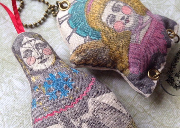
 As the images are fairly symmetrical I just paired them up back to back when sewing together and stuffing so this way they look good from either side.


Using the Stamps LPC016 and LPC020  I stamped my images in Black Memento ink, I tried a few different brands on my Calico and this gave the best image.


I coloured in my image using Fresco Paints in shades of Terracotta, Gold, Peachy Keen and layered Red Lipstick over Glacier Ice to give the mottled affect on the neckline. I edged the wings with diluted Infusions in Golden Sands, just dabbed around the edges with a paint brush.

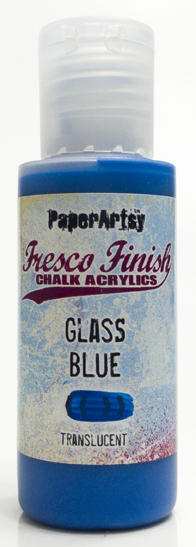
This one I used Fresco's in shades of Gold, Glass Blue, and Red Lipstick to colour them.


I added small bells by sewing jump rings onto the bottom of the doll.


I stamped the greeting from LPC016 onto shrink plastic and attached it to the bottom of my decoration with jump rings, adding bells for that Christmas jingle.


I used eyelets to attach the hanging chain and shrink plastic decoration to my Angel.


This is my favourite of the two decorations, simply because there was more open area to colour in the image and I liked having enough area to add eyelets without interfering with the image too much. I did find with the eyelets it was best to punch a smaller hole and then add a larger eyelet to it. I found using the right size hole for the eyelet gave it a tendency to fray around the hole, but a small hole and an over-sized eyelet kept it all tight. I did have to wriggle the eyelet in before closing it and it was fiddly but it worked the best.

Having done these now I think that the Russian doll would make a lovely row of bunting and if I get time to do a row of fat stuffed dolls for above my fireplace before Christmas I will share the photo on the PaperArtsy People Facebook Group. You can join here.

Thank you for your visit today and I can be found at the following places.