2021 Topic 5: Find Your Vibe
If
you've ever thought that scrapbooking wasn't for you, how about trying
mini albums? With a great artsy feel this is a fabulous detailed walk
through using stamps, stencils, grunge paste, fabric and twine. Spoiler
alert : there are some very cute photos in Kate's fantastic blog post!!
~ Keren
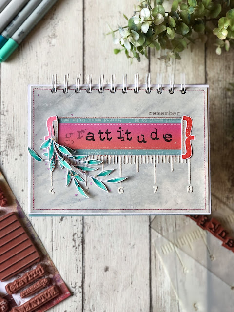
Hi everyone, it's Kate with you today, and I'd like to share a mini album using old photos that I had stored on my desk.
Find
your vibe is a great theme because it is all about making something and
infusing it with your personal touch. Mini albums are a great project
for creative play because of the backgrounds.
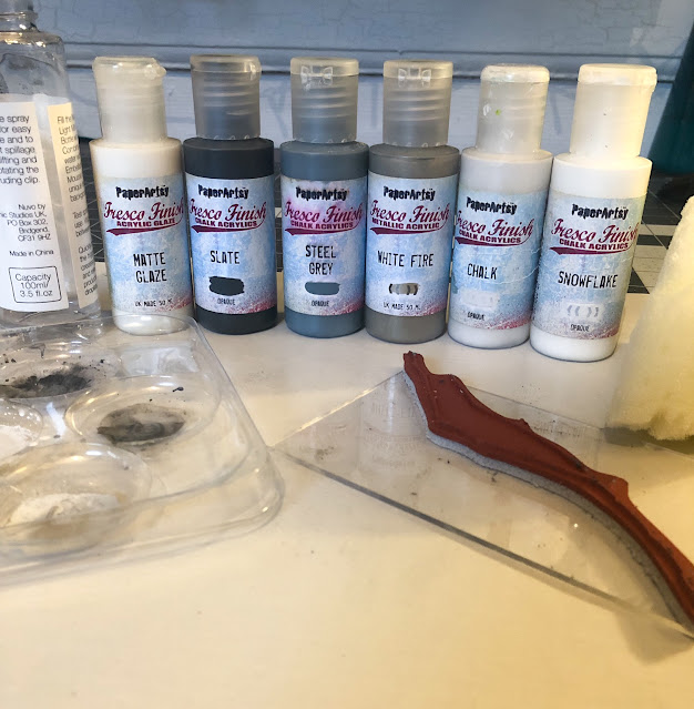
I
was able to use a lot of paints and various styled stamps in this album
so it was a great way to dust off some of the products that I haven't
used in a while.
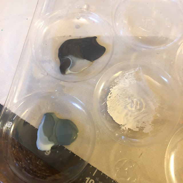
I
started off by gathering PaperArtsy postcards and other cardstock. I
then covered some of them in patterned paper while leaving others blank.
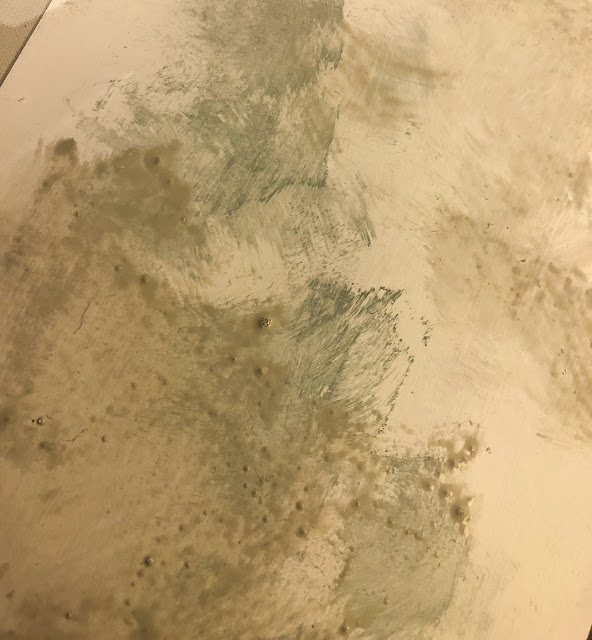
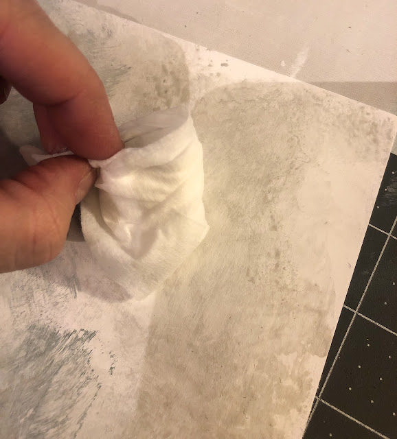
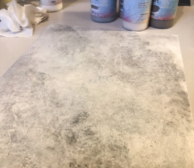
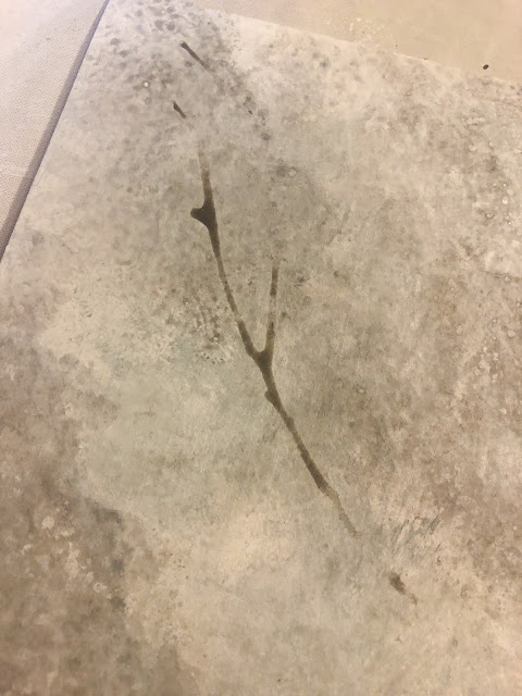
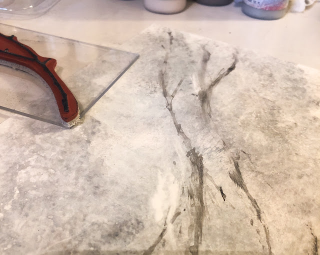
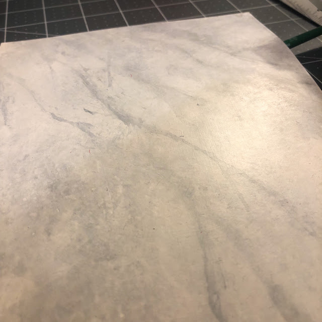
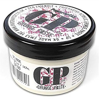
I used stencils and grunge paste to start building my backgrounds.
You might recognise these stencils used to do these backgrounds,
PS105,
PS051.
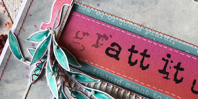
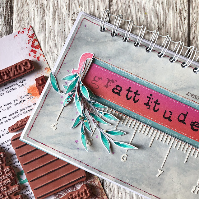
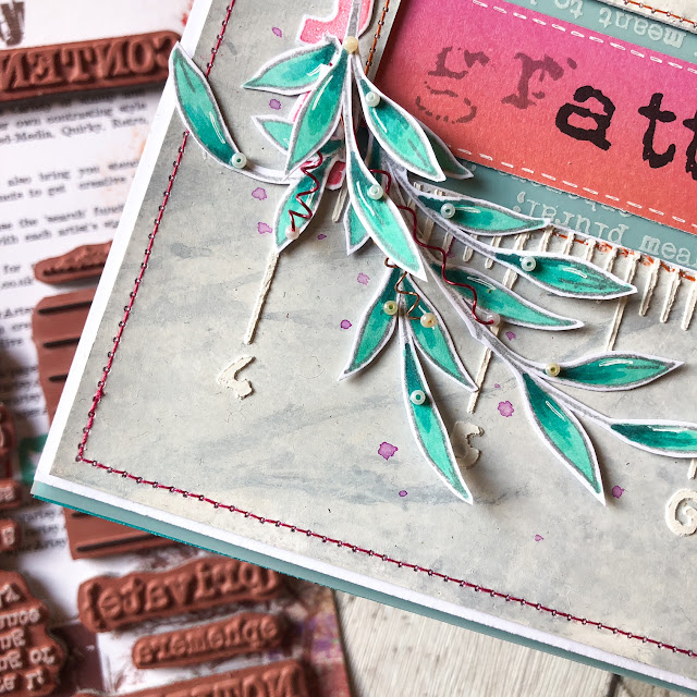
Once my backgrounds were dry, I started layering my stamps and embellishments.
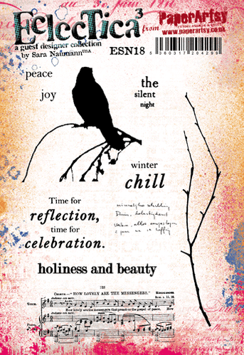
This image from the 'Ink and the Dog' Collection: Travel Plate 2,
is often featured in my journals, if you look close, you can see it is
inked in a couple of colours to add more depth and interest.
Painted book paper makes a great backdrop for a focal stamp.
I love the Lynne Perrella stamps too, I've used the sun from this set a number of times.
I used a stencil to draw my background doodle.
Making my own flowers from the new Hot Pick 2101
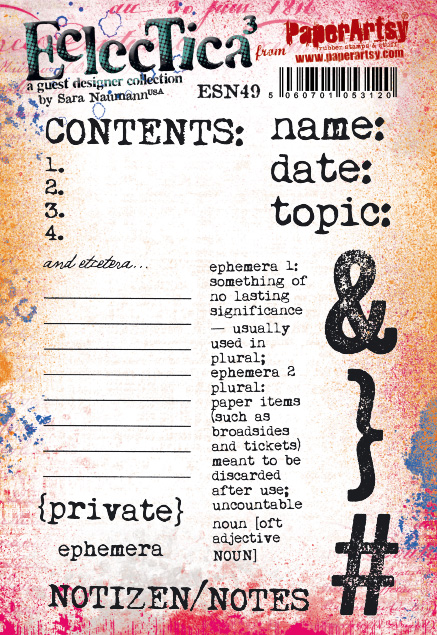
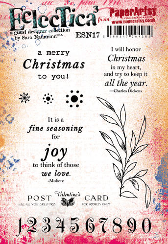
The cards were stamped with newer images from ESN49 and left blank for future journaling.
A mini (EM48) by Seth Apter... makes the space less blank...
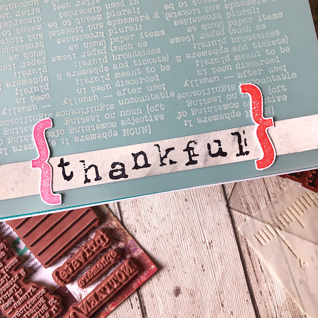
All kinds of shapes are used as embellishments, like the zodiac circle below from ASI1
Can you see how the Grunge Paste was over-stamped below with EA4?
The conductor's ticket adds interest, and has space to be personalized...

This is one of my favorite backgrounds. I love the combination of grunge paste/stencil, paint and stamping.


That starfish from Gwen's fishy set EGL15 comes in handy too!


This background was gessoed stamped and embossed.
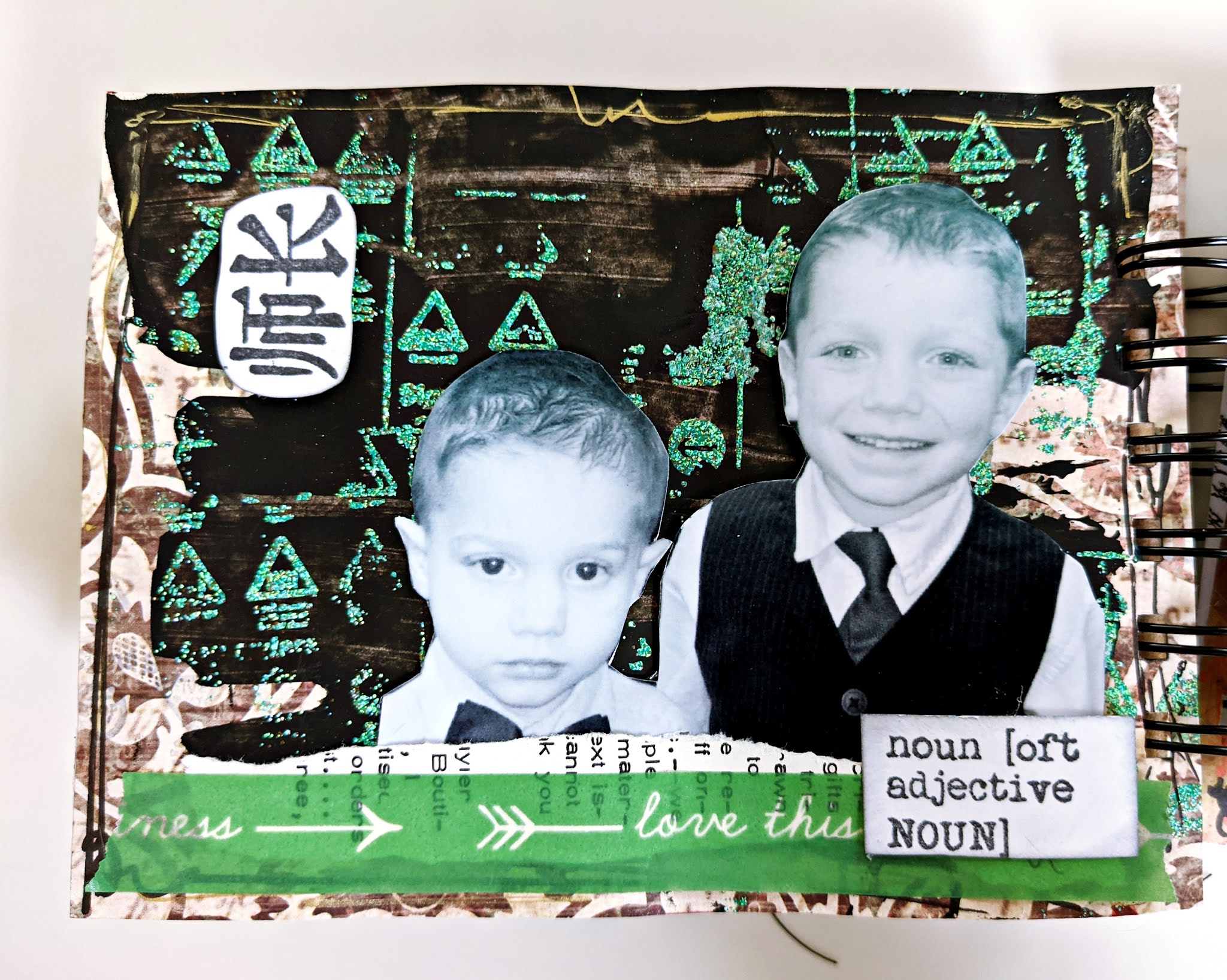
Boys and bugs, what a combo!
I love these colorful and painted fish from Gwen Lafleur (EGL15).
I left the back of this PaperArtsy card blank because I wanted to use the print as my background.
Sometimes I'll tuck things behind layers rather than adding them on top, like these mandalas of Gwen's (EGL12)
The flower from this Ink and the Dog set (ASI4) is an easy embellishment to fill a space
The stenciled area on this background was painted over with a gold POSCA pen.
As
you can see, I like texture and drippy paint for my backgrounds, but
that might not be your thing. Try making an album with your
signature background and use mostly stamps to embellish. I think you
will have a lot of fun.
Until Next Time,Kate