Showing posts with label ESC29. Show all posts

Sunday, 23 October 2022

2022 Topic 14 : Colour Study: Triads {by Etsuko Noguchi} with Lynne Perrella stamps


Hi everyone, it's Etsuko (My favorite things) with you today, and I'm here to share with you winter decoration and cards using a selection of stamps my favorite designed by Lynne Perrella.


My current topic is Colour Wheel - Triads and I chose PaperArtsy Fresco Finish Chalk Acrylic - Lemon Meringue (FF142), Summer Sky (FF150) and Prawn (FF98) as the base colours. My chosen colours are separated 2 segments apart as No. 1, 4, 7 as shown on the colour wheel below. They are cool colour combination so I made these three items because I thought they would be perfect for decorations and cards this winter.




I used Lemon MeringueSummer Sky and Prawn as base colours. I combined opaque and semi-opaque colours to create a thick and beautiful colour and I chosen the coolest triads 3 colours possible. I made it while looking at the tone difference between the colour wheel segments, so I didn't have the luxury of making extra my three colours. I made it again while looking at the sample of the wheel later.


First I made triads 3 colour sheet used brayer and added PaperArtsy Fresco Chalk Acrylic - Heavy Cream to the blue green and light yellow sheets to tone down the colour and it some variety, on the reddish purple sheet placed a little Prawn and the white areas are the gaps between the paint.




When I thought about how to connect these three colours to my work, I first stamped the same stamp Lynne Perrella set 061 ( LPC061) on each piece of paper, cut it out and thought it would be nice to make a mosaic, so I used it as the background.
 

I did a rough experiment with what would happen if I put the Lynne Perrella set ( LPC059 ) lady's profile in the new PaperArtsy Printed tissue Frame circular frame against the mosaic background.


I decided to making the background with that mosaic idea and paste the cut papers onto the Smoothy (Heavyweight) A4 white card with a glue stick so that it would be a 6 inch square as much as possible. 


I wanted to try with the 3 colour a bit more so I used it for decorative trimming on these two cards. For the first card, I used the Lynne Perrella set 061 ( LPC061 ) lady to make it the 7th segment of the colour wheel, a card centered on reddish purple. I used infusion blue and PaperArtsy Fresco Finish Chalk Acrylic - Gold for the lady as a focal point.


I used gold embossing powder for the Scrapcosy set 30 and 33 ( ESC30ESC33 ) frame and script stamps for the center frame and background.


Made the second card trim using LPC059 stamp.


 I used LPC059 stamp for the lady and PaperArtsy tissue paper for her frame.


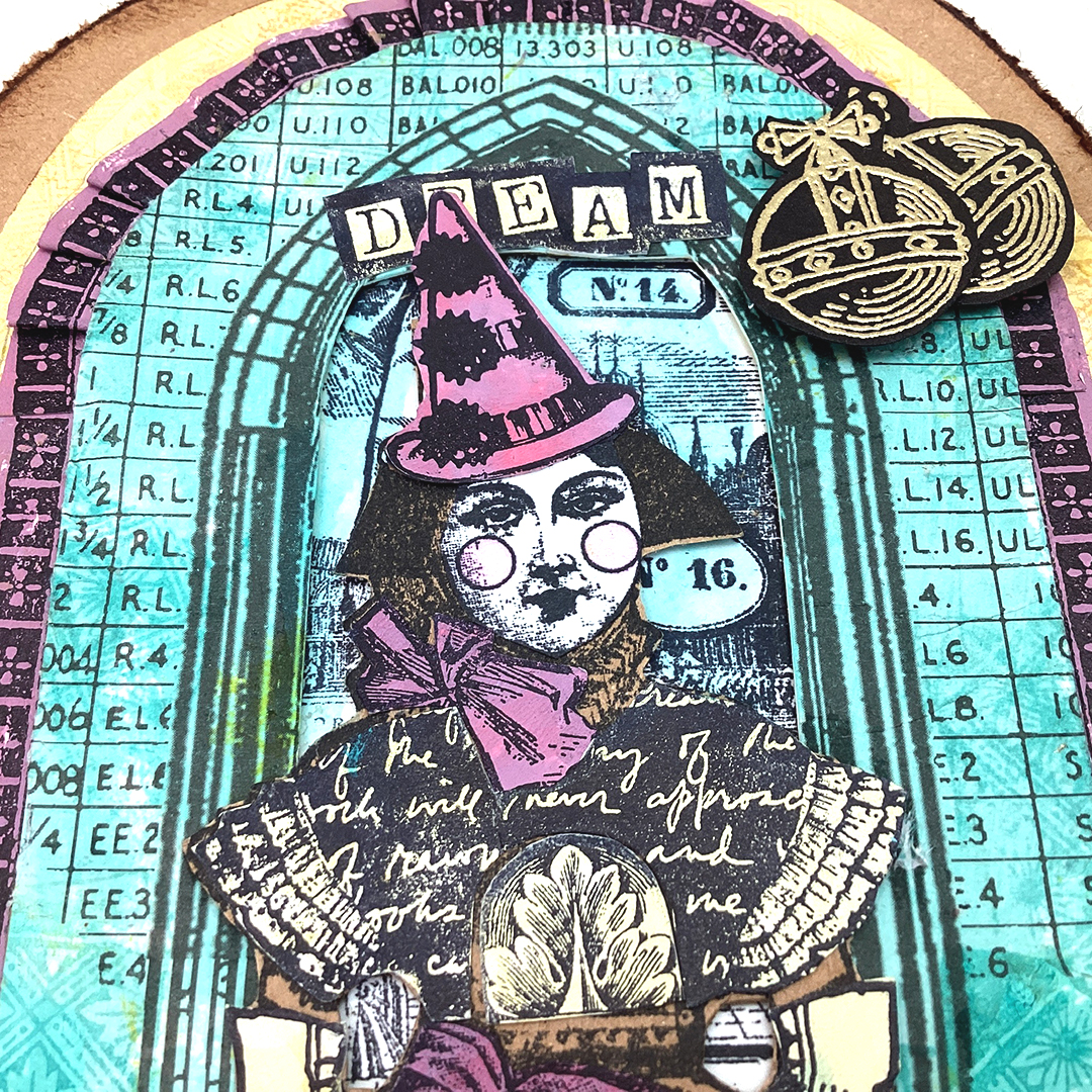
This is the completed image of the panel. The background of the circular frame was collaged of the LPC061 skirt image. At first, I thought that a monotone black stamp would be enough for the image of the lady, but I added colour and the crown of Lynne Perrella set 07 ( LPC007 ).


The panel side edging was trimmed with Scrapcosy set 33 (ESC33 ) stamp image embossed by gold embossing powder on the black cardstock. For the center circle of the focal point, four gray boads of the same shape were stacked underneath to create a height, and 8 mm high paper painted with gold was wrapped around the edges so that it could not be seen from the sides.


The circle frame and the lady popped up with foam tape.


Finished image the first card, I used LPC061 lady to make it the 7th segment of the colour wheel, the card centered on reddish purple, Used blue Infusion and Gold for the focal point lady.


The finished image of the second card.


As you can see the close up of the top part.


And bottom part--
Ranger Archival ink- Sky Blue stamped with the LPC059 book cover pattern on the green-blue background. Merry Christmas used Scrapcosy set 29 (ESC29).


The colour wheel- Triads and two previous topic colour wheel were very helpful to me, until now I used complementary colours or my own senses to find out the colours. I realized how it had narrowed my colours choices. I hope this will be a leap forward in my future.
Thank you so much for visiting.
Etsuko xxx


Blog: My favorite things

Instagram: Pixienest
Pinterest: Etsuko N
Facebook: Etsuko Noguchi


Sunday, 9 October 2022

2022 Topic 14 : Colour Study: Triads {by Nikki Acton} with Scrapcosy stamps


Hi everyone, it's Nikki (Addicted to Artwith you today, and I'm here to share with you some layered Christmas cards using a selection of stamps designed by Scrapcosy.


As Keren explained in the launch post to our Colour Study on Triads we are using colours that are separated on our colour wheel by 1,2 or 3 segments. My chosen colours ended up 2 segments apart, and so they are less influenced by the blue, cool side of the colour wheel. I selected some colours that I hoped would work for some simple cards - and it's always good to get a few Christmas cards made early! 


I began by establishing my colour scheme. I selected a 'red', 'blue' and 'yellow' PaperArtsy Fresco Finish Chalk Acrylic - Mulled WineA Bit Fishy and Haystack. I completed the colour wheel before deciding on which of the segments to use.


I have highlighted my options with the asterisks (segments 1, 7, 10) also seen in the swatched circles. I knew I would need to come back to mixing more colour on another day - so I gave myself a quick reminder of how to mix them from the primaries. The colour wheel always reveals its secrets, maybe in the future I might even choose 3 differnt combinations from this wheel. It's so good to have swatches of these colours. 
 
 
I didn't try it, but I am pretty sure if I mixed these 3 colours together while wet I would get mud! The theory is if you mix 2 coloours opposite each other on the wheel you will make some kind of brown. But I was mixing just 2 of these 3 colours in the required proportion to create the selected colours. 

Out came the trusty gel plate in order to build some layers! For some prints I just brayered the colour over the plate and pulled the print. For the green I used one of my favourite (and simplest) methods of adding scrunched paper over the painted gel plate before taking the print.
 

I combined 2 colours on some prints by adding each colour individually to the gel plate and building up the layers on the print - I do this by taking the plate to the paper - so I can selectively add colour in different places. I used PaperArtsy Stencil PS074 (Scrapcosy) for these prints.


I selected some groups of prints to work together - ensuring all 3 colours were in each card.


Next I stamped and fussy cut the bauble and bow from PaperArtsy Stamp Set ESC08 by Scrapcosy. The ink was very close to the Mulled WIne paint, so that was a great way to reinforce the chosen colour combination.

 
I also added some stars to my base layer - sponging a little Fresco Finish Chalk Acrylic - Chalk using PaperArtsy Stencil PS264 (Scrapcosy).


Having adhered by layers onto the small (4x4 inches) cards - I started playing with positioning. I stamped my greetings - one from ESC08 and the other from PaperArtsy Stamp Set ESC29 (Scrapcosy).


You can hopefully see the gold twine I added underneath the bauble and bow - for a bit of Christmas bling!
 
 
And the paint spatters on both focal points for some added interest and to tie in with the white card base.


These colour studies are great for challenging me to use different colours to my normal go-to. I am really pleased with how these worked together! Give it a go - it's great to experiment.

Nikki