


Heippa everyone, it's Riikka Kovasin from Paperiliitin blog here today with you. I'm sharing my make for the Lynne Perrella designer focus. I just love her stamps and use them in my other projects, too, so it was such a joy to be able to create something for this topic.
The project could have been anything as Lynne Perrella's stamps are so versatile and can be used in every kind of project, but it was the quarterly theme of "transparent" that got me thinking about encaustic collage. I own a couple of blocks of actual encaustic wax, but what I've used before to mimic the look is pure beeswax. If you are looking for making something that stands the test of time in excellent shape, then use the actual encaustic waxes, but if you'd just like to experiment and see if this technique is something that intrigues you or not, then pure beeswax is a great and inexpensive option.

Encaustic is a whole world of its own. It's an ancient technique and a really captivating one. I especially enjoy collaging and the transparent or translucent layers you can create with it and how the colors of the collaged bits change when they are immersed in wax. Should you want to know more about this art form, here's the link to Wikipedia article (link) and to a maybe slightly more detailed blog post (link).
My first encounter with the medium, that has been embedded in my mind, was in Creative World event in Frankfurt Messe, Germany, when I saw encaustic artist Lora Murphy working on a big canvas and was intrigued by her medium. Me and my friend watched her create and asked about the medium I guess that much, that she invited me to try it. And to no other surface than to that gorgeous painting she was working on! It took some convincing, but in the end I did try a little bit and was astounded about the method and medium. This experienced has since been a cherished memory.
I still haven't tried my hand at an actual encaustic painting, but I have made some collages with beeswax and bought a couple of colors of actual encaustic blocks. In this project I combined the beeswax with beeswax based crayons to get some colors I wanted, so maybe I'm one step closer to actually dare to paint with encaustics!

When I had decided the medium, I knew the substrate as encaustics need an absorbing surface to work on. I was first thinking of small wooden blocks, that I have used before, but when I saw the Lynne Perrella set LPC040, I knew any small substrate simply wouldn't do, I needed a bigger canvas! Luckily I remembered seeing a untreated, wooden cutting board in a craft store and thought to try it out. I was a bit hesitant about the hole in the piece, but to my slight surprise, you can't even notice it from the finished piece. If I had been working with a wet medium, like gel medium, the paper would have sunk in the place, but the wax kept it straight and the image conceals the placement perfectly!

I'm not sure if there was an inkling of a thought already when I started looking through the stamp sets or was it the set that really sparked the final piece of the puzzle - Gustav Klimt. I thought to make a painting-like piece that would have the Egyptian style head and then a gown in the style of the Austrian painter Gustav Klimt. I visited Vienna in my teens and fell in love with his art. I bought a memory game with details of his paintings and now used them as reference and inspiration when starting my project. I was especially drawn to "Expectation", "Judith I" and "Portrait of Adele Bloch-Bauer I".
Another source for the elaborate dress was another artist, who in fact was also inspired by Gustav Klimt - Tawny Chatmon. She's a photography-based artist, who I follow on Instagram. Especially her "The Redemption" and "If I'm No Longer Here, I Wanted You To Know" series speak to me with the Klimt-esque details.

Now that I had the substrate, means and inspiration, I only needed colors. Gold was an obvious choice because of both Klimt and Chatmon, but I needed some other colors, too. At this stage I thought to be able to make the project using just golden tones, but as you can read a bit further down, I soon realized that another color needed to be added. It should have been obvious just by looking the source material, but maybe the rich tones of the detail shown of "Judith I" in the memo card got me distracted. Anyhow, at this stage I chose a palette on three Fresco Finish colors - Gold (FF20), Gold Rush (FF204) and Little Black Dress (FF19).


With my materials gathered, I started the project. I first decided to stamp the bits I needed for the character. As I knew that encaustic turns delicate papers transparent, I chose a sturdy piece of cardstock for the character parts and used Fresco Finish acrylics to further prevent layers peeking through. I first stamped the head (LPC040) to a piece of white cardstock as a kind of a sketch using a stamping tool. I then colored the segments using the acrylics and after letting the paint layers dry, I then placed the piece back to the tool and stamped another layer on top. For example you can see the head before the second stamping in the picture below. This method allowed me to color more freely as I could color over the lines without worries.
What you can see from the photo below, too, is the introduction of another color. Yes, the first step into the project and I immediately realized that I needed another color! I reserved Gold Rush (FF204) for the skin color of the character and thus was left with just two colors in my original palette of three - black (FF19) and gold (FF20). Um, not a good situation. So, after a little ponder, I chose to add this vibrant blue - China (FF101). It reminded me of the lapis lazuli ancient Egyptians used in their jewelry.


I also stamped some other details, which on this stage I thought to use as hands for the character. I stamped two heads of the fish for the palms and two fan-shaped pieces to be used as sleeves. I colored and stamped them the same way I did with the face. If you want to see this technique in a video form, I use it for example in this art journal page (link) you can find on my YouTube channel.
I also made a huge golden sun. As the sun was totally golden, I first painted the piece of cardstock with Gold (FF20) and then stamped the sun on top. No need for the "sketch layer" this time!

Next I then sketched the outlines of my character slightly on to the wood using a pencil. I was looking at the shape of Klimt's "Expectation" especially and thought to add something to her head, some kind of embellishments or an elaborate headdress. I was also a bit hesitant about the hands, but couldn't see another way around them at this point as I wanted to use the stamps.

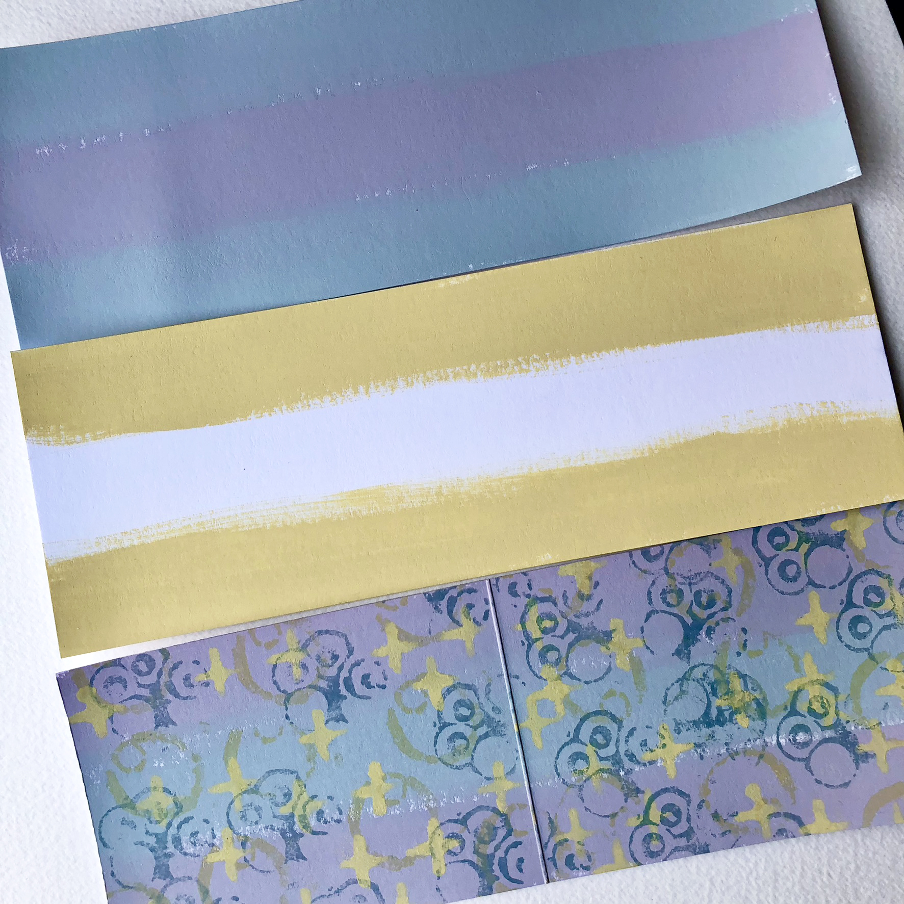
Then it was time to make some collage material for the dress! As I wanted the dress to be a bit eclectic, showing different visual textures, I used different papers in this stage. I stamped some patterns on top of notebook paper and some on tissue paper. As I wanted these layers to be translucent, I opted for thinner papers in this stage and didn't use heavy cardstock or similar. I also used a water-based ink and another that I had previously tested to work nicely with the beeswax layers without bleeding. If you are working on your first project, make a little test before the big project as you don't want your work going down the drain. I kept the color scheme the same, choosing just one blue and a black ink. Notice, how I again used just a part of the head stamp to get that lovely pattern. Even with a big design you can just use a part of the stamp either by just inking it partially, masking it or cutting the excess off in the stamped piece.

More collage material! I chose the same substrate, tissue paper, but this time patterned it using stencils and the Fresco Finish paints. I used a trio from my set of four here, still retaining from using the Gold Rush (FF204) and going with China (FF101), Gold (FF20) and Little Black Dress (FF19).
While I did some splashes, too, I mainly used this great dash-like stencil (PS394) that to my eye fitted so well with Klimt-esque approach. I also used a swirl-like one (PS034), but only with gold as it to echoed the golden lines of "Expectation".


Before starting the collaging, it became obvious that my lady needed some shoulders. I was thinking about a couple of options, but chose the most easy one. This also allowed me to use the supplies I already had on my table and a similar tecnique to the excisting parts. Let me explain.
I first rummaged through my other Lynne Perrella stamps if I found a shoulder piece I could use. Partly because I didn't find a good match and partly not wanting to add to the already long list of supplies, I decided the draw the piece myself. It didn't need to be too fancy, just a shape that would mimic a shoulder line. I was convinced that I probably would get the first go wrong, so I made a little template or stencil of the shape out of transparency and traced that to a piece of cardstock I had painted with Gold Rush (FF204). Funny enough, the first go then worked perfectly and I had no need for the stencil after all for this project!
The shoulder piece with just the flat paint layer looked quite different than the face with dotted shadows, so something had to be added. I inked the head stamp I had used so far, masked most features of the stamp with a piece of scrap paper and added that shadowy, dotted pattern to the edge of the piece as well as echoing collar bones. Yes, she has many noses, if you look carefully, but if you don't know, I think the shape does its part!

Now I had made all the elements I needed (or so I thought at this stage) and it was time to start adding layers to the wooden base!

The starting of the actual collaging caused my heart to race a bit. With "normal" collaging, I'm able to go back and forth and cover layers, but with this medium the covering part would be a bit harder to do. Although, getting rid of layers would be easy as I could just re-heat and pull of the parts that needed to be out or scrape off a layer, but it might cause me to need to start over completely. But there was no way around and should everything go wrong, I could always just start again! That's kind of what freed me in the first place to try out mixed media, the possibility to start over. Back then I was doing scrapbooking pages and the realization "It's only paper" revolutionized my creative process. If I would to "ruin" the page somehow, I would only be throwing away a piece of paper. The memories would remain in my head and nothing would be lost. Since this epiphany I haven't thrown away any unfinished project.
Before I could start with the collaging, though, I realized that the background needed a little something as I didn't want to add any collage material there to give the character the full impact. Painting the whole surface was out of the question as the surface needed to be absorbent, so I added just a touch of pattern using two stencils and Fresco Finish acrylics. After a bit of pondering I added blue swirls (PS034) and tiny golden dots (PM025) carefully not to add the patterns underneath the character. Because while the face and shoulders would have covered the pattern, the dress wouldn't as I wanted that part to be translucent, showing layers from underneath. I used China (FF101) for the swirls and Gold (FF20) for the dots.


Before I could begin the actual collaging I still had two things to do. I needed to cut my collage bits into little rectangles, inspired by Klimt, and also needed to prep the wooden cutting board with beeswax.
I don't own actual encaustic tools, but instead use a heat tool together with metal palette knifes. I heat the blade of the knife with the heat tool and use that to fuse the materials together with the beeswax. The beeswax I have are these little grains that I bought from a bee farm. I chose the "craft quality" from the options as it was the cheapest and also what I intended to use the wax for! It has worked nicely so far but mind you, none of my experimental pieces is really old yet. Internet told me that the pure beeswax can turn cloudy over time as it's more subject to temperature changes than actual encaustic wax that has resin in it.

I'm not sure if you can make out that droopy line in the picture above. At this stage I was thinking of adding these gathered, bell-like sleeves to my character, but opted not to add them in a later stage. One of the reasons was the little twist and turn you can see a bit further down and the other just the shape of the character. The sleeves would have broken the sleek, almost toga-like shape.
When I had the base all waxed, it was time to start adding the collage layers. I heated the wax in the bottom with the heat tool, added the collage piece on top and then melted some wax to cover it. I followed the sketched line I had in the background for the shape and tried to alter between different patterns and materials.

The collaging part was so much fun! No other mediums than just the wax and the paper pieces I had made and slowly building the shape and the layers. Mind you, if you are sensitive to smells, make sure the ventilation is good as beeswax has a scent.
When I had covered the shape of the dress once, I added the stamped bits on top to see, where I was at that point. I didn't wax them down yet, but just added on top of the board. And that's when I saw it. I just couldn't use the stamped hands as they didn't echo Klimt at all! But luckily I could then add the pieces as tassels to make the head-dress more elaborate for my lady.


By no means I could draw or paint like the Austrian master, but what I had already learned from the shoulder piece was that a simple shape with some added stamping would do the trick. I didn't have to spend hours to carefully sketch the hands, but instead loosely find the right shape of the hands holding an item. To get the shape right, or at least there-abouts, I asked my husband to take a photo of me holding my hands the way I wanted the character to have them.

I know hands can be tricky, but to my luck I had envisioned the golden sun in her hands the whole time. This meant I didn't need to think so much about the individual fingers but more about the general shape of the palm in a specific position. From the reference photo, I quickly learned that the hands could be just two scoops in a way. I sketched the shapes on a piece of cardstock painted with Gold Rush (FF204), traced the shape with with a black marker and added the shadows the same way I did with the shoulder piece - using the 'nose' of the character stamp to create texture on the hands. To my astonishment I even managed to stamp the 'nose' shape almost in the exact right spot for it to resemble a thumb!

The hand issue now solved, I could then add the head and the shoulders of the character. As these were stamped on top of that thick cardstock to make them more opaque, I first melted some wax to the back of the pieces and after that added them to the collage. While the wax gets through the more delicate papers, not totally covered with acrylics, here it couldn't because of the paint layer. The wax on the back of the shape then secured the placement better while maintaining opacity from the paint.
I didn't want to add the new hands and the sun in just yet as I thought I might need to work on that dress more. I also added another layer of little "tiles" here and there, especially to the places where I had used the golden swirl pieces as the bottom layer in the beginning. I quickly learned that they weren't good for that as almost only the swirl was visible, but they were perfect for the second layer.

The dress almost done, it still seemed that the character was getting lost on the background. As I had been using wax throughout the whole piece, I couldn't paint with acrylics on top as adding a water-based paint over wax isn't recommended as it can flake off over time. I actually had thought about whether or not to cover the whole thing with wax or just the character part, but felt it would be easier to just go with the flow and cover the whole background first with wax.
I felt that a solid color was badly needed for the background to differ that from the ornate dress. Like I said in the beginning, I own some colored encaustic waxes, but didn't want to use them here for two reasons. The first is that I only have white and black and feared that such a combo would be too over-powering. The other reason was the beeswax already in the project as I wasn't sure how the two mediums would react and if the use of encaustic with pure beeswax was just wasting the encaustic.
Solution came from a more childish source - beeswax crayons. I had these block like beeswax crayons that hold almost the same shade of blue as the China (FF101) Fresco Finish I had been using. The set also had a black, a white and a darker blue crayon! A perfect combo. I first colored the crayons on top of the board and then used the heat tool to melt the markings and move the colors around. The end result was like misty transitions, almost like sfumato in oil paintings. I was careful not to get the colors on top of the dress.

The solid block of color to the base of the work seemed to do the trick and differ the character from the background. To heighten that even further, I added a thin black line also around the dress. This was to mimic the stamped lines and also those I had drawn to the shoulder and hand shapes. I used a black permanent marker for this and made sure the wax layer had completely cooled before drawing. I also used a very light touch not to dig the nib into the wax. I also added the hands and the sun in place the same way I had added other cardstock shapes - melting some wax to the back of the shape first and then adhering it with wax on top of the dress.
While the solid was good to distinguish the character and background, it was now a bit too monotone compared to the patterns all over. Luckily there was quite an easy solution - adding a pattern on top! Inspired by both Klimt and Chatmon, I wanted more gold. I used two of the stencils I had already been using but this time with a golden wax that I knew would stick on top of the waxy surface. I added some dots (PM025) near the head of the character, kind of representing delicate jewelry chains hanging from the headdress. For the bottom part I used the swirls (PS034) with the same wax thus masking the solid background. I used a rigid brush to push the wax through the stencil openings.

More gold was still needed! I remembered seeing a video of Tawny Chatmon painting with golden paint these little dash-like brush strokes to one of her pieces. Line next to line, making a beautiful textured look. I wanted something a bit dimensional but was hesitant about the medium. As this was a finishing touch, I felt that the relatively new medium of wax wasn't the thing as I wasn't totally sure how to get a dimensional look I wanted. I knew that I could create the texture with acrylic mediums, but was not sure how they would adhere to such a waxy surface. In the end, I just decided to try.
To get a really thick golden paint, I mixed Gold (FF20) together with a really heavy body gel medium. I then applied this thick paint to my project through the dash-like stencil (PS394). The look of the paint was first a bit clouded, but I knew that it would dry golden as the white-ish gel medium would dry clear. I let the project dry thoroughly before continuing.

Now trying to scrape of the texture, it seems to stay relatively put there, but only time will tell. On the other hand, as the beeswax isn't perfect to stand the tooth of time either, I guess the project will endure its life cycle just fine.
As a finishing touch I added some dimensional details to the top of the project to match the texture in the base. For that I used golden epoxy stickers. Or rather, epoxy stickers turned golden. I used the same wax I had used for the background layers and gilded some dot stickers. Only later, when I had already added the beads in place it came to my mind that I could have simply painted them with the golden acrylic!

So there she is, the Egyptian influenced lady with a spectacular headdress. I think the beeswax used to make the collage brings a golden glow to the whole project, which is only appropriate for a Klimt-inspired piece. I also really enjoy the translucency of the dress pieces, showing the layers underneath and adding to that Klimt-like feel with the surface made out of small, layered rectangles.


I enjoyed this project very much! It forced me to really look at some of the art pieces that I have loved for years and years and analyze what I like about them. I also like that it allowed me to have yet another go with a medium that intrigues me and behaves such a different way from acrylic mediums I've accustomed to use. I also enjoy that I got to make something inspired by a painter I've admired and that by doing so, it also forced me to draw and study the forms of a human body.
I hope you found this project and post inspiring and maybe you also take a plunge to try beeswax as a collage binder!
Xoxo Riikka


I have a new online workshop about double sided adhesive sheets and the things you can do with them. There's so much more than just adding two pieces of paper together! The only thing is that the workshop is in my mother tongue, Finnish. But if you are interested to have a look nonetheless, here's the link to that (link)!


.jpg)


.png)

