Thursday 4 May 2023

2023 Topic 5 : Tinged Blue {Floss Nicholls} with Squiggly Ink stamps (tones)


Hi everyone, It's Floss with you again today and I'm here to share an exciting project I have just designed using the star of the current topic; Surfs Up. The challenge set for me this time by PaperArtsy was to use Surfs Up with a grey so that I could explain and demonstrate the use of 'tones' of Surf's up to you. Mixing Surfs Up with Slate gave me some wonderful tones to play with on my gel plate to create master boards ready for making pages for my 'Any Year Calendar'.  


It turns out I learnt a few things along the way and I hope that you enjoy this project as much as I did creating it.


There were several things that I needed to do before I started sharing my 'any year calendar' with you as it was still at the idea stage and so it needed a prototype.  But first things first, I needed to do some colour mixing/testing to explore the 'tone' terminology.


I snaked my way across the page and back...it probably would have been more helpful if I'd have used a longer piece of card and did my colour mixing in a straight line to show the tonal increments for your reference, and so apologies for that.  I think I also could have added the slate grey in smaller amounts to give me more lighter or closer variations within the Surf's Up end on the page. What was interesting though, was that I did find that the darkest tone would not exceed that of the slate acrylic paint.  I found this was the same when I trialled elephant too.

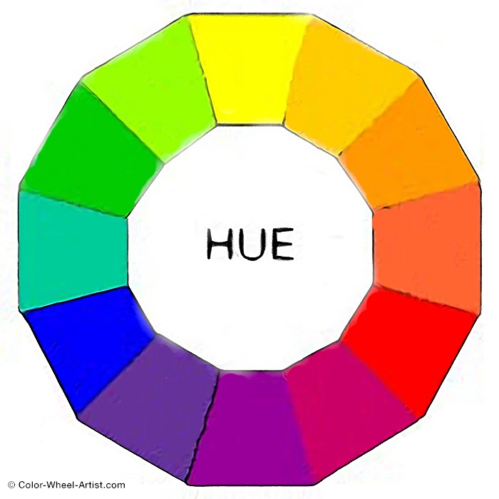
So to clarify the use/definition of the word TONE; Tone is a colour created by adding grey to the starting colour. Tonal colours are often considered more pleasing to the eye as they are more subtle. Generally speaking almost every colour we see day-to-day has been toned to some degree. As you can see on the example I found below, the toned colours are slightly softer on the eye as the grey takes away the brilliance of the original colour.


I chose to use PaperArtsy fresco finish acrylic paints Tinned Peas (FF55) as I liked the similarity of its colour strength, Vintage Lace (FF18) for its contrast and Slate (FF84) to mix with Surfs Up (FF146).  I added those to my colour swatches and mixed a little of all the paints together which made an interesting putty grey colour which I loved. I often mix a little of all the colours I use together as I think it helps make all the colours work together nicely.


Before I started prototyping the calendar stand, I needed to work out the size that the date and month pages would need to be so I printed a few different layouts using the Squiggly Ink stamp Love and Kisses Plate 4 (SILK4EZ) for the letters and Ding Dong Plate 9 (SIDD9EZ) for the numbers. I started looking at colours and how I'd fill each box and letter, whether to be neat and stay inside the box lines, or whether to overflow the edges.


Using these stamps gave me the dimensions 120mm x 45mm for the month pages and 70mm x 60mm for the date pages. I looked at two calendar stand possibilities after doing a few sketches on my 'under paper'. I always have paper not a mat or glass under whatever I am working on as it allows me to jot notes or doodle ideas onto it whilst working away on other things. It also has a wonderful way of building layers without trying and often ends up as a wonderful collage piece used elsewhere...enough of that; sorry I digress...The first calendar idea allowed me to potentially have three pages to turn but it meant that I would've had to have had a slot for one set of the pages which would need to be slotted through the face every time I made a date change which was fiddly, so I ruled that one out!


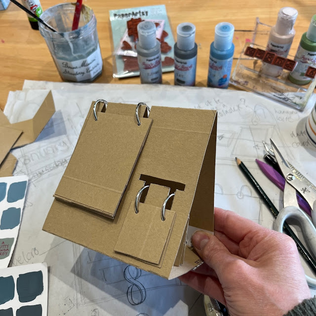
My second idea was to make the stand oblong and have only the month and the date pages. I found that by making the month slots deeper, they would hang lower to make it more visually appealing.  This gave me a calendar surface of 240mm x 90mm.
 

I marked the base out onto 30gsm card; it measured 315mm x 240mm overall. The picture below shows sections left to right as 75mm x 240mm, 90mm x 240mm, 90mm x 240mm, 40mm x 240mm and the two half circles were made in the remaining 20mm x 240mm being 40mm in from the edges with a diameter also of 40mm. Score the three fold lines. The slits were made by folding it into a triangle and marking where the semi circles needed to go to hold the base together. Cut these with a knife. The slots will be explained later. I gave the surface a base coat of acrylic.


Now that I was happy with how it was going to be constructed, it was on to the most fun part...creating the master boards for the pages and playing with collage and the designs.
 

Out came the gel plate, I wanted to try and lift painted dragonflies from it! I started with stamping dragonflies using the Squiggly Ink Mini (SM13) with Rangers Distress Archival Ink in faded jeans.  I let that dry before painting Surfs Up directly onto the gel plate. After letting that dry, I rolled a layer of Surfs Up mixed with Slate to make it two shades darker over the top and pulled the image.


I decided this would be good to use on the calendar stand but the image didn't lift the first time as I tried to gel print straight onto the card. Gel printing definitely works better onto thinner paper. Because the images only half came out I let it dry and then sanded the surface ready to try a second pull over the first, it created quite a distressed look which I quite liked, and it left me with some dragonflies on the gel plate which added to my next gel print.


I made a selection of 'master sheets' to make the calendar pages from.  I started by collaging small parts of the PaperArtsy tissue paper (PT01) and slightly off-white book pages onto A4 paper with matte gel medium and letting that dry before rolling different mixes of Surfs Up and slate onto the gel plate to make the gel prints.


I used gesso over the areas where printed book pages were to mute/soften the words and also over the edges of the collage papers to blend them.


I used the Squiggly Ink Tops and Tails Plate 2 (SITT2EZ) to add further detail to the sheets. The little dragonflies on the bottom left sheet were the ones I painted onto the gel plate to lift. I really like the way they turned out.


I glued the A4 gel prints back to back so that the images were double sided to make them stronger and I could choose which prints were the best of the bunch. I cut them into their pages. I made six 120mm x 45mm rectangles for the months and sixteen 70mm x 60mm rectangles for the dates.


Rather than printing out each word or date onto the tissue paper as it read; and so that I could space the letters and numbers individually, I counted how many of what letter and number I needed, then printed them making sure that I had a couple of spares for each in case I made a mistake.


I waited for these to dry before painting on the reverse of the tissue paper. I decided to paint all of the letters using PaperArtsy Fresco Finish chalk acrylic in Vintage Lace keeping inside the boxes.


I used a combination of the Vintage Lace and PaperArtsy Fresco Finish Chalk Acrylic Tinned Peas for the numbers. I decided to do a variation of keeping inside and painting over the edges for the numbers as I generally like a more grungy unkempt kind of feel to my art.


Using a thin paintbrush and water, I painted a fine line and separated each letter and number tearing them carefully apart ready to apply them to the card pages. I tore them rather than cut them as the torn/feathered edges blend better into the substrate when gluing them on.


I then randomly selected various designs to paste onto their background cards for the first six months and 16 days. As the pages were double sided it was important to have the months turning in sequence so that July would be on the reverse of June, August on the reverse of May working through so that December was on the reverse of January.  The same was important for the numbers so that 17 was on the reverse of 16, 18 on the reverse of 15 working through to 31 being on the reverse of 02 leaving the reverse of 01 blank. This allowed the cards to be turned in sequence throughout the year and in date order just by turning them over.


To hold them into place I punched two holes in each using a card jig. This allowed the holes to be in exactly the same place each time with only needing to measure one card for each.


I secured the dates and the months together both using two 30mm loose hinged rings.


Having made all the components I was ready to make the slots and assemble it all.

I continued to distress the stand using more layers of the Surf's Up tones. I watered down a small amount of Surf's Up to wash over the empty areas to give the brilliance back to the original colour.

Using the holes that I had punched as a guide to where the slots needed to be. I marked either side allowing the slot to be 5mm wide making sure to keep the spacing at the edges equal when laying out both pages.


I measured 35mm down for the month slots and 30mm down for the date slots and double checked that the rings lined up.


I folded the calendar at the top and cut down the line using scissors, folded the waste from the slots inside the stand, then tucked the semi-circle tabs inside the holding slots on the underside allowing the stand to become 3D.


Which left the last thing to do...pop the dates in place and sit it on a shelf... 


I tried to keep the contrast between the stand and the calendar pages so the blues did not merge into one another.  Since photographing the final outcome, I now think that I could have added more detail to both the stand and the pages without going totally overboard. I may add more stamped images from the same set at a later date...maybe I should have incorporated the flower stamp but definitely the birds...I think my stand is crying out for something more. 

There is room to add to this project and I've since thought that it could be possible, and a fun touch, to add a dragonfly/dragonflies to some wire to be secured into the apex of the stand so they could be flying above/around the stand...let me know if you try that.


Until next time, enjoy your creative time and space.

Floss x


I have made a YouTube video to show you easy to follow step by step instructions.


Facebook: flossWORKSHOPart


Website for Art and Classes: flossworkshopart.com

I will be teaching various mixed media classes from my workshop in East Sussex UK including


2 comments:

Etsuko said...

Stunning your flip calendar! Demo video is great. xx

Caty said...

Absolutely gorgeous your calendar. Lovely to see the process. The colours anda stamps are great. This is amazing.
Have a very nice weekend
Big hugs, Caty