


Hi everyone, it's Jenny Marples with you today, and I'm here to share with you ideas for creating interactive pages and elements in your art books and journals.

As my adventures into creating art books and journals has progressed I have become increasingly aware of the need to employ interactive elements like flaps and pockets as a way of ensuring pages are not too cluttered with competing focal points. Using 'blank space' gives your eye a chance to rest and appreciate each part of the book or journal in turn. It also increases the available space you have available to play with by extending pages.

I really enjoy seeing the work of Nellie Wortman who uses interactive elements to help lead people through her books, providing numerous reveals with added texture and ephemera along the way.

In this post I'm going to show how you can add some interactivity to your books and journals using simple stationery supplies.
Before starting I just want to show you what I mean by 'blank space'; below you can see where a lot of detailed imagery has been offset by a scrap of wallpaper in a complimentary colour with neutral toned ephemera and trims. If you are planning on creating two different projects on adjacent pages you need a way to partially cover one of them in order to create this 'blank space'.

Having previously finished the left-hand page I partially disguised it by inserting a piece of embossed vellum; you can still see some of the colour through the vellum. A similar effect can be achieved using tracing paper, baking parchment etc attached with some masking tape.

To further extend the right-hand page and cover what would lay beneath I created a pocket by attaching an opened envelope onto the edge, decorating it with stamped flowers from the ESC18 stamp set using Scottish Salmon Fresco Finish Chalk Acrylic paint. Make a fold along the bottom of the envelope before wrapping it around the edge of the page, securing on both sides with glue and masking tape. Give it a more vintage feel by adding ink and tea-staining. I also chose to remove the closing flap to allow for easier access.

A simple blank postcard or piece of plain card cut to fit provides the perfect base for a small piece of artwork on one side and a more neutral textured piece on the reverse.

Opening out the envelope flap, start by mapping out your basic design on the reverse and part of the main page.


Use a spatula to add layers of Caramel, Scottish Salmon, Peachy Keen and Rose Fresco Finish Chalk Acrylic paints in decreasing amounts. Try to use the colour to draw the eye towards the central image by adding it on each side, leaving some areas of 'blank space'.

Stamp the text from stamp set ESC18 over some of the painted areas in a pale blue permanent ink.


Then use Grunge Paste through Scrapcosy stencil PS293 to add some patterning over the painted areas, making sure to avoid the main image.

With the backgrounds finished it's time to work on the main images.
Use Sand Fresco Finish Chalk Acrylic paint to fill in the stonework areas of the drawings.


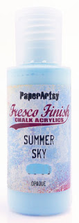
Add colour to the main parts of the door and window; I decided to use a thin coat of Summer Sky Fresco Finish Chalk Acrylic paint in order to preserve some of the drawn detail underneath. It was then easy enough to trace back over the top of the lines to make them stand out again and add shading with some grey watercolour pencil.

I love the ornate filigree ironwork that adorns so much architecture but to draw it can feel too complicated, so the release of Scrapcosy stamp set ESC28 for me was a real blessing.

You can either choose the images to fit your architecture or mask off some areas before stamping. Think about using inks that replicate the colour of metal or rust and heat embossing with clear embossing powder to emphasise the patterns.


The flowers from Scrapcosy stamp set ESC20 together with Scottish Salmon, Rose and a little Zucchini Fresco Finish Chalk Acrylic paint help to bring an extra pop of colour, particularly against the blue of the door and window. It's worth using a stamping platform to achieve this.

It was only after the flowers had been added that I decided the paintwork on the door and window looked too clean so, in a drastic move, I rubbed some sandpaper across the top of them. Of course it would have been much simpler to have done this before adding the flowers and filigree embossing!

To finish add a few appropriate words; Alison Bomber can always be relied upon to have something perfect for the job and in this case both phrases came from stamp set EAB01. A touch of Glossy Accents over the flowers makes them stand out even more. Bits of lace and hand-stitching add to the texture.


On the reverse of the postcard keep it neutral and concentrate on texture, stamping the text, postmark and a butterfly from stamp set ESC18 before applying Grunge Paste through another of the designs on stencil PS293.

With all the elements assembled it's time to see how they all work together, starting with the butterfly drawing you into the contents of the envelope. You can see how it all works with the hints of colour behind the embossed vellum. Glimpses of the colour that lies beneath on the main page will also ensure the envelope flap will be opened out.


Turning the postcard over reveals the first of the finished focal images enhanced by those Scrapcosy stamps and stencil.


Opening up the main page reveals the finished doorway.


On reflection I should have been less concerned with attempting to leave the detail on the door visible beneath the blue paint and concentrated on adding layers of colour to create that aged, weathered look without the need for sandpaper.

There are so many other pieces of stationery that could also be used to create a flap, including index cards, old diary pages and even paper bags. And why stop there? Neutral colour fabric and wallpaper are also perfect for providing texture and interest without overpowering the main focal points. I hope you feel inspired to give them a go in your own journals and books.
Thank you so much for stopping by.
Jenny


6 comments:
Absolutely stunning again Jenny! I adore these layers, they are beautiful!
Fabulously layered - the grunge paste lace is stunning and the colour palette just sings.
Alison x
Loved your interactive pages/flap Jenny x Beautiful use of the stamps and stencils
Big hugs
Annie x
I just adore this project... So beautiful, and with clever ideas. Thank you so much Jenny! xx
I love these colors Jenny and love the way you used this stencil, not one in my collection (will be soon now!) and how you continue to incorporate drawing into your mixed media creations, so so pretty! xx, Autumn
So stunning Jenny!
I love your colour use and
awesome drawings.
Thank you so much for sharing your inspiration and how
you made this,
stay safe and have a wonderful day.
Post a Comment