
2015 Theme 3: Paint
Hi there, Liz Borer
here again. Today I’m using PaperArtsy Fresco Paints so that I can show you a
few of the methods that I use to paint flowers and faces. I’ll also show you
how to create an interesting background effect.

I have only used a
few colours; Prawn, Southern Skies and Buff from the new JOFY Limited Edition Set along with Nougat, Claret and SnowFlake. By using such a
limited palette I find that the colours will blend together in a pleasing
fashion and will mix to create other colours that will work together very
nicely.
I find that mixing MatteGlaze with the paints allows me to add thin layers of paint and also helps with
blending. As some of the paints are opaque, mixing them with Matte Glaze makes
them more translucent and less likely to obscure the stamped image.

I found
this wooden folder in my stash. I know I got it originally from Leandra at
PaperArtsy but I don’t know when! I painted the whole thing with two coats of
Buff, sanding between coats to create a smooth finish. Then I did something
rather odd; I stamped the images that I wanted to use from EEB03 and EEB04 onto
white card and then I enlarged with a photocopier.

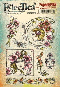
I wanted to use these images rather than drawing something new and this seemed a brilliant way of doing it! I cut out the faces and the flowers from both photocopies. As you can see, I have used the flowers and faces separately on the piece of work. On the image on the right hand side I found that the hanging flower did not fit so I cut it off and stuck it elsewhere. I then used another photocopied flower to fill the gap. I stuck all the photocopied images to the wooden folder and then, when the glue was dry, I painted a layer of Matte Glaze over the images and the painted background. I did this for two reasons: firstly, it protects the paper and the photocopy and prevents the image from bleeding and secondly it makes it much easier to blend colours over the top.
EEB03
EEB04
I wanted to use these images rather than drawing something new and this seemed a brilliant way of doing it! I cut out the faces and the flowers from both photocopies. As you can see, I have used the flowers and faces separately on the piece of work. On the image on the right hand side I found that the hanging flower did not fit so I cut it off and stuck it elsewhere. I then used another photocopied flower to fill the gap. I stuck all the photocopied images to the wooden folder and then, when the glue was dry, I painted a layer of Matte Glaze over the images and the painted background. I did this for two reasons: firstly, it protects the paper and the photocopy and prevents the image from bleeding and secondly it makes it much easier to blend colours over the top.

Once the
Matte Glaze was dry, I used the Buff paint to blend any edges of white paper
into the background by painting over them. Any areas of white paper between
curls of hair and so on I also painted with Buff to match the background.

The faces
were both painted with Nougat paint mixed with Matte Glaze. I blended the paint
down the neck so that there was no obvious line between the Nougat and the Buff
paints.


This is how I paint flowers whether they are large or small stamped images. I
start with the lightest colour and work towards the darker colours. The first
colour I used on all the flowers you see here was a mixture of Prawn, Nougat
and Snowflake. If you look, you can see that I didn’t paint all the petals,
only areas that would be pale when the flower was finished.

The next
colour I used was Prawn mixed with Matte Glaze. If you look closely you will see
that I have added this colour to the areas where the flower would be naturally
darker for example the centre. Sometimes I find that a little finger is a very
useful blending tool! I also used the pale
pink mixture to wash a little pink down the sides of both the faces.


This
shows the flowers at the bottom of the folder. As I’ve said, I started with the
very pale pink but then I mixed Prawn and Southern Skies to create a pinky
purple hue. I used this to start adding deeper colours to these flowers.

Going
back to the pink flowers, I have added in some places a little of the purple
colour. The reason for this is that by using colours from
elsewhere in the design it pulls the design together into a cohesive whole and
makes the colours blend well together.

This is
a close up showing the deeper colours I have used.

Now, the
darker flowers at the bottom of the design needed another and deeper colour so
I mixed Claret and Southern Skies and used this in the shaded areas.


Next I
used pure Southern Skies in shade areas. Finally, I used the darker purple
(Claret and Southern Skies) to add depth to the shading. I used the lighter
purple mix (Prawn and Southern Skies) to add a little more colour to the face
along both ladies’ cheeks.

After a
wash of Mushroom on the top lady’s hair, I washed a little of the lighter
purple in shade areas and then some of the darker purple to deepen the shading.
Some of the lighter areas were coloured by using a mix of Nougat and Southern
Skies. The centres of the
flowers are Guacamole and then a darker green made of Guacamole and Southern
Skies.

Finally to the background! I find this technique easiest if I use a small, flat brush.
Again, using a mix of Matte Glaze and Nougat I “slip slapped” the paint randomly
down from the right hand lady’s neck and also in the centre and to the right
above the left hand lady. “Slip slapping” paint
is an easy and random way of applying paint. Just make a small stroke with the
flat brush and then turn the brush a little and make another small stroke in
another direction. Keep making little strokes in lots of different directions
moving away from the brightest area of paint as the brush runs out of paint. It
will look very messy to start with. This is normal!

Add some
Southern Skies to the Nougat to create a pale blue and continue “slip slapping”
away from the Nougat to cover move of the Buff base coat. It’s not actually
necessary to cover the whole of the base coat. In fact, it makes the whole
thing more cohesive if little bits of Buff show through.

Keep
adding Southern Skies to the blue mix and continue “slip slapping” so that the
paint gradually gets darker towards the edges and the corners. I find sometimes
that I have to repeat the whole process again to get a softly blended finish.

Here you can see the finished painting.


I’m stopping here
because this post is about using paints. At some time I will return with this
project and show you what I did next and how I decorated the outside of the
folder. I hope that you’ll stop by in the future to see more of this project.
In the meantime, I hope that I have given you some ideas about how to use these
wonderful paints.
Liz.
Absolutely exquisite Liz how you have blended a limited colour palette to create such beautiful effects/shading, perfect for such a delightful face. Your continued experiments in customising paint combinations is fascinating. Thank you for such a wonderful post.
Liz.
Absolutely exquisite Liz how you have blended a limited colour palette to create such beautiful effects/shading, perfect for such a delightful face. Your continued experiments in customising paint combinations is fascinating. Thank you for such a wonderful post.
We would love you to join in with Challenge #3:Paint. If you are inspired by any of our guests who blog with us over these 2 weeks, then please join in and show us your painterly exploits HERE.
All links go in the draw to win a £50 voucher to spend on products of your choice from the PaperArtsy online store. The Paint link will close 17:00 (London Time) Sunday Feb 21st, winner will be announced 2 hours later at 19:00.


18 comments:
What incredible blending of colours, Liz! The flowers look absolutely beautiful, and so do your ladies' faces.
Gorgeous!!! I really like how you've explained this!! Thank you!!
Beautiful! X
Beautiful, the intricate faces with the mix of colours are fantastic:). Fabulous Liz. Xxx.
Absolutely beautiful Liz and thanks so much for the detailed explanation of your paint blending which gives stunning effects.
Fliss x
WOW! It's stunning and you've only just started. I can't wait to see what you did next. Lx
Love it Liz , the colours are pretty,.xx
Wonderful instructive post Elizabeth & the end result of the painting is stunning. The images look gorgeous and I can't wait to see how you finish this beautiful project.
Hugs
Lesley Xx
Absolutely beautiful xxx
You are amazing with paint and colour, Liz! I will try and use some of your tips but I will never be as good as you,
Lucy x
Stunning Liz and thanks for sharing your tips about building glazes cannot wait to have a go xx
Absolutely stunning Liz, valuable tips and inspiration xx
This looks gorgeous. Thanks for telling us how you made it. Anneke.
stunning work Liz, the colouring is gorgeous x
This is wonderful artwork, and these stamps - although not totally suitable to my style - are really beautiful... Congrats to you Liz Borer, wishing you the best for your line of stamps. Coco x
Wow!!! This is Fabulois. Must have these stamps.
This is just so very, very beautiful.
Wow totally gorgeous, beautiful creation. Kezzy :-) xxx
Post a Comment