Monday, 12 May 2014

GD: Keren Baker Project #2 Altered Frame

"Hi, Keren here with project #2. Today I wanted to do something different and took inspiration from the paper-cutting world. The skills these artists have are amazing; skills I don’t have, but with the beautiful Lynne Perrella designs and a good sharp craft knife, I could create something a little different".

I like to upcycle as much as possible. I had already decorated this frame but didn’t like it, so stripped all of the decorations off and sanded down the frame. It was a good old swedish store bought job. I couldn't take the photo without managing to get my silhouette in it!


By simply taping a piece of cream cardstock onto a self-healing mat, carefully cutting around the images, you can choose which elements to leave and which to remove. For elements that have no ‘anchor’(like the heart) I added little ‘struts’- that connect to the outer frame and so provided both structure and kept the element from being cut out. For delicate, intricate parts, press, rather than pull the blade. I experimented and loved the outcome and even survived without cutting any parts of my fingers off too! 


I then put this aside and got on with changing up the frame. Here’s the paints I used to create the effect on the frame.


I wanted an effect that didn’t include too much colour or it would detract from the intricacy of the papercutting. I had some black paint I’d already mixed with Snowflake, so thought I’d use that up rather than wasting it.


I wanted to use Crackle Glaze as I’d already tried this product and loved it. I did wish, however, that I’d watched Leandra’s video on how to use it FIRST! - ah well, I learnt plenty by trial and error, including the fact that Crackle Glaze is best used very sparingly for the best results. The frame looked a little bare so I stamped the pen image onto the matt side of some tissue paper with Tuxedo Black Memento Ink.


I trimmed the stamped images, being really careful (I ripped a few!!). Next I added a very thin layer of Snowflake onto the frame, carefully laying the images over them, and pressed them into the paint. You may get the odd wrinkle, but don’t try and smooth it out or you risk tearing the image. Once dry, the wrinkles will disappear (wish Snowflake worked on the wrinkles on my face!)
Finally, leave to dry before adding a thin layer of Metallic Glaze which gives a gorgeous sheen to the frame. I added a few buttons to the corners, and voila your frame is completed.


Now I just needed to use the old frame mount to position over the cut image, trace around and cut out.


And that’s it. I simply secured some bright cardstock behind the papercut image and adhered that to the mount so it wouldn’t slip. I wish I'd used a brighter colour for the background colour- but hindsight is a wonderful thing! The advantage of taking time over creating the frame is that I can change out the image when I get bored (which is quite often!!)

"Thanks for joining me today, I hope you’ll come back tomorrow for a project using some curtain offcuts"!

~Keren~ 

Leandra Says: That is such a cool idea. Love the papercutting technique and how you can easily select what to keep or not! That takes some serious patience though, and the grey/ white crackled frame looks wonderful!

Gillian Says: The crackled frame looks fab along with the bright pop of blue, love your altered frame, everything works so well in the overall composition.

If you would like to join in this week's challenge and play along with Liesbeth's techniques, then do link up your creativity here, and go in the draw to win some PA stamps of your choice! You need to link your entry by 17:00, Sunday May 18th 2014 

Sunday, 11 May 2014

Welcome GD: Keren Baker Project #1 Clean & Simple Card Ideas

"Hello everyone, Keren here with the first of this week projects, I’ve used the Lynne Perella Collection. As each of my projects are clean and simple, I’ve created 3 for you in case you feel a little shortchanged (wink)"!


For this Clean and Simple card I’ve chosen to add colour details with alcohol based pens. I have used my favourite stamping card, which is, of course, Smoothy White Stamping Card along with the Copics/Promarkers blended well on the surface!

For any of you that haven’t used them, they blend amazingly - think felt-tip pens, except they're a million times better as the alcohol in them means there are no lines where the brush strokes meet. You can create some stunning effects. By adding different layers of colour you can get depth that would be difficult for a beginner like me to obtain with paint. I’ve separated the individual images, coloured them and then mounted them onto cardstock. I used a punch to create the shapes behind the images using a little washi tape and patterned paper. I’ve used adhesive pearls to add movement to the project.


Knowing that you all like techniques, my projects are fairly simple on the eye - I’ve prepared a couple of other card projects using this set.


The Lynne Perella set reminded me of a set of beautiful pictures, so I thought I’d recreate a little wall of art. 

I stamped out the images and then measured the sizes to cut out frames from bright coloured cardstock. My default colours are always bright and fun, so I just used whatever scraps I had lying around. I added tiny shapes from dies and punches to give depth to the frames (whilst also cutting out some very un-straight straight lines!!).


By adding gold thread to the reverse of the frames and ‘suspending’ them by hooking around little brads it created the ‘art wall’ look. I broke out my London Bus Fresco Paint and added to one of the PrimaEmbellishments , loved the fact this colour is translucent so I can still see the surface effect of the embellishment through the colour

http://shop.paperartsy.co.uk/fresco-finish---london-bus-3256-p.asp

For my last simple project I decided to play a little with the paints.

The ‘pen’ image in the stamps reminded me a little of fancy 'turrets' (think Taj Mahal!) so by stamping and white embossing them, I wanted to create a simple skyline by using the paints watered down.

I used these colours as they jumped out at me, I stamped and embossed the image several times over before starting.

I then added some water to make them even more translucent. 


Once mixed well, I added in broad strokes across the embossed cardstock. I was looking for strong bands of colour rather than a graduated effect although I think it would have looked better had I picked my colours more carefully (!).

Once dried, I trimmed the piece down and chose to use the offcut. I stamped a sentiment from the Eclectica Sara Naumann Collection.

http://shop.paperartsy.co.uk/e-sara-naumann-01-4121-p.asp


I wanted to stamp the sentiment that way, so that when positioned on the card, the colours would be going in a different direction and so add interest to my project.
I then added my embellishment, mounted the sentiment and adhered the painted piece to a kraft base before adding some white gel pen ‘stitching’.

"I’m back tomorrow with another project- and this time there won’t be a card in sight"! 

~Keren~

Leandra Says: Wow all these ideas are great Keren! When those stamps came out, I think this set immediately grabbed me with the wealth of options it offers! You have captured that perfectly. Bravo and so nice to have you here!

Gillian Says: Welcome Keren. I love your Clean and Simple style of art .... something I really cannot master lol. Love your use of bright colours which works so well with the Clean and Simple style. We are in for a treat this week :)

If you would like to join in this week's challenge and play along with Keren's techniques, then do link up your creativity here, and go in the draw to win some PA stamps of your choice! You need to link your entry by 17:00, Sunday May 18th 2014 

Weekly Challenge and Winners {May:Week 2}

Hi everyone Darcy here. Last week Liesbeth Fidder was our newest guest designer, and wow did she cause a stir with her 'fired' tin. You all loved it, twitter was bouncing with the chat of how to burn tins! Then we brought you a great video from our very own Sara Naumann, such a cool technique on that front cover. If you missed it do check it out on the PaperArtsy Channel. We also had the delightful button house from Lucy and  a gorgeously bright and funky tag book from Ellen Vargo. We finished the week with a super card from Joanne. 

What a great start to Semester two!

Thanks to everyone who joined in and made projects last week.We, and the designers truly love seeing your creations.  And thank you also for all the comments left on blog posts.It means a lot to us all that you take the time to leave comments. In addition to the weekly challenges don't forget we have a monthly journalling challenge, you can find the latest one HERE. 


1. And the winners are...
Random winner #1 from the First Challenge draw (every single entry linked, including multiple entries) is:  Massofhair

 Congratulations, you have won a PaperArtsy A5 stamp of your choice. 

 Random winner #2 the winner from the Second Challenge draw, (only one entry per name)
 is: Margaret B

 Congratulations, you have won a PaperArtsy A5 stamp of your choice.


*Winners please get in touch with Darcy (darcydotneedles@hotmail.com) with your full  name,  address and choice of stamp plate. 

2. The week ahead...

Hi everyone, Leandra here introducing our newest Guest Designer! Tonight we welcome a brand new guest designer, Keren Baker.   

You might have noticed Keren's work back at the start of the year when I asked her to do some samples with the new JOFY stamps, you can see the blog post here. Here is a reminder of what she made with Jo's new stamps and paints.

 
But if you are a proper blog stalker, you may remember Keren first came to our attention as a #3UP participant at the end of Semester 2 last year, when we had our 10th anniversary special #3UP. Keren did a stunning project with Sara Naumann/ Lin Brown mash up  See it here. She told me at the time she was well out of her comfort zone, but oh my goodness you would not know it! I adore her design-eye for pulling things together in a way which ,makes creativity look elegant and effortless!


Keren  has been chatting her ideas through with me a lot over the last few months since she was selected, everything she has shown me is just beautiful. I am loving the whole minimalist thing. Minimalist is something I struggle with, as you know, I'm very much a more is more girl, but I hope Keren's methods rub off on me this semester, I am really wanting to master stripped back and naked crafting! ....nooooooo not like that!! OMG you lot!!! stop it!. 

I know Keren is anxious to get started, and she is really hoping that you like what she makes. She will be joining us soon, so pull up a chair and get comfy. 

3. P.A.Weekly Challenge from....{Keren and other guests}


Keren will be joined in the latter part of the week with other surprise guests, and of course, if you are inspired by any item you see on the blog this week, then please share what you get up to, and link your creativity here on the weekly challenge link. 

Your challenge entry can link to your own blog, Pinterest or Flickr pages, or any webpage that shows us what you have made in response to the posts on the blog this week. Just make sure you come back to this post, and use the linking tool below to show us your entry. We have extended the challenge entry deadline to 5pm on Sunday evenings.

Make sure on Sunday 18th May by 17:00 (5pm London time) you need to have your link entered below, and you will go into one of 2 draws to win new stuff.

To help you find the linky tool when you need it, just look at the final green paragraph on each blog post, there you will find a link that brings you back to this post.


Weekly Challenge guidelines
The first draw is for every single entry listed, so if you have multiple entries, you get entered multiple times. 

The second draw is only for one entry per name, and the winner of Draw 1 is not included in this second draw. Having 2 draws makes it fair for everyone, no matter how many times you can join in during the week.


As this challenge is to show how you have been inspired to action by this week's designer, make sure in your blog post you explain what prompted you to create.


Please don't feel you need to copy a designer's work exactly, it may be one small aspect or idea that you want to explore that sends you into the creative zone. You are also welcome to use any stamps/ products / substrates you have to hand, we do not expect you to exclusively use PA products - but of course it is lovely when you do!


The winners are announced Sunday evenings in the 7pm blog post (as above). It is your responsibility to check back and see if you have won. If you are a winner, email Darcy darcydotneedles@hotmail.com with the name of the stamp you would like, and your snail address. We do not chase people for unclaimed prizes.


If we are away at an event, then the winners post would generally be updated by Monday evening with draw details.

Saturday, 10 May 2014

Paper Flowers {with Eclectica³ Lin Brown Stamps by Joanne Wardle}

Hi, It's Joanne Wardle here again with another quick and easy project. I'm really enjoying playing with the new releases from february and this month I've made a quick card using Lin Brown's stencils and paints, and an easy technique for paper flowers.


I have used all of the colours from the fabulous set of Lin Brown limited edition paints

I started by taking a sheet of cheap copy paper and painting one side with Tikka and the other side with Chutney, and put aside to dry.


I then used ELB stencil 006 with seaweed paint, directly onto an A6 white card blank.


I then used a stamp from ELB05, for this card's one and only stamp.


And ELB stencil 001 with chartreuse in random places around the leaf


Then it came to making the flowers. To do this just tear thin strips of paper from the painted sheet. Fold down one end and then wrap the long end around this folding it with each twist, so that both sides of the paper are shown. This will create a spiral as shown, which will need the layers gluing together before gluing to card. I hope this picture helps this to make sense. If not, then look on youtube at how to make ribbon roses, it's the same technique.


 Glue these to the card.


 At this point I realised that I had made a couple of small marks on my card, so I went and added a few more dots with the stencil and paint to disguise them create a background!!

 I hope you enjoyed this project and I'll be back soon.
Joanne. 


A huge thank to Joanne from PaperArtsy. The composition here is wonderful with the text overlaying the leaves in the centre, a really nice little cluster of elements. We also like the subtle changes in paint coverage, with the top leaves being more dominant over the less solid bottom leaves, small differences that can add a whole lot of dimension. 

If you would like to join in our weekly challenge with any of this week's guests who have blogged since Sunday night, then join in to link up your creativity HERE you will go in the draw to win PA stamps of your choice! You need to link your entry by17:00 (London time) Sunday 11th May 2014

Friday, 9 May 2014

Tag Flip Book {with Eclectica³ Ellen Vargo Stamps by Designer Ellen Vargo}

Hello!
It's me, Ellen Vargo, so happy to be back here on the PA blog to share another inky-painty-stampy project.  The last time I saw you all we had just released another two new stamp sets in the Eclectica3 EEV series, so today I wanted to share some fun ways to use them, along with some of my other stamps, and we'll be making a mini book out of tags.  Any ONE of these tags would make a lovely gift so don't feel pressured to make the whole book... I just wanted to show you lots of options.


I started with three #10 manila tags and six #7 manila tags.  To create the backgrounds for each #10 tag, I used an old credit card to scrape fresco paint (one color of paint on each tag, front and back - so six sides).  I'll show you how I did one of them - the method is the same for each, just use a different color paint.

First spread a thin line of paint across the top of the tag.  For this tag I used Hey Pesto.

Then use the credit card to scrape the paint down the length of the tag.  If you want a deeper shade just add another coat of the same paint.


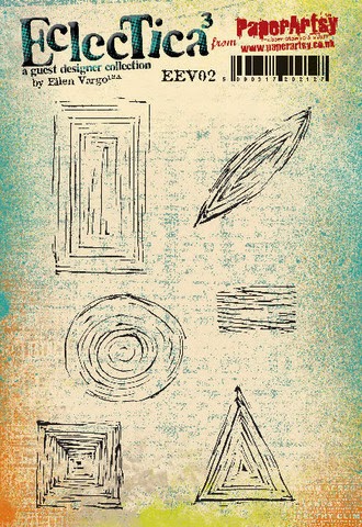
Then I stamped the scratchy square stamp from EEV02 (these stamps are *awesome* for backgrounds! I'm just sayin'!).  Use a coordinating shade of archival ink for a tone-on-tone background.  I used Sap Green.
EEV02
Voila!  Instant background!  Then I used some collage papers that I made using lots of stamps from EEV05 and EEV06.  
EEV05

Just stamp one image over and over again to create a nice pattern - I *love* repeating patterns.  I used the washer stamp from EEV06 and black archival ink on deli paper (dry wax paper) - but waxed tissue paper would also work beautifully for this, just make sure you heat set the inks as you're stamping so they don't bleed. 


 Here's a picture of my collage paper stash...

 (this picture is from a different tag, but you get the idea...). 

I applied a border using the collage papers to the top and bottom of each tag, using Glue 'N' Seal matte, and used all the same techniques to prepare the front and back of each #10 manila tag.  Here are the fronts:


And the backs:


I added some border stamping to each of the #10 tags using black archival ink and stamps from EEV05 and EEV06.  Once again - I used these stamps to create *patterns* - do you see a "pattern" emerging??? LOL!

Then I prepared six #7 manila tags using distress inks, Hot Picks stamps, and other PA background stamps, and adhered them using dimensional foam tape to the #10 tags.  (I trimmed one inch off of the bottom of each #7 tag for a better fit.)  Then stamped an encouraging greeting on Smoothy white card and adhered to each small tag. I'll list the supplies used in the captions for each picture.


(Zesty Zing paint, Chrome Yellow and Manganese Blue archival inks, Stamps: EEV02, EEV05, EEV06, Backgrounds 2, HP1010)


(Limelight paint, Sap Green and Venetian Orange archival inks, Stamps: EEV02, EEV06, Words 3, HP1006)


(Yellow Submarine paint, Venetian Orange and French Ultramarine archival inks, Stamps: EEV02, EEV05, EEV06, Backgrounds 6, HP1009)


(Tango paint, Venetian Orange and Emerald Green archival inks, Stamps: EEV02, EEV05, Backgrounds 4, HP1005)


(Hey Pesto paint, Sap Green and Venetian Orange archival inks, Stamps: EEV02, EEV05, Words 2, HP1011)


(Zesty Zing paint, Chrome Yellow and Emerald Green archival inks, Stamps: EEV02, EEV06, HP1006, HP1004)
I scored a fold line one inch from the top of each #10 tag so the "pages" would flip nicely and used double sided super-sticky tape to adhere all three tags together at the top.  Here are some pix of the finished mini book.


Close up of the pages on the fronts:


And close up of the pages on the backs:


Thanks for stopping by - I hope you liked my mini book and got some ideas on how to use my stamps to create awesome patterns and textures for your next stamping project!  I'll be back next month for some more fun - see you then!

~ ellen.


Ellen is giving away one of her newest stamp sets to two lucky winners.  Leave a comment on her blog HERE for a chance to win!


A huge thank you to Ellen from all at PaperArtsy HQ, it is wonderful to have you with us again this semester. Your stamps are just fabulous over every colour, creating brilliant textures. this tag book is so full of vibrancy and interest. 

If you would like to join in our weekly challenge with any of this week's guests who have blogged since Sunday night, then join in to link up your creativity HERE you will go in the draw to win PA stamps of your choice! You need to link your entry by17:00 (London time) Sunday11th May 2014