Sunday, 8 December 2013

Welcome Back Joanne Wardle Project #1 Z Folder ....


"Hi everyone, Joanne here, It's getting very close to christmas now, so I'm sure you've all finished and wrapped your christmas shopping.... no? Really? No, me neither. When it gets to this stage, and I can't think what to buy, it usually means gift vouchers or cash. The thing is although these are brilliant presents, and always well received, they are just a bit boring to give and can look like not much thought has been put into them. The way to make sure the recipient knows that you care is to make the gift presented in a beautiful or at least interesting way".


This week I am looking at ways to present vouchers, cash or small presents, in cute but easy ways. I am concentrating on using stamps from the squiggly ink range.

Some websites (or even real life shops and resturants) offer printed vouchers on A4 sheets.

This z-fold is a really lovely and easy fold, that is very “playable with”. You really need to have a go at one to see what I mean.

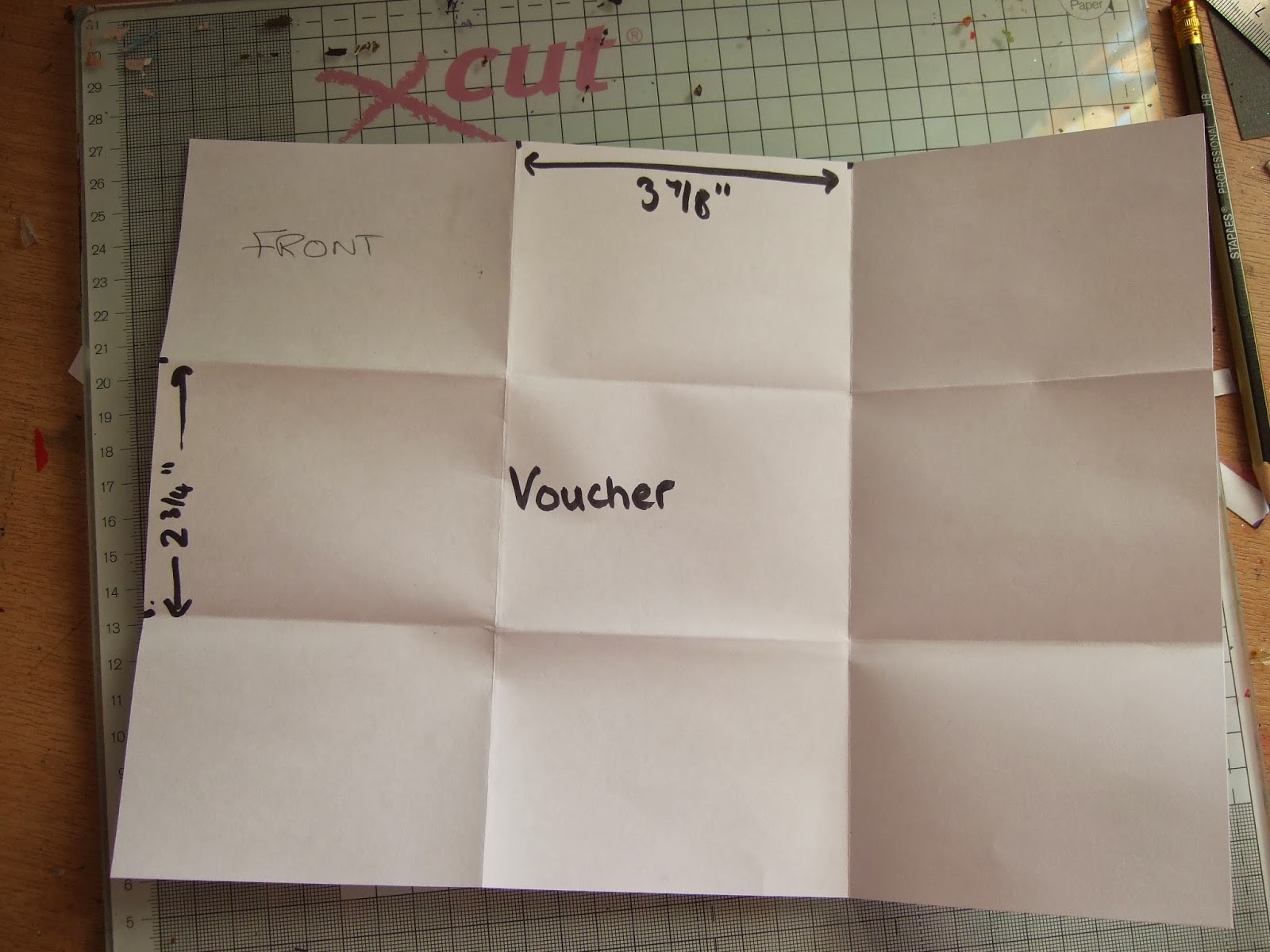
Start with your A4 sheet and mark intervals at 2 ¾ inches along short side and 37/8 inches along long end.


Then score ....


and fold ....
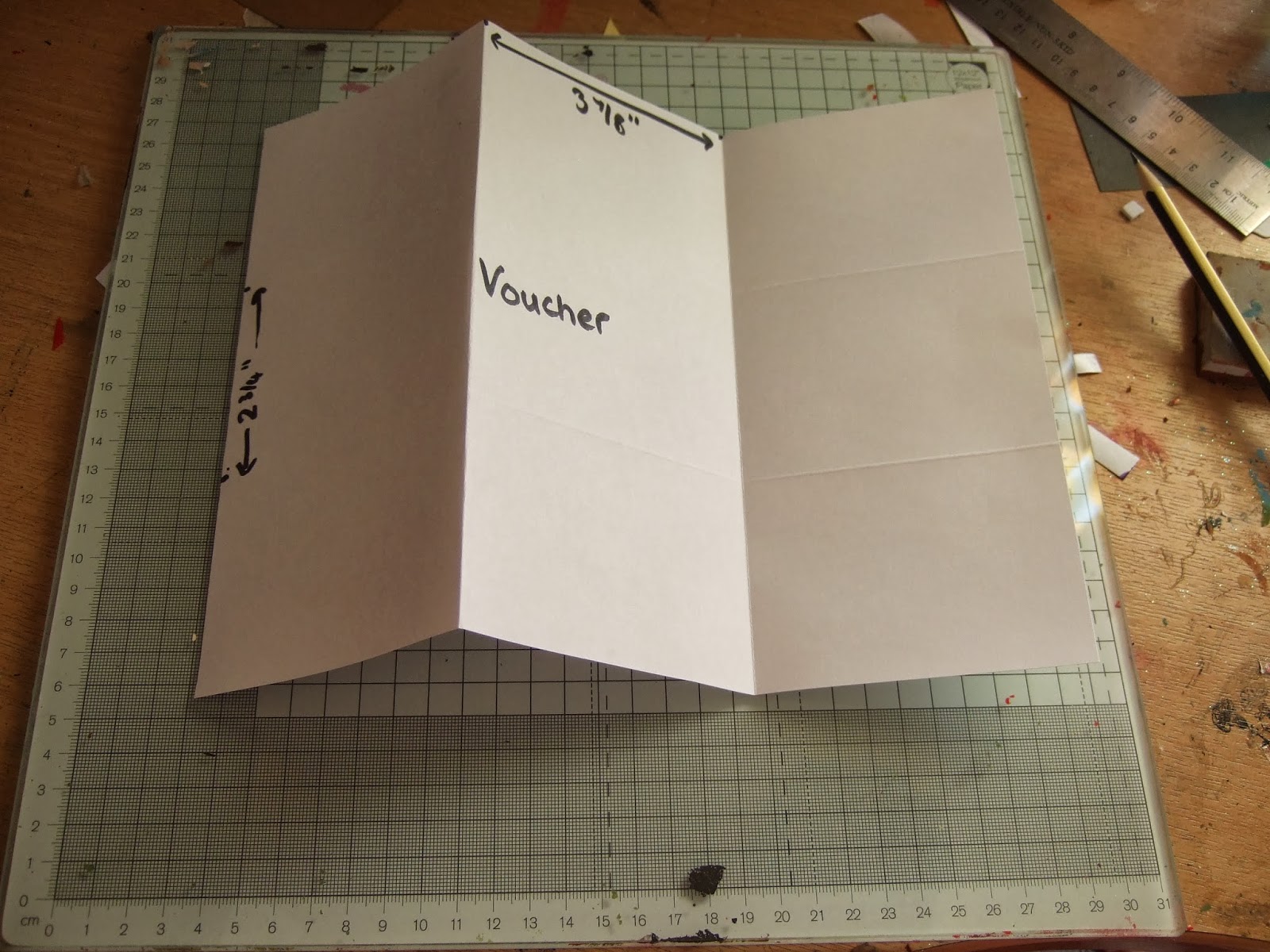


I hope that these pictures explain the fold. That's the hard part done. Now cut two rectangles of Heavyweight Smoothy Stamping Card, these are each 3x4 inches.


Now decorate at will! Go mad! I started out by using Tinned Peas.


I then applied some Crackle Glaze


and the third layer was Honeydew.


Put aside and leave it to crackle.


I'll be honest here! I hadn't meant to use Honeydew at all, I'd meant to use Nougat... but more on that later.


I stamped the fairy from Squiggly Ink - Nut Meg 6 in Archival Black Ink, and coloured her with felt tip pens, then glittered her wings.


I edged the front with some green Distress Ink and stamped the Holly edging from the same stamp set again using Distress Ink. I also distressed the back with the same ink


Next I glued the front piece of card to the front of the folded voucher as shown


Lining up the bottom right hand corner.


I then glued on the back so that it sat neatly with the front.


and that's it pretty much done, so play with the fold now. It is really cool.


At this point I realised I had used the wrong paint and that the fairy had a green hue to her skin... oops. So I carefully painted Nougat with a very fine brush, over all of her skin areas, and stamped xmas and fairy from the same stamp set to finish.


This now easily pops into a card, or you could tie it up with a ribbon. I can't wait to see what people do with this as it's a lovely size to decorate (almost ATC size) and you can do anything!


I will be back tomorrow evening with my 2nd project of the week. Until then ... Joanne x

We do hope you can join in with Joanne's techniques this week. you can link to your own blog, Pinterest or Flickr Pages, or any webpage that shows us what you have made in response to her posts this week. Just come back to the Sunday nigh winners post, and use the linking tool to show us your entry.


On Sunday 14th December  by noon (GMT) you need to have your link entered below, and you will go into one of 2 draws to win new stuff.
Leandra Says: That's such a nice touch, gift vouchers can be so impersonal, and this idea can easily be adapted to suit the recipient! Good thinking, and not overly time consuming either, I like it! :)

Gillian Says: This just adds that special touch to any present. Doesn't she look great against the crackle background.

Challenged by Joanne Wardle and winners

Last week we had some wonderful projects from Alison Bomber. We had bothersome baubles, which turned out wonderfully and the wooden icon that was given a luxurious molten metal treatment. Then the amazing upcycled jars, given new life as glorious,golden candle holders. So many elements to take inspiration from. 

Thanks to everyone who joined in and made projects alongside Alison. 

1. And the winners are...
Random winner #1 from the First Challenge draw (every single entry linked, including multiple entries) is: PearshapedChris

 Congratulations, you have won a PaperArtsy A5 stamp of your choice. 


 Random winner #2 the winner from the Second Challenge draw, (only one entry per name)
 is: Mark

 Congratulations, you have won a PaperArtsy A5 stamp of your choice.


*Winners please get in touch with Darcy (darcydotneedles@hotmail.com) with your full  name,  address and choice of stamp plate. 

2. The week ahead...
Coming up in the week ahead we welcome back Guest Designer Joanne Wardle. Let's see what she has been up to since we last saw her. 

Over on Joanne's blog we find more of her clean and simple style. 


I am in love with this tiny bird card. See how effective a little touch of paint can be. 


Joanne has also been making more chutney, have you ever heard of Persimmons? I definately haven't but Joanne found some and made this amazing looking chutney. I hope she lets us know what it tastes like. 


Joanne's first project will be up soon, so get ready for some very cool gift packaging, lots of fun ideas and perfect for last minute gifts. 

3. Challenged by....{Joanne Wardle}

I do hope that you will find time to join in with Joanne's techniques this week. You can link to your own blog, Pinterest or Flickr pages, or any webpage that shows us what you have made in response to her posts this week. Just come back to this page, and use the linking tool to show us your entry.
On Sunday 15th December  by noon (GMT) you need to have your link entered below, and you will go into one of 2 draws to win new stuff.


Draw guidelines

  • The first draw is for every single entry listed, so if you have multiple entries, you get entered multiple times. The second draw is only for one entry per name, and the winner of Draw 1 is not included in this second draw. Having 2 draws makes it fair for everyone, no matter how many times you can join in during the week.


  • As this challenge is to show how you have been inspired to action by this week's designer, make sure in your blog post you explain what prompted you to create.


  • Please don't feel you need to copy a designer's work, it may be one small aspect or idea that you want to explore that sends you into the creative zone. You are also welcome to use any stamps/ products / substrates you have to hand, we do not expect you to exclusively use PA products - but of course it is lovely when you do!


  • The winners are announced Sunday evenings in the 7pm blog post (as above). It is your responsibility to check back and see if you have won. If you are a winner, email Darcy darcydotneedles@hotmail.com with the name of the stamp you would like, and your snail address. We do not chase people for unclaimed prizes.


  • If we are away at an event, then the winners post would generally be updated by Monday evening with draw details.
  • Friday, 6 December 2013

    Paint Sample Chart

    Hi everyone, Darcy here. While messing around with my paints today I decided that I really needed a colour chart. Once finished I was really pleased with it and thought you might like to make one for yourselves. 

    I started out by creating a table, just in a word programme, it's really nothing flashy. Actually I wanted to keep it fairly simple, but with a very important element. 

    Of course there needed to be spaces for the paint, and a box underneath with the corresponding paint name. However the really nifty addition is the set of chevrons within each paint box.  (Scroll down to near the bottom of this post for a download link)

    So why are these chevrons so important? well have you ever noticed that there are similar chevrons on the front of every bottle of Fresco Finish paint?


    So we have these chevrons, and it would appear they are covered up with paint? yes they are. When the paint is bottled and labelled up, each and every label has a little paint brushed onto the label. All by hand, wow those PaperArtsy elves work hard. 

    Did you know that the paint covered chevrons are actually a cool little tool, there to help you when you are choosing paint? How can that possibly help you may ask..

    There are 3 categories of Fresco Finish paint, Translucent, Semi-Opaque and Opaque. You can see these clearly in the photo above. We also use the word 'coverage' a lot with this paint. It is a confusing word,and many people think that it means that the paint will 'go a long way'. However what it really means is that the paint is good at 'covering up' whatever is underneath. 

    Take a look at those bottles. On the translucent bottle, you can clearly see the chevrons through the paint. So the translucents, which are the brightest of the colours, have the lowest level of coverage. Then we have the semi-opaque, you can still see a little of the chevrons. Finally look at the opaque bottle, the black chevrons are completely covered up. 

    So let's start to fill in the colour chart. Here we have Zesty Zing, this is a translucent and so the printed chevrons show through. This is good to know especially when you are colouring in stamped images. Use a translucent paint and you won't lose the stamped outlines of your image. 


    Next we have Chocolate Pudding, the chevrons are still partly visible, this is a semi-opaque. 


    Finally the Space Cadet, see how the chevrons are completely gone! Because of this, opaques are perfect for backgrounds. Also if you ever make a mistake with your project, grab an opaque and cover it up and start again, nobody will ever know because the opaques are so good at 'covering up. 


    So I filled in my chart completely. Now I can see several things at a glance. 

    1. I can see which colours I have and which are missing. 
    2. I can see how the colours look out of the bottle, always helpful when picking out a colour for a project.
    3. I can see at a glance which colours are translucent, semi-opaque and opaque.
    4. I can see at a glance the colour families. 

    This final point, about the families, is another nifty tool intended to help you. All the paints are in groups of families of 4. Each member of that family will work in harmony with other members of that family. 

    When faced with so many colours it can be confusing knowing which colours will work well together. Using this chart you can easily identify sets of 4 colours that will work in harmony. Each family runs from lightest on the left to darkest on the right. 


    I hope you find this useful. Please feel free to download and fill in your own chart. You can download a copy to print from this link:  http://www.paperartsy.co.uk/pdfs/FrescoFinish72.pdf

    PaperArtsy also have this new printed paint chart (below) of the 72 Frescos. This is designed primarily to be a 'tick chart' as you collect your Fresco paints. It also indicates which shades are opaque, semi and translucent. 

    Due to differences between computer screens, and the difficultly of trying to reproduce painted colours as a printed CMYK version, the colours are not a perfect match. Particularly the darkest and turquoise (blue-green) shades. This is why PaperArtsy elves paint the colour on the labels on the front of every bottle as it is the best, and only true indicator of the colour inside !

    When you place an order at PaperArtsy, they will pop one of these in with your order. They are also putting wads of them into every box going out to trade customers (shops), so ask at your local PaperArtsy stamp store for a copy of this chart below.


    Darcy x


    Thursday, 5 December 2013

    Baubles!

    Hello everyone, how are the festive preparations coming along in your house? I know many of you have already put up your trees, so here is Darcy with a little project that you can add to your tree. 

    I started with plain white baubles, you could use any colour, silver would work well. I knew that I would be using translucent Fresco paints and for them to be bright and true they are best used over a white or at least light coloured background. Of course you can use Snowflake to create that base layer. 

    You can see mine are just plain white plastic baubles with silver coloured caps.


    However they didn't start like that. I searched for about a month for plain white baubles, could I heck find any. But not one to be defeated... us designers are nothing if not determined. I bought these glitter baubles. I knew there was white plastic hiding under there, with a lot of scraping and a generous amount of cleaning product I managed to get all the glitter off them and onto me!!! My jeans,slippers,socks and floor have never looked so festive!


    I started by sponging on a layer of London Bus, to achieve an even finish use a sponge or cut n dry and not a brush. I then blended in some sponging of Blood Orange and Claret. To finish this layer I added a little sponging of Old Gold. I applied this base treatment to my first bauble. 


    To change the colour of the caps, I first used Old Gold, then I dabbed on some Treasure Gold in Spanish Topaz followed by White Fire. 

    I then started on a base for bauble number 2. This time I wanted a more textured look, but with the same colours. I covered the bauble with sheet music. So far so good. I really liked this effect and thought I was on to a winner. 


    I painted over the sheet music with exactly the same colours as bauble one. Then I decided to cover it with buttons, covered buttons to be exact. ( inspired by Alison Bomber from this post)

    I stamped some tissue paper with fern green archival ink. It looked great for all of 10 seconds and then it decided to wander all over the place. So I tried again, this time I zapped it good with the heat gun and set it in place so it couldn't run away. See here the difference. On the left is my stamped image left to dry alone, and on the right is the same image that was immediately heat set. 


    I started to cover my tiny buttons, realized that it just wasn't the look I wanted so onto plan B. I painted my tissue first, with several green frescos, then stamped my text in black. 

    Voila! I love these little buttons now. I added some gold thread. 


    I used glossy accents to stick them all over the music sheet/red painted bauble, but I can't show you because I seem to have deleted the photo, and the reason is because it was hideous. Can we say Sputnik! or possibly a suspicious WMD. It was truly terrible, so I pulled off all the buttons, scraped off the music paper....and now we are back to plain white plastic bauble. 

    Frustrating, and in one sense a waste of time, but at least I ended up with some cute buttons which I am sure I will use elsewhere. 

    Back to the plan, well the revised plan. 

    I now wanted all 3 baubles to be similar but not completely identical, so I gave bauble 2 and 3 the same red/gold paint treatment as bauble 1.Then I looked through my Christmas stamps. I decided that holly would look good over the red base, and found 3 different holly stamps. 

    EDY04  


     HPXM02  


    I took some white tissue paper, and blended on some green Frescos. Limelight, Hey PestoGreen Olives and Hyde Park. I did this quite roughly, so that different shades were stronger in different areas. I then stamped my holly stamps using black archival ink. 

    I dried the ink and cut out each leaf. I then brushed on a little Pearl Glaze, I love this glaze for adding just a little shimmer. 


    The final step is to glue the leaves to the bauble. I stood the bauble on a piece of reusable adhesive (blutack) this keeps the bauble steady and easily peels back off. I used Gloss glaze to stick the painted tissue paper in place. I also went over the top of the leaves. You might think that the gloss glaze cancels out the pearl glaze but it doesn't. You get the super gloss finish with the pearl shimmer showing through. 


    I decided they looked  a little flat, so I watered down some French Roast and using a fine brush I added a little around each leaf. this just gives them a bit of a shadow and adds dimension.

     For this one I also added in some berries , again painted and stamped onto tissue paper. 


    Here is #2.. You can clearly see the shadow of French Roast, and also accents with Old gold and Claret. I totally sympathize with Alison Bomber and her bothersome baubles, as this is the one that had a brief former life as a musician. 


    #3. This was was the fiddliest to cut out, but not impossible. 


    All 3 baubles were decorated in the same way, and in total each has 3 coats of the gloss glaze  all over the whole bauble, to make them really shiny. 

    I love seeing them together, they have a wonderful shine and in real life they look more like glass than plastic. 


    I hope you have enjoyed this little project, why not have a go at painting your own baubles. Perhaps make them personalised by stamping names onto them, that would be so lovely for children. 

    See you again next Thursday for another festive project. 

    Darcy x