
I am keeping my promise to show you some more Portfolio Oil Pastel fun you can have. So what are these pastels? They make no sense to me. How a product can be so waxy-soft-oily and water soluble at the same time defies logic, but these pastels are all those things.

When I first heard about them from Lynne Perella, I thought, why would I need those, I have my aquarelles? And in blog comments i've seen, I can see some of you think that too. There are quite a few brands of water soluble crayons out there. When you touch the feel of the Portfolios on paper you instantly know these are different! We don't have touchy-blog capability yet......So how do the portfolios differ? Well for starters here are a few reasons.
Price: They are cheaper. In the UK £15 ish for a set of 24 crayons has pitched this product at school/college students...ie not the high end art shops, and thus made an affordable product.

Feel: They are soft. Other crayons I have used are generally a typical hard crayons. These are soft, almost pliable, and blendable with your finger; put one line on your paper, and rub it and it softens out instantly, the warmth of your hands assist with this.
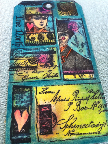
Vibrant: With 24 colours, you do have a lot of choice for the money, the brights are really bright and there is a large range. There are several shades of each colour, blues, greens, oranges, pink-reds etc so you can build depth add shading, and blend to create new shades. I think these must be loaded with pigment to get such great colour from such a small amount of crayon. (stamps from Lynne Perella collection)
Dissolvability: They are easily dissolved with water. You can take a damp fine brush, swipe it lightly over the pastel, and apply to your image. This is great for fine detail work and layering colours for depth. Of course you can scrape a shaving onto, or write directly onto your craft sheet, mix with water to get stronger colour or mix bespoke colours. Or you can apply the pastel direct to your surface, then apply water or a liquid glaze to mix on top of that. To soften as you apply, blend or dab off excess.
Melty: To melt most crayon-style products it's easy to do with the help of a melt pot. But cool things happen when you introduce a heat tool...in just one quick zap you can make awesome backgrounds. Like I'm talking a 2 second zap. Wicked!
Notes on supplies:
- I am working on Manila tags. These do suck the true colour of the crayons a little, so for a more vibrant, true colour use white card. Whatever product you use for today's techniques, it needs to be smooth and matte (ie uncoated). In my language: sucky..... But smooth and sucky OK! If its not smooth, you don't get properly stamped images, and if it's not sucky, the wax can't sink in when heated....makes sense.
- I am using a permanent ink. I prefer ranger archival because it is a proper black, it is permanent once heat set, the oil in this ink coats our detailed rubber stamps nicely and stays wet long enough to stamp it out well, it gives sharp defined image. Memories is similar, but it is not as black as archival, so I don't use it anymore, and not many people sell it, so re-inkers are hard to come by. Ancient Page is also a permanent dye ink, and their black is also good.
Technique 1: Zappy Backgrounds
When working with portfolios you will begin to notice that the colour you put down first onto the sucky card will stay put in that spot. For example, if you want a darker edge to the tag, then apply blue or teal to the edge, and as that is the colour that sinks into the virgin, sucky surface those colours will 'own' that spot. So if you want some lighter areas in the centre of the tag, then you need to make sure the light shades 'own' their space too.
I start by scribbling white, yellow, skin tone up and down the tag and blend them with my fingers. Next move the mid tones towards the edges, blend again, and last darker shades at the very edge. If i want to add some bright orange, or red for a bit of zing and contrast, then come back over what you have done, and add more pastel on top, then blend. (see pink orange BG below) Too much colour, or no likey? Take a paper towel and rub to knock back while warm. So once you have created a light, waxy base, it's much easier to blend darker shades into that, and if you don't like them so much, take a paper towel and wipe back to remove, cool huh! This gives you control.
So do you like what you have done? Great!....So how are you going to stamp ON TOP of that...???? Its all waxy, no ink in the world can stamp over that surely?? Feel it. It feels sort of sticky-waxy yet smooth...right?? Kind of greasy.....well we can 'fix' it...
Go grab your heat gun. And zap it! It only take a few seconds. Now feel it, totally different right? It feels kind of like a manilla tag again, yet none of the colour has changed. So the heat has melted the waxyness into the tag....now you know why we needed a sucky tag!!! If you don't have a heat tool, just turn on your toaster, and hold the tag (pastel side up!) over your toaster, the same thing will happen. *lightbulb moment*

Technique 2: Stencil detail
Right i'm so excited about this idea, I figured it out when demoing at the NEC...one of those happy accidents again....I'm sure I am not the first to do this by any means! But if you don't try you'll never find out right?? When we go to shows we take loads of these...stencils...I'm sure you all have some in your stash...
The thinner the stencil is are the better for this, although, the thicker ones you can build more texture....
So the next thing is put your stencil over your BG, and lightly scribble a LITTLE bit of a contrasting darker colour over the light parts of your BG.....or if you have done an all over dark BG, then use a very light...like white perhaps...over your BG...for that matter white could look good over light backgrounds too.....oh for goodness sake, don't listen to me...just put any colour over the top of any other colour OK. Got it . Good.....
Just a little is all you need, now take your finger and smudge it around.
Keep the stencil/mask still, and rub, see how easy it is to blend it and make sure you go right up to the edges of the pattern

There's hardly any on this one....but it does show you how cool the white portfolio pastel through a small round dot stencil can look on top of other shades.....I'm itching to add more red to the edges in just a few places.....
Once you have finished applying colour through the stencil, I sometimes give a light rub with a paper towel, and then lift off the stencil, and voila, check out the texture. Right touch it. Oops, you just smudged it all over didn't you? Take a paper towel and wipe of the smudgey bit...see you can edit this way.
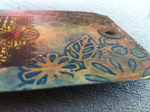
Zap it! Yes I said ZAP IT. Only until it rises up a bit like EP, once the sharp edges look raised and rounded like the picture above...then stop. Now keep your fingers off for a minute or two. It needs to set up. Once it has cooled, you won't be able to smudge it off as easily as before. *lightbulb moment* I sooo love that texture..wicked.
Technique 3: Stamping (3 methods)
OK are you still with me? There's a miracle.....bless you for sticking with me!
If you prepare a BG that got zapped and therefore the oily stuff sunk into the sucky paper.....(I hope no one is reading over your shoulder by the way....people just don't get craft-speak these days)....then you can now stamp an image directly onto it with ranger's archival ink.
You will need to heat set the image, and because the sucky surface is already 'oiled', it will take longer than usual for it to dry off. When the ink is dull instead of shiny looking you are done.
Now you can go ahead and add more pastel colour to the images (bottles HP1109, Lynne Perella images at the top) to boost or highlight the stamped designs where appropriate. {isn't this fun....i just soooo love this.... I have no idea why I'm loving it this much.....feeling a tad more excited than is acceptable...but i'm just trying to share the vibe...new products always do that to me} So you can see I have done the extra colour thing in the sample above.
TIP: If your black ink starts to travel then your pastels haven' sunk enough or your archival wasn't dried enough. More zapping should solve both.
METHOD TWO: Glaze then stamp...
OK more excitement (is that even possible....), because this uses the new PaperArtsy Fresco acrylic glaze.....you already know how easy it is to stamp on top of our fresco paint collection because of their matte chalk finish right- I mean you've been using our paint for a whole year already right?? Haven't you??
So what if you glaze the waxy surface and then stamp on top of the dried glaze, you will naturally get a sharper image because your archival ink will not bleed into the oil pastel....
To be fair the archival doesn't bleed much... see pic below, but the glaze will provide a barrier between the pastel and the ink, but you can't see it because 1 coat of satin looks exactly the same shiny-ness as waxy tag BG !!! *lightbulb moment*
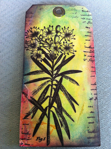
Well what are glazes? We have a satin and a gloss glaze. These are mediums that can be added to paint to change how glossy the paint is. So it's kind of like paint with no colour, just different degrees of shine. I also use it to make an opaque, chalk paint more translucent. Or to seal a surface as above. So now look at this close up of this extremely fine detail flower stamped (HP1109) on top of the satin glaze. And here's the really cool thing.....you can put more portfolio pastel on top of the glaze too, because our glazes have tooth! *that is another lightbulb right there*

METHOD THREE: Stamp First...

I figured you knew this already...but of course, your ink is even less likely to have any bleeding issues if you stamp a blank tag first with a bunch of Hot Pick images in archival jet black. Heat set thoroughly, like really, really well. And now you add colour to the stamped designs.
This way the colour matches the design, each colour 'owns' its appropriate spot, you can still zap, blend, zap, blend with heat, add shadows, blend colours .....
...... or you can use the pastels water-colour styley for a more delicate/subdued effect.....
(errrr I must confess I don't have a sample of that....I'm more bull in the china shop than delicate and understated).....but you go ahead...you do it!!

Right for my last trick I just wanted to show you how the fresco paints and the portfolios oil pastel also can work together. Happy families.
A Lynne Perella Image was stamped on top of the Freco Background, and parts of the image were coloured with the pastels.
Now I will admit that it's possible here I did water down some of the pastels either before of after applying the colour, but I also glazed over the top with about 3 coats of gloss to seal.
Layers of gloss glaze does make the very matte chalk fresco paint layers below 'pop' and look less chalky and more zingy.
This is good to know...if you want to give your paint a completely different look use gloss glaze! They will look far more vibrant than they do as a matte.....my paint chemist tells me this is because your eye picks up more colour when it's glossy than when it's matte because more zing is reflected back at the eye....well something like that..... Probs not quite the words he used....
I must have given this one away because I don't have it here to scrutinise further.
Right, that's your lot for today...plenty of things for you to try this weekend!
Do check out Lin Brown and Jo Firth-Young...they have both been using Portfolios and Frescos recently on their blogs. love what they both do!
If you liked the techniques in this post, please leave a comment. it's lovely to hear from you! have a fab weekend and I'm going to try to do some painty posting next week.


22 comments:
Thanks for sharing these techniques! i love these effects ... must get some of these pastels!! i love all your products!
Looks great fun will have to check them out
Happy craftin
Rebecca
Are you kidding, this looks great! Don't have those pastels, but I'm dying to get some. Thanks for the tutorials!
Thanks for sharing these techniques Leandra, and making me aware of another craft product that I need LOL
Thanks for all the techniques Leandra, can't wait to start having a go.......and thank you for all my lovely goodies received safely today.
Wow! those techniques are amazing - what a great product
Oh my, I'm definitely getting my Portfolios out this weekend. In fact no, I've just put them on my desk, so I will use them, I will!!
Thanks for so much inspiration Leandra :))
Helen xx
ooooooooooooh this is absolutely fabulous ! The colours are soooo bright !
Thank you for the tutorial, I shall have to get some of these and try them out!
Thanks so much for the info on portfolio oil pastels. Looks like a great must have product.
Thanks for pointing out the difference between these pastels and 'ordinary' oil pastels. I have some of those stuck in the back of the cupboard because I was so disappointed in them - can see I need the Portfolio ones instead. Love the vibrant colours in your samples - thanks for sharing all your experiments with us.
Thansk for the tutorials, much appreciated, massively inspired now, need to play! jo xx
I got to the smooth and sucky part and skimmed the rest. I've bookmarked your page because the tutorials look great. Thanks!
Hi Leandra, this is a brilliant post. Thanks for the great advice & tips. Your tags are gorgeous.
I received three lots of none water soluble oil pastels at Christmas and have had great fun melting them too, love my neocolour water solubles and not so tempted to move away :)
I know I would use up a soft pastel way too quick, but I can see the temptation to spend less if the finished product does not need to last decades...
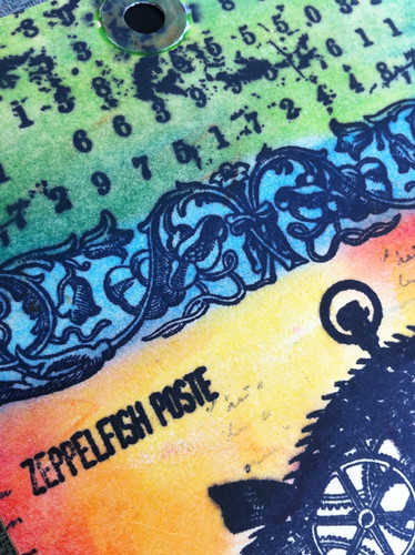
However, I will NOT be able to resist buying the zepple fish postie
superb image!
and a great tutorial- please do keep on sucking and smoothing...
Sheesh I was convinced I had left a comment on here the other day ... anyways what a fab tutorial Leandra, zapping and glazing have me hooked ... oops they just fell into my basket!! x
Fab post, Leandra. Thanks!
These techniques really caught my eye. With so little time to stop and smell the crayons that speaks volumes about how very wonderful these sticks are!! ooooooo's and ahhhhh's.
One more thing...how in the world do you find all this time? You have staff right? No husband? Kids? and a staff of 25? I'm in awe. and Thanks!
Great tutorial, I rushed and ordered these as soon as I read it, very unusual for me. Can you recommend a name of cardstock? I have a scrap on my workdesk that has worked great but I don't know what it is and I generally use coated card for stamping which is probably not 'sucky' enough. Thanks,
Lucy x
This is my second comment on your post as I was browsing your website yesterday and bought the Portfolio pastels, and some more Fresco paints, then I gave in and bought a Lynne Perella stamp plate as well.
Could not believe it when the Postman brought the parcel today - how quick is that. Rushed into my craft table, ripped open the package and opened the pastels - they are gorgeous and everything you said about them is right. Can't wait to get down to a good session with these and try out all y our examples.
Thanks
I have just found this post after reading a hint in the June 2012 issue of Craft Stamper that you had more ideas for these pastels. Thanks for that great info, I have had these for a month and love them but am sure I will love them more after trying some of your tips and hints.
I just bought some portfolios and your blog has given the very BEST information on how to use them. Thanks so much. I wasn't even considering using them with my stamps, just my journal but the images you shered changed my mind in a flash! Awesome!
Post a Comment