Saturday, 21 February 2015

2015 #3 Ledger Book Portrait {by Clare Lloyd PA Signature Designer}

2015 Theme 3: Fresco Paints

Hi Clare Lloyd here tonight with a portrait I painted using the brand new limited addition paints by JOFY. I am going to share a few ideas about how to using translucent paint in your art work to add depth both of colour and texture.


Step One:
Working in an old ledger book which had a page already covered in black gesso, I was brave and brayered a rough face shape using Buff Fresco paint and then used some Jade over the background using a Mini Brayer. I did my favourite baby wipe technique to rub away some of the colour through a Crafters Workshop stencil called Mini Susanas Arrows, plus also scraped through with an old comb to get a scratch effect.

Step Two:
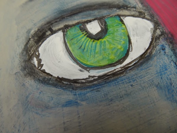
After sketching in some detail I added some more colour; Prawn for the hair, another layer of Buff on the face and some Jade for the eyes.

Step Three:
Now some ideas on how to use translucent colour over your art work...

Lips after a layer of Prawn and then a Snowflake highlight I added a layer of Cherry Red and did some simple sgriffito (scraped into wet paint with wooden end of a paintbrush). You will see the same effect using Limelight over Jade on the eyes and also with Tango on the hair.


Step Four:
To add some contrast shading to the face I used Southern Skies (a bright translucent), I applied this with my finger to be able to blend it really well. I did two layers of this shading in the end and used the left over paint on the background. 

Step Five:
The face needed to 'pop out' from the background a little more. So around the edge of the face, on the background, I added some Snowflake with a baby wipe and then rubbed through with a Crafters Workshop Mini Stones Divided stencil to wipe away some of the snowflake, leaving the stepping stones impression. 

And Finally: 
Of course there had to be some stamping and I used some of the fab new quotes, chevron elements from EEG02/EEG03 in black ink. 

I hope this project has helped to see how translucent paints can be used to enhance colour and texture in any project using Fresco Paints. Why not try that Sgriffito technique this week! 

Find my blog HERE and I am also on Instagram HERE.

Clare

What a great array of helpful tips Clare. I can only encourage people to have a go at faces, its so true, the more you do, the better you get, and often kooky faces have an unexpected quirky personality. It's probably better to try to restrain any expectation of what a face *should* look like. I've only recently realised, if you paint the skin in non-traditional skin tone face colours, like Clare has used the blues here, that there is less pressure for the face to conform to some kind of unrealistic perfection. I am really loving those faces that are painted in really bright lime greens, blues, purples, pinks etc rather than skin tones perfection we have seen lots of over recent years. So come on people, lets do kooky bright faces and throw caution to the wind, are you IN ??? Then show us what you can do in the challenge. ~Leandra

We would love you to join in with Challenge #3:Paint. If you are inspired by any of our guests who blog with us over these 2 weeks, then please join in and show us your painterly exploits HERE.

All links go in the draw to win a £50 voucher to spend on products of your choice from the PaperArtsy online store. The Paint link will close 17:00 (London Time) Sunday Feb 21st, winner will be announced 2 hours later at 19:00.

Friday, 20 February 2015

2015 #3 Art Plaque {by Alison Hall}

2015 Theme 3: Fresco Paints

Hi everyone, Alison here, joining you this evening with a little art plaque featuring Sara Naumann's new stamp set ESN14, and using some of the new blue and purple Fresco Finish paints. I've used a splatter technique with watered down paints on my background, as I love the random effect this gives.


Step One:
My base is a 6x6 inch Grey/White Board, on which I applied Grunge Paste through PaperArtsy Stencil ELB001. Once the Grunge Paste was fully dry, I painted the whole board with Chalk Fresco Finish Paint, a gorgeous creamy white, which is now part of the main Fresco range.


Step Two: 
I wanted to make some custom washi tape, so I laid a couple of strips of masking tape on my craft mat, then randomly brayered them with some of the new Smurf and Lavender Fresco Paint. I then used Versafine Onyx Black Ink to stamp the numbers image from ESN07 and the floral names from ESN14.
ESN07

Step Three:
On the background of the board, I partially stamped the script from ESN14 in a few random places, then used Ranger Multi Medium Matte to glue down some torn pieces of dictionary page and my wash tape. 
I then used a medium round paintbrush to flick some spots of watered down Glass Blue and Blueberry Fresco Paint all over my background. Looking lovely and messy now, isn't it?! Lol!

Step Four: 
Now to make the flowers. I used black Versafine Ink to stamp the flowers from ESN14 on a piece of white Smoothy Card, 8 small flowers and 3 large flowers. I painted the large flowers with watered down Lavender and Blueberry Frescos, 4 of the small flowers with watered down Smurf and Glass Blue, and the remaining 4 flowers with watered down Hey Pesto. The Hey Pesto flowers are going to be leaves. I didn't bother colouring the flower centres, as they'll be hidden.


ESN14

Step Five:
I cut out and layered up the flowers and 'leaves', using Glossy Accents to glue them together, then added some Prima Junkyard Snap Heads to the centres.

Step Six:
I sponged some Lavender Fresco onto a piece of White Smoothy Card, then stamped the Benjamin Disraeli quote from ESN14 with black Versafine Ink. I cut out each line and edged them with black ink, ready to be attached to my plaque.

Step Seven:
Now to put it all together. As you can see, I highlighted the Grunge Paste embossing, the flowers, Prima Snap Heads, and the edges of the plaque with Spanish Topaz Treasure Gold. The small two layer flower on the right has been raised up with a couple of foam pads, to give some more dimension. Here is an angled photo of my plaque which hopefully gives you an idea of the dimension of it.

I really enjoyed working with Sara's new stamps, the script flowers are just perfect for colouring and layering. I also love the new bright blues and purples in the Fresco Paint range, you can never have too many shades of blue in my opinion! I hope I have inspired you to get your Fresco Paints out for a play, and to join in with the challenge.

Alison xox
Inky Adventures

Thanks Alison, what a fabulous use of paint. Firstly the Chalk gives a beautiful base for all those awesome splatters, and we just love the faux washi tape. Full strength or watered down there are so many possibilities with paint. Those new blues and purples are just stunning used together. 

We would love you to join in with challenge #3: Paint. If you are inspired by any of our guests who blog with us over the fortnight, then please join in and link up your creativity HERE. 

All links go in the draw to win a voucher to spend on products of your choice from the PaperArtsy online store. The Paint link will close 17:00 (London Time) Sunday, Feb 22nd, winner will be announced 2 hours later at 19:00.

Wednesday, 18 February 2015

2015 #3 Repurposed Vase {by Wanda Hentges}

2015 Theme 3:  Paint

Hi everyone!!  Wanda here this evening with a post using the new Eclectica³ Limited Edition Set 3 paints.  I love these colors!!!  I'm using the Fresco Finish paints for the first time on glass to repurpose an empty flower jar into a vase with flowers to brighten these winter days. 


I started with an empty Prima Flowers Jar like the one below that still has some flowers in it. I removed the label (it wasn't hard to peel off) and lid from the jar and cleaned it very well.  I mixed caribbean sea with satin glaze and sponged it all over the outside of the jar.  After that was dry, I stamped with budding branch from ELB15 with Archival Ink aquamarine randomly around the jar drying each stamping as I went otherwise I know I would have smeared them. Next I stamped part of the dandelion head (ELB15) with bougainvillea paint around the bottom and finally I stamped the little group of 3 dotted circles (ELB15) with snowflake paint.  

I painted a scrap of copy paper with banana, dried it, stamped the quote (ELB06) with Archival Ink jet black, dried it and cut the words out.  They are glued to the jar with matte glaze.  Finally I decided to gloss things up by giving the jar 2 coats of gloss glaze allowing the glaze to dry between coats.  The twine wrapped around the top was white and I colored it using banana paint and water.  


For the flowers, to keep the stamping crisp I painted (banana, tangerine, bougainvillea) the smoothy card first and then stamped the flowers.  I created them in groups of 2 for stacking and I wanted 3 flowers. Using small finger dabbers made painting in circles easy starting with the center and working out changing the line-up of colors for each flower.  After drying the paint I stamped the flower (ELB16) with Archival Ink jet black and dried it.  I lightly stenciled with paint (banana, snowflake, bougainvillea) through sequin waste to get the circles pattern.  Finally I cut out each flower.


Here they are cut out and just laying stacked. 


For the stems I used 24 gauge craft wire.  I took enough to fold the wire in half and twist it. After twisting the wire, I wrapped tissue tape around it and then painted it.  I mixed caribbean sea and banana to get a really pretty bright green.  


I painted the back of each flower with banana and also three 1 1/4" punched circles of smoothy card.  I put each set of flowers together with a brad that I had painted with banana. The prongs were too long so I just cut them off, used a small hammer to get the prongs nice and flat and glued on the stem and painted circle with matte gel medium.


I bent each stem to create a leaf as shown.  I thought the 24 gauge wire would be heavy enough since I was twisting it but I was wrong, the flowers wanted to flop.  I took a piece of 20 gauge gold wire and wrapped it around the stem which also held the stem and leaf together.  I was actually glad they weren't heavy enough and needed the extra wire because I really like how it looks!!!  


I decided to added some Treasure Gold brass to the top of the brads to give a little more metallic to go with the gold wire.  I put some dried beans (I thought I had some glass pebbles but couldn't find them) in the jar along with the flowers to help keep them in place.


Here is a picture from the back. 


If you haven't painted on glass yet, you should give it a try, it worked really well.  If I wasn't careful (I have long, hard finger nails) the paint could be scratched off the glass but after the coats of gloss glaze it's very strong.  

Thanks for following along!!!!  


Wanda Hentges
Blog - Art By Wanda
Twitter - @WandaHentges

What a neat idea. Doesn't the paint go onto glass so well! Honestly, its sticks to anything that stuff!! Beautiful so bright, fun and cheery! Thanks Wanda for sharing another of your wonderful ideas!

We would love you to join in with Challenge #3:Paint. If you are inspired by any of our guests who blog with us over these 2 weeks, then please join in and show us your painterly exploits HERE.

All links go in the draw to win a £50 voucher to spend on products of your choice from the PaperArtsy online store. The Paint link will close 17:00 (London Time) Sunday Feb 21st, winner will be announced 2 hours later at 19:00.

Monday, 16 February 2015

2015 #3 Bright Upcycling {by Jo Myhill}

2015 Theme 3:  Paint

Hi everyone Jo here again joining you this evening with a post about using PaperArtsy Fresco Paints.Today I'm showing you a quick idea for up-cycling old tins and demonstrate how well PaperArtsy Paints go on any surface.


Step One: My husband has tinned Grapefruit every morning for breakfast, they are quite large tins and were begging to be "altered". First I gave them quite a few coats of white gesso to give a "tooth" for the paint to stick too.


StepTwo: Then it was deciding on colour schemes. This time moving away from my all time favourite neutrals I decided to go bright!  For the green tin I went all over with Cheesecake and a little bit of Limelight for highlights. I then flicked a mixture of Guacamole and Hey Pesto all over for some contrast splats.


Step Three: For the bottom of the green tin I added in a border of Guacamole and Chartreuse. Finally I added some splats of Prawn from the new JOFY Ltd edition Paints as a constrast and stuck on some pink buttons and wrapped a length of spotty pink ribbon around the middle of the can.


Step Four: For the orange tin I started the same with white gesso and then covered the whole tin in Yellow Submarine and wiped over Zesty Zing for some highlights. 


Step Five:  For the bottom of the tin I used Tango and the contrasting splats were in Blood Orange. This time I added some Prima flowers in yellow (cut in half and stuck with Matt Glaze) and some some yellow and orange check ribbon.


I have to say using these brights was a bit out of my comfort zone, but I'm really pleased with how they came out, the question is now what to put in them, I'm thinking my Treasure Golds, but it could be more buttons, embellishments, small posies real of fake.  I was also thinking of putting a whole through the back and hanging from a rail using butcher 'S' hooks.  You can never have enough storage!   

They were really simple to do and really quick and the new PaperArtsy colour families means you can easily pick out your favourite range of lights and darks and give it a go.  Old jam jars would look great as would baked bean tins or any other old container and what about tissue paper stamping instead of buttons, flowers and ribbon?

Now I have more Grapefruit tins and a whole stack of blue buttons, now where's that Smurf....?

Jo
Twitter: @jomyhill
Instagram: jomyhill

Thanks Jo for these fab quirky pots of inspiration, these would be useful in so many areas around the home and garden as Fresco Paints are ideal for all surfaces. Would like to give this project a go using the new "bright paints". Thanks for coming out of your comfort zone too :))


We would love you to join in with Challenge #3:Paint. If you are inspired by any of our guests who blog with us over these 2 weeks, then please join in and show us your painterly exploits HERE.

All links go in the draw to win a £50 voucher to spend on products of your choice from the PaperArtsy online store. The Paint link will close 17:00 (London Time) Sunday Feb 21st, winner will be announced 2 hours later at 19:00.

Sunday, 15 February 2015

2015 #3 Fun Girl {by Jo Firth Young PA Signature Designer)

2015 Theme 3: Paint

Hi everyone Jo Firth-Young here, joining you this evening with a post about decorating a box canvas using a mash-up of JOFY and Eclectica Clare Lloyd stamps.  As soon as I saw Clare's lovely girls I knew I wanted to create projects combining them with my flowers. This box canvas is the first of many projects to come I think.


On the project I used the Fresco Finish paints to:
  • block paint background colour
  • create a colour wash
  • paint detail (as watercolours)
  • stencil a pattern
  • paint on canvas, paper and wood
  • stamp a pattern  
The project is created on a 4x6 box canvas - I really like working on small box canvasses because the depth allows them to stand on the surface and give extra space for decoration.


I used the girl from ECL04 - a new set of Clare's stamps. 


I stamped the long haired girl (in Archival black) onto a page of book text that I had given a wash of Chalk paint.  I painted her skin in Buff.


I painted her hair in French Roast, and mixed it with Prawn to warm up the colour on some of the strands of hair.  I used Prawn for her lips and cheeks too.  Her dress is a mix of Bougainvillea and Prawn. (In this photo her skin seems a slightly strange colour but in real life she looks a much healthier!).  I tore the panel (using a ruler) to fit the box canvas, giving it a measurement of 6x12cm.


On the canvas I wanted her image to be in a frame - but I didn't have a suitable one and so I cut one in half, painted in several layers of Old Gold and rubbed White Fire Treasure Gold onto the surface for an extra bit of bling.


I rough painted the canvas in Caribbean Sea - a fabulous new colour in the latest Lin Brown Limited Edition set.


Then I dry brushed the edges with Snowflake instead of my usual choice of Chalk as I wanted the canvas to have a fresh rather than vintage tone.


Next I created a simple stencil.  I stamped the 'three circles' image onto scrap paper & cut out the centres of each - this created a bespoke stencil.


I stenciled Jade coloured spots randomly over the canvas - using copy paper allowed me to bend the stencil around the canvas.


I then stamped corresponding circles over the top and Snowflake zigzags randomly over the canvas - on the front and all sides. 
  

I used Matte Medium to attach the girl panel to the canvas, and used Cosmic Shimmer to attach the frame (I find that Cosmic Shimmer 'grips' the items together faster).


I stamped flowers from JOFY22 & 23 onto Smoothy card and painted in tones to contrast with the canvas (Bougainvillea, Prawn, Tangerine Twist), to make them pop.  I repeated with leaves from new mini JM46 (painted in Hey Pesto and Tinned Peas).  I cut them out and arranged on the canvas, sticking in place with Matte Medium.


I painted the space in the offset circle images in Pearl Glaze for a touch of subtle shimmer. 
I thought the girl needed some sparkle so I gave her a gem necklace, and added gems, buttons and pearls to the flowers too.
I looked at the canvas a couple of days after it was finished and decided the background needed a pop of colour so stamped lines of dots (JM46) and painted them with Prawn.


I like to put some kind of writing or phrase on canvasses and on the one I combined 2 of the phrases on ELC04  to create 'I just want to have fun' rather than 'girls just want to have fun' - I like how it makes this girly sound a little bit rebellious! I glued it to the top of the canvas so it isn't obvious when the canvas is viewed face on.


This was a fun project to create - I love how bright, fun and 'flirty' it is.  I encourage you to try box canvasses - they're not much bigger than a card and are really versatile.


Jo
You can find my blog at www.jofirthyoung.blogspot.co.uk, and twitter @jofyjo and I have a Facebook page www.facebook.com/JoFY.JoFirthYoung


Fantastic Jo, we love how bright and cheery the canvas is, a perfect mash up and so many awesome ideas you have introduced here too!!


We would love you to join in with Challenge #3:Paint. If you are inspired by any of our guests who blog with us over these 2 weeks, then please join in and show us your painterly exploits HERE.

All links go in the draw to win a £50 voucher to spend on products of your choice from the PaperArtsy online store. The Paint link will close 17:00 (London Time) Sunday Feb 21st, winner will be announced 2 hours later at 19:00.


....had you noticed this happened today....
Those of you who follow Jo and PaperArtsy on twitter will have seen there is another sneaky surprise Jo kept up her sleeve until today too!! She has some gorgeous new stamps to share that were released at the CHSI Trade show today in Birmingham. (This is a show for retailers only, not a consumer show)


Here they are...coming soon to your favourite PaperArtsy stockist!


JoFY 31
JoFY 32
JoFY 33
JoFY 34
Well done Jo, another series of fabulous stamps!