Friday, 3 October 2025

Christmas Cards with NEW JoFY minis {by Katy Norgate}


Hello everyone, Katy Norgate here with you today, great to be back again. As I write this blog, it is beginning to feel decidedly autumnal outside. I always feel a little sad that summer might be coming to an end, saying goodbye to the warmer weather, but then once I get my jumpers and wellies out and acclimatise, I love the cosiness and beautiful colour palette that autumn brings. Having said that, here I am jumping into a Christmas themed blog with some sparkle and brighter colours!! Boy am I getting my seasons confused LOL!

It has been my pleasure to play with these new Christmas themed mini stamps designed by Jo Firth-Young. Here we have a great mix of cute images, sentiments, as well as background stamps, making the whole set so versatile, whatever your favourite crafting desires are!

Here is a look at some of my finished cards, before I talk you through my process. It must be said that the idea for these cards is not my own, but that of Jo herself. She featured the process for making the masterboards and cards in a live video back in April, over on her facebook group 'JoFY Jamboree'. https://www.facebook.com/groups/1157026247969625 If you are not a member of this group, I can highly recommend it. I loved the design so much, I wanted to give it a go, and I felt these stamps, along with a couple of stencils, were perfect for the job. I hope you agree?


Here are the supplies I have used:

The 8 new mini stamp sets are JM89, JM90, JM91, JM92, JM93, JM94, JM95, and JM96 All now available from PaperArtsy Stockists


In addition I have used the border stamp from the new Christmas release JOFY144 (available from PaperArtsy stockists), stencils PS438 and PS477 (also available from PaperArtsy stockists) and the heavy weight PaperArtsy Smoothy Card stock (SCA4H). For a touch of Christmas bling I have used Fresco Finish Metallic Acrylic in Pewter (FF21)


I used Tim Holtz Distress Oxide Inks to create the masterboards choosing villainous potion, speckled egg, and pumice stone. I stamped images with Ranger Archival jet black ink. I heat embossed some sentiments with VersaMark ink and silver embossing powder. I used watercolour paints to colour the stamped images.


Firstly, using stencil PS436, the villainous potion ink and a stencil brush, I gently applied the ink, concentrating on the large stars, onto the cardstock (SCA4H). In places I went over the edges, but I wasn't too concerned about that .... Once all the other images are applied you really don't notice these minor imperfections!


Next was the turn of speckled egg distress oxide ink through medium sized stars using stencil PS477


I inked the small open stars JM93, using the pumice stone ink. I didn't use a stamping block so that i was able to just stamp  sections of the stamp.


Then it was time for the open star from JM91, the 'noel' from JM90 and the snowflake from JM96. For all these are mini stamps, Jo has packed in so many fabulous little additions.


Finally I added touches of PaperArtsy Fresco Finish Metallic Acrylic Pewter (FF21) through the small star, just for the obligatory touch of shine at Christmas!


Needless to say I didn't finish there; I had to try the same process in different colourways!! Here I have also used some PaperArtsy Fresco Finish Metallic Acrylic in Gold (FF20) through one of the stencils, on top of Tim Holtz distress inks twisted citron, salvaged patina, as well as a combo of worn lipstick and carved pumpkin. I really love each combo.


I have used the border stamp from stamp set JOFY144 to make complementary papers for piecing the papers together. I could have just as easily used JM92 or JM93 to be honest.


For the next step, I stamped and fussy cut the tree from JM94; the festive heart from JM90 and ‘Festive Fred’ from JM89. I used the regular weight PaperArtsy Smoothy cardstock (SCA4) for this, and then coloured them with my watercolour paints. 


Now it is time to bring all the elements together. I gathered complementary coloured card for mounting. I began cutting the masterboard to size for various card shapes; and then started arranging and building my layouts.

I stamped and heat embossed the stamp JM95 with silver powder onto the coloured card stock. See also, in the image below, how i have made the tree taller by combining 2 cut out images.


I utilised some of the smaller leftover pieces to collage together strips of masterboard and coloured card for this card


And so there you have it, after obligatory additions of stickles glittery magic, several Christmas cards are made. I have really enjoyed making cards using these mini stamps, they are so adaptable. Jo has clearly thought very carefully about these designs and how they complement previous releases so well too. For this reason alone I think they are such great value to have in your stash. I could easily make all my Christmas cards with these since the process is so simple, and condusive to batch making, and with many options for colour combinations too.

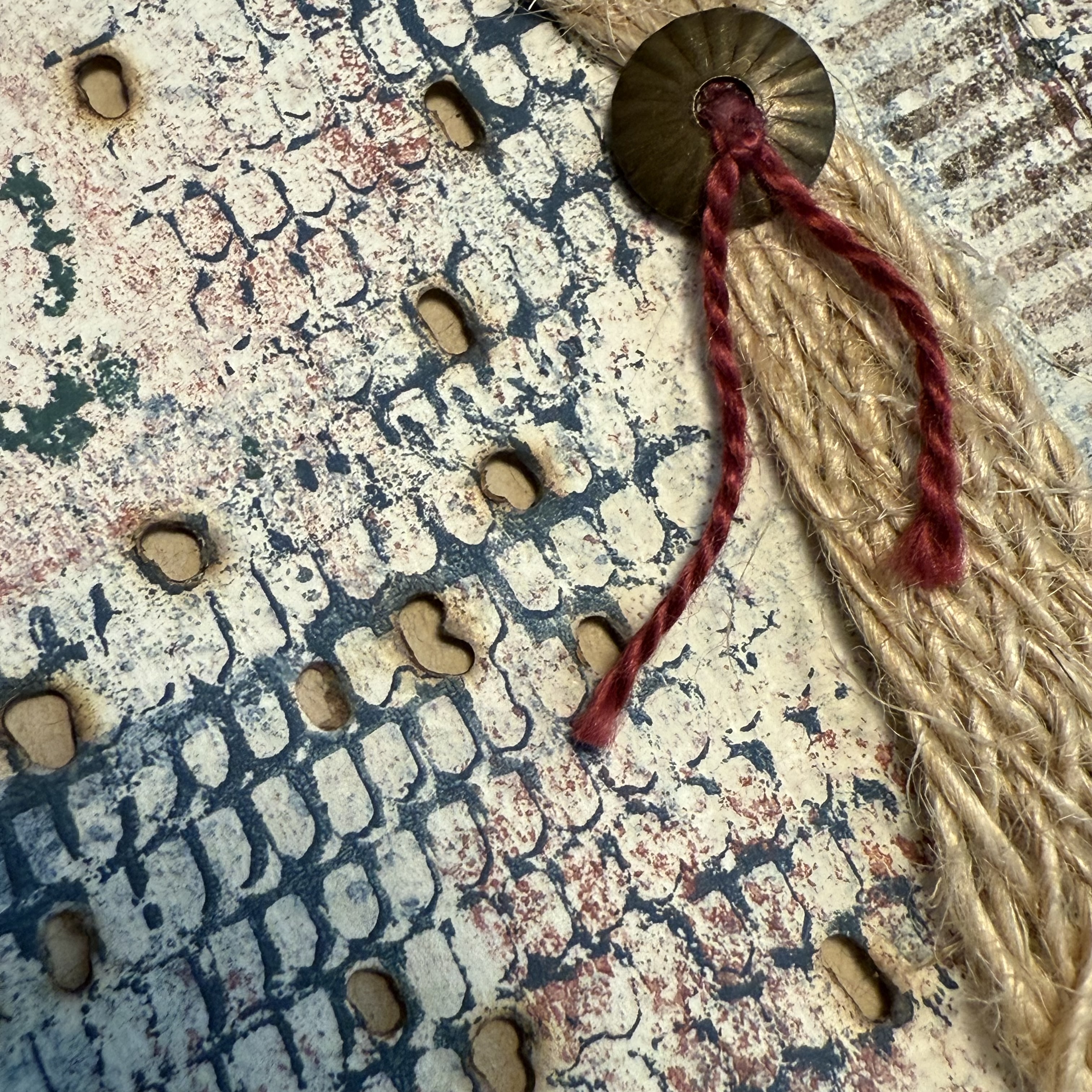
Here are some closeups of the cards I have made so far, including some of the additional colour mixes. I hope you like them, and many thanks for looking x


Facebook: Katy Norgate
Instagram: katy_norgate
Pinterest: Katy Norgate

Wednesday, 1 October 2025

Art "Zine" Booklet with NEW Seth Apter minis {by Ann Barnes}

Hi everyone, it is Ann (@aksbarchitect) here with you today and I am so excited to share this art booklet I created with the newest Seth Apter Minis for PaperArtsy.

I was thrilled to learn that I would be creating something with the newly released mini stamps from Seth Apter for so many reasons; the main one being that I am a huge fan of Seth's art and style, which is always evident in his stamp designs. When I received the set of eight mini stamps, I was not disappointed! They are perfect for incorporating into backgrounds as well as becoming focal images in your artwork.

Today I'm looking forward to sharing with you what I created when I allowed myself to simply play and experiment with these stamps.


I have so many ideas for creating with these stamps, and wanted to create a sort of art reference book for how they each initially inspired me. Something that I could refer back to as well as expand upon.

I created the entire booklet as one large (albeit divided) page, and it was so cool to see how all of these stamps worked together. When the page was folded into the booklet form, seeing each stamp image highlighted on its own was the crowning glory.


The main supplies required for this project are a sheet of heavyweight drawing paper, as well as all eight of the new PaperArtsy Seth Apter Mini Stamps (EM137, EM138, EM139, EM140, EM141, EM142, EM143, EM144). I thought it would be fun to also use a few of the newest PaperArtsy Fresco Finish Chalk Acrylics by Seth Apter: Admiral (FF233), Kiln (FF234), and Castleton (FF231), as well as one of my all time favorites, Heavy Cream). You can find the newest products at a PaperArtsy Stockist.

Once you begin to play with the stamps and envision different ways to embellish them, you can grab your favorite go-to supplies. I used some coordinating embroidery thread, some jute and also some weathered gold mixed media embossing powder inspired by Seth Apter for WOW!


To make the zine booklet you only need one piece of paper. The overall size will depend on how large or small you want each of the individual pages to be once it is folded as well as the number of pages. For this booklet I wanted to create ATC sized (2.5" x 4.25") pages. I found some tutorials online for creating a 14 page zine and adapted to accommodate for size. A 10"x17" piece of paper worked perfectly.


I begin by folding and tearing the paper to become the zine; however, I do not create the actual booklet until I have all of my pages completed. This allows the sheet to remain fairly flat for ease of stitching and embellishing.


I add my first layers of color with a brayer along each of the fold lines. Working with one color at a time I add thin layers of color randomly across the page to build a background. I also use a sea sponge to add dabs of opaque color. You can add as much or as little paint as you like, and if there are areas that you are not happy with, you can always add a layer of heavy cream to soften what you have, then build up once again.


The beauty of using the PaperArtsy Fresco Finish chalk acrylics is that they are fast drying, meaning creating layered backgrounds does not mean you spend all day waiting for the paint to dry. 
I love the look of the background I have created, and can't wait to begin working with the stamps on it.


Before working on each individual "page" it is a good idea to fold the zine back into booklet form and mark the covers and each page in the bottom corner. Once they have all been marked, flatten the page back out. You will notice that each row of pages falls in the opposite direction. This means that as you design your pages, especially if you are adding any words or directional images you want to pay attention to where the top and bottom of that page is located to ensure everything is positioned properly.


At first glance, many of the new mini stamp images had me envisioning textiles, stitching, and even mesh. This vision was the basis for my cover. I mask off areas of mini stamp EM137 and then stamp onto a scrap piece of specialty paper. Once the ink is dry, I use a dark green embroidery floss to mimic the stamp marks. Before adding this stitched piece to the cover, I dip the stamp into Fresco Finish Chalk Acrylic Castleton (FF231) and add partial stamping randomly onto the background.


When the stitched piece is added in place, the imagery from the partial stamping and the stitched piece play off one another, drawing your eye around the page.


The next pages focus on mini stamp EM138, which gives the appearance of linen cloth. I love the subtle diagonal pattern that evolves when you repeat the stamp pattern. For these pages, I brayer Fresco Finish Chalk Acrylic Castleton (FF231) onto the rubber stamp and stamp onto the background, repeating the process, eyeballing where the repeating pattern should occur. The pattern and texture it creates reminds me of a piece of linen fabric I have.


I cut a diamond shape out of the cloth and add it in place of one of the stamped diamonds. A piece of deep red floss accentuates the diagonal lines created by the repeat stamping.


Throughout the pages I have used mini stamp EM144. On some pages I have heat embossed it directly on the background, on other pages I have stamped it separately and cut out a rectangular section then collaged it onto the page. I think this stamp would also make a great edge detail when stamped partially down the side of a page, or even as a color swatching chart.
 I can see myself using this stamp often.


The next set of pages focus on mini stamp EM139, and all I can say is that this image sets my imagination into overdrive, I love it! Using Fresco Finish Chalk Acrylic in Admiral (FF233) I randomly stamp across both pages and allow it to dry. Then I use my wood burning tool to burn some holes keeping within the pattern.


I keep the number of burnt holes to a minimum, but I can foresee a time where I attempt to create this entire mesh pattern. To allow the holes to be more noticeable when the booklet is folded, I painted the back side of the pages they would be up against. There are also sections of the stamped pattern that were heat embossed onto a different paper then torn into strips and collaged onto the page.


Mini stamp EM140 looks to me like the perfect structure for weaving. I heat emboss the entire stamp image onto the background and then use an Exacto knife to cut out openings in the two larger middle sections. This allows me to weave embroidery floss, jute, linen thread and a piece of selvedge through the slots.


It is so cool to see my vision for this stamp become a reality. Probably my only regret is not adding color to the pages that it backs up to so that the openings where there was no weaving would be more noticeable. On the facing page, I stamp little bits of the image randomly to add some interest to the background. I also collage one of the embossed rectangles from EM144.


On the next two pages, the focus is on mini stamp EM141. This image with its numbers and fine lines is what I consider classic Seth Apter imagery. I think this stamp would be fun using each of the numerals separately (with masking), or even highlighting a specific number by circling it once stamped... the possibilities for this stamp really are endless. On these pages, I first stamp the image onto the background with Ranger Archival ink in Faded Jeans. I also stamp the image on a piece of tracing paper using the same ink. I flip the tracing paper over and collage it onto the left page, creating the mirror image. Using a fine detail brush, I cover the number four on both pages with embossing ink and then heat emboss. I also trace some of the horizontal lines and emboss those as well. Adding details and marks to make stamped images more of your own is definitely something I try to do often and encourage you to also, it makes the art and images more personal and unique.


At the page fold, I have used mini stamp EM144 to create a vertical line of boxes. Inking up two rows of the stamp and turning it ninety degrees, I stamp and emboss, then add the third row by only inking the first two boxes and stamping then embossing. I stitch red X's into three of the rectangles and cut pieces of my linen cloth to fit into the remaining ones.


Each time I look at mini stamp EM142 I see it as a three dimensional piece, so I thought it would be fun to try to make it into one. This is not as difficult as you would think. Stamp the image with embossing ink and add a heavy coating of embossing powder to it. After heating it and allowing it to cool, use an Exacto knife to carefully cut out around the edges. Next, turn the cut piece over, add embossing ink, coat that side in powder and heat set it. Voila!


The piece is held in place on the page with a few stitches. I can imagine myself using this stamp and technique to make a buckle for a strap to keep an art journal closed, or maybe even in some sort of jewellery piece.


On the opposing page, I ink up only the central section of the stamp and create bold lines These are embellished with marks and French knots. I also add a few more pieces of the collage paper from EM139.


The final pages of the booklet are all about mini stamp EM143. The focal point is a piece of linen that has the image stamped in its entirety. This piece is attached to the background and then I use different threads to stitch the pattern. At the top right and bottom left corners of the pages I mask the opposing directional section and stamp an "L" shaped portion of the image using Fresco Finish Chalk Acrylic Kiln (FF234).


While both corners are stamped using the same paint, one is much bolder than the other. This creates a very different look even though it is the exact same stamped image. 
With all of the pages complete, it is time to fold this Zine into a booklet and glue the pages together as needed.


I am thrilled with how the booklet turned out. This will be a wonderful reference for inspiration and ideas when I use these mini stamps in my art. Here are a few additional detail pictures:


Using your art supplies to make a Zine is an easy way to have some fun and experiment with different techniques. Since it is simply made with a single sheet of paper, there is not a lot of pressure or expectations for a masterpiece. I have always found that some of my favorite work has been the result of enjoying the process and letting my creativity express itself.

I hope that maybe this has inspired you to get out some of your favorite PaperArtsy stamps and play, perhaps even grab a few of Seth's new mini stamps, they are all pretty amazing! You can find all the details for this release of Seth's mini stamps on the PaperArtsy blog here. The new stamps are available worldwide at a PaperArtsy stockist near you.