Sunday, 26 November 2017

2017 Topic 18: Torn,Ripped and Burnt {Intro and challenge}

 2017 Topic 18: Torn, Ripped and Burnt

Scrapperia
Welcome to a new topic everyone, Darcy here to talk about our latest theme. This fortnight we will be looking at ways to distress art work in very specific ways, using tearing, ripping and burning. 

Before we start, let's see who won the Topic 17: Shades of White Challenge...

The winner is: Gail from Crafty Nomad


Email Darcy to claim your prize. Darcydotneedles@gmail.com


As is often the case, the techniques we use in our art stem from ancient techniques, and paper tearing is no exception. In the 11th century the Japanese were tearing paper, usually handmade, and creating pieces of art. These pieces were quite delicate and often resembled watercolour paintings, known as Chigiri-e they had calligraphy over the top. 

Barbara Hamer
Moving forward to the 20th century saw Pablo Picasso and Georges Braques coin the phrase 'collage' 

Picasso

Here is a modern collage, beautifully executed, all those ripped pieces forming these gorgeous otters. Choose your pieces based on colour and scale of pattern. 

Dawn Maciocia
We also use tearing and ripping as a way to distress and interest to edges. This lovely Christmas layout has been made much more dimensional because of the paper edges being torn. 

Basic Grey
These layered Christmas cards use torn edges too mixed in with cut edges, it really does pay to mix them up the torn edges make for wonderful shapes. 

Michelle Wooderson

Torn paper makes a great mask or stencil, Barbara has used a torn scrap of paper here on her gelli plate, the paper stops the paint in that area from reaching the cardstock, resulting in this negative space with interesting edges. 


Barbara Gray

Similarly, Eileen has used a torn paper mask to create the landscapes on this tag. You could also use the edge of this stencil PS030

Eileen Godwin

Here is another way to layer up your torn and ripped edges, as different sizes of pages these make a really interesting and tactile art journal, each page gives a glimpse beyond to the next page. 

Gracie

Torn edges also look great in backgrounds, wash a little diluted paint over the edges just to blend them a little. 

Claudia
Another great background, this time the artist has torn lovely stained teabags and layered them over text, as the teabag paper is translucent the text shows through. Follow the link to see how she added sketching and stamping over the top of the teabags to create a beautiful piece. 

Becca Kirkland

Torn paper can be combined with drawings , fabric and stitching to create free hanging pieces of art. 

Philippa Leith
This piece was created on torn corrugate card, itself having the surface torn away, this was done by an Alevel student. 

Matravers
Another piece, torn, stamped, folded, layered and stitched. 
Miss Stitch Therapy

Our own Jo Firth Young loves torn corrugate card, she turns it into the most beautiful pieces of art. 


Jo Firth Young

I think my favourite ripped piece has to be this dog, ripping fabric is just so satisfying, and it creates wonderful raggy edges, use them to wrap around books or loop through the tops of tags, use ripped fabric to make flowers or just to layer up. leave all those loose threads hanging, they look great. 

Barbara Franc
This simple piece introduces burning, along with the clean white card and glimpses of gold leaf this looks so fresh. This has been done using a blowtorch and a branding iron, but you could achieve similar results with a soldering iron or a wood burning tool. 

Kelly O'Brien
This piece is 4 layers of Abaca paper,( this is a plant fiber from the banana tree) the holes are made with a soldering iron. 

Karen Margolis
For a rustic Christmas how about making these wood burnt snowmen. 

Burnwood Creations
I love this piece, so sculptural but yet delicate with its singed edges. 

OsikDesigns

I wasn't sure at first about singed clothing, but the more I look the more I like this, how could you incorporate this idea into your work? perhaps singed layers on a book cover or on the dress of a doll, or even singed fabric pieces on a card. 


Judith Orshalimian
A great way to add a burning technique is to simply use your heat gun, if you hold it over paint long enough it will bubble and blister and singe. Do be very careful, do this in a ventilated room and do not allow the artwork to set alight. The blisters which are then raised can be brushed over with Treasure Gold to highlight the texture. 


Andy Skinner
Heat guns can be used on fabric too, you can burn through dried out baby wipes, through sheer fabrics, through tyvek, so many ways you can experiment with burning. 

This sample is layers of tyvek stitched and zapped with a heat gun. 


Kim Thittichai

I just had to finish with this burnt offering, how many of us have burned toast, everyone right?but have you ever made a portrait with your burnt toast?


Henry Hargreaves


Summary....  Have fun!

Don't forget to follow Darcy and Leandra's Pinterest boards if this topic pushes your buttons, you will see plenty more examples to whet your appetite there! 
I am really looking forward to seeing what you create over the next 2 weeks!

~ Darcy


We hope that you  learn something interesting from our blog. Our bloggers deeply appreciate your comments so much, so please take time to let them know you've been inspired! Why not join our challenge by blogging your interpretation of the current topic and link it here?

The current topic link will close 17:00 (London Time) Sunday, 10th Dec 2017, and the winner will be announced 2 hours later at 19:00.

All links go in the draw to win a £50 voucher to spend on products of your choice from the PaperArtsy online store.


Challenge Guidelines

  • The challenge is a for you to show how you are inspired by the current blog topic. We encourage you to play with us and explore your personal creative style.
  • Please mention which PA blog post inspired you and and why (link directly to that post). Please don't link to the home page of your blog because then no-one can track back to easily find the original post.
  • We prefer your challenge blog post is created exclusive to our challenge, but if our topic fits perfectly with another challenge, then you may link to both if appropriate.
  • You are most welcome to use stamps/ products/ substrates you have to hand from a variety of companies, we do not expect you to exclusively use PA products - it's lovely when you do though!
  • You can enter as many times as you like. We don't want to restrict your creativity! 
NB. Link closes at 17:00 Sunday 10th December  (London Time)

Prize: The winner will receive a £50 credit voucher to be redeemed on the PaperArtsy Website. The credit voucher includes VAT and postage. We request that one of your purchases is an A5 rubber stamp. You can add any other items to your basket, but the final total should not exceed £50. It's your responsibility to claim your prize coupon from Darcy. 
email: darcydotneedles@gmail.com

NEW Challenge/ winner: Each fortnight on Sunday, the winner will be announced at 19:00 (London time). In the same post, the link for the next fortnight will be posted. 

Good Luck! If you have any questions, don't hesitate to ask!

Saturday, 25 November 2017

2017 #17 White: White Odyssey with ESN {by Florence Adam}

2017 Topic 17: Shades of White


It's the lovely Florence from France back to share how she built up a beautiful background with elements, textures and stamps! Enjoy!

Hi everyone, it's Florence and I'd like to share my shades of white piece with you.

I was really fascinated by the subject of “shades of white”, however when i was faced with the thought of designing something based around the subject, my thoughts strayed as I was  confronted with some strange and challenging philosophical questions. What is the colour white? How many shades are there? Is white really a colour? Staring at my empty and white board I wondered: “Is this work already finished?”.


I was inspired by Ivy Newport’s work and decided to create a collage with old papers, like music partitions and books (apologies to the books). I then applied a soft layer of white gesso, trying not to cover everything, I find that this gives the background a refined feel as you can see through the old book paper prints.


Once I had my background done, I've jumped straight into the layers, texture, volume, and 3D parts!! Sterile gauze, buttons, sand, micro beads, feather, threads, sardine can opener, anything you have will do the job!


Eclectica³ : Sara Naumann - Set 21 (ESN21)

I embossed my dragonfly with white powder on tracing paper, so it looks frosty.


I stamped with Jet Black Archival ink the beautiful dragonfly designed by Sara Naumann. Then I used some puff paint around the piece, this crazy paint is really fluffy under the heat, creating a perfect 3D effect. This small piece will actually be my focus point. To make it more interesting, I used UTEE powder to create a glass effect.


It's never easy taking good photographs of a normal project, but it's a nightmare when you need to take a good photograph of a white project!


I hope you will enjoy this piece, make your own one and be creative!! It's been a while since I wrote a blog, it was nice to be back again!

Blog: mlledantan.canalblog.com
Facebook: Florence ADAM
Instagram:mlledantan
Pinterest: Florence ADAM

Wow, this is gorgeous! I am loving how everyone is exploring the white texture vibe so perfectly. Love those the puffy effects too!!


We always hope that you  learn something interesting from our blog.

Our creative team love to read your comments so much, so please take time to let them know you've been inspired! 

Why not join our 2-weekly challenge by blogging your create response to the current topic and link it here?

The current topic link Topic 17: White will close 17:00 (London Time) Sunday, 26th November 2017, and the winner will be announced 2 hours later at 19:00.

All links go in the draw to win a £50 voucher to spend on products of your choice from the PaperArtsy online store.

Friday, 24 November 2017

2017 #17 White: 'Ladies of the Forest' Triptych with LPC {by Chris Cresswell}

2017 Topic 17: Shades of White


When you build textures, and apply some white paint to soften, everything looks gorgeous! Add some Lynne Perrella stamps into the mix, and Chris has a truly lovely interior decor piece!


Hi everyone, it's Chris Cresswell from loopsandlines.blogspot.co.uk with you today, and I'd like to share with you my triptych canvas, Ladies of the Forest, using a few of Lynne Perrella's fabulous stamps designed for PaperArtsy. 

I must admit that this was a huge challenge for me. I usually work with a lot of colour and bright colours too! I generally shy away from neutrals and monotones although I really admire those artists, like Lynne Moncrieff, who prefer to work within a minimal colour palette. However, as soon as I brought Lynne Perrella's images into the mix, ideas began formulating. Now, I am very much a 'process' person. I have a vague idea of what the final result should look like but I generally don't plan beforehand how I'm going to get there. Sometimes the end result is a bit of a surprise - as this was!


My first intention was to create some 'white on white' Christmas cards, but as I started collecting various products in different shades of white (for someone who loves colour, I seem to have a surprising amount), a mixed media project was increasingly calling out to me. Then I came across a long piece of cardboard packaging and I knew that would be perfect for the base. After that, everything just fell into place. 

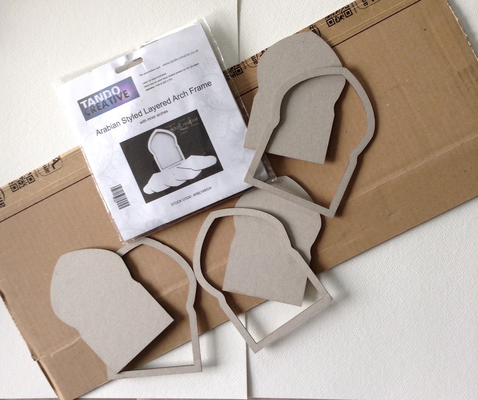
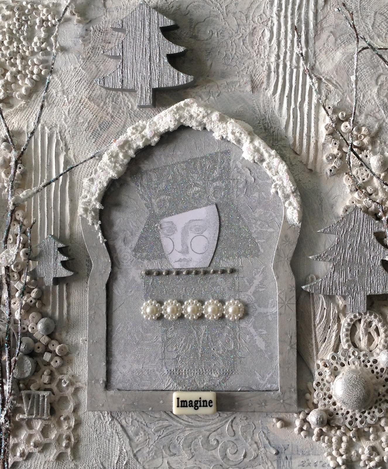
A lover of the rule of three found me rummaging through my stash of wooden arches to find three that would be the right shape for the stamped images I knew that I wanted to use and also be large enough to spread evenly across the base. 


What followed was a series of process steps, some of which proved entirely unnecessary; such is the problem of not having a clear plan in mind! I tend to make decisions as I go along and invariably find myself thinking, "Oh I didn't need to do that". However, I do find myself following a similar pathway as I approach each project: gesso, collage, paint. One clear plan, however, was to keep to different shades of white and introduce metallic silver at different points for gentle contrast. As this would be a Winter scene, there would also be added glitter!


I covered the entire base and (quite unnecessarily as it transpired) the arches with an assortment of delicious papers and tissue stock from my stash, gluing and sealing everything with gel medium. As the final layout would essentially be white, I wanted elements of the collage to peek through the various white layers at the end. I started by painting over this collage base with a very watered-down Snowflake Fresco Chalk paint in order to make it more translucent. However, I realised that this was too bright for the more 'vintage' feel I was after, so this was quickly followed with a layer of Nougat Fresco Chalk paint, similar to an Antique white. Perfect. Now, an idea of where this was going began to take shape in my mind.  


I had no problem choosing three stamp images for the arches as these are my all-time favourites: LPC008, LPC018, LPC028.


This is an example of having taken an unnecessary prior step as I now changed tack and decided to stamp the images onto the top, thin layer of a silver and white, snowflake-patterned serviette. The images were embossed in silver as I wanted them to be quite subdued. However, the faces were not prominent enough so I 'borrowed' an idea from Lynne Perrella herself (True Colours, Somerset Studio publication, p.14) and stamped the faces onto PaperArtsy Smoothy card, again in silver, cut out the faces, and glued them on top of the first images. Much better. The frames were first painted with Pewter Fresco Chalk paint then stamped on top using Encore Silver ink by Tsukineko. 


Creating the focal images and adorning them with beading and Ranger's Liquid Pearls was relatively easy, especially as the pattern on the serviette added interest behind each figure. I spent much more time deciding how to compete the space between and behind the arches, rifling through my stash for inspiration. 

The result was a mixture of corrugated board, beads, ceramic 3D balls (Powertex), lace, voile and texture paste through a stencil. I painted over everything, first with a thin layer of gesso, then another layer of Nougat. I was liking it more and more but it somehow felt 'empty'. I am used to crowded, busy, colourful scenes. This was too tranquil!


The little wooden trees were painted with DecoArt Metallic Silver and I have added DecoArt Snow-Tex to the arches and the twig/trees. Three word tiles were added to the frames before adding final touches with 'Treasure Silver',( to highlight the texture paste) and lots of Ranger's Crystal Stickles!


I also added Treasure Gold in Silver (Connoiseur Art Studio) to the larger beads and glass domes that I had previously painted over with Nougat. The 'Trees, though lovely and twinkly with snow and glitter along the 'branches' needed something trailing through them. I deliberated about hanging little stars from them before finding a lovely string of pearls (courtesy of a Goodie Box from Artful days) that I was able to wind through and around the 'branches', resembling little fairy lights. Now it was looking magical. My ipad camera doesn't do justice to the pretty effect of this as the nylon 'string' is very fine.


This challenge has taken me far out of my comfort zone but I have really enjoyed the journey. Perhaps you have also backed away from what at first seems to be a limiting challenge, but I do encourage you to have a go. The limited colour palette actually gives you a sense of freedom to really explore just what is possible with different shades of white - of course, the addition of silver broke the rules a little, but that's what makes each of our projects unique. Until next time...

Blog: www.loopsandlines.blogspot.co.uk
Facebook: Chris Cresswell
Twitter: artmadnana
Instagram: artmadnana
Pinterest: Chris Cresswell

Oh my, this looks fabulous! Thank you so much for sharing your small details that bring it all together! I love the textures in between the each of the frames too and the glitter and silver accents are stunning! What a lovely wintry project! Superb! ~ Leandra 


We always hope that you  learn something interesting from our blog. 

Our creative team love to read your comments so much, so please take time to let them know you've been inspired!  

Why not join our 2-weekly challenge by blogging your create response to the current topic and link it here?

The current topic link Topic 17: White will close 17:00 (London Time) Sunday, 26th November 2017, and the winner will be announced 2 hours later at 19:00.

All links go in the draw to win a £50 voucher to spend on products of your choice from the PaperArtsy online store.

Wednesday, 22 November 2017

2017 #17 White: Christmas Ornaments with Squiggly Minis {by Ingrid Vichova}

2017 Topic 17: Shades of White


Our bloggers seem to be loving the shade of white challenge, even if it does seem a tricky idea at first, they certainly get on a roll! Ingrid is giving paper clay a whirl in this post!!


Hi everyone, it's Ingrid with you today, and I'd like to share with you my take on the 'Shades of white' theme. At first, I thought, my Goodness! All these gorgeous Fresco paints and you want me to create something white?! And then I thought, why not! I like to challenge myself and in the end the biggest challenge of all was to take the photos of the all white thing. The creative part was super fun! I kid you not, it took me three days to get some decent shots. Even with my studio lights it is a challenge on a dark rainy day. 

I always think of how I can stretch my stash and how I can use it in other than the obvious ways. I have already done stamping in the PaperArtsy Grunge Paste so I wanted to push it even further. I got my paper clay out and it all went from there... 


I'm no expert on paper clay and I use it mostly with molds to make frames and other embellishments for my mixed media art. I never tried stamping on it before so this was more of an experiment. I knew I was going to stick to whites so I needed a bit of a contrast as well as to protect my stamp a bit so I used the Ranger, Wendi Vecchi, Archival Ink in Shadow Grey before stamping into the clay. Is that cheating?:) 


I highlighted with Snowflake paint and then it was too fiddly so switched to a white Sharpie. Is that cheating again?! :) I'm doing really well, apparently.. LOL! Guess what though, I discovered you can use the sharpie as a base for heat embossing so my raised areas were suddenly shiny! Ha! 


As you can see, I added more interest and sparkle to my background before I found these lovely berries and snowflakes. The music sheet was confiscated from my partner. He's a musician, but it's not like he needs it more than I do, right?  


I couldn't stop playing with the clay. The stamping into it became rather addictive. 

Squiggly Mini 26 (SM26)
Squiggly Mini 25 (SM25)
 Suddenly, I wasn't just making a wintery card with a cute clay cat embellishment. I made so many I turned them into some ornaments too. I stamped and cut them out and left them to dry. I came back and nearly keeled over! Not because they were so cute! Because they slightly curled. So, learn from y mistakes and put something over them to keep them flat. I have an obsession of solely decorating 'my' Christmas tree to nothing but a perfection. These, my dears, will be decorating my daughter's spare tree in their bedroom. LOL! But anyway... it's an idea that counts. 


And there you have it! Why not use your rubber stamps in new innovative ways! You could swap the clay for a lovely melted embossing powder to stamp in. It's the same process and it's quick too! Try it and make your own embellishments too! The best thing is that you have a vast number of fabulous stamps available from the PaperArtsy shop. You don't have to used the Squiggly Mini 26 or the Squiggly Mini 25 to create these fun embellishments and ornaments. Have a browse to see what catches your eye and treat yourself to an early Christmas pressie. Just don't tell your husband!:D 

Have fun and stay creative! 

Ingrid xxx 

Blog: Ingrid Kristina V Designs 
Facebook: Ingrid Kristina V 
Twitter: https://twitter.com/ingridkristinav
Instagram: https://www.instagram.com/ingridkristinav/
Pinterest: https://www.pinterest.co.uk/ingridkristinav/

I'm happy for you to get in touch, if you have any questions! 

Being challenged seems to always take you in an unexpected direction! This is fabulous Ingrid, and I'm fascinated by the Shadow Grey ink with the sharpie!! Awesome result! Thank you for such great exploration!


We always hope that you  learn something interesting from our blog. 

Our creative team love to read your comments so much, so please take time to let them know you've been inspired!  

Why not join our 2-weekly challenge by blogging your create response to the current topic and link it here?

The current topic link Topic 17: White will close 17:00 (London Time) Sunday, 26th November 2017, and the winner will be announced 2 hours later at 19:00.

All links go in the draw to win a £50 voucher to spend on products of your choice from the PaperArtsy online store.

Monday, 20 November 2017

2017 #17 Winter Wonderland with EEG by Anneke de Clerck

2017 Topic 17: Shades of White


Another of our regular bloggers has created a pop of soft colour in the background of her white composition. And it looks beautiful of course - its the lovely Anneke!

Hi everyone, it's Anneke with you today, and I'd like to share a wintery 3D scene that I made for the current 'Shades of White' topic. I love creating small dioramas in shadowboxes or mason jars. I enjoyed the process very much although the colors ( is white a color ?) were quite a challenge for me. As you know I'm usually going for bold and bright colors. 
Below I'll share some tips on how to start a project like this.


Shades of white...this topic during this time of year asks for a wintery landscape doesn't it? I knew immediately I wanted to do a diorama. 


First I'll tell you how I started. If I have to do a 'big' project for a challenge I'm often making a moodboard. I looked through my supplies and gathered embellishments and other stuff in white, off white and cream. Not everything what you see ended up on the project but looking at this improvised moodboard gave me instant inspiration.


Next I went through my patterned paper supplies for 'shades of white'. Then I looked for matching PaperArtsy Fresco Finish Chalk Acrylics. To my surprise PaperArtsy has lots of 'white' paints in their collection! From the left to the right: Concrete, Nougat, Buff, Snowflake, Chalk and Honey Dew.


I wanted to mix papers and paints for both background and trees. Finally I've chosen to work with Chalk, Honey Dew and Snowflake Fresco Finish Chalk Paints. These 'whites' matched best with the patterned paper.


I worked on a paper panel that I trimmed to the size of the shadowbox. I punched 47 inchies out of patterned paper and used 10 cm wide double sided adhesive tape to attach the inchies. As you can see on the photo I laid a pattern out first before glueing everything down. I'm never creating an inchies background randomly. I'm always going for a nice balance between the different colors/patterns.


I overstamped the background with a circle stamp from the EEG15 stamp set using Snowflake Fresco Finish Chalk Paint.


To decorate the trees I used small stamps from different EEG stamp sets: EEG07, EEG14 and EEG15.


I've cut triangles out of patterned paper and added a wash of PaperArtsy Fresco Finish Chalk Acrylics on top. I stamped with small stamps from EEG14, EEG15, EEG07 using Versamark ink and heat embossed the prints with WOW embossing powder Opaque Bright White. I glued the trees on 340grs stamping card to make them more firm, added tree trunks and used 3D tape to attach the trees. 


On the tree in the middle I applied Golden Glass Bead Gel. After drying the gel becomes translucent.
To decorate the shadowbox I used a few products from the Tim Holtz Ideo-logy collection: a tree, a decorative dome, a few deer and a typed token.


I wrapped some of my favorite fluffy yarn around the shadow box.


To highlight the word 'winter' on the token I rubbed over the text with a white Distress Crayon.


I love how the trees turned out. The use of patterned paper adds interest to the trees. And it's amazing what you can do with just a few small and beautiful stamps.

There are no bold colors involved but to my own surprise I'm happy with the result. Note to self: make projects in shades of white more often :)

For this project I used a wooden tray that I bought in a home deco store. By putting the tray on it's side it became a shadowbox. I added a few layers of gesso first to hide the ugly green color. For the top layer I used Snowflake Fresco Finish Chalk Paint.
To create a shadowbox/diorama you can recycle all kinds of boxes or lids or you can use the back of a canvas.  Why not making a diorama in a large mason jar or in/below a glass dome. The possibilities are endless. 

I hope I inspired you to bring your own 3D wintery scene to life. I can't wait to see what you come up with!

Thanks for stopping by!

Anneke


Oh yes!! It IS amazing how super small stamps can be used to create big bold patterns! I love how the embossing turned out, such a fantastic project for any room this winter! Lovely! ~Leandra


We always hope that you  learn something interesting from our blog. 

Our creative team love to read your comments so much, so please take time to let them know you've been inspired!  

Why not join our 2-weekly challenge by blogging your create response to the current topic and link it here?

The current topic link Topic 17: White will close 17:00 (London Time) Sunday, 26th November 2017, and the winner will be announced 2 hours later at 19:00.

All links go in the draw to win a £50 voucher to spend on products of your choice from the PaperArtsy online store.