Showing posts with label Tinned Peas. Show all posts

Friday, 11 July 2025

December Diary with NEW PaperArtsy products {by Jenny Marples}


Hi everyone, nice to be back with you again. Jenny Marples here with you.

This year on the blog, we have free reign to do a deep dive into a PaperArtsy product range of our choosing. For this post I have been exploring the new Hot Picks Xmas releases.

If you watched Leandra's recent video launch you'll have seen there are three new sets of stamps and some new Paper Tissue, great for making your seasonal cards. I decided to use them to create a way of recording the memories, activities and important details from each day leading up to the festivities on Christmas Day.


Rather than go down the usual route of creating a journal for this purpose I opted to make a set of index cards and challenged myself to use every stamp available. To find out if this was achieved and see how I created these cards keep reading.


The PaperArtsy Fresco Finish Chalk Paints chosen for this project leaned into a 'Scandi style' colour palette.


Let's get straight into building the background for the cards beginning with base layer, a random patchwork of Tinned Peas, Hey Pesto and Zucchini Fresco Finish Chalk Acrylic Paints. It's worth having three brushes on the go at the same time for this part.


I like to add extra layers in decreasing amounts and find scraping the Blue Moon and Marbles Fresco Finish Chalk Acrylic Paint from a gel plate with a spatula onto the background works well. It also means you can pull a print with any remaining paint from the gel plate 'palette', so no waste!


To finish the layering take turns with 'highlight' colours, Sand, Peachy Keen and Cloud 9 Fresco Finish Chalk Acrylic Paints rolling a small amount of each in turn across the gel plate with a brayer before running it lightly over the background.


Chop up your background into the size of cards needed, retaining some to decorate your box. Now it's time to start decorating the individual diary cards.


It can feel pretty daunting to be faced with 25 'blank' cards so break it down by using some of the new Printed Tissue PT12 'Script', tearing off pieces and adding them using Mattints which coordinate with the paint colours. Here you can see Fern Mattint produces a subtle look which is to be expected on a mainly green background.


Then try Shark Mattint to echo the blues already used. You'll notice I blended the tinted tissue into the background by scraping a little more Sand, Peachy Keen and Cloud 9 Fresco Finish Chalk Acrylic Paint over the top.


Ladybug Mattint again echoes the salmon pinks in the background but definitely provides more contrast.


Finally try using Nutty Mattint, again to provide more contrast. In hindsight I would have been less heavy-handed with this one but still like how it picks up some of the browns in the colour palette. Now it's time to get stamping with that challenge to use every image provided.


It was a joy reaching randomly for each stamp in turn from the new PaperArtsy Hot Picks sets HPXM10, HPXM11 and HPXM12I recommend using a stamping platform for this part as it allows you to re-stamp with extra ink if needed (we are stamping onto an uneven surface after all). It also means you can paint in the details and re-stamp over the top with ease. Along with the colours already used I added Chocolate Pudding and Scottish Salmon Fresco Finish Chalk Acrylic Paints into the mix.


You'll notice a simple 'faux stitched' border has been applied around the cards; it's my favourite 'no sew' option which involved running a pattern tracing wheel along the edges before following the lines with a permanent black pen.


Try stamping directly over the Printed Tissue sections to enhance each image. It means you can get away with using even the smallest images individually to help decorate each page. You might spot I even used the PaperArtsy car image which is included on the sheet of script.


To add visual impact with the tiniest images try repeat stamping them. I also used part of the sentiment from one set inside the decorative cartouche from another.


Since the idea of this project is to create a record of each day in December adding the dates is always helpful; I used the PaperArtsy Stencil PS021 for this, adding that slightly uneven look in the corner of every card.


To finish the set mount your decorated cards onto slightly larger plain ones, enabling you to add lists, reminders, photos, receipts and memories on the back. You can also make a few blank cards with pockets on the front to store these. For my diary box I used a CooKatzCraft kit which has a co-ordinating die set to cut the holes in the bottom of the cards.

Now your diary cards can be loaded into their box in readiness for December.


Here are some more of the completed cards;


I loved creating this set of diary cards and did indeed use all 26 of the stamps contained within the three new sets. As well as making your own record in a box (or book) you could also use this method to create cards, tags and gift bags.


Thursday, 2 November 2023

2023 Topic 11: Monochrome {by Floss Nicholls} with Green & Everything Art stamps


Hi everyone,

It's Floss Nicholls aka flossWORKSHOPart here with you today.

I was pleased to be part of the final colour wheel monochromatic topic of the year because I have enjoyed contributing to them all so far; I feel that there's something quite meditative about mixing colours and I couldn't wait to get started.

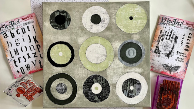
This latest colour wheel had me thinking about being bold and creating something for a wall.  I have a recent personal challenge for myself to make BIGGER art and what better excuse do I need to put 'bigger' into practice... I adore circles and monotone themes and so thought that making a large canvas to hang on my dining room wall would fit this challenge nicely.

I had originally planned to feature more typographic images and stitched lines but when I got down to the assembly I actually preferred to use the imagery in a more subtle way and make more of a feature of the tetradic colourway instead.


I was asked to use green within the monochrome colour wheel and so I chose one of my favourite greens; Tinned Peas, to go with Little Black Dress, Cloud 9 and the Everything Art rubber stamp sets shown below.


As with all the colour wheel projects that I have had the pleasure of sharing with you, I started by making a full colour wheel using three PaperArtsy fresco finish chalk paints.  This time I used Little Black Dress FF19, Cloud 9 FF149 with Tinned Peas FF55


I really wanted to use a good contrast within my colour choice and so I chose to use the two strongest 'opposites' black and white.  The cloud 9 is a softer slightly more creamy white which I thought might be good to define it from the white canvas background...but then I decided it'd be fun to have a textured background on the canvas too and so that idea went completely sideways. I automatically fell in love with the Cloud 9 as soon as I started painting a whole flat page of it.  It reminded me of my favourite vanilla white embossing powder, so I made a mental note that I needed to add this to my next shopping list as I know it's going to become one of my go to paints!

Sorry...I digressed in a moment of colour bliss...back to my tedrads...with the great tip Dounia gave in one of her blogs, 'try not to use all the colours in the same quantity', I opted for a complementary TETRAD split as shown below. This combination uses two primaries with their two opposite secondary colours.  I thought that this offered a harmony so that I could use strong variations for foreground and background pops of colour.


With the clear idea of wanting to use circles I started doodling layouts which could be fun on a big scale. I considered stitching in, around and through the circles, I considered adding asemic writing to embrace the typographic theme...


and then I thought before I go any further it'd be more useful to cut out some paper circles** and play with layouts rather than doodling them on paper to get a better feel of placement and size. 

Rather than adding gesso to the whole canvas and stamping into that, I decided to add gesso to the stamp and stamp that onto the canvas. My thinking behind this was that I wanted to add a light 'broken' or textured wash over the canvas rather than keeping the blank stark white background.  I also wanted the colour to absorb into the canvas in areas. I used PaperArtsy's Everything Art EEA02 hand and moth stamps for this as I loved the compass detail and the grungy details. I did two test runs on small canvas's to see whether I liked the outcome before I started on the 400mm x 400mm one.  I videoed the small canvases to show the process... (scroll to the end to watch) 


The gesso left most of the stamp detail on the canvas. TIP: put something firm beneath the canvas when stamping. 


I then started looking at what  textures to add to the whole pages of painted paper I had made. I used Wow matt clear embossing powder and Ranger Archival Ink in moss green here.  I especially liked the two dark sheets but knew I had to get the gel plate out to get rid of the flatness of the pages...


I played around with my paper circles** and decided on the layout. (photo taken before I had used the gesso). I drew around various round objects I had in the workshop to get my sizes and was rough in cutting round them rather than being precise.


I don't know about you...but I am much more of a ripper than a cutter and wanted my circles to have a torn slightly uneven edge and not a 'perfect round smooth circle' hence the rough cutting. If this is not your thing then naturally feel free to use a compass and a pair of scissors for all circle making stages. I used scissors only at this stage for the shape to draw round to use once I had printed my papers.

Having torn paper many times I knew that if you tear it one way you show more of the unpainted edge and vice versa. The way to remind myself especially for circles was to tear two from a page in my scraps box...one clockwise circle and the other anticlockwise.  I am right handed and so the paper in my right hand was torn upwards leaving more unpainted white edge on the clockwise tear...if you are left handed naturally the outcome for you is likely to be the other way round. 


Using the same colours from my colour wheel I used my gel plate to create a selection of textured papers to use for my circles.
 

I also used the colours over ones I had already painted from the same colour wheel selection  to bring me more depth and texture. I used the letters from Everything Art EEA05 that could be read either as is or in reverse on my stamping block so they read the correct way round regardless of whether I used them to texture the gel plate and pull a print or to take the paint off the gel plate and stamp it directly on a printed sheet. I like to press the stamp that I have pressed into the paint on the gel plate to make an imprint onto other prints to make full use of the paint so less gets wasted or washed down the sink.


I loved the subtle textures that I was creating with the stamps and in this case decided that it would be good to focus on the colours more than the powerful images as a focus.


I then had quite a choice of which layer would be on top of what in which circle!


I mentioned changing my mind about a flat white background and using more texture instead by using the hand and moth from stamp set EEA02. I wanted the background to be soft and muted. When I make a colour wheel I always mix the three colours I use together for an 'overall' colour and decided to do just this for my background.  I added plenty of water and applied it to the whole canvas, including the sides and then whilst it was still wet, I rubbed it with a dry sponge to expose the stamped gesso.


The circles went back onto the canvas to relook at my position choice and then I numbered them so I knew where I'd placed them!


Using a piece of card to make the circles into windows allowed me to select the exact piece of printed paper I liked for a circle. I use this method quite a lot and it does go totally against my OCD of cutting paper near the edges to not get too much waste by cutting right in the middle of something, but textures and patterns here were far more important and I know the rest of the paper will definitely get used for other things! 


I did this with each of the layers in all the circles and then moved them about again until I was happy with all nine. 

I tore the circles and arranged them paying attention to contrast and harmony in my choices.


I do like how the colours and texture compliment each other and how the stamp designs are subtle rather than the focus of the piece. I used the bottom left circle as an O to also represent the typographic theme as well as part of the overall circle design.
 

I decided to edge finish a few with Ranger archival black ink and glued them onto the canvas using a gel mat medium.
 

I divided the canvas into 9 equal squares and positioned each circle within the centre of them. I found this to be the easiest way to place the circles as they were not of equal sizes.


My favourite colour is green and so the colours really appealed to me personally in this monochrome colour wheel topic.  The canvas is now hanging in my dining room.


I use rubber stamps in many ways, for texturizing, for over stamping, for adding phrases or focal points to my art and this project made me reflect on the many ways I do that within my work and how calming art keeps me in my everyday. I found this project particularly calming as there was a lot of colour mixing and methodical repetition in the processes. I do hope that if you give this project a try, whether it's in a journal or on a canvas and whether you use the same stamps or colours I have, or not, it also brings you the same amount of joy and calm in the process as it did for me.


I have created a two minute video to show how I added the gesso texture stamp to the canvas.  A little tip...with the canvas not being a solid surface, I found that a lot of the stamp did not imprint.  By using a book or a solid surface beneath the canvas allowed a much better outcome.


Until next time,

Much love,
Floss x x x


website/in-person workshop bookings: flossWORKSHOPart

Full Day Mixed media in-person workshop: 

Go LARGE in-person mixed media full day canvas: 

Many other classes and dates available