Showing posts with label EKC17. Show all posts

Tuesday, 15 October 2024

2024 Topic 8 : White {by Victoria Wilding}


Hi everyone

Victoria here with you today.

Heading into winter and thinking about the nature theme for this quarter, naturally had me thinking about frosty and snowy winter walks. Some of my favourite memories are being wrapped up warm and being out in the landscape with my boys, so I wanted to create a memory box scene of winter florals.

The white topic might initially seem daunting, but some of my favourite ever projects use a neutral colour palette. Creating a white project is actually pretty simple when you know what to pair it with and you can’t go wrong with some other neutral colours, to help the white stand out. 


Creating my floral memory box was really straight forward and I can’t wait to break down all the steps for you so that you can try it for yourself. Be warned though, you have to enjoy a bit of fussy cutting to make this one! 


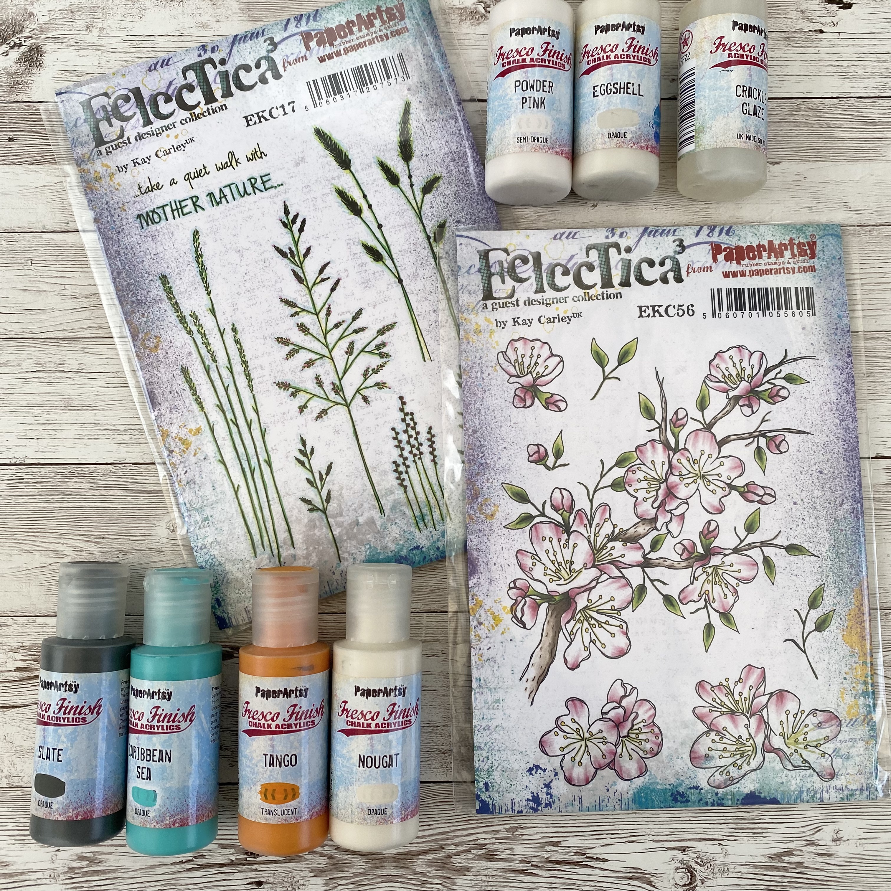
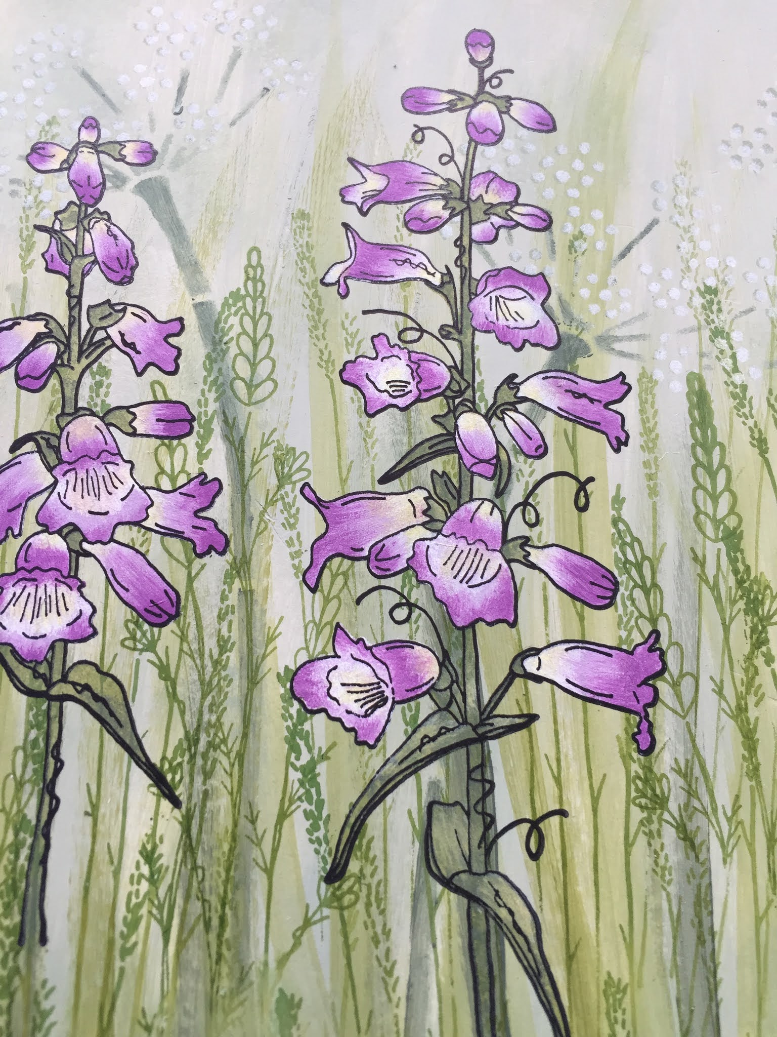
Kay Carley’s stamp sets EKC17 and EKC72 had the perfect winter florals for my project, with a nice selection of different shapes and sizes. I also picked out Fresco Finish Chalk Acrylics in Snowflake (FF15), Koala (FF141), and some Crackle Glaze (FF22) to create some extra background texture. Finally, I selected flat white and glitter white embossing powders from my stash.


I started off by prep’ing the box. I wanted something small that could nestle against my other makes on top of the kalax unit in my cabin. I had a frame die cut from an Eileen Hull Sizzix set, in my stash so decided to use that up and create a back using the measurements shown above. You could easily just mark out and cut two of these in place of the die. 


I cut away the corner pieces so that I could fold and glue the sides and bottom.


And scored along all the fold lines.


Next I applied some Fresco Finish Chalk Acrylic in Snowflake, using some cut ‘n’ dry foam, to the frame.


Finally, I applied some distressed white to the background piece. I applied a coat of Fresco Finish Chalk Acrylic in Koala, dried it and, put a coat of crackle glaze on top. I dried this too, before applying a final coat of Snowflake Fresco Finish Chalk Acrylic. This creates a crackle effect texture, which is subtle, but oh so yummy! It also looks a lot less grey in the finished project once it’s paired against the white flowers.


Being a flower fanatic, creating the floral elements is always my favourite part of a project! I wanted to keep things really simple, so selected some kraft card (for extra contrast) and stamped the various flowers, embossing them in flat white and glitter white embossing powders.


Then it was time to get fussy and cut them all out carefully, with a pair of small detail scissors. The white embossing looks fantastic against the kraft and will give some extra depth to the finished project, preventing the flowers from disappearing into the background.  


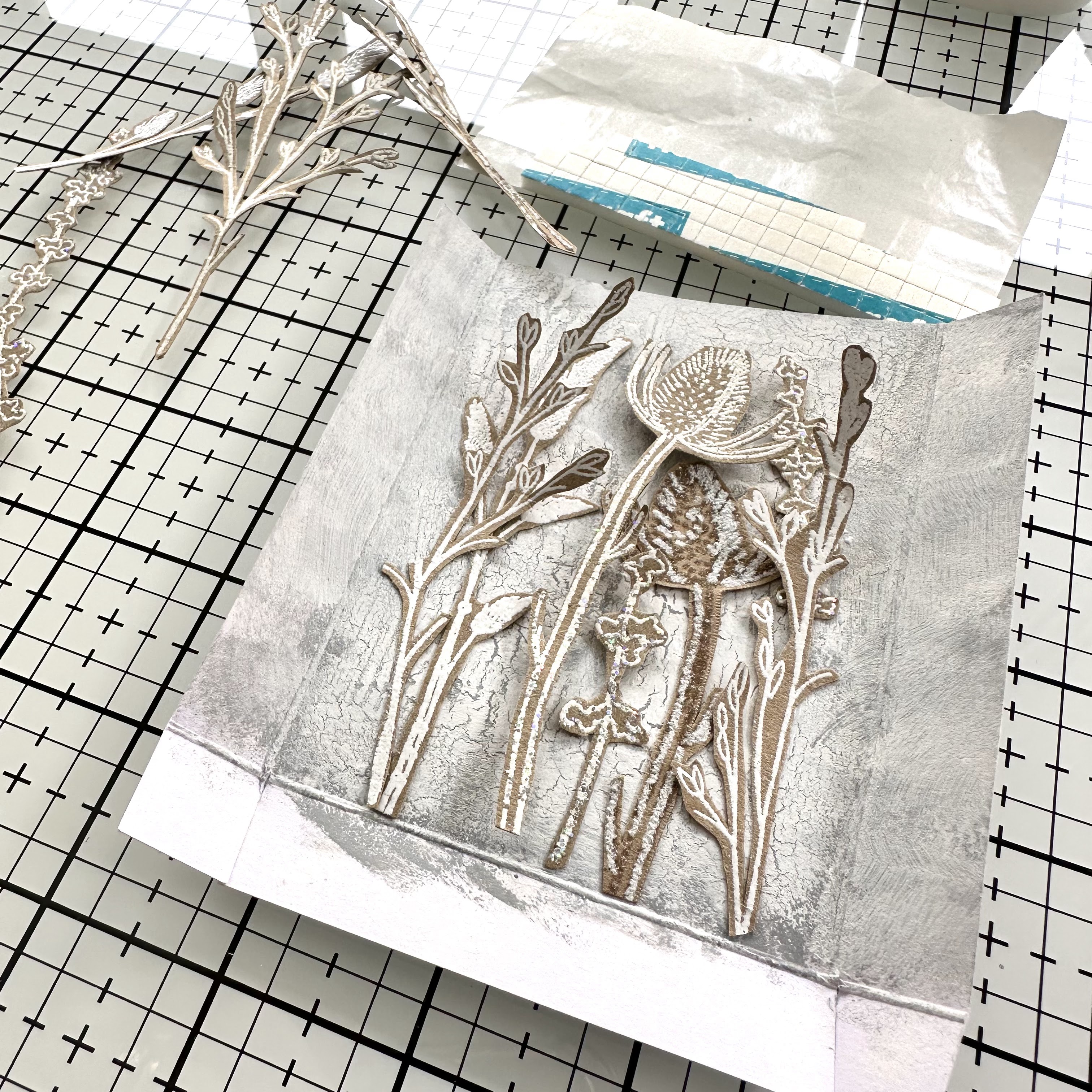
Assembling the different elements was the final step of the project. I started by layering the flowers onto the background, gluing some flat, adding some where only parts were glued so that the stems could be teased out and then a final layer stuck down of foam pads. This created depth in the floral arrangement. 


Then I stuck the front and back pieces of the box together, using double sided tape.


Before adding some florals to the front of the frame for extra detail.


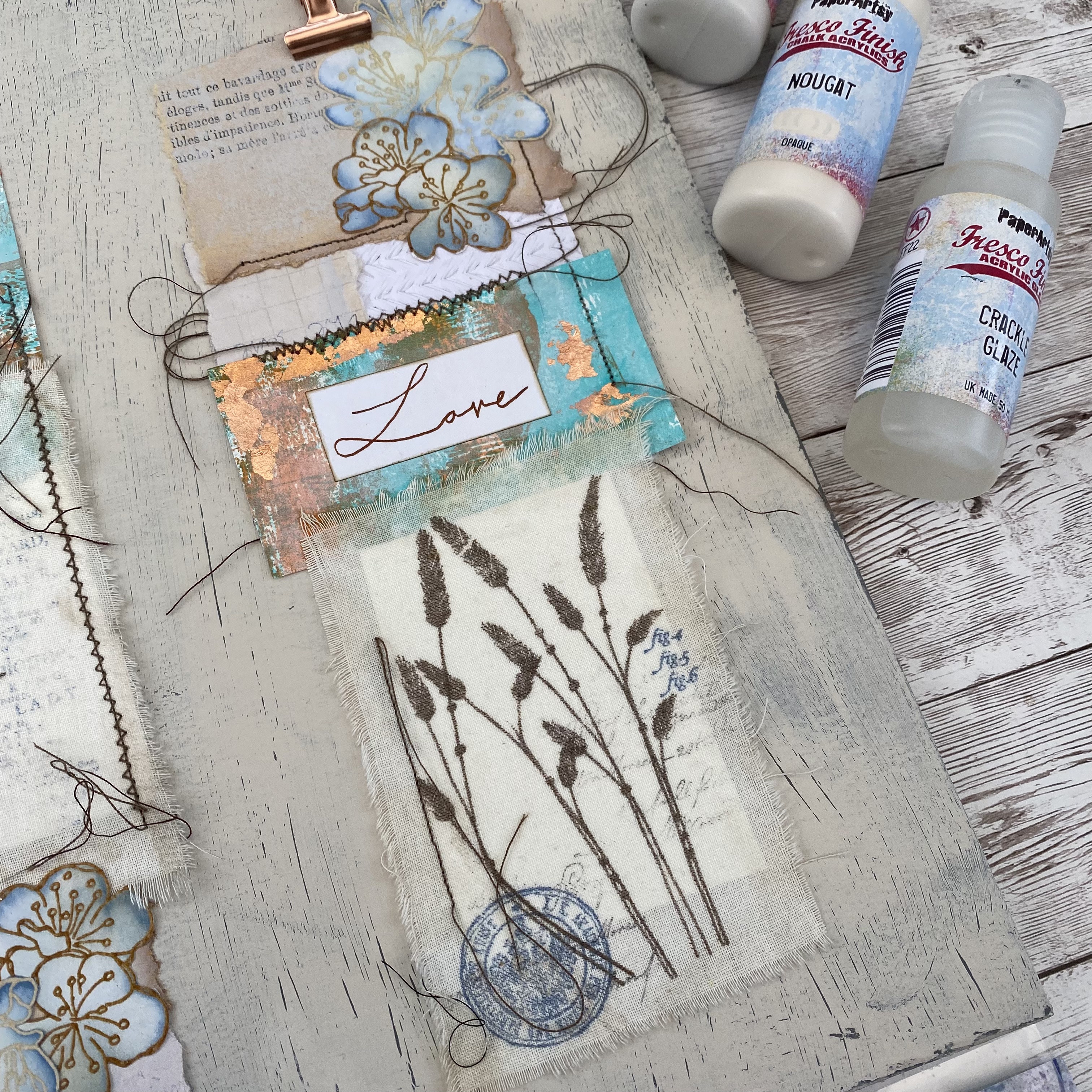
Finally, I added the memory sentiment (leftover from a previous Scrapcosy ESC32 project) to the bottom middle of the box. 


The finished effect is just what I was aiming for. Slightly distressed and with enough contrast to make the white pop. The glitter from the embossing powders looks magical in real life, unfortunately the camera doesn’t pick it up that well. 


This floral box is going to look lovely amongst all my supplies in my cabin. Nothing beats being surrounded by previous makes for a serious dose of inspiration!


I hope you enjoyed learning about these white techniques and feel inspired to give it a go yourself. If you do, I’d love it if you shared and tagged me on socials. 

Until next time, wishing you a happy, creative week.

Victoria x

Thursday, 22 September 2022

2022 Topic 13 : Fabric {by Victoria Wilding} with Kay Carley stamps


Hi everyone, it's Victoria with you today, and I'm here to share with you a wall art triptych using a selection of stamps designed by Kay Carley.


The best facet of mixed media art is the almost limitless interchangeability of mediums and materials. Fabric and paper is a particularly marvellous combination and there are many, many options to create with them. Creating a wall art piece with stamping on fabric has long been on my to-do list, so this topic was the perfect opportunity to finally put some of those ideas into action.


My first task was selecting a colour scheme and some stamps to incorporate in the piece. I always tend to keep to a limited colour palette and have a love of neutrals, so I decided to keep the habits of a lifetime but introduce a pop of blue and orange here and there. I selected PaperArtsy Fresco Finish Chalk Acrylics in - Eggshell (FF138), Nougat (FF39) Powder Pink (FF220), Tango (FF72), Caribbean Sea (FF94) and Slate (FF84). I also picked Kay Carley stamp sets EKC17 and EKC56 for their simple elegant floral elements.


I decided that I wanted to make three oblong strips made of a range of papers and fabric to make a triptych piece, so I started off my project by creating a series of papers. I selected some old book paper and a sheet a grid paper (containing my sons old school work!) from my paper stash and applied a layer of PaperArtsy Fresco Finish Chalk Acrylics in Eggshell (FF138) and Powder Pink (FF220) on my gel plate to knock back the text so it didn't overpower the finished piece.
 
 
I then used a piece of white paper and covered it roughly with PaperArtsy Fresco Finish Chalk Acrylics in Caribbean Sea (FF94using a brayer.
 

I then used PaperArtsy Fresco Finish Chalk Acrylics in Tango (FF72) to add some contrast colour.


With the collage papers set aside to dry, I started to create the floral elements for the oblong panels. I started by stamping and embossing cherry blossom flowers using EKC56 and Distress Embossing Glaze (in Antique Linen, Vintage Photo and Walnut Stain).


I then applied some background colour to the paper blossoms using a blending brush and Distress Ink (in Faded Jeans and Vintage Photo).
  
 
Next up were the main focal points of the piece, the floral fabric elements. I tore three pieces of cotton fabric in different sizes, from a larger piece of fabric, creating rough edges. I then stamped elements from EKC17 in Distress Archival Ink (in Ground Espresso).
 

The final stage of the make was creating the background board to bring all the elements together. I wanted to create a subtle distressed effect which would give some gentle detail without detracting from the three oblong panels. For this I used an A3 piece of greyboard and started off by giving it an all over coat of PaperArtsy Fresco Finish Chalk Acrylics in Slate (FF84).

To create a distressed effect to the background, once dry I gave the grey board an overcoat of Crackle Glaze, applying it in a think coat with a palette knife.


The final step in creating a distressed effect was applying a top coat of PaperArtsy Fresco Finish Chalk Acrylics in Nougat (FF39).
 

With the back board drying, I started to assemble the three oblong panels, using the fabric and background paper pieces. I experimented with different combinations of shape and size until I had three unique panels I was happy with. For a final bit of detail I added some additional stamping using text and circular stamps from Alison Bomber (sets EAB24EAB25EAB26) and some Copper Guilding Flakes for a metallic accent on the coloured card.  Once assembled I added some machine stitching to secure the various elements on each panel, leaving the loose threads for some extra texture on the finished piece. The final step was attaching the paper blossoms and a hand lettered sentiment to each of the three oblong panels.


The project was completed by mounting the three panels on the background board, with a mini rose gold bull dog clip as a faux hanging element.


The simple floral stamping is really effective on the finished piece. The basic colour palette really helps to ensure the finished piece isn't too busy and lets all the textures from the different elements lead the eye around the board. The pop of blue and orange is just enough to help distinguish the three panels from the background. The crackle effect to the background didn't turn out as pronounced as I'd hoped and in hindsight I should have used the paint more generously on the top coat to get more pronounced crackles.


I hope this has inspired you to have a go at stamping on fabric as a different substrate. I'd love to see what you make so don't forget to share and tag me on social media.

Wishing you a happy creative week

Victoria

Thursday, 13 May 2021

2021 Topic 5 Find Your Vibe with Flower Scenes {by Kay Carley}

  2021 Topic 5: Find Your Vibe


Whilst wandering with Kay through her wonderful wildflower gardens, it's easy to see her vibe and how beautiful the resulting pieces are. With lots of tips for adding details to the stamped images and how to combine her older and newer sets to create depth, you'll soon be wiling the hours away creating bespoke cottage garden flower scenes.
~ Keren

Hi everyone, it's Kay with you today, and I'd like to share with you how I go about creating my flower scenes.

I have always really liked wildflower meadows and cottage style gardens so when I began designing my stamp range for PaperArtsy I had in mind that I would like to try and recreate those type of scenes using a combination of stamps and stencils to create a layered effect that would emulate a cottage garden.

Using this particular style of stamping and stenciling with PaperArtsy's chalk acrylic paints enables me to easily create this 'layered look' and nowadays it is always my 'go to' type of artwork as I think it gives a really effective result. It is something that you can definitely play around with, as you might choose only to use stamps (no stencils) to create your whole scene or perhaps just have one background layer instead of several.

For this project I have used some of my latest products with older stamps and stencils as most of my products have been designed to mix and match seamlessly with each other.


I just love how you can easily adapt this style of creating flower scenes depending on how much time you have, what finished result/composition you want to achieve, what size of project you are creating etc... It is just so versatile!


I began by creating my brushed background with several different green Frescos - namely Lichen, Zucchini, Hey Pesto and Winter Green


Next I stencilled my tall background flowers (PS060) very lightly with Winter Green before realigning and softly stencilling Snowflake to create the white heads. 


I then added layers of stamping (in green) using tall grasses from EKC17


Now its time for the and tall flowers from EKC45 before stamping my main flowers (EKC45) in black. 


To colour these flowers I used the matching stencil PS237 (which comes with full instructions).


After colouring the flowers using opaque paint you then want to stamp all the original detail of the image back. Therefore all my stamping and colouring of the main flowers take place within a stamping platform, enabling me to perfectly align the flower image to re-stamp the detail over the painted layers.


My next step was to paint the background flowers using Periwinkle, Southern Skies and Snowflake. Smaller flowers were stamped into the foreground (EM32) and painted with Candy Floss and Orchid. To add a bit of depth to all the flowers I added small amounts of a mauve pencil to the purple and blue flowers and pink pencil to the pink flowers.


To add further interest to my panel I used PS061 with Slimed and Gumboots Frescos at the top edges of the panel.


The picture above shows just how little of the mauve pencil I added to my main flowers but it makes such a difference to the overall vibrancy of them.


Whilst I was creating my main project I went ahead and painted and stamped a smaller panel with different coloured flowers so that you can see how this lends itself to small projects too!

As I mentioned at the beginning of this post I am definitely in my 'comfort zone' when creating these layered scenes and I must admit that I very often work on a green background for them as then I can paint my main imagery with any colour I choose. But occasionally I will begin with a different coloured background however when I do this I already have in mind what colours I will be using for my flowers so that the background I'm beginning with will complement them.

I have quite a range of different flower stamp sets for PaperArtsy ranging from quite small, delicate flowers to much bigger and bolder flowers so whatever size of project you create you should be able to find something to suit!

I hope this has given you some inspiration :).

Love Kay x

Blog: Kays Crafty Corner
Facebook: Kay Carley
Facebook Group: Crafting with Kay Carley
Twitter: @carleycards
Instagram: kay.carley
Pinterest: Kay Carley

At this current time all of my teaching is being done online. You can find details of all of my past and current online workshops over on my Crafting with Kay Carley Facebook Group.