Showing posts with label EAB28. Show all posts

Friday, 15 November 2024

With 3 things: Juniper Goodness {by Ellie Knol}

Hi friends, Ellie Knol from PAPER-STAMPS-COLOR here with you today with you for another With 3 Things post.

This feature on the PaperArtsy Blog is where 3 bloggers are sent 3 items in the post. We have no clue what PaperArtsy HQ is going to send us, there might be a slight variation but generally 2 of the 3 things will be identical.

I was happy to find these supplies in the package: Two panels of Grey Board, Alison Bomber stamp set 28 (EAB28) and 2 colours of Infusions Sleight Blue, Violet Storms.


Our most recent blog topic has been a Designer Focus on Alison Bomber, and going back before that was also the topic of WHITE, and the overarching current theme is NATURE. If I can tie these links into this '3 things' post, then that adds another challenge.


I always like to make swatches of the colors before I start.


Today I have made these two panels using all of the above product...... let's take a closer look.


I started off with applying a white heavy gesso randomly to the panels with a palette knife, and pressed into the texture with stamps, and a lid into the wet gesso. Tip is to gently mist your stamps with water to help them lift off the gesso. The texture is quite random, I let it dry naturally.

When dry, mist the panel with water, add crystals of the infusions to the top of the panel, mist it with water and let it run down the panel. That's it.

Believe me, less crystals is better! These guys pack some punch and you really only need the littlest of a sprinkle, you can always add more if you wish. 

I tried to emphasize the various colors of crystals in each color of Infusions.

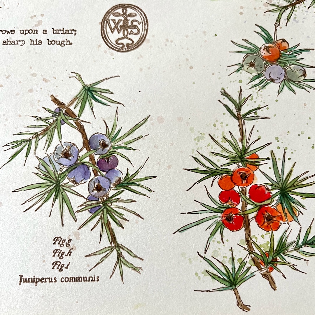
After drying, stamp the foliage in black stamping ink, and heat emboss with clear embossing powder.
Add extra color to make the berries pop.


White paint splatters and splatters with the infusions adds interest!


... and of course some background stamping.


So, compare the two, and choose which one you like best.
My favorite is the one with more white surface... 


As you can see: just play.. see what works best, and with Infusions: the outcome is very unique and unpredictable...

Parts of the surface that was not covered with gesso, turned out darker, which makes sense as it was more porous allowing the infusions to grab and sink into exposed the grey board paper. Also the infusions collect in the textures created by stamping into the wet gesso.

Once you experience such differences, you can lean into exploring the effects you might prefer.

Thanks for joining me today

Saturday, 12 November 2022

2022 Topic 15 : Paper, Seeds and Twigs {by Victoria Wilding} with Alison Bomber stamps


Hi everyone, it's Victoria Wilding with you today, and I'm here to share with you a gift wrapping project using the latest collection of stamps designed by Alison Bomber. 


As the gift giving season approaches, there's something very special about sharing with friends and family, the time, thought and energy that goes into something handmade. Handmade gifts have long been something that I have shared with my loved ones and what better way to celebrate the festive season than with a gift on a gift. 


As a paper crafter there's always been something exciting about choosing the paper wrappings for presents, so I wanted to use the Paper, Seeds and Twigs topic to get a head start on the seasons preparations. I've also been meaning to have a try at making my own paper for some time and thought this would be the perfect opportunity to create something special for my gifts this year. My idea started with making some paper and I considered making handmade paper packages to give as gifts, however I wasn't sure that they'd be used so I considered how else I might use some handmade paper and I hit upon the idea of incorporating it as a two in one layer and gift, a part of my packaging that could be reused. Something that would look lovely and add something really unique to my presents whilst also not ending up in the recycling bin. And this is where my idea ended up, as a handmade art piece which will look lovely framed and on the wall long after the presents have been opened and enjoyed.

Handmade papers have long been a lovely pairing with my other favourite art supply; watercolours. My handmade paper started with preparing a watery paper pulp by soaking paper scraps. I wanted to create a white paper finish, so I dug into my white paper scraps. For those also trying this for the first time, dyes used in printed papers can affect the final colour of the paper you produce, so I was definitely playing it safe. The process started by cutting my scraps into small scraps that would in theory soften in the water more easily.

Once I had a good amount cut up in the bowl, I filled it with cold water and left the bowl of paper to soak for 24 hours. 


I expected at this stage to have a paper mache type consistency to the paper and water, however as you can see from the photo below, the paper had pretty much held its form. I think this was due to the paper type I was using, mostly heavy weight white card stock. So there was only one thing for it and this was to blend the mixture into a pulp. 
 

I then poured the pulp mixture through a paper making frame. If you don't have a frame (this wasn't expensive, I bought tit from Amazon for about £7.99) you could use any fine mesh you have lying around you may just end up with slightly less defined edges to your finished paper. 

I poured enough of the mixture to give me an even covering across the mesh and patted this firmly down with a tea-towel to remove some of the excess moisture and encourage the pulp to form together.
 

I then turned the paper out onto a silicone baking sheet and repeated the process until all the pulp had been used, which in this case created 6 sheets, 6x4 inches in size. I love handmade papers which have petals, seeds and threads incorporated and originally wanted to include these too, however, after placing dried petals on one of the sheets, the colour started to bleed and I wasn't sure how this would dry, so I decided to leave the remaining sheets plain.


The drying of the paper was another big learning curve. I'd expected it to dry in a day or so, but it actually took almost five days for the papers to completely dry. This probably wasn't helped by the British weather turning cool and damp, but the climate you live in is definitely worth considering if you were making your paper with specific completion dates in mind.


The final papers has a very rough finish and were a little thicker than I had expected, probably on account of having used the card stock, however this did give them a very obvious handmade quality which actually adds to the finished project. With the papers complete I selected the new stamp sets by Alison Bomber, EAB28 the Juniper Edition and EAB29 the Mistletoe Edition, to create the artwork as I knew these would give the delicate vintage floral finish that I love.


I knew that the rough texture of the handmade paper was going to prove challenging to stamp on and that I would probably need to re-stamp the images several times, so using a stamping platform was an essential. I also thought that a more opaque medium would help the imagery show up better, so I decided to stamp using PaperArtsy Fresco Finish Chalk Acrylic - Sage (FF66). I selected the large mistletoe stamp from set EAB20 and after several stampings the image was still a little patchy, but visible enough to guide the application of the watercolour I wanted to use to colour the image. 


I started to paint in the detail of the image using watercolours in a natural colour palette and the paper absorbed the water and pigment beautifully! Honestly, it was so much better than I had expected, as by this point I had started to worry it was going to look like a complete mess, but as I coloured the image, it really started to pull together, looking less patchy and quite pleasingly, like a hand drawn illustration.
 

Once I had painted the initial stamped image, I added some charcoal pencil to give a little more definition to the outlines. At this point I decided that I wanted to extend the sprig of mistletoe using the smaller stamp in the set. Curiosity at this point had me turning to a Distress Ink pad  (Peeled Paint) to stamp the second part of the image to see if this would work any better of the rough paper surface and I was surprised by how well this worked. Once coloured you can't see much difference in the two parts of the image, so I suppose it just depends on your preference and confidence in the water-colouring.
 

With the floral image complete, there was still a lot of white paper on display, so I turned to EAB28 for some text detailing for the background and used Distress Ink (Speckled Egg) as I knew at this point that it would give me a slightly crisper stamped image. 


Once the handmade paper art is complete the rest of the project pulls together quite quickly. I added some border stitching in gold thread along one corner and edge of the handmade paper  art to give one final detail. I also cut a Kraft gift tag and white embossed one of the text stamps from EAB29. To help the art to stand out as a feature in the wrapping, I placed this against a kraft paper wrapped package and chose some luxurious velvet green ribbon to literally tie the elements together.


I love the final look of this gift wrapping and there's something extra special about having part of the gift you are giving on display, but with an element of surprise until you actually get to the unwrapping. 


I'm so pleased with how this present looks, that I might actually struggle to let go of my gifts this year! Only joking, I'll just have to send a gift to myself so that I get to keep one, haha. I'll definitely try the paper making again too, although I might try doing it with a lighter weight paper scrap to see what difference that makes to the finished paper surface. 

I hope I've inspired you to make a start on your festive preparations. I'd love to see what projects you're making so don't forget to tag me on socials. 

Wishing you a happy, creative week.

Victoria

Pinterest: www.pinterest.com/victoriawildingcreates 

Thursday, 27 October 2022

NEW PaperArtsy Products: Eclectica³ Alison Bomber {October 2022}


A note from Leandra:
Alison's botanical creative style has been so well received with her stunning sketches and coordinating ephemera. The next 3 sets feature Hawthorn, Juniper and Mistletoe. Alison's definition in the ephemera mentions hawthorn was boiled for the relief of inward tormenting pains ... I've noticed the thorns on that stuff can inflict some pretty serious outward pain too! We see these berries all around us here in the South of France, vicious as they might be, very pretty they are too!
 
Alison will be LIVE with her new products and ideas over in our Facebook Group, PaperArtsy People shortly after this post publishes. I really hope you can drop by or catch the replay. You will love seeing what she has made with these for sure!
 
For the next 3 months, these stamps are only available EXCLUSIVELY from our approved stockists. Please check the list at the foot of this post of from the home page tab of the blog.
 
Hi, everyone!  Alison here, and I'm thrilled to share my latest release for PaperArtsy with you - three new stamp sets with botanical sketches, herbal concoctions and prescriptions, and ephemera linked to the world of theatre, another of my great loves.  And all of it is with an eye to the changing seasons too.

Those who know my work know that it is strongly seasonal, so I'm sure you guessed that after the first autumnal trio, the next release would be heading into winter.  We're forecast a long cold winter here in the Czech Republic, so the trees and bushes are heavy with berries... and so are these stamps. You could even say that it looks like being a very Berry Christmas!

I'll share a couple of creations for each stamp set and talk a bit more about the thoughts behind the designs.  Then later in the post there are some trios and triptyches where they are all "in conversation" together. 

Price: RRP €23.00 +VAT    Size:5" x 6" (13 x16.5cm)
All stamps are individually trimmed onto cling foam with a laminated storage/index sheet.

  
Eclectica³ Alison Bomber 27 - Hawthorn Edition (EAB27)

Nature Journal - Hawthorn

I had a beautiful hawthorn bush outside the house where I used to live.  I really want to plant one here in the Czech Republic - it's a wonderful plant all year round, so I wanted to celebrate it on this plate.  With each stamp set, I started as I did last time - by stamping the entire plate as it stands, and then exploring the botanical sketches in more detail on the facing page to create a "nature sketchbook" spread.
 

You can see that I wasn't using expensive watercolours - just dipping my water brush in the inks and colouring in. I love that you can choose to be very detailed and precise with the image, going for a real botanical art look (without having to do any sketching first!)...
 

... or you can keep it loose and free, in a much more spontaneous style.  I've designed the images so that they're really flexible in terms of which direction you can stamp them.
 

Finally, the two sides of the sheet are mounted in a kraft journal, and aged to suit the historical feel of the ephemera and the sketches.

Eclectica³ Alison Bomber 28 - Juniper Edition (EAB28)

Nature Journal - Juniper

I think these nature sketchbook pages are a really great way to introduce the stamp plates - you get a really clear look at what you get, and start to see how the stamps can be really flexible.  And the Juniper plate is a real joy to me - those rounded berries, those dynamic pine needles... and lots of Shakespeare connections.
 

If you think juniper berries only come in slate blue and misty purple, think again... not only are there all the different stages of ripeness to consider, but there are also such things as red juniper berries!  And look how this large stamp is just as good either way up...
 

And again some spatter and some loose inking brings the berries to life just as much as a detailed version. Those fir needles going in every which direction have such drama and movement to them!
 

And here's just some of Culpeper's advice on using the juniper plant to improve your health... this is cut from a MUCH longer section.  Really it seems that juniper can help you with pretty much anything.  An excellent excuse to top up the gin and tonic!  This font I've used for the Culpeper gives me great joy, and again it works wonderfully to create background detail if you don't want to use the whole thing.


Shakespeare's Seal?!

There are plenty more juniper berries to enjoy later on, but for my next make I wanted to focus on the ephemera from this set.  Shakespeare's The Winter's Tale seemed like the right play for the season (though this is for an adaptation, but you've still got the title there in the middle!).  


The advertising fonts on this poster from 1758 are a treat. I had a lovely time ageing and distressing the paper with inks and the blade of my scissors, but it's the wax seal that really excites me here.  The signet ring from which the WS seal stamp on this plate comes may (only may) have belonged to William Shakespeare himself.  
 

The ring was found in 1810, in a field just by the church in Stratford upon Avon.  While even quite ordinary people would have had signet rings in his day, this one is made of good quality gold, indicating it was owned by someone quite prosperous (as Shakespeare was when he returned to Stratford after his playwriting days in London).  We'll probably never know for certain, but even if it only might be his, having (maybe) William Shakespeare's seal as a stamp was too good to miss!
 

It's stamped into paper clay here, rather than wax (you could also use Grunge Paste or embossing powders), as I wanted it dried and cracked around the edges, as though it was very old.  It looked magnificent when first sprayed with ink - exactly like the vermilion-coloured shellac they used rather than wax in Will's day - but as it dried it became rather faded and shabby (just as though it really was ageing!), so I used a bit of Distress Crayon to highlight the texture again.  I do have some sealing wax somewhere... I just have to track it down, and then I can't wait to play with this again!


Eclectica³ Alison Bomber Set 29 - Mistletoe Edition (EAB29)

Nature Journal - Mistletoe

I didn't want to go for the obvious festive plants. I was trying to find ones that can work all winter, and in fact for lots more of the year.  You can't beat the romance of mistletoe - the perfect excuse to kiss a loved one under the garlands - but it's also full of danger and mystery.  It was one of the most treasured plants gathered by the druids, considered sacred, and the berries, of course, are poisonous.  And apparently, according to Culpeper, if you hang it around your neck it will cure witchcraft!
 

There's a piece of really personal ephemera on this plate to go with the one from the previous release.  You may remember seeing my relative Martha Pollak's school certificate last time... well, now we have a termly report, complete with her marks in each subject at the Vienna Academy of Music and Performing Arts in 1903.
 

You can of course choose to colour the images in any rainbow your imagination can create, but I was amazed to discover that in real life there are varieties of mistletoe in both pink and red, so even nature is inviting you to get creative!
 

Here I was testing to see just how loose I could go with my inky watercolouring... answer: pretty loose!  And again, you can stamp these berries hanging downwards from a wreath or garland, or growing upwards or sideways... any which way works beautifully.  It's so lovely being able to use these stamps for watercolour practice without having to do the drawing every time!


Mistletoe Parcel Tags

You may be wondering where all the tags are... is this an Alison Bomber launch post?!  Never fear, here they come, starting with these two small parcel tags (12 x 6cm which is about 4.5 x 2ish inches). They're cut from some textured watercolour card with a Tim Holtz die. I wanted to try out a couple of ideas for combining the sketches with the ephemera, getting the ephemera to sit "behind" the imagery.


With the first one, I stamped and painted the mistletoe using the stamping platform, and then gave it a coat of PaperArtsy Matte Glaze (could have been any of them) so that I could apply clear embossing powder.  This resisted the Distress Ink stamping of the school report with ease as well as giving a lovely glossy finish to the mistletoe.


On the second tag, I used PaperArtsy Frosting Glaze (well, Christmas is there on the horizon) over the painted tag, and that was perfectly capable of resisting the Distress Ink too - I just used a slightly damp paper towel to gently wipe away the writing... look closely - the photos are not the same!  The Frosting Glaze has a very subtle sheen, so I ended up adding a little Distress Dry Glitter to that one in the end.


And on the reverse sides you can see some of the other ephemera in use - the lovely Austrian stamp (stamped straight onto the tag and then painted with Distress Oxides in various greens), as well as some of that Culpeper font used as background detail.  And I added back in the Latin name of the plant and the figure numbers for the illustration in new positions. (Confession: I'd cut up the stamps by now rather than taping them - it was just quicker when I was making so many things at once!)


Tag Trio Experiments


If you were missing the tags, here come plenty!  It was another little exploration comparing the images painted vs simply embossed over some of my favourite Distress Ink backgrounds.  Obviously I started by creating some inky backgrounds in colours suitable for winter greenery... six of them, working in pairs.  Here's one...


Next on one of each pair of tags I stamped my botanical sketches - one from each set - in Olive Archival and clear-embossed them.  


And on the other, using the stamping platform, I stamped and painted (Hawthorn as your example for this one)...


... painted some more - using Fresco Finish Acrylic Chalk Paints (colour details coming up) in much the same way as the inks from the beginning of this post - dotted on the mat, spritzed with water and applied with a water brush - and finally re-stamped to get back any details which might have been lost in the painting.  


Obviously I used a slightly different paint palette for each pair of tags (and a slight variation in the ink colours used in the backgrounds too, if you look closely).  So here are the Juniper paints:


... and here's a closer look for comparison.  I do love the painted versions, but I'm happy to say that I think the sketches absolutely hold up just as line drawings in the embossed versions too!


Same again for the Hawthorn pair.  Here are the paints I used.  I wanted subtle variation on individual berries as well as between different berries, so there are lots of reds!


And take a look at the finished results... Again, I'm really happy with the embossed one - and in fact, it was already holding its own on the inky background even before the embossing powder.


Here are the paints for the mistletoe - back to a smaller palette, as I decided to just stick with the classic white berries for this one!  The Lake Wanaka was just for a bit of dimensional shading and shadows.


These inky backgrounds were sparser, as I knew it would be better to avoid having too much ink in the way of white berries.  You can stop the ink from bleeding into the white by sealing it before painting, but time was getting on, so the fewer steps the better!


So there's my trio of pairs... time to divide them up into two separate trios.  We'll follow the painted ones for now, but you can see a sneak peek of where the others ended up at the end of the post.


I loved my berry paintings, so I didn't want to cover them up too much.  A little torn book page text on each...


... and some simple fine twine "wreaths" layered over wispy cheesecloth for texture, and then the quotes from each set get to take centre stage. Each stamp plate has a carefully chosen quote to coordinate with the imagery and ephemera, so you can still keep building your collection of beautiful words to add to your projects.  

The quote about bright berries - could there be a better description of bold hawthorn berries in the hedgerow? - is by Hartley Coleridge (son of the famous Coleridge, and also a poet).


Edmund Spenser, a poet contemporary with Shakespeare, is on the Juniper plate alongside all that Shakespearean ephemera.


And it's Thomas Haines Bayly, a poet and playwright, who is decking the halls with mistletoe (and holly, but you'll have to draw that yourselves for now!).


So there they are... a painted berry trio of words and pictures.  Right up my street!


I'm just going to leave you with a few sneak peeks of projects coming your way on my blog and over on Instagram in the coming days and weeks (and I'll be sharing some of the ones above in more detail too).  It doesn't have to be all about the vintage look.  With Christmas coming up, how about some cool, modern gift card holders?


I don't know about you, but with teenagers in the family there now seem to be more gift vouchers and money being exchanged than actual presents.  Experiment with your embossing powders over design paper to create unique gift-wrapping to make those boring gift cards a little more fun to unwrap.


And although I don't make many cards, these intricate designs are perfect.  No need for multiple layers costing more in the post - these are lovely enough just as they are.


And it's so easy to create coordinating envelopes to go with them, so they're a treat even before they get opened!


But what about those other tags from the pairs, I hear you cry... what happened to them?  Well, the leaves stayed unpainted, but in the end, I couldn't resist turning all the berries a festive red (now that we know you get both red juniper and red mistletoe, why not?!). 


You'll get to see these seasonal tags in more detail nearer to December, but I couldn't resist giving you a glimpse!


I know this has been a monster post, but a stamp launch is a very special moment. I'm so (over) excited to share these new stamps with you, and I've been having such a lovely time playing with them.  I hope you've enjoyed seeing all these pictures as much as I enjoyed creating the projects.  As I said, there will be more details on most of these coming your way, so make sure you keep an eye on the social media links below.

Thank you so much for stopping by tonight, and I hope that you'll also be able to catch me on the Facebook Live Launch either live or on catch-up.

Socials...
Website: Words and Pictures - brand new website at www.alisonbomber.com
Pinterest: butterfly crafter
Facebook: Words and Pictures 
 

 PaperArtsy Stockist List

Our stockists are your go-to  source for all PaperArtsy products, and we suggest that you also use the PaperArtsy People Facebook group to source a retailer in your country. Many are members of our FB group and will happily share links to their online stores.

Australia
Bev's Cross Crafts, Spreyton, Tasmania https://www.bevscrosscrafts.com.au/
Crafters Cupboard, Berwick, Victoria www.crafterscupboard.com.au
Memories on the Murray, Murray Bridge, SA  https://www.memoriesonthemurray.net/
Natalie May Scrapbooking, Dover Gardens, SA https://nataliemay.com.au/
Scrapbook Superstore & More, South Penrith, NSW https://www.scrapbooksuperstore.com.au/
The Scrapbooker's Confetti Box, Swansea, NSW https://thescrapbookersconfettibox.com/
The Scrapbook Store, North Perth,WA http://thescrapbookstore.com.au/ 
Time To Createwww.timetocreate.com.au

Belgium
Cart N Scrap Art, Antwerp, www.cartnscrapart.be
Créatelier Caracolle, Liège, www.createliercaracolle.be

Canada
Clipper Street Scrapbook Company, Langley, BC. www.clipperstreet.com
Paper Art Creations Inc, Leduc, Alberta, www.paperartcreations.com/
Scrapbook Centrale, Dollard Des Ormeaux, Quebec www.scrapbookcentrale.ca
Scrap Addicts, Edmonton, Alberta www.scrapaddicts.ca/
Scrap and Bean, Edmonton, Alberta scrapandbean.com/ 
Scrapbooking Fairies, Drayton Valley, Alberta www.scrapbookingfairies.com/
The Paper & ink Boutique, Calgary, Alberta www.paperandinkboutique.com/
The Scrap Yard, Calgary, Alberta, www.thescrapyardcalgary.com/ 

Denmark
Hobbyboden Scrapworld Samso www.hobbyboden.dk

France
Eirl Bancon Cartoscrap, Midi Pyrenees, www.cartoscrap.com
Fée Du Scrap, Saint Sébastien-Sur-Loire, www.feeduscrap.fr/
Horizon Créatif, Ste Jalle www.horizon-creatif.fr
Instant Créatif, La Possession, La Réunion, www.icreatif.re
Katzelkraft, Ingwiller www.katzelkraft.fr/en/
Kerudoc Creation, St Yvi www.kerudoccreation.com
Le Grenier des filles, Pierre Benite
Page de scrap, Saint Pavace, www.pagedescrap.fr/
Scrap Déco Home, Goutrens, www.scrapdecohome.fr/
Toutencolle, Dun sur Avon www.toutencolle.fr

Finland
Heidin Korttipaja, Istunmaki, www.korttipaja.fi/fi
Piia Paper, Kittiläwww.piiapaper.com/fi

Germany
Stempelbar, Berlin, www.stempelbar.de
Stempeloase Munich, Munich www.stempeloase.de
Stempelfee Shop, Hilden www.stempelfee-shop.de
Stempellaedle, Stuttgart, www.stempellaedle.de/shop

Greece
Scraps N Pieces, Kallithea www.scrapsnpieces.gr

Italy
Immagine SAS di Rapaccini, Rome, www.immaginelab.com
Il Negozio Della Mamma Di Cle, Torino, www.ilnegoziodellamammadicle.com
Marte Savona, Savona, www.martesavona.it
Pezze E Colori, Lissone, www.pezzeecolori.it/ 
Piccole Passioni, Siena, www.piccolepassioni.it

Japan
La Wadao, Odawara, Kanagawa, www.lawadao.com
Tiny Dots, Funabashi-shi, Chiba www.tinydots.shop-pro.jp

Netherlands
De Hobbystudio, Genemuiden, www.dehobbystudio.nl/
Doe@ding,Spijkenisse doeading.nl/
Hobbycompleet de Duif, Leeuwarden www.hobbycompleet.nl
Stampingcorner, Capelle Aan Den Ijssel www.stampingcorner.nl

Norway
Hobbygarasjen, Kopervik, www.Hobbygarasjen.no

Spain
Cien por Cien Manualidades, Barcelona,  www.100x100manualidades.es
Ideas 10 Manualidades Y Scrapbook, Bilbao ideas10manualidades.com/
Marakiscrap, Tarragona, www.marakiscrap.com
Scrap & Papers Experiences, Barcelona, www.scrappapersexperiences.com
The Paradise Corner, Barcelona, www.theparadisecorner.com

Sweden
Butik Elva, Staffanstorp, www.butikelva.se

Taiwan
Mandy's Cards, Taipei www.facebook.com/mandy.card.77

United Kingdom
Amelia's Creative Crafts, Studley, Warwickshire  www.ameliascreativecrafts.co.uk
Art from the Heart, Harrogate, Yorkshire www.afth.co.uk
Crafts at The Malthouse, Herstmonceux,  East Sussex, www.themalthouse.co.uk/
Loobi Crafts, Leighton Buzzard, Bedfordshire, www.loobicrafts.co.uk
Papermaze, Ipswich, Suffolk www.papermaze.co.uk/ 
Stampers Grove, Springbank, Lilliesleaf, Melrose,Scotland www.stampersgrove.co.uk
The Artistic Stamper Craft Store, Faversham, Kent www.theartisticstamper.com
The Forget me not Kraft KabinRochford, Essex, www.TheForgetMeNotKraftKabin.co.uk

USA
Artistic Artifacts, Alexandria, VA www.artisticartifacts.com/
Artistic Studio Creations, Fayetteville, Georgia www.facebook.com/ASCbyCrystal
Craftiness, Chatsworth, CA, www.craftinessonline.com/
Ephemera Paducah, Paducah, Kentucky www.ephemerapaducah.com
Everything Scrapbook & Stamps, Lake Worth, Florida https://everythingmixedmedia.com/
Frantic Stamper, Oregon www.franticstamper.com
Free Heart LLC, Denver, Colarado, www.freeheartllc.com/
Joggles, Coventry, Rhode Island, www.joggles.com
PaperCraft Clubhouse, Westbrook, Connecticut, papercraftclubhouse.com/
Qingquing's Stamp Shop, Portland, Oregon
Runaway, Art & Craft Studio, NE Salem, Oregon www.runawayart.com/
Simon Says Stamp, Columbus, Ohio www. simonsaysstamp.com
Topflight Stamps, Irmo, South Carolina topflightstamps.com/

Our brand is only available from established stockists who are VAT/ GST/ sales tax registered and for whom product education is a core principle. If you would like to apply to be a stockist, you can find our more about our supply criteria here.

PaperArtsy Links
Facebook Group PaperArtsy People
Facebook Page PaperArtsy