


Hi everyone, Ann (aksbarchitect CREATES) here with you today.
I've been keeping busy with my family lately. My youngest just finished high school and will be heading off to college at the end of summer. Along with celebrating her achievements, we have been preparing for the next step and savoring the summer days before she leaves.
When I heard that inks/ink pads would be the fifth topic for the PaperArtsy blog, I immediately thought of working with alcohol inks and the Alcohol Lift Ink Pad. I love the vibrant colors of alcohol inks and there are so many techniques to play around with. I am also wondering if perhaps my desire to work with the alcohol ink might have something to do with the fact that it is sometimes not easily controlled, you simply need to embrace the beauty of the flow... kind of like having your youngest leave the nest.

For me, Lynne Perrella stamps and bright and bold colors go hand in hand. I have a floating glass frame that I've been holding onto for a while and I think it would make a wonderful sun catcher to hang in a bright spot. I want to combine the beautiful PaperArtsy Lynne Perrella Collection stamps (LPC040) with alcohol ink. I imagine it will be stunning as the sun shines through it during these long summer days. I look forward to sharing some of my experimental play with the alcohol inks during the creation of the piece. I am really pleased with how the piece turned out, giving off a wonderful summer vibe. I already have ideas for creating inserts for different seasons.
One of my favorite aspects of the piece is how I incorporated the "hidden" theme into the design.
Using alcohol lift ink, I was able to create a ghosted stamp design in the background. This adds a bit of interest without taking over the focus. I can't wait to share the process with you.


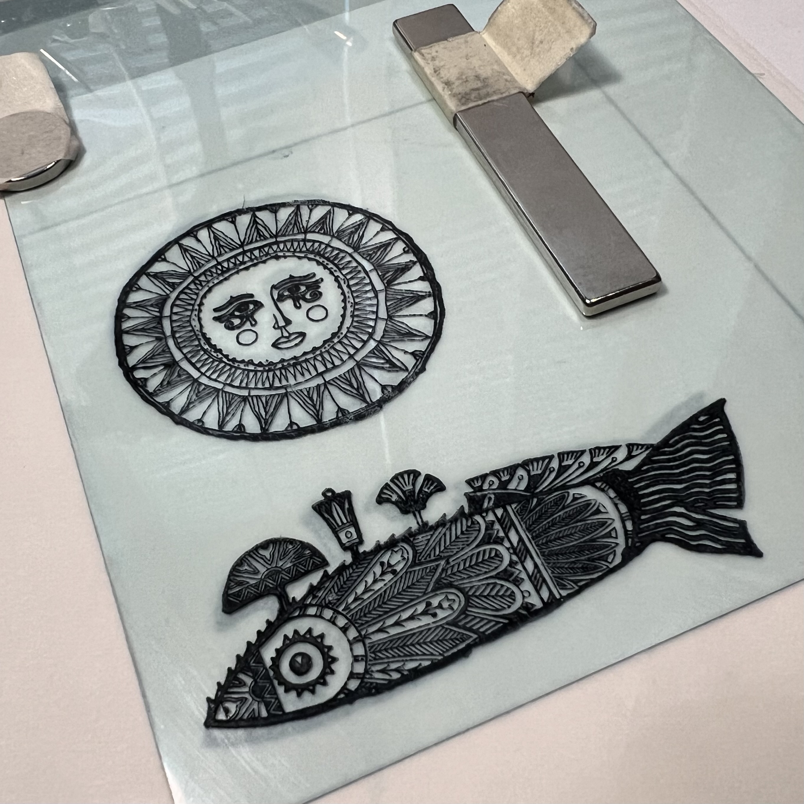
Knowing I was creating something to enjoy this summer, I chose bright vivid colors, opting for yellow, blue, teal, orange, purple and magenta, but I believe that any colors you my have would work splendidly. The Lynne Perrella Collection stamp set 40 (LPC040) has a beautiful detailed sun image that I thought would be wonderful as a focal point. Being in the summer mindset meant that I also would use the fish stamp from the same set.

Knowing the size of the frame I will be using allows me to select different stamp designs that may fit best. You can always use portions of a stamp to fit an area if the overall dimensions don't work out. When I chose the sun stamp, I wanted a blue/teal "sky" color for the background and Tim Holtz Alcohol Ink (Stream) was perfect.

The best alcohol ink results are achieved on a non-porous substrate. For this project, I used Grafics clear Dura-Lar as my base. There are a number of ways to apply ink to the surface, and varying opinions on each. It's always best to try different techniques and decide what works best for you. You can find a bunch of videos on YouTube to help you get started if you have never worked with alcohol inks before. (I really enjoy watching Tim Holtz demo alcohol inks!) I like to create a solid background by using a paint brush with the ink. You can use either alcohol ink blending solution or isopropyl alcohol as your fluid medium. If using alcohol, be sure to always use at least 91% (or higher) alcohol.


Now to the magic of the alcohol lift ink...

Using the Alcohol Lift Ink pad (by Ranger industries), ink the stamp then stamp onto the background making sure to put even pressure along the entire image. Then, carefully lift the stamp off the background and set aside. Using a clean cloth (or a smooth paper towel) blot the stamped design, constantly turning the towel to a clean area before blotting another section. Essentially what we are doing is removing the lift ink. In order to keep the image crisp, it is important that you do not rub the area and smudge the ink, you want to simply blot and lift the towel then repeat the procedure with a clean area of the towel until all traces of the lift ink are removed and you can see a negative of the image. So instead of seeing a stamped image on the background, you will have the background with the image removed from it.


I had originally envisioned a richly colored background, but had a difficult time getting a smooth, non streaky base layer of alcohol ink, so I ended up using the lighter colored background. Initially I was disappointed; however, once the pattern emerged, I was glad that it played more into the quarterly "hidden" theme. This will give me more opportunity to showcase the focal images with vibrant colors. Having my background established, it was now time to focus on my favorite way to use alcohol inks, painting with them. For me, the easiest way to do this is using a palette of alcohol ink that is essentially dry in wells (or pans). The palette I use is byTim Holtz and contains 36 compartments for different colors.

Using Ranger Archival Ink and a stamping platform, I stamped the images onto the Dur a Lar and allowed it to dry completely. Since the alcohol ink will smear the archival ink, and my base is clear, I will be "painting" the reverse side. I add color to reverse side of each of the images and allow it to dry. If you are not happy with something, alcohol ink is easily removed by using a brush loaded with alcohol and taking up the unwanted ink, then wiping the brush on a paper towel. You can then go back in and re-paint the area.
Painting with the alcohol ink takes a bit of practice and a lot of acceptance. Although you can somewhat control the ink, it still sometimes has a mind of its own. Depending on how wet your brush is when you load it will make all the difference as to how much it bleeds once it is brushed onto the substrate. It's a great idea to keep a paper towel beside the palette to absorb some of the alcohol before picking up the color.


I changed out the original chain that the frame was supposed to hang from with a wire and some trade beads that I had from my stash. Then I trimmed the piece to fit into my frame and voila! I already have ideas for creating different pieces to use in the frame. the PaperArtsy Lynne Perrella Collection has so many beautiful designs, maybe I won't just limit myself to seasons...

Blog: aksbarchitect CREATES
Facebook: Ann Sullivan Barnes
Instagram: @aksbarchitect
Pinterest: aksbarchitect


2 comments:
Gorgeous project and fabulous tips for working with alcohol ink x
Absolutely amazing, Ann - so creatively exciting!
Alison x
Post a Comment