Showing posts with label Carol Quance. Show all posts

Tuesday, 20 August 2013

Carol Quance Project #3 Flower Canvas And Tags ....

So technically this is Carol's final Guest Designer post, but i think you have busted us, and know to expect her back tomorrow with a surprise! ...so we'll reserve our proper goodbyes till then! Here she is...... (drum roll)....Carol Quance...

"I think this is my favourite project during my time as Guest Designer. I hope you like it too."


I started by stamping flower images from ELB01 and ELB03 onto some heavyweight cotton canvas in StazOn Black.  I re-inked my pad before doing this to make it more juicy because the cotton canvas is quite thick and it helped with the absorption of the ink into the fabric. I also found that if I held down the rubber stamps for a while longer than usual it gave a stronger image. 

Next I painted the images with Fresco Paint.  I added some water to the paint to help it spread into the fabric but not too much as I didn’t want it to bleed. A pointed paintbrush was helpful at this stage for accuracy. I started with the flower accents in the centre. Then dried.

I painted a border round the edge of the images about 4mm (quarter inch) so that when cut out they would still have a coloured edge and not a white fabric border. Make sure you dry the fabric before switching paint colours, or the 2 colours will merge. If you dry after the first colour, then that will contrast nicely with the second colour.


  I painted up some leaves and branches too.

Next up, I cut out the different painted shapes and layered them up with some soft curtain interlining.


 I then used some plain cotton for the backing.


You don’t have to use curtain interlining – just whatever is to hand but make sure it’s not too thick.   As you can see, I didn’t cut them out particularly carefully.


Out came the sewing machine.  I set this up for free machine embroidery and with some gold thread, stitched round all the borders and highlighted the inner areas where I felt like it.


I did not tie off any loose ends of thread.  I made sure I re-stitched over the beginning and ends of my stitching lines and just cut them off. 

Once all the stitching was complete, I carefully cut round the edges. 

I didn’t like the white edges that were left after cutting out the flowers so I painted round them with watered down Fresco Paint in a matching colour.


Because the Fresco Paints have a high pigment, you don’t lose any of the depth of colour by watering them down.  It also makes it easier for the colour to absorb into the fabric.

Next I sprayed a piece of 25 x 25 cm piece of cotton canvas with dye inks. 


Finally it was a matter of placing the flowers and leaves on the canvas until I liked the layout. I only attached them lightly to the canvas with the sewing machine so that the edges were free and gave a more dimensional look. I also added a few beads to the flower centres for added texture.  Some words from the ELB03 plate were stamped onto a plain piece of canvas and stitched in place.   I backed the picture with another piece of cotton canvas and roughly stitched all round the edges to hide where I had attached all the flowers and leaves. 


Side project – canvas tags.

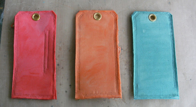
I had a lot of spare leaves and flowers left over and made some tags with these.  If you don’t fancy a full sized canvas, this is an easier way to go.  The tags can be cut out with the Tim Holtz tag die or cut from a template. I really enjoyed painting the canvas with the Fresco Paints because it worked so well. I liberally watered them down and the colours blended beautifully. As I mentioned previously, because they have a lot of pigment, the colour stays strong. 


  And this is the result.


 I also painted the edges and the backs.


 I attached the flowers/leaves and words as previously and here is the finished result.


This is my final project for PaperArtsy this semester. I have had a fabulous time. The PaperArtsy products are such fun to work with and I have been on a creative roll with them. Thanks to Leandra and Gillian for inviting me to a fun filled and exciting few months.

Leandra Says: Such a great idea. I love how you have used the little flower head 'upside down' it works really well that way! Adding a bit of 'puff' to fabric through stitching and the interlining giving depth really gives some real life to the flowers. Fantastic. Thanks Carol, you projects have been amazing this semester! It's been so great having you share with us all. Thank YOU!

Gillian Says: I think I have to agree with you Carol, I adore how you have combined the Fresco Paints with Lin's stamps onto these fabric works of art. Absolutely BEAUTIFUL. It has been a real pleasure seeing you create over the last few months. xx

Don't forget that if you want to join Carol in this week's challenge, then please why not have a go re-creating, or twisting-any-idea Carol has presented this week, and link your creativity here. Winners get to choose an A5 stamp set from PaperArtsy of their choice. We love to see how our designers inspire you! So join the fun!
 

Monday, 19 August 2013

Carol Quance Project #2 Card Design Elements ....


"I’ve never had any artistic training -  just learnt what works for me as the years have gone by but I think there are certain things that I’ve become aware of that help produce a cohesive piece of art/craft and not a collection of elements just lumped together on a piece of card that make you wonder why they’re there. I’ll try and explain some of them as I go through making this card along with some general hints and tips. This is more a case of feeling what’s right for me rather than the design reason so apologies to anyone who knows the correct way to express all of this"!

Although I never have a design in mind, I generally start with a stamped image.This one is from the LPC010 set.


    I fussy cut this because I felt this would add extra interest.  Then I coloured it in. 


Once that was done I chose my card colours.

I’ve always loved layering up card, going through my stash and finding colours that work together.  Make sure you’re in natural daylight because if you do this at night in an area that’s not well lit you will find that in the day time the colours look quite different and won’t work together.  
 {Night}
{Day}

Once you’ve chosen your card colours, look for elements in your stash that you think will work with your project such as matching ribbon, matching ink colours, embellishments (such as the Eclectica ones I’ve used here), beads, charms etc. I then spend quite a long time trying out the different colours/layers, together.  I try the dimensional elements in lots of different positions until I like what I see.  I’ve learnt that it doesn’t look right if you just plonk an element on to your card.  It looks better if you have your items slightly offset (not level), and I always try and attach the elements to the central image so that they are all connected together and the whole thing feels more complete.


I stamped up some Eclectica shapes ES03 with Mini 61.

 I then stamped the shapes with the matching stamps from ELB01


 I find it easier to take the stamp to the Eclectica shape.


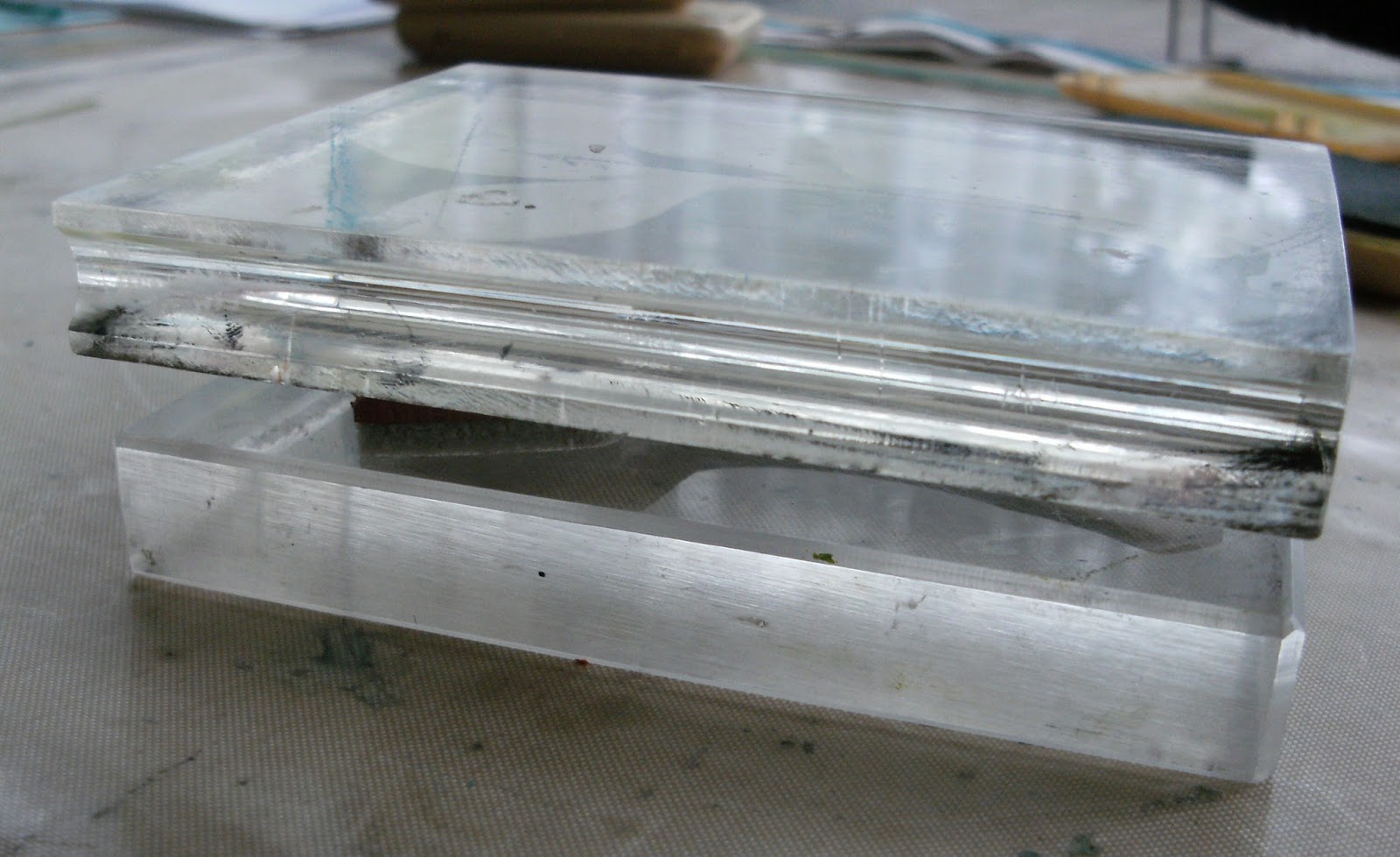
 and then put another acrylic block over the top to add pressure.

 {Note that I’ve stamped the writing so that it will be horizontal when the card is finished}. 

I stamped a tulip from ELB01, die cut it (PA tulip #1) and painted it with Blood Orange which is translucent and allows the stamping to show through.  You might wonder, having chosen blue and green coloured background card why I chose red for my flower. 


You can see from this pic that there are elements of red in my gelli plate background which added a splash of interest in a different colour.

Now all my elements are ready to go. 


I have a useful tool when which I use when I’m trying to work out the size of my card/piece of artwork.  I cut 2 strips of mountboard about 2 inches (5 cm) wide and glued them together in an “L” shape.  Do the same again and you can then use these as a frame round your work to give an idea of what it will look like.

If I use any card with a white core I always edge it in black or a dark matching colour with a marker pen.  This makes the layer look more grounded/attached to your work.

If I’ve used coloured card as the base on the front of my work, to save wasting my precious colours unnecessarily on the front of the card, I always cut a matching piece in white for the back.  I cut the front slightly larger so that I can score a “tab” down the side in order to attach the front to the back. 

Once I’ve spent some time (hours sometimes!) organising my elements to my liking.  They can all be attached in place.


TIP: Don’t cut the different layers of card with the same amount of border  - vary it for added interest.

As you will see in the final image, although the sentiment in the top right corner is not joined to the central image, it is still connected to the whole by layering it up with the same card that I used to mount the main image on.


Leandra Says: Fantastic tips Carol. I love the eclectic shapes with script and the image. I discovered a tip the other day re those too. If you lay the clean stamp directly onto the chipboard shape (ez mount up), you can move the leaves to match the shape perfectly, and then slap the acrylic block onto the exposed EZ mount, your image will perfectly match the shape of the dies cut chipboard.

Gillian Says: I love how you have brought so many different elements together to produce this wonderful card. The splash of red incorporated into the tulip and on the background really makes an impact. Fab composition Carol.

Don't forget that if you want to join Carol in this week's challenge, then please why not have a go re-creating, or twisting-any-idea Carol has presented this week, and link your creativity here. Winners get to choose an A5 stamp set from PaperArtsy of their choice. We love to see how our designers inspire you! So please, feel free to join the fun!