Showing posts with label 2020 Topic 17. Show all posts

Saturday, 3 October 2020

2020 Topic #17 Simmer Dim with ESN (by Jennie Atkinson)

                                                  2020 Topic 17: Day & Night


I won't spoil the surprise and reveal what Simmer Dim is, but it was awesome to learn about it and how Jennie recreated it with her gel plate. Her palette isn't one that you might automatically pull, but it perfectly matches her muse. She's created a workbook we'd all love to use.
~ Keren.

Hi everyone, it's Jennie (Live the Dream) here with you today with a rather colourful (for me!) interpretation of Shetland skies. 

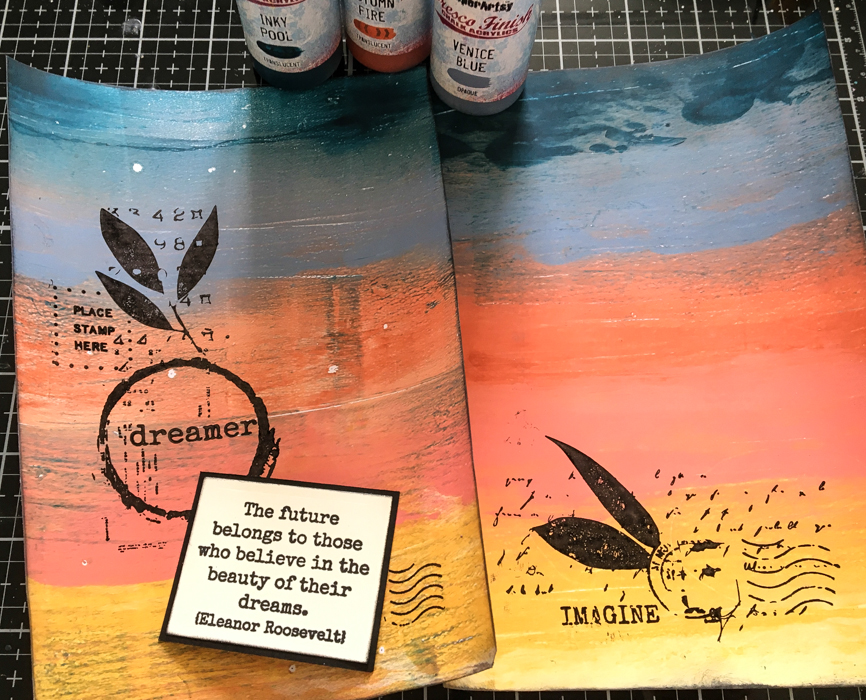
In mid summer here in the north, the sun sets late and rises almost immediately - day becomes night and night becomes day. In Shetland dialect it is known as the Simmer Dim (Summer Twilight). I wanted to try and create the colours of this amazing twilight using my Gelli Plate and Fresco's and actually surprised myself with the result! I used the papers to make an A5 workbook. 


I used Sara Naumann's fabulous Dreamer stamps released back in the summer.


I started with the Gelli Plate and a number of Fresco Acrylics. I had this photograph in mind and tried to match the colours as best I could. The photograph was taken from the house here at midnight around midsummer.


I have used Fresco Finish Chalk Acrylics in: Inky PoolVenice BlueAutumn FirePeach Nectar, Pumpkin Soup and Cheesecake.


And these were the resulting sheets. I used the colour in strips and very carefully brayered them sometimes allowing the colours to mix. The little white spots were the result of a couple of pieces of dried paint on my brayer! Unfortunately I picked them off so the lovely "stars" effect unfortunately didn't transfer to the second sheet!


I cut the sheets down to fit my cardstock (an A4 black sheet folded in half to make an A5 book) and stamped with Black Archival Ink.


I had some pieces left over from cutting the main sheets so used them to make small pockets for the inside of the notebook and a couple of tiny books for the inside.


I really love how well the colours blend into each other but still retain their brightness. I think this was due to using translucent colours along with the opaque. For example the Inky Pool sits on top of the Venice Blue rather than blend into it. I don't think I could have achieved this array of colours without using the Gelli Plate - one of my most favourite tools! I am no artist but I love that I can use a photograph and a collection of Fresco's to create something really quite artistic! 

As always, thank you for joining me and I hope like me you have enjoyed this fabulous theme and all the wonderful projects created by the PaperArtsy Designers.

Jennie x

Blog: Live the Dream

Thursday, 1 October 2020

2020 Topic #17 The Circle of Life with EKC (by Helen Chilton)

                                                2020 Topic 17: Day And Night


Artistic processes rarely run entirely to plan, and Helen's Circle Of Life project incorporates experimentation, patience and a whole lot of doodling. She's ended up with a beautiful representation of both this topic and indeed of life itself. 
~ Keren.

Hi everyone, it's Helen with you today, and I'd like to share with you project which I've called the Circle of Life - for obvious reasons! I wanted to create a clear demarcation between Day and Night but still give the idea that it goes round and round. I've deliberately used the same colours against both the yellow and the dark blue to see how the background colour affects the colour on top, just as the light of day and darkness of night would. The stamping is roughly symmetrical.


Eclectica³ {Kay Carley} 06

Eclectica³ {Kay Carley} 07

Eclectica³ {Kay Carley} 14

PA Stencil 187 {ETS}


The MDF circle was originally, I think, part of a clock blank - hence the hole in the middle. I used washi tape to divide it off and then painted each half with Frescos: Snowflake, Zesty Zing, Banana, Midnight and Deep Sea.


Then I added a bit of stencilling in Slimed; it's interesting how the green looks so different on the dark background.


I've stamped in black trying to keep the flowers in roughly the same place on each side.


As so many of the flowers were dotty I decided to used Ranger Enamel Accents to add a bit of gloss.


Then I filled in the open flowers with Frescos.


I used Posca pens to add extra colour and doodling. You could also do this with Frescos and a fine brush but I always end up wobbling at the wrong moment!


I was a bit worried that the background stencilling was too strong so I added shading with a soft pencil and white highlights. I also drew the stamped lines back in with a fine black pen.


For the centre ATCoin I've made a sun and a moon using a Prima mould and layered them onto a scrap of inked, patterned paper. You can hide a brad under the sun so the ATCoin turns.


I like how this project turned out - eventually! This was my third attempt. 
I knew what I wanted to do but couldn't get it quite right. I started off by blending the night and day colours at the sides to create dawn and dusk, but that took up too much space. Then I tried it without the stencilling, but that looked too flat - I felt like Goldilocks! Then I spent ages trying to work out what to put in the middle to hide all the mess where the stalks overlapped. An ATCoin was just the right size. As they say, third time lucky! I think by then I just decided to go for it. 
Day and Night is a great topic with so many different interpretations. It'll be great to see what you come up with. 

Helen

Tuesday, 29 September 2020

2020 Topic #17 Night And Day Journal Cover with ZA (by Jenny Marples)

    2020 Topic 17: Day And Night


Day turns to night oh so gradually and Jenny has reproduced this effect using paints in a cleverly conceived ombre way. Such an effective technique to use as a background to then add some wonderful painted houses onto.
~ Keren.

Hi everyone, it's Jenny Marples with you today, and I'd like to share with you a Journal Cover featuring the wonderful and quirky houses by Zinski Art for the current theme.

The theme 'Day and Night' lends itself perfectly to the creation of ombre effects depicting the change in light from daytime to night time. Adding a pop of colour on top of a monochromatic background is really effective as can be seen from the finished cover below.


Here's a closer look at the front of the cover, the view at evening to night time...


 and here's the back of the cover, the view from morning to afternoon.


Here are the steps taken to create this cover, starting with the assembly of the cover itself, (cut from thick board using Eileen Hull's 'Journal' Die). I painted directly onto the board having divided it with pencil lines into four equal sections. After painting each section from light to dark I went back with the same paints, dry brushing the two colours together on each 'border' to blend them.


With the paint dry I splattered gold droplets of Izink Pigment Ink by Seth Apter over the whole cover using a small paint brush.


To create the 'scene' for the houses the larger of the trees from Kay Carley's stamp set EKC31 was repeat stamped across the width of the cover using permanent black ink.


To 'ground' the trees I then stamped some of the grass and smaller flower stems from Kay Carley's stamp set EKC40 across their bases, again with permanent black ink. To give them all a little more dimension I used a grey gel pen and blended it out across the tree trunks with a wet brush.


The houses (from the Zinski Art ZA40 stamp set) were created using gel plate printed tissue paper backgrounds, made with a mix of the blues from the background and some greens and pinks seen in the photos below. Having stamped parts of each house onto the tissue backgrounds they were fussy cut and paper pieced together.


After adding the houses to the cover I heat embossed the saying from the Zinski Art ZA40 stamp set onto the front with gold embossing powder.


Below you can see how the journal cover was completed by threading some dark grey elastic through the holes to secure pages inside and to act as a closure.


Here are a couple of close ups showing the details on the front cover.


Below you can see more of the details on the back cover.


If you haven't tried creating an ombre effect with paints I highly recommend giving it a go, remembering to keep a light touch when dry brushing and blending the colours together for more effective end results. 

Thanks so much for stopping by.
Jenny