Showing posts with label 2016 Topic 7. Show all posts

Saturday, 16 April 2016

2016 #7 Fossil Resist ATCs {by Alison Bomber}

 2016 Topic 7: Resists


Hello all, it's Alison here from Words and Pictures. I've not been around much lately but I couldn't resist joining in with the Resists theme, and it gave me the excuse to get two of the PaperArtsy Minis I've coveted for ages - finally giving in to temptation (like Oscar Wilde, I can resist everything but temptation!). Regular followers of mine will know that clear embossing is a favourite thing of mine - I love its glossy dimensionality - and it works brilliantly as a resist for the inkiness to follow.

I ended up creating a quartet of ATCs with these fabulously detailed stamps... one pair with the fossils lying in state in a fusty wooden drawer in some zoologist's collection...

... and one pair where they are in a kind of dream of the world they used to inhabit.
I started by cutting ATCs from some off-white card and stamping the fish fossils - Ink & The Dog Mini 100 and Ink & The Dog Mini 101 - in Versamark before embossing with clear embossing powder.

ID Mini 100
ID Mini 101
(You'll see I created a spare pair in case of problems or other ideas!)


For the zoologist's pair, I applied Distress Inks to the ATCs with a blending tool - Antique Linen followed by Vintage Photo and some Black Soot around the edges - keeping some damp paper towel nearby so that I could buff away any excess ink from the bones as I went. Then I did some spritzing and flicking, and also sprayed some Distress Marker splatter to add to the aged look.

I added some vintage script - the zoologist's notes, taken from the Ink & The Dog Words Plate 4 - stamped in Distress Ink so that it could also easily be wiped away from the bones. And finally I added the rub-ons to label the collected specimens, as well as the word stickers which I shaded around with more ink.

Ink & The Dog Words Plate 4

For the underwater pair, I applied my ink differently - pressing the chosen colours - my usual blue/green suspects, Broken China, Salty Ocean, Mowed Lawn, Peacock Feathers, I think - onto the craft mat, spritzing with some water, and then dipping and smooshing my ATCs until I liked the look of them.

I used the branches from Hot Picks HP1008 as seaweed, again stamped in Distress Ink so that the paper towel could spring into action to remove any excess from the embossed fossil.

HP1008

I painted some Snowflake Fresco paint on to my craft mat and then used the top of a paintbrush cover and the other end of the paintbrush..


...to "stamp" my columns of bubbles.


I always enjoy the gleam of the clear embossing in sunlight...
... and it gave me great pleasure to fit in just a little bit of Resistance in my brief few days at home recently. Heat embossing and inks are my favourite, but there are so many ways to create a resist, so I hope you'll be inspired to play with some Resists too. Thanks so much for stopping by today.
Alison x
Words and Pictures


Great smooshing Alison, a fabulous way to blend colours. The embossing resist is so magical, appearing all glossy and bright from under the ink. Great to see both colour options too, showing that these stamps work equally well in a vintage or a bright project. ~Darcy

We would love to see how you interpret this Resists topic by linking what you make to our 2016 Challenge #7: Resists, on this page HERE.
All of our bloggers love to see your twist on their ideas,  particularly if you were inspired directly by their post. 
All links go in the draw to win a £50 voucher to spend on products of your choice from the PaperArtsy online store. The Resists link will close 17:00 (London Time) Sunday, April 17th 2016. The winner will be announced 2 hours later at 19:00.

Friday, 15 April 2016

2016 #7 Blooming CD Art {by Alison Hall}

 2016 Topic 7: Resists 

Hi everyone Alison (Craftytrog) here. Tonight I'd like to share with you a post about using vaseline to create a resist with PaperArtsy Fresco Finish Paint.
I love using this technique for making backgrounds, as you can build up many layers, each time leaving some of the lower layers visible, and you get a lovely, random finished effect. I used an old CD as my base for a piece of hanging art, together with Emma Godfrey's beautiful floral stamp set EEG14 and some of my favourite bright Fresco paints.

Step One: I Began by priming my CD with some Chalk Fresco Finish paint, then I used Ranger Jet Black ink to stamp a background with the phrases from EEG14.

EEG14.
Step Two: I added a thin layer of Bora Bora Fresco paint, watering it down so that the stamping shows through. Then I used my finger to add some vaseline in a few places, where I wanted the next layer of paint to resist.


Step Three: I carefully painted the CD with some Zucchini Fresco, taking care not to spread the vaseline. After drying the paint with my heat gun, I used some kitchen towel to remove the paint where the vaseline had been. Oops...rubbed a bit too hard bottom right! But that's fine!


Step Four: I added some more vaseline, making sure that I wasn't covering too much of the lower layers, then painted a layer of Lavender Fresco, drying and wiping away the resisted paint as before.


Step Five: My final layer was some South Pacific Fresco. I wanted the top layer to be a bit darker.


Step Six: To make my embellishments, I painted some book paper with Bougainvillea and Tango Fresco, and stamped and cut out the two flowers from EEG14. I also stamped the phrase from EEG14 onto some unpainted book paper edge, and cut out each line and two of the words. I stamped the large flower onto the CD, just to check that it would cover the centre hole, then inked the edges of the CD, using Black Archival Ink and Ink Blending Foam.


Step Seven: I used Glossy Accents to layer the flowers and adhere them to the CD. I adhered the phrase, adding some Glossy Accents on top of the words. I then glued a small metal book plate and some buttons to the flower. At this point I decided to stamp another small Bougainvillea flower, and glued this just below the larger one. I decided to add some more tiny buttons next to the phrase, to add a bit more balance to my piece. I finished it off by punching two holes at the top with a Crop-A-Dile, and adding some eyelets and chain.


I hope I've inspired you to try out the vaseline/paint resist technique. It's messy and fun, and gives you a lovely random, layered background. It would be fantastic as a journal page, canvas, or card background. You could used unpainted stamped embellishments instead, as a great pop against a colourful background.

I look forward to seeing your resist projects for the challenge.
Alison x
Blog: Craftytrog's Inky Adventures
Facebook: Alison Hall
Twitter: @craftytrog

Thanks Alison, not only is this a great bit of upcycling but what a brilliantly effective technique. The effect is just like peeled paint, and can be easily controlled to be as subtle or as dramatic as you want. A really nice cheery piece of art. ~Darcy 


We would love to see how you interpret this Resists topic by linking what you make to our 2016 Challenge #7: Resists, on this page HERE.
All of our bloggers love to see your twist on their ideas,  particularly if you were inspired directly by their post. 
All links go in the draw to win a £50 voucher to spend on products of your choice from the PaperArtsy online store. The Resists link will close 17:00 (London Time) Sunday, April 17th 2016. The winner will be announced 2 hours later at 19:00.

Wednesday, 13 April 2016

2016 #7 Spring Wings{by Seth Apter}

 2016 Topic 7: Resists

Hello everybody. Seth here,  I am thrilled to be back for my first guest post on the PaperArtsy blog in 2016. The theme for today's project is resists. And who can resist a good resist? There are so many approaches to making resists and mine focuses on the wax crayon technique. I seem to be channelling spring with my colour choices, waiting for warmer days in NYC.


This piece started with a 6 x 6 inch square of 140lb cold press watercolour paper. The 140lb weight makes this sturdy and the cold press surface is slightly textured. I used watercolour paints for this project and I just love the way the colours settle into the nooks and crannies.

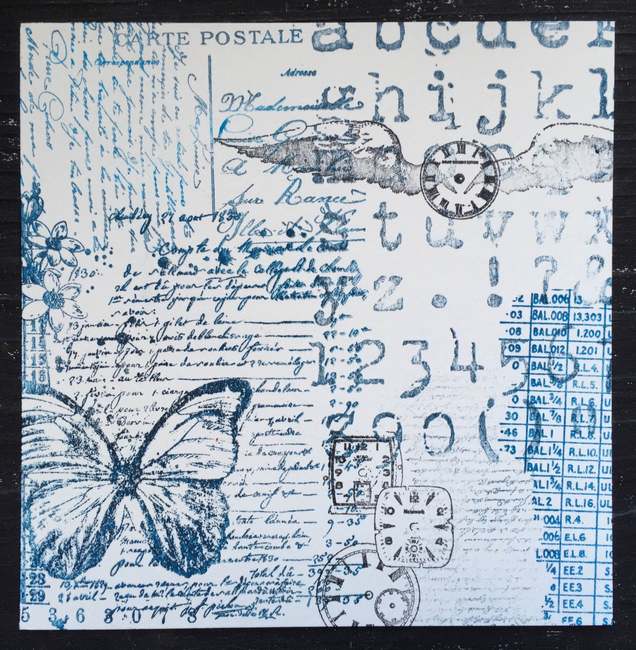
I started by gathering my (large) collection of PaperArtsy stamps. I pulled out stamps that were either text-based or image-based. I was not looking for any particular theme but rather a grouping of stamps that I could use to create a stamped collage over the entire surface of the paper.

Words 2
Mini 30
Using StazOn ink pads so that my ink would dry fast and remain permanent, I stamped on the surface creating a collage of images and text. I used Words 2 Mini 30 HPXT01 HP1301 and VID04 and VID09


HPXT01
HP1301
Next I took a white wax crayon and selectively coloured some of the surface of the paper. I chose to fill in the larger areas with spaces, such as the butterfly wings, bird wings, clock faces, flower petals and inner loops of the letters.


I then painted the entire surface of the paper with watercolour paints using a water brush. I used a spring palette, choosing yellows, reds, blues and greens and allowing all the paints to bleed and blend together. Once the surface was painted, I used a baby wipe to gently rub over the areas that had been previously covered with the crayon. Because of the wax, these coloured areas resisted the watercolour paint and stayed white. I was careful not to rub too hard so as not to dig into the paper below.


Here are a couple of close up shots showing how the white crayon has resisted the watercolour paints. 


Any paint on the crayon areas can be wiped away leaving the white areas bright and clean, this makes them really pop against the colourful paints. 


There are many approaches to resist in addition to the crayon technique but I find this simple and very effective. If you haven't tried it yourself, hope you are now inspired to do so.
Seth. 
Blog: The Altered Page

Who indeed could resist a page like this. thanks Seth for highlighting one of the simpler techniques. So often overlooked in the wake of all the fancier products. Getting back to basics has produced a fabulous page here, with a technique accessible to everyone ~Darcy 

We would love to see how you interpret this Resists topic by linking what you make to our 2016 Challenge #7: Resists, on this page HERE.
All of our bloggers love to see your twist on their ideas,  particularly if you were inspired directly by their post. 
All links go in the draw to win a £50 voucher to spend on products of your choice from the PaperArtsy online store. The Resists link will close 17:00 (London Time) Sunday, April 17th 2016. The winner will be announced 2 hours later at 19:00.

Monday, 11 April 2016

2016 #7 Grow with Me {by Gabrielle Price}

 2016 Topic 7: Resists

Hi everyone Gabrielle from Crafty Thoughts here.

Tonight I'd like to share with you this evening with a post about using Glossy Accents as a resist.

When I was aware we were exploring resists I immediately thought of using embossing powders but then I remembered you can use glue as a resist. I love using Glossy Accents as a glue and I wondered how it would work as a resist.


Step One: I started by making sure I had a baby wipe to hand! Tape your stencil down as you don't want too much 'bleed' and then pool some Glossy Accents on your craft mat. With your finger add the Glossy Accents to the stencil. As soon as you have finished, removed the stencil and wipe clean with the baby wipe as you will not want the Glossy Accents to set!


Step Two: I wanted to create a floral themed project so I added a grassy border on the bottom.


Step Three: I added layers of Ice Blue and Lake Wanaka. When dry I gently 'polished' the Glossy Accents with a baby wipe to remove the paint, sanded the whole piece and then added a reed stamp in the background from EDY18. I forgot to take a photo of the whole piece at this point (was having too much fun!)


EDY18


Step Four: I stamped out the flowers and the stalks on to dictionary paper and coloured them using watercolour pencils. I used sets EDY17, EDY18 and EDY19.


EDY17

EDY19


Step Five: I cut out all the flowers, leaves and stalks - for the stalks with leaves I stamped the stalks on to the project and added the cut out the leaves.


Step Six: The final flourishes were to add some stamped accents using White Fire on the circle stamps from EDY17; a few lines of Slate using the side of a palette knife and the sentiment from EDY19.

I loved the way the Glossy Accents emerged from under the painty layers and found the contrast of the white card beneath, and the blue paint, really satisfying. This is a technique I will use again - remembering to clean my stencil straight away!

Gabrielle x
Blog: Crafty Thoughts
Twitter: FreyaTom

Love this resist technique ... Great spring colour combo and love the subtle graduated shading around the centre of the blooms allowing the script to show through. Thanks Gabrielle for sharing your creativity with us. ~Gillian

We would love to see how you interpret this Resists topic by linking what you make to our 2016 Challenge #7: Resists, on this page HERE.

All of our bloggers love to see your twist on their ideas,  particularly if you were inspired directly by their post. 

All links go in the draw to win a £50 voucher to spend on products of your choice from the PaperArtsy online store. The Resists link will close 17:00 (London Time) Sunday, April 17th 2016. The winner will be announced 2 hours later at 19:00.

Sunday, 10 April 2016

2016 #7 Paint and Ink Resist {by Kim Dellow}

2016 Topic 7: Resists

Hey folks, Kim Dellow here with a technique I have never tried before, well before I wrote this blog post that is. I thought for the Resist theme running here on the PaperArtsy blog that I would have a go at the Gouache and ink resist technique but I’ve swapped out Gouache paint for the PaperArtsy Fresco Finish paints. This is a fabulous technique and you can get some great print-like effects from it so if you haven’t tried it yet then do give it a go.

But, before you go rushing off to try this technique for yourself, you do need to know that it doesn’t actually work on PaperArtsy Fresco Finish paints on their own. However, it does work if you mix the paint with the PaperArtsy Crackle Effect Glaze. I’m guessing that it might work if you try mixing the Fresco paints with the other PaperArtsy Glazes too but the Crackle Effect was the only one I had so I haven’t tried the other ones yet. If you try them then do come back and let me know how you get on!

As to how much of the Glaze to add the only ratio I have so far tried is a 50:50 split, when I have some more time I shall do some experiments with different ratios. But so far I do know that if you use a mix of half Fresco paint to half Crackle Effect Glaze then you can get this great Fresco Paint and Ink Resist technique to work.

Fancy a bit of PaperArtsy Fresco Finish Paints and Ink resisting? Great! Let’s do it!

Step One: Heavy weight mixed media paper is great for this technique, you could also use watercolour paper too. Tape the paper to a hard surface with masking tape and stamp out your scene using Tsukineko Memento London Fog ink. I chose this ink to stamp with because it does not show under the ink I’m going to use later. I used EKD01 and EKD02. 


EKD01
EKD02. 

Step Two: Paint your scene with the 50:50 Fresco to Crackle Effect Glaze mix, the colours I have used are Fresco Finish Cheesecake, Fresco Finish Teresa Green, Fresco Finish Coral, FrescoFinish Turquoise and Fresco Finish Mermaid.

The trick is to paint all the negative space, so both inside and outside of the stamped lines but don’t paint over the lines. Anywhere you do not have paint will become black when you add the ink wash at the end. A fine detail brush is very useful in some places depending on how much of the stamp detail you want to keep, but it is worth it in the end!
Let the paint dry completely.


Step Three: ***SCARY BIT ALERT!***
Deep breathe now, take a large brush and cover your beautiful, taken you hours to do, painting with an ink that is water-resistant once dry, like Indian Ink (or India Ink if you are in the US). I know, it is scary, but you can do it!
Let the ink dry completely.


Step Four: Things are about to get messy! Use a brush and clean water and wipe over the painting to reveal the colour beneath. You can un-tape your picture at this point to help the ink to pour away if you need to.


How much you brush with water will determine how distressed the final painting will look as the paint also reacts to the water and can be easily washed away. So just be careful not to lose all of your Fresco painting as well as the ink. I did get a little overzealous in areas so my picture is looking quite distressed but hey, it is still a cool look!
Once you are happy let your painting dry.


Hope you have fun with your resists this week and do let me know if you try this technique with the PaperArtsy Fresco Finish paints, I would love to hear how you get on.
You can find me on the following:
Blog Kim Dellow 

Thanks Kim. Well, scary indeed, you are one brave crafter! What a dramatic step to take but the results are well worth taking the leap of faith. I love the grungy, pitted effect at the end along with those pops of colour. Those lil hedgehogs make me go 'Aww' everytime I see them. ~Darcy 

We would love to see how you interpret this Resists topic by linking what you make to our 2016 Challenge #7: Resists, on this page HERE.
All of our bloggers love to see your twist on their ideas,  particularly if you were inspired directly by their post. 
All links go in the draw to win a £50 voucher to spend on products of your choice from the PaperArtsy online store. The Resists link will close 17:00 (London Time) Sunday, April 17th 2016. The winner will be announced 2 hours later at 19:00.