Bryan
always creates such bold and striking collages which I find so brave
and organic. This striking authenticity really resonates with me, and
pulls me into the possibility of hidden messages that lie within. I
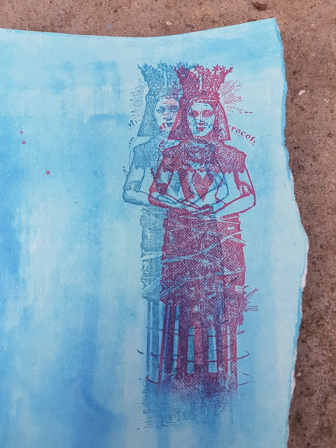
love the double exposure with different inks, and the red circle really
makes you winder what 'she' might be thinking about. ~ Leandra
Hi everyone, it's Bryan here from Geezercrafter with you today, and I'd like to share with you my collage using some stamps from the range of Lynne Perrella.
I
chose this topic as I like working with various colours of blue, and I
have just started to incorporate red within my collages. Really pleased
with the stamps, just love all of the fine details, and the fact that
you can de-collage some of the elements.
Some masterboards created with Fresco Chalk Acrylic Paint Mermaid, London Bus and Inky Pool. A piece of plain rice paper dyed with Infusions In The Navy.
I recently saw a picture on Pinterest where the artist had created a double exposure of a photo, I wanted to recreate this with stamps and inks.
Initially I placed my collage elements on one of the blue backgrounds and glued into position. When I came back to it, it just didn't work for me, I was able to recover each piece by gently cutting around and reattaching to the rice paper background. Phew, that's better!!
I
have thoroughly enjoyed this 'nautical' collage, love how the colours
play so nicely together. I am looking forward to seeing your
interpretation of the topic. Next time I will try different colour
combinations and continue to add layers behind the substrate.
Happy Crafting. Bryan.
Blog: geezercrafter
Facebook:Bryan G Evans
Instagram:bryanevans7772
Pinterest: Bryan Evans
We always hope that you learn something interesting from our blog.
Our creative team love to read your comments so much, so please take time to let them know you've been inspired!
You must complete step 1 AND 2 to be entered into the draw.
To join our challenge:
1. Leave a comment on the Topic Introduction Post and go in the draw to win a PaperArtsy Apron.
2. Make something arty relevant to the topic, and link your creation from any social URL (eg. Instagram, Pinterest, Blog Post etc) sharing your original make to this challenge page.
The current topic link Topic 5: Nautical Colours will close 17:00 (London Time) Sunday, March 31st 2018, and the winner
will be announced 2 hours later at 19:00.
All
links go in the draw to win a PaperArtsy creative apron. Please make
sure we can contact you as a prize winner - it helps if you share your
contact info from the platform you opt to use.
Good Luck! If you have any questions, don't hesitate to ask!


8 comments:
This is amazing Bryan. I love the boldness of the colours against some of the more delicate images. Perfect for the topic!
I like this concept, I'm itching to try... Great bold colours for a gritty, urban grunge look!
Love it ! xx
Super explorations of nautical colours Bryan! Love blue and red together!
Great layers and the double exposure looks fab.
I like the double exposure idea, nicely repeated on one of the crowns too. This is a really interesting piece of collage work, well done Bryan.
Fantastic! I love that double exposure effect!
Lucy x
Love your work Bryan. Very thought provoking....and fun too. 😜
Post a Comment