Hi everyone, Leandra here with you today.
This year we have set aside time each quarter to deep-dive into one of our Stamp designers to find out more about their story. It's time to talk about Lynne Perrella, illustrator, researcher and interested historian, exhibiting artist, author, teacher, and a stamp designer with over 40 years experience creating products, classes and inspiration to many the world over.
 |
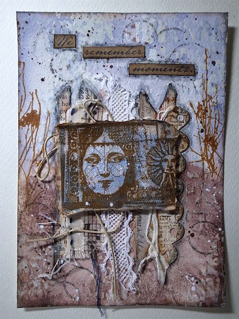
| LPC049 Mixed Media Card by Autumn Clark |
Perhaps you may not know that much about Lynne. Well, that is about to change! Unless you have been a stamper for longer than a decade, perhaps even two decades or more, she may not have been someone you know all that much about. I think Lynne might be perceived as one of our more mysterious or elusive designers for those outside the USA in particular) as she is not on social media, which we rely on so much for instant information. If you want to get a better sense of her, head on over to her website here, and make sure to sign up for her newsletter which offers a beautiful insight into her personal creative style.
 |
| Lynne Perrella |
If you read Stampington publications regularly, you will more often than not read an article written by Lynne. She has been a contributing editor for some years now, and creating content for Stampington has been a regular rodeo for her for as long as I can remember.
Lynne first came on my radar when I laid hands on the Stampington Publication 'True Colours' (Stampington, 2003). This was a round robin collaborative project coordinated by Lynne where she invited artists to create a journal themed by a colour. The journal was passed between the 15 contributing artists, and each would create a spread or series of pages in their own creative style but within the colour restriction of each book.
I absolutely treasure my copy, and when I bought it back in 2003, I poured over each page, desperate to find each detail, and grasp the intention behind each page. The photography was stunning, and the style of each creator so different, and the colour combinations, like Teesha Moore's Pink and Orange and Lynne's own 'white' book knocked my socks off. For many crafters at the time, this publication was a revelation about what our creativity could evolve into. Read more about True Colours here, Lynne's own words on Seth's blog (from May 10, 2010) NB there are numerous interviews on Seth's blog from many of the other artists who were involved in this project
 |
| LPC047 Acetate Cover Mini Book by Keren Baker |
You might be wondering how the collaboration between Lynne Perrella and PaperArtsy came about? I will share that story at the foot of this post, for now, here is our interview with Lynne seeking to discover a bit more about how she ticks! Lets hear from Lynne herself ...
Creative Philosophy
 |
| Created by Lynne Perrella : Offerings 1 |
Q: How would you describe your general philosophy in creating art? Can you sum it up in 3 words?
A: Three words: “Always keep working.” Work is always the answer for me, no matter what. I go to the studio every day, including weekends, because I know I will make discoveries there regardless of outcomes
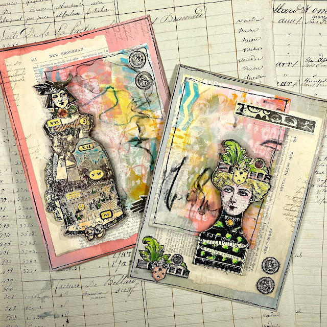 |
| LPC061 Pages by Leandra Franich |
Q: What are your feelings about “art” vs “craft”? Do you think it matters? Where do you position yourself and does it matter to you?
A: Starting at the age of 5, I’ve always considered myself an artist. I’ve always been aware that my authentic interests and curiosities were about art --- so it’s been easy for me to self-identify as an artist. However, as a former commercial artist I greatly respect the role that designers play. A designer has to work with all the creative fervour of a fine artist, but also has to wrangle deadlines, think about end-use, consider the requests and needs of a client, etc. My former career as a self-employed commercial artist and illustrator has been endlessly helpful to me, providing me with discipline and practicality.
 |
| Created by Lynne Perrella : Offerings 2 |
Q: What do you try to present to the world with your art? Is that important to you?
A: Difficult to express………..but when I create something, I am trying to ADD something to the world that does not already exist. My working premise is to bring something forward that adds fresh value, or unique beauty, or shared happiness, or a kindred spark.
 |
| LPC051 King and Queen Playing Cards by Keren Baker |
Q: How do you go about evaluating your own art, practice and progress? Do you tend to compare yourself to others? Do you feel pressured by external opinions?
A: My own self-evaluation comes down to one tried-and-true “acid test”: Am I getting to the studio and spending my time wisely? If so, I know the (imperfect) process will unfold, and I will make discoveries and move forward.
Shakespeare supposedly said “Comparisons are odious.” Although I have great admiration for fellow artists, I don’t compare myself to anyone. After decades in the art world, I totally expect that many people will not “get it” about my art, so I create for my own self-expression. Exhibiting and/or selling artwork assures that one will hear opinions – pro and con – and that is part of the game. In the world of design, I think the most interesting designers are always looking ahead, innovating, and setting their own trends.
 |
| LPC059 Venetian Mind by Keren Baker |
Q: What would be your main advice to people starting creating or looking to further their artistic expression?
A: This reminds me of a quote by American author Mark Twain: “The secret of getting ahead is getting started.” Great, right?
The most authentic discoveries are made in the act of “doing”. First, give your Inner Critic the day off. Give yourself some uninterrupted time, and just start. Use low-tech materials that are non-intimidating. Remember that you are making discoveries, not creating important finished works of art.
Keep going.
Artistic Practice
 |
| Created by Lynne Perrella : Shapeshifter 2 |
Q: Where does your inspiration come from? Where do you start a piece? Has that changed significantly since you started?
A: Inspiration is, literally, everywhere. I can become inspired by something as mundane as a postage stamp, or as vast as a cloud formation. I suspect we all have a languishing inner library of fascinations and interests that have accumulated over decades.
These topics simmer, bubble, or even evaporate --- and then something comes along that ignites our inspiration. Wow! Many of the topics that inflame my imagination have been simmering for decades. And now I feel it is my destiny to explore them, or interpret them as a piece of art, or an illustration. It feels like kismet.
I start by note-taking or list-making. (I’m a lifelong list maker.) I think of a list as a way of notating “connections”. So, a list about a potential rubber stamp collection might include book titles, museum exhibits I’ve seen, travel experiences, reference resources, quotations, etc. I like to look back at the notes and lists at the end, to see if the initial “flash points” were instrumental or just momentary suggestions. “The good is never wasted.” – This is a phrase from my mentor, Sas Colby, and it reminds me that one idea can become the shoulders for a better idea.
Every idea matters.
 |
| LPC003 Triptych by Marie Hampson |
Q: Is there an art supply that you cannot do without? Has that changed?
A: I love white gesso. It is the first thing I add to a canvas, or an art journal page. It is the ideal way to prep any surface. When I am working on an assemblage or shadowbox, I always sand the outer surface and coat it with white gesso. Coating both sides of an art journal page keeps my pages from warping and rolling. Gesso is essential.
 |
| Created by Lynne Perrella : Shapeshifter 4 |
Q: How do you know when a piece is done? Is that hard for you?
A: I hear this question frequently, and luckily I have a sensible straight-forward answer.
I know a work of art is done when I am satisfied with it. My mixed media artwork includes endless layers, so in theory I could keep working indefinitely. Layering isn’t simply a case of “add, add, add, add” – it is about using an array of colors, materials, images, etc. in a complex way for collective richness. I’m comfortable determining when a work of art is complete and I have a few tricks up my sleeve for can’t-fail “finishing touches”.
 |
| LPC008 - Haunted by Etsuko Noguchi |
Q: You seem to love teaching. How did that come about? Did teaching come naturally? Do you find it fulfilling/rewarding?
A: I started giving workshops in 2001, and I enjoy it more and more each year. The pandemic stopped in-person workshops, and I think the break made me reflect how much I crave working and meeting with other artists.
My classes are extremely interactive and my specialty is on-the-spot brainstorming. I cover a lot of techniques and do fun demos, but my favorite thing is creating deep connections within a group of kindred artists. Most mixed media artists love to share and cross-pollinate, so my events are very lively learning experiences for everyone.
Before I began giving workshops, the word “teacher” intimidated me; but then I realized that I could transmit my techniques and enthusiasm to other artists and create a nurturing, fun environment in the classroom. That awareness changed everything, and now I feel proud to think of myself as a teacher and a mentor.
Product Designer
 |
| Created by Lynne Perrella : Shapeshifter 1 |
Q: You had your own stamp company. How did that come about, and why rubber stamps as your item to create? What brought you to stamping?
A: I got very interested in Correspondence Arts in the 1970s. I was a self-employed illustrator at the time, and my daily work consisted of “on-assignment” illustrations for the corporate communications world; plus I also took any other assignments that came my way. I designed annual reports, needlework kits, posters, logos, packaging, anything and everything! I loved it.
Just for fun, I explored Mail Art, and I liked creating quirky objects that could be sent via (postal) mail. I amassed a huge collection of rubber stamps, (I still have them!) and eventually I tried my hand at designing my own images. I founded my own stamp company, Acey Deucy, and some of my first designs were nostalgic/Pop Culture images, followed by Southwestern images, and designs inspired by vintage graphics.
Eventually, I looked at the drawings in my own personal sketchbooks, and my so-called “goddess” stamps were born. These collage-style images in my signature style were totally new and different in the rubber stamp industry. The stamps were my entrée into the collage world, and I ended up in a new community participating in art journal round-robins, specialized deck projects, art doll collaborations, and more.
This all lead to becoming a regular contributor to Somerset Studio Magazine, and I am on their editorial advisory board. I do fine art collage, and am represented by the Lynn Hanson Gallery in Seattle, Washington.
 |
| LPC027 Panel by Sue Carrington |
Q: Your stamp designs are full of intricate details. How and where do you find your references?
A: My studio is located in the midst of my art library. I’ve been amassing my reference library since the start of my illustration career, plus I am an inveterate collector of books, prints, maps, engravings, and more.
I moved to Manhattan right after art school, and at that time there were entire neighborhoods full of antique book/print dealers. Illustrators and art directors traded recommendations about these quirky places, and I started a serious collection of archival images.
Eventually my travels took me to paper emporiums and antique book sellers in Europe, and I always came home with an “extra” suitcase full of ephemera. Vintage typography, old correspondence, detailed engravings of people and products, sheet music, and more --- I include these in my designs because they are unique and elegant; plus they reflect my personal interests and collections.
 |
| LPC046 Textile Panel by Jennie Atkinson |
Q: Where do you find your inspiration for your designs? What is your aim when designing?
A: I think I caught the mania for “themes” from my wonderful mother. She had a marvelous sense of humor and always enjoyed anything that was eccentric and “down the rabbit hole”.
Since childhood, I’ve always been theme-crazy. Nothing much has changed. I still like to think about ideas that are connected by themes, historic eras, mutual quirkiness, or a collective sense of style.
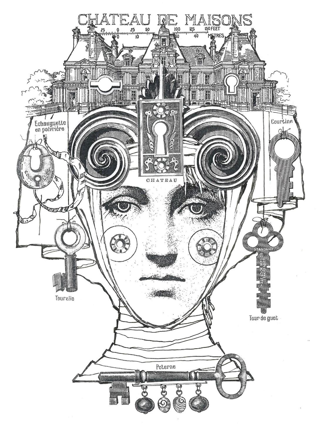
Ideas for stamps come from just about anywhere. I was recently looking through my own History of Costume binders, full of saved clippings and articles, and re-discovered “chatelaines”. These beautiful belts were worn by Ladies of the Chateau and all of her necessary tools, keys, sewing implements, and delicate silver mesh bags dangled from her waistband. I realized this vintage topic would be perfect for rubber stamps. (……and I was positive that no one had ever designed any rubber stamps around this theme!
 |
Sneak Peek of new 'Chatelaine' stamp created for PaperArtsy (coming soon)
|
It has always been important to me to explore fresh design concepts, and not intrude on other designer’s ideas.) When I design stamps, I try to think of what the customer might have in their studio stash that would go with the designs………In this case, I imagined old keys, bits of jewelry, textiles and trims, old documents, etc. I try to create each stamp as a discreet illustration that has a story, a design “vibe”, a mood, a journey to an earlier gracious age.
 |
| LPC040 Junk Journal by Kate Yetter |
Q: You are probably one of the longest-standing designers still coming up with new stamps. Does that still excite you? How do you keep evolving/improving? How much do you watch what other people are doing with your products? Does that surprise/inspire you?
A: To be perfectly honest, designing stamps is STILL one of my favorite things to do.
When I begin a new collection, I feel authentic excitement, and the thrill of a fresh assignment. Working in black and white is a totally different challenge for me; since my mixed media/collage work is totally color saturated. I want each stamp design to look lavish and layered, but it must also have pristine black/white clarity. Although I am not designing for my own company any longer, I want to build on my previous design work and make sure that I always deliver something that is intriguing, beautiful, and unique. Since my earliest days as a stamp designer, my biggest enjoyment is seeing what customers do with my stamps. I am always inspired by their creativity and their ability to see surprising possibilities that I did not see myself.
Working with Paper Artsy is a total treat for me. My intricate stamps are manufactured to the top standards in the industry. And I am so happy to be one of their Signature Designers. Thank you, Leandra and Mark!
 |
| LPC30 Card by Liesbeth Fidder De Vos |
Lynne Perrella & PaperArtsy
 |
| LPC027 - Panel by Lin Brown |
Leandra here with you again and wasn't that fascinating to read! I so enjoy understanding what has influenced a designer through the years. Lynne certainly does stand out as unique in her design style, and she truly does love to go down the research rabbit hole when coming up with new stamp designs! So let me continue with how we first came to work with Lynne, and the lasting relationship this has become.
I used to teach weekend Art retreats with Lin Brown under the name ArtsyCrafts. Lin had a shop for 20 years near Milton Keynes called LB Crafts, and by 2010/11 she was thinking about how to shut shop and semi 'retire' but the retreats were still going to be a thing for the short term. We absolutely LOVED the retreats that we created, but boy was it a lot of work! We estimated sometimes we would spend 4 weeks or more planning the classes, then there was all the kitting (thanks to Karen!) It was all totally worth it when the weekend itself finally rolled around; people would arrive with an apron and scissors, and we would take care of the rest. Bliss. These weekends were a joy to be part of, we made strong friendships and created a wild range of projects over the years!
On October 6th 2010, I received an email from Lynne Perrella asking if we were open to hosting her for a mixed media creative workshop. Can you imagine how absolutely blown over I was to get an email from my most favourite ever rubber stamp designer! And how the heck did Lynne know about what 'we' did in the UK??? At that time, both Lin and I had been avid stampers for over 15 years, and both of us were huge fans of Lynne's stamps under the Acey Deucy label, so of course we were going to do everything possible to make this event happen! The next day after much excited talking with Lin, I wrote back with questions, trying to figure out how we could make this work. It was a year in the planning and in October 2011 the Mixed Media Magic event went ahead.
 |
1. Leandra and Lin (ArtsyCrafts, Oct 2011)
2.Lynne Perrella Shadowbox class sample for ArtsyCrafts
3. Lynne Perrella teaching the Triptych project at ArtsyCrafts |
I got to know Lynne with our regular emails back and forth during the planning. Within those discussions, I discovered that Lynne's back catalogue of Acey Deucy designs were only available via Stampington, but they were not interested in commissioning new work from her! (what!) So I approached her with an idea that she design stamps for us! Hey Presto, we had 4 stamps for the event.
Initially I thought these designs would be a one-off, but as talks progressed, I realised Lynne was keen to make this a regular thing. wahooo! Lynne became a signature designer for us from the start. Above are the first 4 sets she created. Still available here because we do not discontinue products. (Many of our retailers also carry the LP line)
So back to Lynne's classes at Artsycrafts....
Lynne taught for for 3 days, and Lin and I for 2, just so we could take at least one of her classes. I was astonished how a face printed onto blue copy paper became this beauty under her expert tutelage.
Not everyone ended up with blue faces, it was possible with the high coverage of our fresco paints, to edit the face to any shade you could wish for! This is the class where we also learned how to 'bump' and blend stencils, one into the next, and layer upon layer. I was mesmerised!
Watching Lynne teach was a real eye-opener for us. We just adored her calm, encouraging, wise-woman manner with students; everyone ended up digging deep within themselves to create a project that resonated personally. We absolutely loved that each student's project evolved into something unique for them: colour, arrangement and so on. We were enthralled at how Lynne brought out each participant's creative individuality so gently.
It was obvious Lynne was an 'enabler'. Each student felt they had been advised, coached, guided, encouraged, and ultimately felt emboldened to make key decisions more independently as class progressed. Over the course of the weekend we could see confidence blossom. The projects people created were absolutely wonderful. Each so different.
As a life-long teacher, this made clear the value in giving students space to explore, experiment and evolve during class. A teacher is there to help people find and walk their own creative journey, but also be a guiding hand. Lynne just brought out the best in everyone that weekend. The event, even though we only got to do one day with Lynne, had a huge impact on my personal longstanding passion for people to find their own creative style and expression. It made us think hard about how we could provide even more opportunity for personal choice in every session we offered in the future too.
If you ever get a chance to take a class with Lynne, do not hesitate! You will love every minute I promise!
So here we are 12 years later and still happily receiving design proposals from Lynne on a regular basis. Every release still gets me as excited as the first.
In September 2023, we will have a new release taking us to set number LPC063/064/065! An absolute honour for us to still be able to bring these beauties to you. Shhh you have not seen this sneak, but ohhh I am swooning over the Chatelaine theme!
 |
| Shhh Sept 2023 new coming very soon |
Throughout this post we have added samples of art work that has featured on this blog over the years made with Lynne Perrella's stamps. It has been our absolute joy to work with, and to learn from her. The designs are always amazing in the details and pleasure they bring.
 |
12 x 12" canvas board by Lin Brown
|
Over the course of this topic coming up, our bloggers have been given free reign to use Lynne's stamps however they wish. Their creations will be shared here to the PaperArtsy blog, and to our social media pages too.
If you want to create along with us, we would love to see what you get up to! Come and join our Facebook community PaperArtsy People to share your love of Lynne Perrella's designs. And if you have examples of things you have made in classes or with Acey Deucy stamps we would love to see those too!!!
Happy stamping and creative happy wishes to you all!
Leandra