Friday, 27 October 2017

2017 #15 Pearlescent: Pearly Trio's with Squiggly Ink {by Bryan Evans}

2017 Topic 15: Pearlescent


I do love a touch of Squiggly ink at Christmas...it's one of our older stamp collections, and it's a clean and simple collection which allows lots of scope to colour, or not. There are numerous Christmas stamps within the Squiggly series, and they certainly lend themselves well to fast cards or tags...watch Bryan work his magic with them!


Hi everyone, it's Bryan here from GeezerCrafter, sharing with you my Christmas Accessories using some of the range of Squiggly Ink stamps along with some Fresco Chalk Acrylic Paints, Distress Oxides and Pearl Glaze. I chose Squiggly Ink, as I love the large open spaces to add colour, and wanted to make some quick and easy projects.


This idea came from Ellie Knoll, Ellie used the round Gelli Plate and Distress Oxides, I improvised and used some thick plastic packaging, double sided tape, worked a treat. Distress Oxide Vintage Photo, then Distress Oxides in Peeled Paint are a perfect match!!


3 simple projects, a Concertina Card, a Place Setting Card and a Tag. I used the same technique to apply the Pearl Glaze, Thanks Ellie! If you are applying the Pearl Glaze over Distress Oxides, use just 1 or 2 brushstrokes otherwise the Oxides will reactivate.


Squiggly Ink: Egg and Nog - Plate 5 (SIEN5)

Don't forget to use those decorative corner punches!!. I love working on Kraft card, Fresco Chalk Acrylic Paints are a perfect match. Kept it simple and just used Fresco Chalk Acrylic Paints Bougainvillia, Banana, and Tango. 


Bright and Cheery... Love the effect of the Pearl Glaze.


 Squiggly Ink: Nut and Meg - Plate 3 (SINM3)

Just one colour here, Fresco Chalk Acrylic Paint Caribbean Sea. I applied the Pearl Glaze with a brayer, and you can make your own Pearlescent card!!


Love the subtlety of the Pearl Glaze.


Squiggly Ink: Nut and Meg - Plate 7 (SINM7)

I am looking forward to seeing your pearly makes, I have found the Pearl Glaze fun to work with and like the subtle effect that can be achieved. Next time I will experiment more with the product and try mixing with some Fresco paints and other mediums. If you have young people over Christmas you could just stamp the images and leave blank with some small colouring pencils- keep them amused!! I found the Concertina cards fun to make, have a try.

I will put some dimensions of the cards on my blog.

Blog: Geezer Crafter
Facebook: Bryan G Evans
Pinterest: bryan evans

I love how you have used so many different colouring ideas with these, and the pearl glaze over oxides is fabulous, they are then sealed and ready for more layers to be applied with no more re-activation of the Distress Oxide ink! Thanks again Bryan! ~ Leandra


We always hope that you  learn something interesting from our blog. 

Our creative team love to read your comments so much, so please take time to let them know you've been inspired!  

Why not join our 2-weekly challenge by blogging your create response to the current topic and link it here?

The current topic link Topic 15: Pearlescent will close 17:00 (London Time) Sunday, 29th October 2017, and the winner will be announced 2 hours later at 19:00.

All links go in the draw to win a £50 voucher to spend on products of your choice from the PaperArtsy online store.

Wednesday, 25 October 2017

2017 #15 Pearlescent: Altered Bottle with Ink and the Dog stamps {by Jennie Atkinson}

2017 Topic 15: Pearlescent


Clearly Jennie is a fully committed crafter when she 'has' to buy wine to use the bottle for a project! It does, of course, turn out to be a lot of beautiful layers that require a lot of water, and the result is a stunning composition (she's so good at arranging those dimensional elements!!)

Hi everyone, it's Jennie (Live The Dream) with you today, and I'd like to share with you an altered bottle which I had great fun decorating (and needless to say drinking the contents!).

For this pearlescent challenge I wanted to use some "pearly bits" and pieces which for those of you who know me will know that these are pieces quite close to my heart. When altering a bottle it is not necessarily easy to use stamps, but I found a wonderful plate in the Ancestors section of Ink and the Dog which fitted what I wanted to achieve perfectly.


Ink & The Dog Collection: Ancestors Plate 1

I would say that this altered bottle did not go initially to plan (or rather the design that was in my head) but as you will see a stroke of luck with the water bottle sorted things out and now I am very pleased with it!


I started with a small Prosecco bottle .... it really is worth looking in the small wine bottles section of your local supermarket as there are some wonderful shapes of bottles, but which are not too large to alter. For the sake of my art, I did drink the contents of two bottles so I had a spare .......... 


The bottle got a couple of coats of Golden Gesso, then a coat of Golden Crackle Paste which I applied with a paintbrush. I didn't want anything too thick. I loved all the little marks on the bottle and had intended to do some layering with texture paste, but in the end let the original textures on the bottle provide the interest.


Now this is where it all started going a bit wrong! or rather not to plan! I wanted a light coat of Violet Storms Infusions to blend into the crackle on the bottle and had thought that rolling it in the colour would work but ....... the shape of the bottle precluded that. I tried painting the colour on and it was too dark (I am using Violet Storms which are not light at the best of times!) Finally I stood the bottle on some kitchen towel and gave everything a spritz of water  (as I thought I would start all over again) and hey presto the water and Infusions dripped beautifully. I wanted to keep this wonderful colour so zapped it with the heat gun, hoping that the bottle wouldn't crack!  I then had the great idea that I would spritz the bottle with a Pearlescent spray ..... I nearly lost all the wonderful colour, but it did work and the bottle has a lovely sheen to it, although the photographs don't really show that.


Now I am sure we all have loads of these - I have an enormous amount bought for a workshop which was then cancelled. I am always looking for ways of using them up and I love painting them with Fresco Chalk Acrylic Paint (Chalk).


I find the easiest thing is to paint them while they are still on the plastic sheeting. They first got a coat of Chalk and then a little Satin Glaze. 


You wouldn't recognise them as the same embellishment.


I then started decorating the bottle and this went fairly fast as I chose various different elements. First I stamped the lovely sisters plate onto tissue and added this over the crackled/infused bottle. I love the way some of the Violet Infusions shows through. 


I hunted for some small flowers to complement the size of the bottle (it is quite small and very easy to overpower).  


I felt I needed a sentiment and the words on the Ancestors plate were a little large. I took a few words from one of Alison Bombers sentiments on Eclectica EAB01 and stamped on some old text paper to keep the vintage feel.


And then the to the top of the bottle. I love using just one colour of Infusions and so I dyed some American seam binding ribbon with the Violet Storms Infusions. If you want a lighter colour you need to add loads of water, but you can make it still lighter by wrapping it in a piece of kitchen towel and squeezing the water out before drying. I love this dusky violet!

When I first saw the cameo stamp I knew I had to find my shrink plastic! I have always used the Translucent Shrink Plastic as it seems less brittle. A little gold around the edges just finished it off.


Then I found the cap of the bottle which I had completely forgotten about! It looked a bit bland with just the Fresco Chalk paint so I gave it another coat of the Chalk mixed with Satin Glaze and it really has a lovely pearly finish. A pearl from an old necklace made a lovely top. 


There is also a piece of pearl necklace (from an old necklace I found in my mother in law's jewellery box) around the top of the bottle underneath the ribbon. 


So here is my "pearly" altered bottle .... pearls and pearlescent sprays and of course the odd pearl button.


I really did enjoy the development of this altered piece once I had the Infusions in place and can't wait to make another one to match. There are so many fabulous Ink and the Dog stamps which can be used in so many different ways we are very much spoilt for choice. I am always looking for areas of a stamp I can isolate and use, not necessarily the whole stamp. I hope I have given you some ideas and look forward to seeing your own takes on this one.

As always thank you for joining me and happy crafting!

Jennie x 

Blog: Live The Dream

It's the simple things, like a layer of satin glaze on top of chalk paint, that adds that subtle lustre and sheen! Lovely idea! Yes I can imagine very hard to photograph, but Jennie has a knack for creating such details that add to an overall effect of vintage charm. Gorgeous! ~ Leandra


We always hope that you  learn something interesting from our blog. 

Our creative team love to read your comments so much, so please take time to let them know you've been inspired!  

Why not join our 2-weekly challenge by blogging your create response to the current topic and link it here?

The current topic link Topic 15: Pearlescent will close 17:00 (London Time) Sunday, 29th October 2017, and the winner will be announced 2 hours later at 19:00.

All links go in the draw to win a £50 voucher to spend on products of your choice from the PaperArtsy online store.

Monday, 23 October 2017

2017 #15 Pearlescent: Snowflakes and Stars with EEG {by Hazel Agnew}

2017 Topic 15: Pearlescent


Good evening, Hazel joins us tonight as our own Pearly Queen, a deserved title as she wows us with a 50 card session. 

Hi everyone, it's Hazel Agnew from Mellifluous Meanderings with you today, and I'd like to share with you my excitement in creating many many Christmas cards using Emma Godfrey and Kay Carley products.


Eclectica³ {Emma Godfrey} Set20
Eclectica³ {Emma Godfrey} Set19
PaperArtsy Stencil 070 (PS 070)
The ideas while using these fabulous products just kept coming and solving the Christmas card problem while having fun was such a bonus.
To be honest, I don't know where to start, but I must calm down and get my head into some order. I don't want to bore you with tedium, so a few details first and then the group pics....a bit like being back at school! 


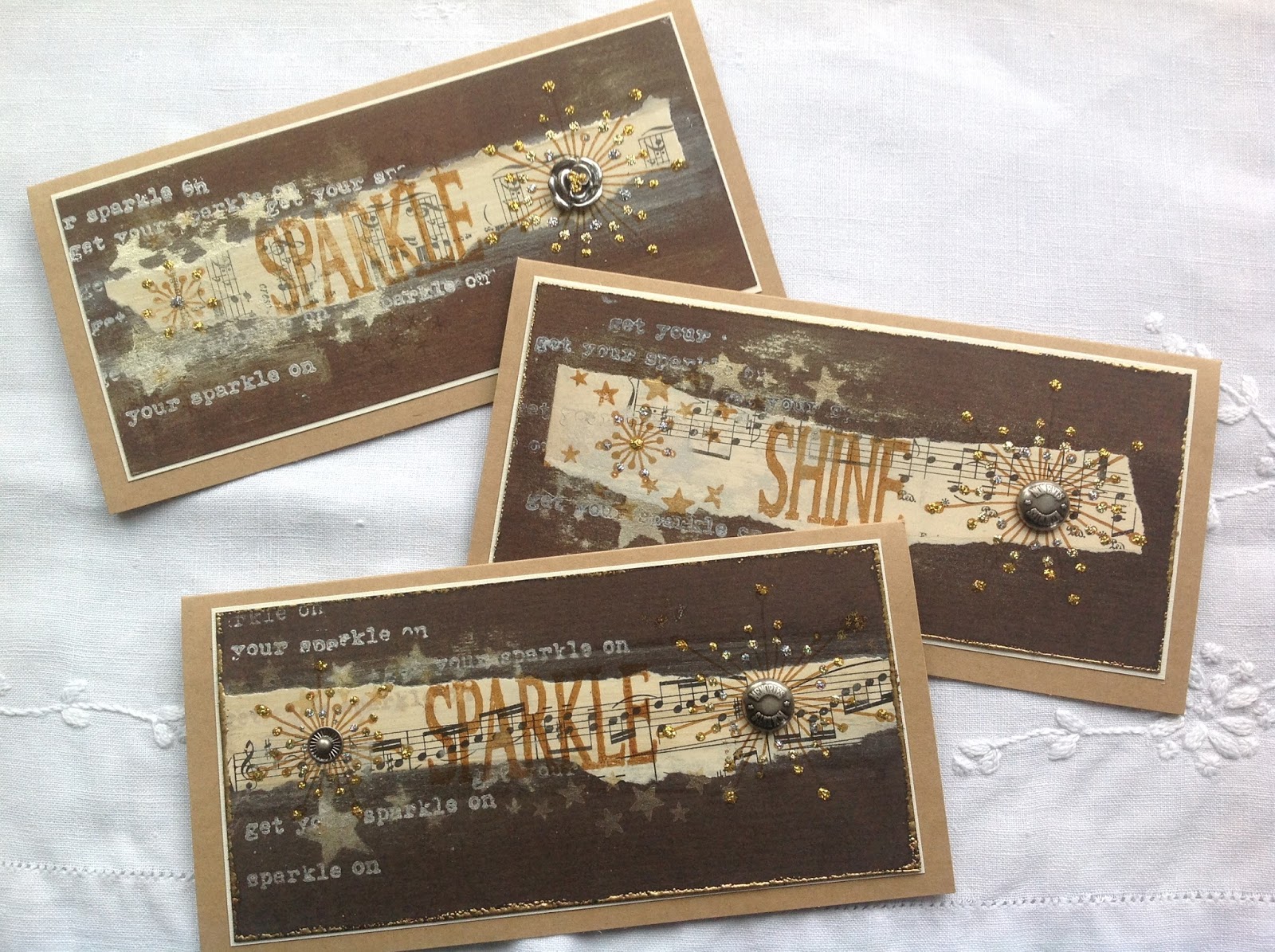
Fresco Finish Metallic White Fire featured a lot in my first creations, as it gave a great sheen to the background. It "aged " the music pages too. Some of the stamping is also White Fire and Pewter. Coffee Archival Ink features too.I enjoyed the rustic nature of these cards. 


Next came the bling!


The background is created by spraying mica mists through Kay Carley's fabulous snowflake stencil. Overstamped with Fresco Finish Metallic Pewter snowflakes. The next picture shows a variety of mica sprays embellished with whatever bling that I could throw at them.


More bling! Simple is best when creating many cards and the sheen is perfect for the time of year.


Same gorgeous stamps but with gelli plate backgrounds. A great way to use up some sparkly additions too.


This close up shows how well the Fresco Finish Metallic Pewter Paint stamps onto black card and how effective simple embellishments can be.


Well, 50 cards in a shoe box ready for writing and still plenty of time to add to them. 
I hope that I have inspired you to begin your card making. These stamps and stencils would be really suitable for creating wrapping paper, gift tags and place cards too. Time to calm down now and have a cuppa!

Thanks for looking and there are more details over on my blog.  Have fun!

Wow Hazel, I would never have believed that you had just 'thrown' embellishments at these cards, every detail seems to well considered as the elements all compliment so well. I don't think I can pick a favourite, I like them all. There will be 50 happy smiles when these plop on doormats this Christmas. ~Darcy

We always hope that you  learn something interesting from our blog. 

Our creative team love to read your comments so much, so please take time to let them know you've been inspired!  

Why not join our 2-weekly challenge by blogging your create response to the current topic and link it here?

The current topic link Topic 15: Pearlescent will close 17:00 (London Time) Sunday, 29th October 2017, and the winner will be announced 2 hours later at 19:00.

All links go in the draw to win a £50 voucher to spend on products of your choice from the PaperArtsy online store.

Sunday, 22 October 2017

2017 #13 Pearlescent: Mosaic Frame with LPC {by Ruth Mescall}

2017 Topic 15: Pearlescent


Ruth shows you 3 ways with infusions AND how to make stunning pearly tiles in this post! Somehow she gets it all to work perfectly together - I can't help but wonder how long it took her to commit to arranging the tiles in such a perfectly random way!


Hi everyone, it's Ruth here from 'a love to create' and today I'd like to share with you a frame I've made using a faux mother of pearl technique...yes I've been experimenting again!

When I was looking at picture inspiration for this topic, I came across some mother of pearl mosaic square tiles and thought I wonder if you could create something like that with paint effects, Pearl glaze and something else to create depth? I wasn't sure at that stage whether the squares would be part of a background interspersed with lovely Lynne Perrella images or  a mosaic frame  around one bold image...or even how I would stamp the images, all I knew was that it was time to start experimenting. 


I thought there would be quite a lot of trial and error as that's what usually happens but it came together fairly easily.  I think smaller squares would be even more effective and would allow for different sized images to be used but on this occasion I used a large detailed image for the frame from this stamp set: 


Having looked at the tile photo and using shells as another reference I created the first layer, roughly blending lots of paints on Heavy weight smoothy card with cut and dry foam. The paints I used were Taupe, Vanilla, Nougat, Caramel, Snowflake, Concrete, Stone, Pewter (for the back board) and Pearl glaze.


So my idea was to mix Pearl Glaze with 3D transparent gloss gel approx 1:3 ratio. I spread it on with a palette knife and textured them all a little differently with simple tools. I thought I may have applied it too thickly but I was so pleased when they dried as it left a lovely soft  pearly, slightly milky glaze and  exactly what I'd hope for.


Now for the main image, I chose to stamp with Golden Sands infusions. Use Versamark, rub in the infusions and spritz with water. You get  such a variety of images with second and third impressions. The one on the far left more closely matched the colours of the tiles so I used that one and decided to seal it with a wax glaze similar to Distress micro glaze. 


I thought I'd also share the central image from the above photo which is surprisingly detailed, this is using the same method but after lightly spritzing with water I waited a minute before stamping and this is the result. In case you haven't guessed I do like experimenting with infusions and will be using this one as the main image on a card. 


Next bit is easy peasy, 1inch/2.5cm squares just glued and mounted but what about using a steel rule die and creating hexagons or other patterns? All the rough blips that happened when spreading out the gel just add to the mother of pearl effect.


Lastly I just needed to add the main image 'tile' and grout it in place. I had tried a painted gold surround at first but grunge paste was perfect and once dry a little pearl glaze was all that was needed. 


I really hope you can see the subtle sheen and different tones depending on how the light hits the frame and I think this effect would look lovely on a box maybe surrounding a stamped cameo. Are you inspired to create some mother of pearl? ...I hope so. Ruth x

Blog: 'a love to create'
Twitter: @argeum1
Instagram: argeum1
Pinterest: Ruth Mescall

I am amazed at how much colour still pops through the pearly layer you put on top of the painted backgrounds! The tiles look fabulous and the 3 images each have their own appeal too. It's hard to imagine you ever have experiments that don't work! ~Leandra


We always hope that you  learn something interesting from our blog. 

Our creative team love to read your comments so much, so please take time to let them know you've been inspired!  

Why not join our 2-weekly challenge by blogging your create response to the current topic and link it here?

The current topic link Topic 15: Pearlescent will close 17:00 (London Time) Sunday, 29th October 2017, and the winner will be announced 2 hours later at 19:00.

All links go in the draw to win a £50 voucher to spend on products of your choice from the PaperArtsy online store.

Saturday, 21 October 2017

2017 #15 Pearlescent: Autumn Cards with ELB {by Alison Hall}

2017 Topic 15: Pearlescent


Gorgeous composition is the name of the game today from Alison Hall. Fabulous colours, perfectly executed cracks, and superb stamped layers. And don't forget those flicky spots of colour! She's ticking all the boxes!

Hi everyone, it's Alison/Craftytrog here with you today, and I'd like to share some Autumn cards I made using Crackle and Pearl Glazes with a few Infusions thrown in for good measure. 

Crackle Glaze and Infusions are two of my favourite PaperArtsy products, as you never know quite what you will get, but the results are always fabulous. 


My card backgrounds were created with a bottom layer of Hey Pesto Fresco Chalk Paint, then a layer of Crackle Glaze, with Chalk Fresco Chalk Paint over the top. It's magical to watch those cracks appear! 

I sealed the crackle with Pearl Glaze, then added some background stamping, using Eclectica³ {Lin Brown} Set 29 and Eclectica³ {Lin Brown} Set 30 Lin Brown stamp sets, and Fern Green Ranger Archival Ink.


 You can just about see the lovely shimmer of the Pearl Glaze in the photo below.


Inspired by the beautiful Autumn leaves that I've seen on my daily walks, I picked out a few of the warm tones Infusions (Orange County, Golden Sands, Sunset Beach, Rusty Car and Terracotta), and spritzed them with Ranger Perfect Pearl Mist. I love the pearly effects I got, using this technique. 


I then stamped leaves from ELB30 and ELB31 using Jet Black Archival Ink.


I finished my cards off with some additional stamping, toning organza ribbon, and I couldn't resist some splatters of Orange County Infusions mixed with water.


Autumn is my favourite season, and it was wonderful to incorporate some rich Autumn colours into my cards.


I had a few of the stamped leaves left over, so below is another, simpler card idea using Lin Brown's beautiful stamp designs.


I hope I've inspired you to join in with PaperArtsy's Pearlescent Challenge. A bit of Pearl Glaze is the easiest way to add some shimmer to your art. You can even mix some into your Fresco Chalk Paint to make it pearlescent. I also encourage you to try activating your Infusions with Perfect Pearls, it really gives a beautiful effect.

Happy Autumn arting!

Alison x

Blog: Craftytrog's Arty Adventures
Facebook: Alison Hall
Twitter: @Craftytrog
Instagram: @Craftytrog
Pinterest: Alison Hall

Such a perfect colour combination for this time of the year, and of course Lin's stamps suit the theme perfectly too with the infusions. Those crackled backgrounds worked a treat Alison!! Fantastic cards! Thank you for sharing with us again ~ Leandra


We always hope that you  learn something interesting from our blog. 

Our creative team love to read your comments so much, so please take time to let them know you've been inspired!  

Why not join our 2-weekly challenge by blogging your create response to the current topic and link it here?

The current topic link Topic 15: Pearlescent will close 17:00 (London Time) Sunday, 29th October 2017, and the winner will be announced 2 hours later at 19:00.

All links go in the draw to win a £50 voucher to spend on products of your choice from the PaperArtsy online store.