Well hello everyone, Darcy here to welcome you to a new topic. this time we are exploring book making, be that a simple one sheet folded book or bound signatures. We will look at bindings, pages and covers.
Before we start, let's see who won the Topic 10: Light to Dark Challenge...
Email Darcy to claim your prize. Darcydotneedles@gmail.com
Over 2,000 years ago, in India, palm leaves were used to create books. These had religious content, the method was surprisingly ordered with the pages even being numbered. the pages were rolled up and tied with twine. The move from rolls to bound leaves took about 400 years, at which point the bindings became both protective and decorative. Around the year 400 we see leather tooling making an appearance on covers, metal took another 150 years to be introduced. At this time the covers were made from wood, by 1508 these were replaced by pasteboard in France. England followed suit around 1520.
Nowadays there are a plethora of books about making and binding books, full of techniques and inspiration, but the first was written between 1741 and 1753. It covered everything from cost and techniques to apprentice regulations. It was fully comprehensive and filled 4 volumes. I wonder if any copies still exist? By the 1800's books were hugely popular, and although the pages were printed by machine the covers were still handmade. This is when cloth covers made an appearance, and later in the century the first dust jackets appeared.
So by making books and journals you are joining in with an ancient and very traditional activity. The materials and techniques available to you now are endless, combine those with the inspiration available all around us, especially online, means you can make some truly stunning books. So, first up we have covers. I love this one made from scrabble boards. Made by Sara Hindmarch, she calls this 'hackbooking' by this she means combining traditional techniques with recycled and found objects.
How about a simple leather cover, leather scraps can be bought cheaply and make excellent covers. What I loved about this book was the way the key is used as a closure, very clever.
This fabulous cover is handpainted, it looks like it is on something substantial, the Paperartsy greyboards or heavy smoothy would make perfect painted covers.
Once you have your covers, you might want to think about the pages inside. What will they be? paper, fabric, acetate? will they all be different sizes? maybe you will add fold outs or pockets, perhaps the paper will be plain, inked, lined. The insides are really dependent on how you intend to use the book. A great way to create pages is to use origami folding techniques, often a book can be formed with just one large sheet of paper. the folds range from simple to complicated and can create very interesting effects and layouts when you open the book.
Here is an example of a book made from one large sheet of paper, watch while Teesha Moore shows you her 16 page journal. Below is video 1 and here is video 2.
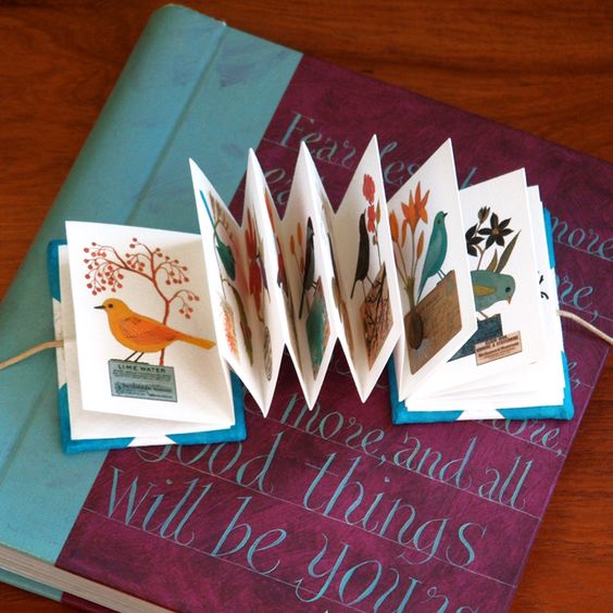
Concertina books are one of the easiest styles, however they are probably one of the ones with the most visual impact as the folds can be opened out and the viewer can see almost every page all at once.
Books can be many shapes, not just the regular flat ones that you think of, what about star books, these look especially lovely at Christmas. follow the linked name for a full step by step on this book.
If you do go for the regular book shape, back, front and pages then you will need a cool binding method, and there are some very cool ones. far too many to show you here. The most popular binding is stitching, but even within that category there are hundreds of different ways to stitch. This one employs a cross stitch, simple but perfectly executed.
Of course you don't need to use thread, how about using ribbons instead. this Japanese stab stitch binding done with ribbon is so delicate, it would be perfect for a wedding album.
A very popular stitch technique is called 'Coptic stitch', here is a very good and clear video showing just how to do this stitch.
Once you have your binding done, why not go ahead and add charms, buttons, beads and other wonderful dangly bits. they could just be your favourite random bits or you could theme them to the contents of the book.
There is no maximum or minimum size for books, but I have to confess to loving these dinky little mini books, how adorable, and of course you need very little paper to make them. why not try making a teeny book from your leftovers.
This is a subject that I love, and I hope that you will too. I am excited to see what kind of books that you make, be they big or small, painted, stitched or folded. Have a fabulous 2 weeks making your journals and remember to link up and show us. Of course once you make your journal then you can do some great PaperArtsy type pages inside.
Don't forget to follow Darcy and Leandra's Pinterest boards if this topic pushes your buttons, you will see plenty more examples to whet your appetite there! I am really looking forward to seeing what you create over the next 2 weeks!
~ Darcy
We hope that you learn something interesting from our blog. Our bloggers deeply appreciate your comments so much, so please take time to let them know you've been inspired!Why not join our challenge by blogging your interpretation of the current topic andlink it here? The current topic link will close 17:00 (London Time) Sunday, August 20th, 2017, and the winner will be announced 2 hours later at 19:00. All links go in the draw to win a £50 voucher to spend on products of your choice from the PaperArtsy online store.
Challenge Guidelines
The challenge is a for you to show how you are inspired by the current blog topic. We encourage you to play with us and explore your personal creative style.
Please mention which PA blog post inspired you and and why (link directly to that post). Please don't link to the home page of your blog because then no-one can track back to easily find the original post.
We prefer your challenge blog post is created exclusive to our challenge, but if our topic fits perfectly with another challenge, then you may link to both if appropriate.
You are most welcome to use stamps/ products/ substrates you have to hand from a variety of companies, we do not expect you to exclusively use PA products - it's lovely when you do though!
You can enter as many times as you like. We don't want to restrict your creativity!
NB. Link closes at 17:00 Sunday August 20th (London Time)
Prize: The winner will receive a £50 credit voucher to be redeemed on the PaperArtsy Website. The credit voucher includes VAT and postage. We request that one of your purchases is an A5 rubber stamp. You can add any other items to your basket, but the final total should not exceed £50. It's your responsibility to claim your prize coupon from Darcy.
email: darcydotneedles@gmail.com
NEW Challenge/ winner: Each fortnight on Sunday, the winner will be announced at 19:00 (London time). In the same post, the link for the next fortnight will be posted.
Good Luck! If you have any questions, don't hesitate to ask!
If
you are at a loose end tomorrow, then maybe having a play with
painterly layers tomorrow, just like Chris shares with us in this
post,is, I am sure you will find, a very enjoyable way to while away a
few hours on a Sunday afternoon!! Stunning contrasts with Kim Dellow's
beautiful images and stencils!
Hi everyone, it's Chris Cresswell from loopsandlines.blogspot.co.ukwith you today, and I'd like to share with you my art journal spread on the current theme of 'Dark to Light'.
This
is an appropriate theme for my preferred style of art journaling,
especially with wet media, as most of my art involves 'contrast'. I love
working with bright, complementary colours, but this theme spoke to me
differently. I felt it was more about exploring the different hues and
tones of analogous colours; at least that is how I have interpreted it. I
chose to use different variants of blues and greens, and colours
alongside these on the spectrum, that would play around with this idea
of moving between dark and light colours. I hope you feel I achieved it .
As
soon as I had the idea of wanting to create a large journal spread, I
knew that I wanted to use Kim Dellow's gorgeous stamp set: EKD06.
I love this set and I love the fact it has a complementary stencil PS048 that works so well alongside.
I
used all the stamps and stencils in these sets on this spread. They are
such fun, contemporary designs, great to colour in and not too
difficult to cut out! However, I did not intend to colour these as I
wanted to use my gelli plate to produce the dark and light contrasts:
much easier to achieve on a gelli plate.
If
you haven't used a gelli plate before, I urge you to have a go. I'm
very influenced by Birgit Koopsen who is the Gelli plate queen. Have a
look at her You Tube videos and you will soon be an addict! Fresco chalk
acrylics work really well on the gelli plate. I never feel I need to
use an extender despite them being pretty fast drying. There are so many
colours which worked well for this project. I selected a combination of
yellow-greens, teals and turquoises. I always use a lot of colours, too
many to list here but I have listed them on my blog! I used a variety
of papers for these monoprints, including deli paper and PaperArtsy
Tissue stock, as well as a variety of stencils from my stash.
Once
I had a variety of monoprints I chose the ones that I felt would best
reflect the theme and add contrast to the much darker background I
intended to place them on. I had used some pearlescent papers which gave
a lovely shine to some of the resulting images. Now it was just a
matter of stamping and cutting. Plenty of coffee needed at this stage!
An
easy way to blend colours across a journal spread, and a technique I
like using because it builds up the first layer very quickly, is to use a
baby wipe dipped into the various paint colours and smoothed across
different areas of the page. I also tend to overlap and blend with my
fingers to avoid a patchwork result. Here you can see how the much
lighter Captain Peacock contrasts against the much darker Blueberry and
Eggplant Fresco Chalks. I used various stencils on top of the blended
colours, including Emma Godfrey's little flower stencils: PM002 and PM008.
After
several more layers of stenciling, overlaying more colour to accentuate
dark and light areas, stamping and mark making, I was pretty much ready
to add the stamped monoprint images. I wanted to create a cascade of
colour diagonally across both pages that would contrast with this darker
background. I tried to create both dark and light areas on both the
background and within the stamped images themselves. You have probably
spotted another favourite PA stamp set on the background: ELB29. I love that spotty circle!
One
of my final steps on this background was to introduce just a glimpse
here and there of one of the colours predominantly used in the stamped
images. I did this by turning the leaf stencil from PS048 into a stamp
using the Distress Oxide: Cracked Pistachio;
smearing the colour from the pad onto a heat resistant mat then
spraying with water, dipping the leaf stencil into this and 'stamping'
randomly across the page. I was pleased with the result.
Although
I used paint pens to add some final touches to the flowers and stamped
images, together with a white gel pen, I realised that I needed to raise
some of the images in order to create some depth. I like the addition
of washi tape around the edges of the page and the text is taken from
Emma Godfrey's stamp set: EEG17. I hope that if you haven't yet had a go
yourself with this theme, you have been inspired and tempted to do so
during the past fortnight. There have certainly been some rich, exciting
and varied ideas posted.
Blog: loopsandlines.blogspot.co.uk Facebook: Chris Cresswell Twitter: artmadnana Instagram: artmadnana Pinterest: Chris Cresswell
If you teach: add venue, dates, booking info with links here for the next 2 months
I
love how you explain how you bring all the layers to life so seamlessly
Chris! The colours are divine and that touch of oxide inks using the
stencil as a stamp is fantastic too!! A beautiful weekend treat for us
all ! ~ Leandra
We always hope that you learn something interesting from our blog.
Our creative team love to read your comments so much, so please take time to let them know you've been inspired!
Why not join our 2-weekly challenge by blogging your create response to the current topic andlink it here?
The current topic link Topic 10 (Dark to Light) will close 17:00 (London Time) Sunday, August 6th 2017, and the winner will be announced 2 hours later at 19:00. All links go in the draw to win a £50 voucher to spend on products of your choice from the PaperArtsy online store.
Alison
always seems to start her projects from an unusual perspective. On this
occasion she starts with overlapping torn card stock, which she then
builds layer upon layer so instinctively. Of course she ties it all
together perfectly with one of her fabulous quotes! Enjoy!
Hello all, Alison from Words and Pictures
here, and I'm delighted to be back on the PaperArtsy blog with a
layered project full of contrasts. As soon as I heard the theme, my
mind went - unsurprisingly! - to my new EAB02 Darkness and Light stamp
set. The whole collection of quotes on this plate is built around the
contrast between light and dark, so I could have used almost any of the
quotes, but I decided to go with a moonlit canvas and this poetic
thought from Russian playwright, Anton Chekhov.
I've
used techniques picked up from a number of inspiring workshops I've
been to over the years - the torn embossed card background from Andy
Skinner, the ombré dry-brushing from Finnabair - and combined them on an
8x8 canvas full of texture and romance, including the glint of light on
broken glass, of course.
Since
this topic is all about the layers, I'm going to take you through some
of them. They start with the overlapping cardstock, embossed with
blossoms, and some Grunge Paste to texturise the edges and soften some of the sharper card edges.
From
moonlight glinting on glass, it's a short step for me to the Capulet
orchard and Romeo describing the shimmer of moonlight - "that tips with
silver all these fruit tree tops" - so the tree blossoms were a
semi-conscious choice.
By the next layers - first Grunge Paste
and then a topping of Watercolour Ground applied through Kay Carley's
gorgeous new tree stencil, PS061 - I had caught up with the inner
workings of my mind, and knew that we were in a moonlit orchard - of
sorts.
The Watercolour Ground is very grainy, so it gives a lovely extra texture over the sturdy base of the Grunge Paste.
Next, the heart-in-mouth moment - a layer (or two) of black gesso covering the whole thing up. And then I spent some time fiddling around with embellishments - some chipboards, some die-cuts and some metalwork.
Then all of that gets the black gesso treatment too.
Here's
where the orchard becomes a little more metaphorical - though the the
Romeo and Juliet idea is still feeding in with all the clocks (they're
under time pressure)...
...
and as the tendrils of their young love start to unfurl, the cogs and
gears of fate are already turning in the background towards the
inevitable ending.
Next it's on to the layers of dry-brushing. From the top left corner comes the gleam of moonlight (otherwise known as Snowflake Fresco Chalk Paint).
And coming up from the bottom right, in the role of the moon-dark shadows, we have Blueberry Fresco Chalk Paint layers. It's bluer in some lights than others.
I
had to wait until I was happy with all those dry-brushed shadows and
highlights before adding my broken glass. There would be no glinting if
it were all covered up with paint! (The chipped glass comes from a
certain Swedish furniture store - I think they mean you to use it in
flower vases to hold dried stems still in a decorative way.)
If
I were a video-type, I'd be able to show you how magically the glass
really does glint as you move the canvas around. I'm afraid you'll just
have to manage with your imaginations.
Finally, but perhaps most importantly, the words which started the whole thing off - the quote from EAB02 Darkness and Light.
I applied Cobalt Blue Archival Ink to the stamp, and then used Jet Black to darken the edges in a shadowy way.
And, thanks to some clear embossing powder, even the words themselves have a glint in the light.
I
hope you're inspired to play with some contrasts and some layers. I
had a wonderful time with my light and shadow. I love that even in the
darkest places, there's a glimmer of light (which is the theme of some
of the other quotes on the stamp plate).
Between
Chekhov and Shakespeare; the textures, paint and embellishments; and
the glimmers of light in the darkness, I ended up feeling thoroughly
uplifted. Thanks so much for stopping by today, and I'll see you again
soon. Alison Bomber
So tonight Alison, you've made me realise I never use the Blueberry paint! And wow does it look amazing over the black, it is a translucent, so you have a magical depth to the darkness! Ohhh and Ahhhh! ~ Leandra
We always hope that you learn something interesting from our blog.
Our creative team love to read your comments so much, so please take time to let them know you've been inspired!
Why not join our 2-weekly challenge by blogging your create response to the current topic andlink it here?
The current topic link Topic 10 (Dark to Light) will close 17:00 (London Time) Sunday, August 5th 2017, and the winner will be announced 2 hours later at 19:00. All links go in the draw to win a £50 voucher to spend on products of your choice from the PaperArtsy online store.
We have Nikki back with a masterclass in contrast and composition. When you see the end result, she certainly makes it look easy, but I sense she took her time getting the balance just perfect! Looks brilliant! Such a really striking piece.
Hi everyone, it's Nikki from Addicted to Art here with
you today to share my second creation for this theme. This one is a
little different to my Seth Apter style canvas from Saturday (you can
find details here if you missed it.)
I decided to focus on the contrast
element this time and what simpler way than to use black and white - at
least that is where I started, although I introduced a little grey and
silver too. I am a lover of abstract paintings and have used PaperArtsy
paints, stencils and stamps to create my own little abstract today.
I
am also a fan of geometric shapes in art (think Mondrian and Malevich!)
and often resort to squares and circles. Sometimes the simplest idea
can create a few problems though as I found out here - the composition
wasn't quite as easy as I hoped!
My start point was to use photocopy paper and stencil tape to dissect my 6x6 inch piece of grey board and paint with Little Black Dress and Chalk Fresco Chalk Paints. Using the rule of thirds I introduced this line at approximately 2 inches across from the edge.
I
used some circle framelits to cut various circle sizes out of photocopy
paper - the circles themselves to build the composition and the
negative space to use as stencils. I always try to remember a tip I
learnt about 'no two items being the same' for good composition - this
can be the same size, the same distance apart etc. This is also why we
try to use odd numbers, so the eye and brain cannot pair things.
Having added black circles to the white side and white ones on the black, I also added some arrows from Emma Godfrey's stencil - PS016.
The
largest of the circles contained three colours - grey, white and black
(overlay the photocopy paper stencils to achieve this) - but I felt it
needed more so I stamped the grid circle from Lin Brown's stamp set - ELB34 in versamark and heat embossed with white embossing powder.
One
of Alison's quotes from EAB02 (Darkness and Light) seemed appropriate!
Again I used my black and white contrasts again and heat embossed the
text for impact. EAB02
In
Darcy's introduction to this theme she showed how contrast can be used
in so many ways and with so many colours. In the end I wished I had used
more colour - but this was a great experiment in using a limited
palette and a challenging composition!
See you next time, Nikki
Blog: Addicted to Art Pinterest: NikActon I
love how the striking contrast has really made you think more about the
composition and balance. The 'thirds' composition really looks
fantastic! So striking! Thanks Nikki, it's so good to see the wide
variety of ways this topic is being interpreted!! ~Leandra
We always hope that you learn something interesting from our blog.
Our creative team love to read your comments so much, so please take time to let them know you've been inspired!
Why not join our 2-weekly challenge by blogging your create response to the current topic andlink it here?
The current topic link Topic 10 (Dark to Light) will close 17:00 (London Time) Sunday, August 5th 2017, and the winner will be announced 2 hours later at 19:00. All links go in the draw to win a £50 voucher to spend on products of your choice from the PaperArtsy online store.