Sunday, 21 July 2013

Welcome Back Darcy Wilkinson Project #1 Sample Tags ....

"Hello and welcome to my July projects. I was thrilled to see so many people be inspired by the June projects. I hope you have been using all the tissue tape that got made".

My first piece this month is not really a project at all, at least not a prettified 'finished' item.
However I would urge every one of you to make this one as it is an extremely useful tool to have in your craft space. I often hear crafters ,card-makers and especially journallers saying how they cannot figure out how to put colours together. They don't know what goes with what, or what might look good. Now you could buy a colour wheel and study colour theory, or you could make these sample tags and have a lot of fun in the process!


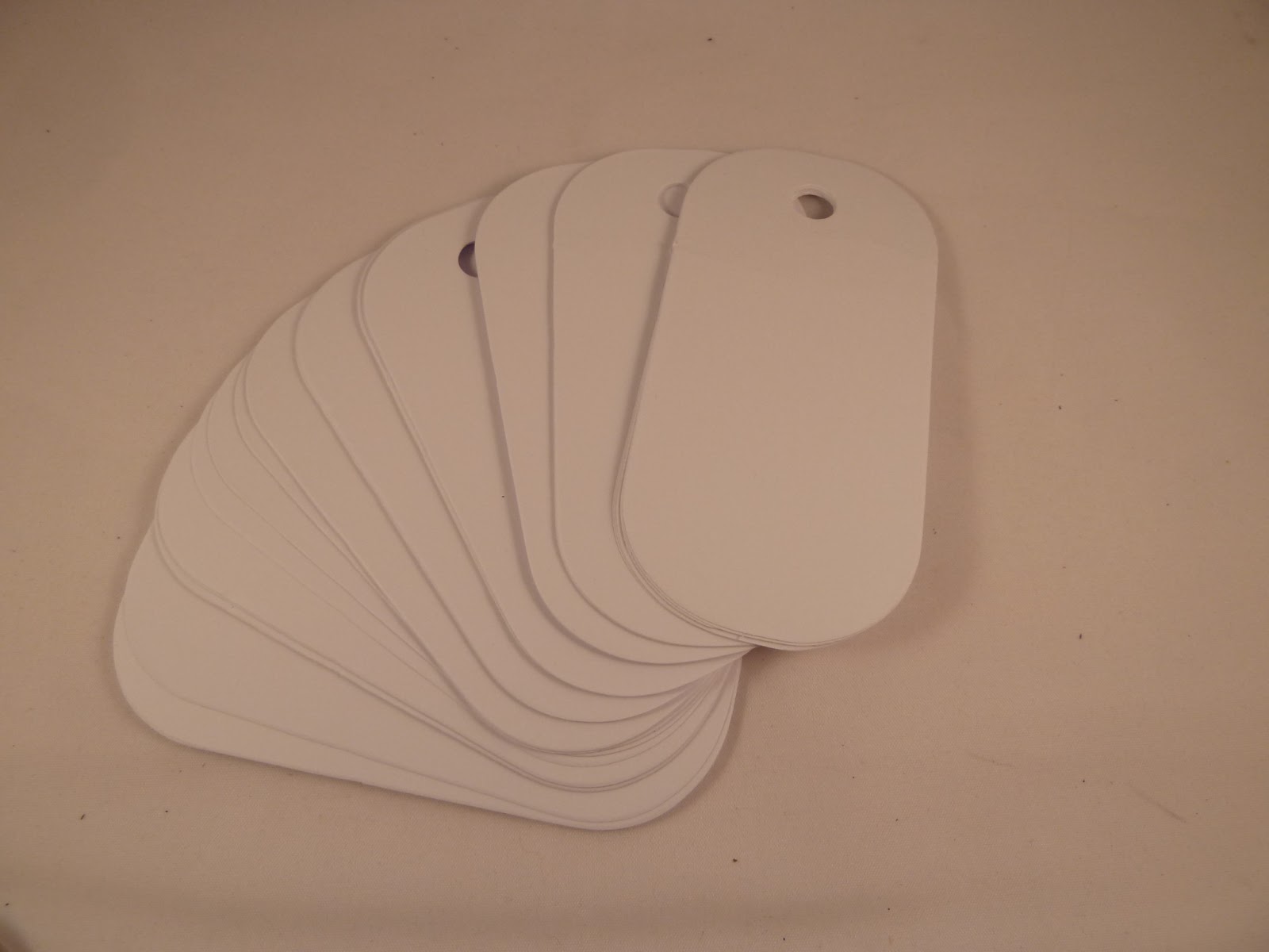
First off cut out some tags on a decent weight like the new card from PaperArtsy, the superb  Smoothy Heavy Weight White Stamping Card. It is 340gsm, so heavier that the other option, but just as smooth, and perfectly matte to use with distress inks, paint, markers etc. You can use any shape, but as they will be glued back to back it is important that they are a symmetrical shape. This is the shape that I chose, it is the large sizzix dog tag. You are going to need a lot....no really even more than that. I cut 100, and I know I will need more in the future.


Now take your Fresco Paints and PLAY... you have permission to do anything you like on these tags. As long as you are only using paint plus tools such as a scraper,brushes,stencils.

NONE of these tags will become a finished decorative tag, each one is only meant to be a paint sample. Or more specifically a paint 'combination' sample.


Try out different colours on each one, different combinations. Try brushing and scraping and stencilling and splatting, splodging and dragging....even if you only have a few Fresco colours the possible combinations will be many and varied.


 My favourite way of applying paint is to dab ...


and then scrape...


Try all kinds of applications, but bear in mind the main idea here is to give yourself a colour
reference of the Fresco Paints. Yes by all means add stencilling, but not on every one of the tags. Firstly it will become too much work, and secondly the stencilling or patterning will start to become a distraction, when all we really want to see is how the colours work together.
Use colour combinations that you already like... use ones you think you might hate...use random ones that you might never have dreamt of...have a look at projects here on the PaperArtsy blog, and try out colours used by other people...
 

Build up a stock of colour samples. As you finish and dry each one, add a small journalling spot to the front with the names of the paints on it.


I used between two and five colours on my tags. Keep some simple, just two colours, then on others add lots....just to see what happens.
 

Here are some that I love ...


... and here are some more that I think turned out well, definitely some surprising combinations. As you can see some are plain, and some are patterned...but look again, which ones are you drawn to? I would say the patterned ones catch your eye most. This makes for interesting ideas for patterning, but doesn't help you choose colours as you are distracted by the pattern. So bear that in mind.


Now the really important bit....KEEP THE ONES THAT YOU HATE ...

We only learn from our mistakes, some mistakes can be costly, especially if you get part way through a project and then decide you hate the colours. These tags will help prevent that. It is important to try out colours that you really don't like, you will be surprised by the results, and will end up with combinations so far out of your comfort zone, but which you decide that you actually like. However there will be ones that you really don't like, and just know that you will never use. Keep them, add them into the pile. They are just as good a reminder of combinations as the ones you do like. Here are ones that I am not really keen on...I can't see me using these colours together, but I will keep these tags to remind myself why I don't care for them.


You might be wondering where to even start, well choose 5 colours and see how many
combinations you can make just from those.


On these two tags I used almost the same colours,Smoked Paprika, Hey Pesto and Limelight...but on the first I added Zesty Zing and I really don’t like it. On the second one I added Rose, and I really like this tag.


So you can see just by substituting one colour you get a different feel.


Make lots...and then make more. Cut a huge pile of tags/shapes so whenever you buy more Fresco's you can paint up a few more tags.


The backs of the tags get all painty and messy, so I stuck two tags back to back. This hides the mess and makes them more durable.

So now where am I going to hang them? Well I want them to be handy, where I can see them and near my paint.


At this point I had all my Fresco Paint dumped in a huge mixing bowl...not attractive and not
helpful. Then I spotted these garden baskets in town. They have hooks at the back, and I found that two would hook onto each other.


I bought four, and hooked them up into two pairs.

Then I bought this really cheap kitchen roll holder and painted it black.


I slipped the pairs of baskets over the towel holder, and wired them together.


Then I filled the baskets with paint.


This has turned out to be a very effective storage solution and was super cheap. The tags hang off the baskets and before I start each new project I flick through them looking for a suitable colour combination. Don't feel you have to make 100 all at once. So far I have painted around 80, and that has taken me three months. This is an ongoing project, that you can add to forever.


Over to you, I hope this has inspired you to make a sample tag ring of your own. Don't worry about it being pretty, this is a purely functional tool for your workspace. I would love to see what really unusual colour combinations you can come up with and hear whether you have been surprised by the ones that you like. Inspired to play along, simply click HERE to upload/share your creativity with us.

Leandra Says: Such a great idea, and a really good excuse to have a go with different colour ideas. I have my 'go to' combinations, and this certainly opens up a lot of other combinations that i probably wouldn't have thought of! Love your baskets BTW!

Gillian Says:  This is a great way to reference all these yummy Fresco colours when choosing which colours to work with ... decisions decisions. Love the wire storage and how readily you can make your own with a few household bits n bobs, compared to having to fork out a small fortune for an already made one.


Winners ....

It's been a Hot Hot Hot week....and we have some hot hot hot stuff planned....

Not only is it a heat wave style of living up here weather wise in the U.K (finally summer has arrived) but of course we are waiting by the hour information about Baby Cambridge, will it be a Prince OR a Princess for William and Kate....we just can't wait to find out!! It's such an exciting time. Did you also realise that this week a year ago the Olympic Games were opening! 

School is OUT and August is just around the corner....that also means at HQ birthday season kicks off, and 2013 is an ODD year for us all:  end of July (Hugo, will be 13), two in August (Leandra, will be closer to 50 than 40) *cough* followed by Courtney (turning 19) and one early September, Ella (turning 17) in the PA family!! Yikes! Lots of celebrating to be had!

The eagle eyed of you on twitter will have noticed our leader, Leandra dropping a few #secretthings comments direct from PA HQ last week which is going to set all your temperatures alight in August.... however (yes I know you are all groaning at this point) my lips are well schtum ... more than my jobs worth you understand! Just giving you a heads up that she has several cunning plans afoot!

What I can reveal is that Leandra is taking sign ups in the next 2 weeks for another #3UP #PAtwits round scheduled for August 28 -September 3rd. As holiday time is here, we want to make sure we get the secret goodie bags into your hot little hands ASAP. Follow Leandra on twitter @PaperArtsy to get all the information you need, or the PaperArtsy facebook page  If you want to play along its a lot of fun, you will be given a period within which to sign up. You must use the #3UP hashtag to enter the challenge. Leandra will advise if you have been selected to play - we try to fit in all of you! and then she will send you a mystery #3UP package with 3 items in it, all of which you have to somehow utilise in your project however you wish to, no rules. You then send us a picture of what you made with a paragraph describing how you did it. Your work will be featured with other #PAtwits on one of 7 days on this blog. It's FUN! and a great way to share what you can do with PaperArtsy products!

It's time to say a huge thanks to Carol for another week full of creativity, to which I know many of you were itching to just "go create", thank you all for your continued support. 

The week's winners from Carol's challenge are ....

Random winner #1 from last week's first draw (every single entry linked): Glennis F


Random winner #2 (selected from one entry per person linked) is: aret B


Congratulations! Please email Leandra sales@paperartsy.co.uk with your snail mail address, and let her know which A5 plate you would like as your prize! 

This time next week we will sadly start gradually waving our goodbyes to the amazing contributors of Semester 2: Sue, France, Carol and Darcy...but let's not get ahead of ourselves...we have a whole week of Darcy to come this week before the final round of this semester commences in August...yay!

So we welcome back Darcy Wilkinson for the week ahead. Darcy will be showcasing her first project in just 15 minutes time, with another four projects to follow Monday through to Thursday evening. Just wait to see what Darcy has in store this week !!!


Wednesday, 17 July 2013

Carol Quance Project #3 Box Frame ....


Continuing (loosely) on the jewellery theme, I found myself playing with this image a few weeks ago from the LPCO13 plate and thought she would like fab if she had real earrings.


 I initially started by colouring the image with pens and added some glitter with the aid of a Quickie Glue Pen.


 Not being sure how to make the earrings, I had a rummage through the stash and came up with some silver beads, a pearl and an eye pin. 


  I attached the pearl to the bottom of the eye pin.


 I then fed the silver beads on top and created a loop at the top of the beads so that I could attach them to the image with a brad. 


So, how best to display her. I recently came across a cute little box frame in my local hobby store.


 I applied some Grunge Paste through a Mini Harlequin Stencil and once dry painted it with Baltic Blue. 


 After allowing the paint to dry (use a heat gun if in a hurry), I carefully covered the frame with Crackle Glaze. 


  I will admit I’ve had my ups and down with the Crackle Glaze but finally cracked it (ha ha!).  You do need to apply a thin coat and I definitely find it easiest to apply with a spatula. Do watch Leandra’s YouTube video.  It’s very helpful. Make sure it’s completely dry before applying your next layer of paint (Nougat in this case).  Watching the crackle process is fascinating.


To add some more highlights, I added some Pewter Treasure Gold. 


  Again, definitely a case of less is more here.  I used an old stencil brush to apply it and after gently tapping the brush into the Treasure Gold, brush off any excess onto a piece of spare paper.  When applying  it may seem at first like nothing is happening but slowly you build up the layers and add more depth and a gentle glow to your  work.


  I also went through the same process with a Tim Holtz Pediments Die.


I painted the inside liner of the box frame with Nougat and also gave it a quick sanding to smooth it down. 


To act as background I stamped the city image from the LPCO12 plate, gave it a light wash with Guacamole and Bora Bora and coloured in the windows with a yellow fibre pen.


As an extra embellishment on the outside of the frame, I added a Tim Holtz Elegant Flourish Die painted with Bora Bora, Crackle Glaze , Nougat and edged with PewterTreasure Gold and attached a couple of flowers from the stash.


Finally to put it all together, I trapped the main image between the front of the wooden insert and the glass, attached the back with the painted background in front of it and glued on the flourish and flowers.


Well that's it from me this week. I will be back next month with my finale projects as Guest Designer for PaperArtsy. I look forward to seeing how you interpret my projects this week. Click Here to upload/share your work.

Leandra Says: Fantastic interpretation with this stamp! All the intricate little touches are fantastic! Thanks again Carol, have thoroughly enjoyed your week!

Gillian Says: This is a real gem, love the backdrop to my most fave LP image and the Pediment finishes off the frame beautifully Carol. Thank you for another creative week of projects.x


Monday, 15 July 2013

Carol Quance Project #2 Acetate Card ....


"I’ve always thought acetate makes an interesting substrate to work on and adds a different dimension to your card".


I started this one by choosing  two images from the ID07 Vintage Ink and the Dog Plate and then rummaging through my stash of inky backgrounds. 


 Once I’d chosen a colour I stamped up my main image.  Be aware when using a face stamp to try and position it on a part of your chosen paper that will compliment the face (unless you particularly want it to look strange).  For example not like this one where she has a white spot on her nose.


I added some white pen to her eyes to highlight them. I distressed the edge of the image.  If you don’t have a specific tool for this you can use the sharp edge of a blade of scissors and run it along the edge of your card (with care!)  The image was then layered up with some black card and then another piece of my chosen background card.  I thought this piece looked a bit empty so stamped round the edge with Distress Marigold and Mini 56.


 Still not quite right so then I stamped with Picked Raspberry and Mini 62.


I’ve recently seen someone stamp up an acetate flower so thought I’d have a go  and started by cutting out  the Tim Holtz Alterations Tattered Florals Die. 


 Didn’t want a flat flower so decided to try and shape it with the heat gun.  Using the centre of each cut die, I tried to find a circular shape to match and laid the acetate on top.


 I then gave it a blast of hot air from my heat gun and the petals just collapsed round the centre of the spool. 


 With some trial and error, I heated the different petals to the shape I wanted.  Obviously BE CAREFUL here as the acetate will be very hot.  If the shape isn’t right for you the first time, it seems you can reheat as many times as you like until your desired shape.  I also decided that I didn’t want a clear flower so coloured the acetate with alcohol inks.  


Time to assemble the flower. I found the layers didn’t like being stuck with glue (probably the alcohol ink) and used sticky glue dots.  Some bling in the centre and the flower was finished. 


For the sentiment on the inside of the card I used the “One Penny” stamp and cut it out with a die for a neat finish.  The first time I used the stamp I noticed it was leaving marks on my card because there was quite a lot of extra rubber round the edge of the stamp. See the mark above the letter  “T”.


 If this happens to you  there’s nothing to stop you getting a sharp pair of scissors and trimming more closely to your image/words.


Before I put a card or any piece of work together, I always assemble it roughly until I like the positioning of my elements.  Sometimes I take a photograph of it and look at it on the computer as it’s easier to be more objective.  I decided it needed some more elements and cut a couple of Tim Holtz Alterations Elegant Flourishes. 


When using acetate,  it’s also wise to have a think about the fact that everything will be seen on the wrong side too . I always back the inside front of any card with a piece of white card to hide any glue or sticky tape.  If you are going to write a sentiment on the inside of your card you also have to think about where you are going to position the piece of card on which to write the sentiment. I do not want this to detract from my work on the front of the card by being visible.  As I was using the “One Penny” sentiment on the inside of the card, I put sticky take on the back of the image and then placed it face down on the centre of the inside front image. 


 I then took the back of the card to the sticky tape to make sure it stuck in exactly the right place. 


A final adjustment of the flourishes to position them to my liking. Again I used a couple of sticky glue dots to affix these. 


And finally, the finished card.


Join me again on Wednesday evening when I share my final project of this week.

Leandra Says: Ohhhhh looks beautiful! Pink and orange lurve coming from me to you!!! And the acetate layers are so stunning!

Gillian Says: I've always admired your acetate cards Carol, this is another stunner. The acetate flowers look beautiful.