I’ve been itching to get this wooden house all painted and couldn’t wait to make a start on it.
I started with a darker paint first because I wanted it to
show through the lighter paint on top.
 I
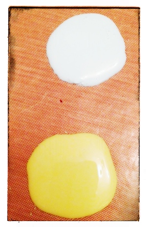
painted the wooden substrate house with an undercoat of Beach Hut and South Pacific Fresco Acrylic Paints.
I
painted the wooden substrate house with an undercoat of Beach Hut and South Pacific Fresco Acrylic Paints.


I painted some Crackle Glaze over the top of the blue paint.

I then applied a layer of Butternut Fresco Acrylic Paint. It only takes seconds for the reaction to
start to crackle. After a few minutes
it’s nearly all done.

When it was all dry I used some sand paper to knock back the
edges so you can see the blue underneath.

I’m all about layers so I couldn't just leave it there could I!!! I
needed some more darker layers on there too. So I brushed some Burnt Umber on the
house, love this finish.


I made a start on the decoration for the back wall of the
small holes. I used PaperArtsy Metal Card for 3 holes, I embossed the metal card first using a Crafter’s Workshop Birds of a feather stencil and then with a flower
and dotty embossing folder. I coloured the metal with Adirondack Alcohol Inks and Promarkers.

I stamped up some Smoothy White Card for the other backgrounds using PaperArtsy Stamp Sets: Ink the Dog, E4,
MON1, ANC3, and D3, then used Hot Picks HP1217EZ. I inked up the card with
Evergreen Bough and Rusty Hinge Distress Inks, and then distressed the edges with Vintage
Photo. The large numbers from the E4 stamp set I inked with a London Fog Grey
Momento dew drop ink pad. I like the subtle grey you get from this ink.


I’ve stuck each background in with glue and I’m ready now to
fill it up with embellishments.


Hope you have enjoyed Part 1 of this project and would love to see you all back here tomorrow for Part 2 to see what else I put inside.
Leandra Says: Wow, this looks amazing. Butternut is a colour I struggle with, not really one of my faves, but on top of the teal base, and stained over top, it looks absolutely amazing! And the layers in your background papers look so interesting, what a brilliant start to this awesome masterclass!
Gillian Says: Love this project loads so far, the Butternut top layer is so effective and sanding it back even further only adds to the beauty of it. Can't wait to see part 2.
Leandra Says: Wow, this looks amazing. Butternut is a colour I struggle with, not really one of my faves, but on top of the teal base, and stained over top, it looks absolutely amazing! And the layers in your background papers look so interesting, what a brilliant start to this awesome masterclass!
Gillian Says: Love this project loads so far, the Butternut top layer is so effective and sanding it back even further only adds to the beauty of it. Can't wait to see part 2.
If
you would like to join this week's challenge and play along with us via
inLinkz, please take a moment to share how you have been inspired by Michelle's creativity with PaperArtsy products. Use some/all of the following: PaperArtsy Stamps, Fresco Paints, Wood or Paper Mache Substrates, and you will be in with a chance to win stamps of your choice {either 1 x A5 set or 2 x A6 sets or 3 minis} simply click HERE to share your creativity.


.JPG)
 Loading InLinkz ...
 Posted with Blogsy