Showing posts with label pavla hozikova. Show all posts

Monday, 31 October 2016

2016 #21 Acetate Mounted Cards {by Pavla Hozikova}

2016 Topic 21: Typography, Fonts, Quotes


Hello everyone, it’s Pavla here with my take on the topic of Typography, fonts and quotes. 


My artwork is full of words and quotes. What I like to do is to take a quote and highlight a word or two. I usually print the quote and make my chosen word bigger, or replace it with a different font or use some big alpha stickers. I found out that Emma Godfrey’s stamp sets are absolutely ideal for this. They have one big word and several quotes that usually contain this word – which makes it ideal for replacing. Tonight, I’ll be creating two cards with Emma’s quotes.


Step One: I cut two square pieces of acetate – because I like to work on square shapes. I stamped one with the swirly circles from Emma Godfrey’s EEG07 stamp set and the other with the “snowflakes” from Emma’s EEG19 set. I used the white StazOn inkpad. 


Step Two: Next, I cut two smaller square pieces of cardstock and created two different backgrounds using various Fresco paints. I watched several videos on YouTube studying Seth Apter’s signature technique of “printing” with structured paper on paper. I’m in love with this technique, the effect it creates!


Step Three: Next, I added more stamping. The tiny stars are also from EEG19 set, the spiky circles are from EEG15. I outlined the stamped images with paint pens to highlight them a bit. 


Step Four: Now, the quotes. I stamped my chosen word/quote combination on black cardstock in white ink and on a piece of velum in black ink. At this point, I didn’t know which I was going to use but it turned out I used both versions in the end...


Step Five: I attached the two backgrounds on the acetate pieces and created a simple card for the back side to cover where the front pieces are glued to the acetate. I used the same stamps and added a smaller quote. 


Step Six: To finish the front, I took my paint pens and added some accents here and there. 


I hope you liked this simple mixed media cards. See you some other time!
Pavla

Blog: pavlart
Instagram: pavla_art

Oh Pavla, thank you for showing your acetate backgrounds, those are beautiful and a brilliant idea to add another dimension to a card. Using words as a focal point really gives them weight and meaning. As you say Emma's combinations of text are perfect for this. ~Darcy

All of our bloggers love to see your twist on their ideas,  particularly if you were inspired directly by their post; so please spare a moment to comment or make your own creative item. They all love to see your feedback and what you can do more than you realise!

We would love to see how you interpret this Typography,Fonts and Quotes topic by linking what you make to our 2016 Challenge #21: Typography,Fonts and Quotes, on this page HERE. The 'Typography, Fonts, Quotes' link will close 17:00 (London Time) Sunday, Nov 13th 2016. The winner will be announced 2 hours later at 19:00.
All links go in the draw to win a £50 voucher to spend on products of your choice from the PaperArtsy online store. 

Saturday, 28 May 2016

2016 #10 Garden of Dreams {by Pavla Hozikova}


2016 #10: Doodles

Hello everyone, it’s Pavla here with a post about Doodles. I have to confess, I never was much of a doodler. I really don’t see anything relaxing about staring at a white page with a lot of black lines. This makes my head ache and for this exact reason, I’m not really a fan of colouring books. So, you ask, why am I doing a post about doodles? Because, luckily, there are these wonderful designers who do the doodling for us. I really fell in love with Emma Godfrey’s stamp sets and I will be doing a project using her circle doodles. Some of you might know, I have this recurring circle theme that pops up every now and then…


Step One: I started with a leftover wooden frame (I believe this one was from IKEA). I gessoed it first, then I randomly applied some paint. I used Yellow Submarine, Blood Orange and a little bit of Smurf on the top (it adds this patina-ish kind of look).


Step Two: I stencilled some dots on top and then went over the edges with a black ink. You can see the difference in the photo - the black gives it a slightly aged look. 


Step Three: Next, I took regular twine and coloured it with black gesso. Then I wound it around the frame.


Step Four: Now, the fun part. I stamped a lot of circles on a piece of cardstock using black archival ink. The circles are from two different sets by Emma Godfrey (EEG07 and EEG15). I coloured them using Daler Rowney acrylic inks. 

EEG07
EEG15
Step Five: Then I cut the circles out. You can see I also turned some of the wheel-like circles into flowers.


Step Six: Finally, I glued the circles to the twine - some to the front, some to the back. I used PVA glue to attach the pieces, then turned the frame over and put a generous blob of glue to the back of each piece and let it dry (I’m a bit of an over-gluer). I added the quote from Lin Brown’s set ELB04

ELB04.

I initially wanted to do this assemblage flat in my journal but I really like how it turned out in 3D. I hope you got inspired. See you some other time!
Pavla

Instagram: pavla_art

Wow Pavla this just jumps off the screen. How clver to use the black strings as they now look like doodled lines between the circles. Emma's stamps have worked brilliantly here and those blended inks are just gorgeous. ~Darcy

We would love to see how you interpret this Doodles topic by linking what you make to our 2016 Challenge #10: Doodles, on this page HERE.
All of our bloggers love to see your twist on their ideas,  particularly if you were inspired directly by their post. 
All links go in the draw to win a £50 voucher to spend on products of your choice from the PaperArtsy online store. The Doodles link will close 17:00 (London Time) Sunday, May 29th 2016. The winner will be announced 2 hours later at 19:00.

Monday, 16 November 2015

2015 #21 Abstract Geometric Backgrounds {by Pavla Hozikova}

2015 Topic 21: Abstract Art

Hello everyone, Pavla here with a simple trick to make easy abstract backgrounds. Before I discovered mixed media, I used to do a lot of “geometric” paintings. Now, I like to return to this style every now and then. What I like about the technique I’m about to show you is that you pretty much don’t know what you are going to end up with until the last moment when the ugly duckling turns into a swan.


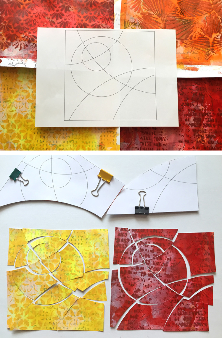
For this technique, I will be working on four backgrounds at once. Why four? I’ll explain later - this technique requires a bit of pre-planning but for now, just trust me. I started by stamping four sheets of white cardstock with four different stamps. I used stamps from: JOFY32, EDY09, and Gentleman Plate 4. It doesn’t have to be perfect – it will be covered, so it doesn’t really matter. Instead of stamping, you can use some book paper or washi tapes. I like to start in black and white, if you use colour in this step, you’d better have your colour scheme thought out at this moment.

JOFY32

EDY09

Gentleman Plate 4


Next, I applied some paints to the paper. I used a Gelli Plate – but only because it was sitting on my table. Feel free to use a brayer, a paint brush or your fingers. You can even use sprays. I worked with Yellow Submarine and BloodOrange Fresco Paints and their combinations because I wanted my final layout to be in yellow/orange/red tones. I also added a bit of Gesso to the top to bring the vibrant colours a bit down. You may notice that the stamped images are still visible, because the paints I used are translucent.


My backgrounds wouldn’t be complete without stencilling. You might want to choose smaller detailed patterns. I applied the Yellow Submarine and Blood Orange paints (and their orange combinations) through some of my homemade stencils. The paints are quite thin for stencilling – but I’m going for a messy look. You can go on adding layers but I’m happy right now with what I have.


Now, the fun part. You need to cut the backgrounds into smaller pieces. It brings us back to the pre-planning. I drew a pattern – couple of lines and circles – and coloured it in so I knew I wanted to use four colours and therefore need four backgrounds. I made 4 identical templates for the cutting and I cut the four backgrounds along the lines of my template.


Once you have the pieces, you need to rearrange them so you end up with four multi-coloured patchwork-like assemblies. Before gluing down the pieces on a sheet of cardstock, I went along the edges with ink.


Finally, you have to decide what you want to do with your reassembled backgrounds. Sometimes, I just make a bunch of them, keep them in my drawer and when I need a card, I only add a sentiment and/or a flower. My backgrounds always end up a bit too colourful, so they require only some bold and simple embellishments. Here I used stamps from the JOFY32 set. I white-embossed them on a black cardstock and added a bit of shimmer using the Wink of Stella glitter pen.


This technique is very versatile. You don’t really need to create new backgrounds to cut them apart. You can use your old scraps and/or discarded artwork to make something entirely new. There is no limit. I’m looking forward to seeing what you create.

I hope you got inspired. See you some other time!

Pavla

Blog: pavlart.blogspot.com
Twitter: @pavlah
Instagram: pavla_art

Fantastic Abstract Art Pavla, love how you still allowed the vibrant colours to show through, and also the added dimensional layer from the stencilling. The composition is simple yet very effective. The finishing detail from the black and white touches is perfect. ~Gillian

We would love you to join in with Challenge #21: Abstract Art

If you would like to join us in some abstract experimentation, then link what you make HERE.

All links go in the draw to win a voucher to spend on products of your choice from the PaperArtsy online store. The Abstract link will close 17:00 (London Time) Sunday, Nov 22nd winner will be announced 2 hours later at 19:00.

Monday, 1 June 2015

2015 #10 Blossoming Bottles {by Pavla Hozíková}

Topic 10: Bottles


Hello, my name is Pavla and I come from the Czech Republic. I’ve recently discovered the joys of art journaling. I don’t label myself as an “art journaler”. A journal is a tool for me, rather than a goal. I don’t do the art journaling for the sake of journaling but I just create my art IN art journals - I simply consider my journals as a collection of individual pieces of art bound together. I was really thrilled when Darcy asked me to do a guest blog post for you tonight with a project based on the topic of Bottles. 


I’m working in a journal I specifically dedicated to this year’s PaperArtsy challenges. I like to work in square sized journals, so I make my own. This one has canvas paper – it can be a pain sometimes because it curls when it’s wet, but I love the texture. First, I gelli printed the background using Smurf and South Pacific Fresco paints with a little bit of glazing medium. I’ll be using just these two colours because I’m going for a bit of a tone-in-tone look. 


I’ve always loved texture and my favourite supplies to work with are stencils (I usually cut my own designs) and texture pastes. For this project, I had a wonderful image in my mind – of stencilled bottles, layered one over another, different texture pastes… I even cut a set of bottle stencils. But you know, when I tested this idea in theory, Plan A was abandoned very quickly – and nobody needs to know, right? 

So I cut the bottles from a piece of cardstock instead. I covered the shapes with crumpled deli paper (similar to Waxed Tissue). I lightly sponged the Smurf paint over the shapes, just a bit, only to get a bluish tint. Then I used the South Pacific paint around the edges on one side to create a shade on the side of the bottle. 


Then I stamped some flowers from the EDY09 set.

I decided to fussy cut them rather than stamp them directly on the layout. It was an afternoon well spent… I coloured the flowers with orange and red markers. Because the layout is a bit monochromatic, the flowers will stand out. Notice that each flower stem is bended slightly differently – I took advantage of the stamp’s flexibility. {Well, I don’t have such a long stamping block, so I had to bend it anyway. LOL}


Now it’s time to assemble the page. First, I glued down the bottles. Notice that I went around the edge of them on the background with gesso to make them pop up a bit. Then, I added the flowers.


Finally, I glued down a quote. I cut the focal word on my Silhouette machine. I also added a bit of shading around the bottles. 


I really enjoyed making this layout even though it wasn’t in my usual bold and bright colours.

I hope you got inspired. See you some other time!


Pavla


Twitter: @pavlah

Instagram: pavla_art

Wow Pavla, not your usual bold colours true! But we can't call these dull colours either! The orange really pops against the blue, and the bottles stand out beautifully with their gorgeous texture and shading! Love how this makes a wonderful page in your PaperArtsy Challenge journal! Thanks for sharing with us! ~Leandra

We would love you to join in with challenge #10: Bottles If you are inspired by any of our guests who blog with us over the fortnight, then please join in and link up your creativity HERE

All links go in the draw to win a voucher to spend on products of your choice from the PaperArtsy online store. The Bottles link will close 17:00 (London Time) Sunday, June 7th, winner will be announced 2 hours later at 19:00.