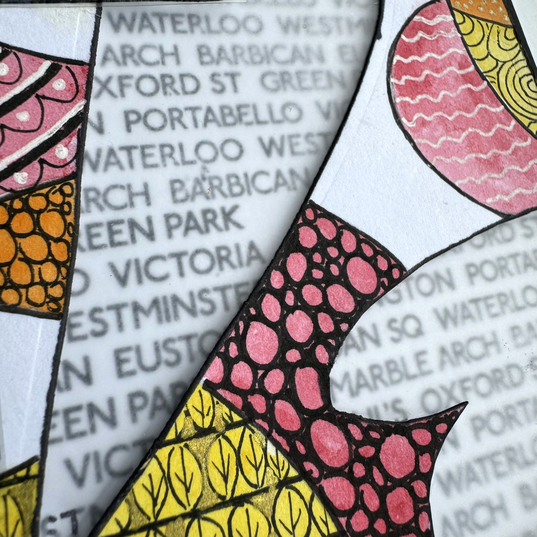
Hi there everyone! It's Riikka from Paperiliitin here today to share with you my make with 3 things! The three things I received were Ink & The Dog Collection (Buttons 4) stamp set (B4EZ), Tall Heart die (PAD-TH) and Fresco Finish Frosting Glaze (FF111).
Frosting Glaze (FF111) was a new product for me, but as soon as I read the description in the card that was with the package, I had the idea of doing transparent ATCs. I've done some before and I really like the floating effect the transparent base creates. There's something magical about the substrate and it's always fun to think different ways to tie the foreground to the background.
The note in the package mentioned the glaze creating a sand-blasted glass effect on a glossy surface and I thought to play with the combination of the treated and untreated areas in my ATCs. One of the three products received also provided me a way to do that - I decided to use the heart die to make a stencil or a mask, which to use to apply the glaze. When I then started creating, I ended up using both - a mask and a stencil - to have a varying effect on the cards. Although I have to be honest, it was partly due to me not being able to decide which one I preferred!

Like I wrote earlier, I decided to use the Tall Heart die (PAD-TH) to make a tool rather as a way to create an embellishment or another element. I had this vision of a heart background and then a cluster on top, but when I then started creating it became painfully obvious that my vision wouldn't work in full detail - the heart was too long to fit to the ATC size! I still decided to be a bit stubborn and followed the idea even though the heart was now partly cut. But I think it still echoes the shape and thus works.
I also cut the ATC sized bits at this stage after having a little ponder. If the heart would have been smaller and fitted inside the ATC, I could have made a master board more easily but as I knew I needed to crop the shape anyway, I thought it would be easier to do on top of the correct ATC size. I cut the bases out of overhead transparency. It's a bit thin, but I've used it before as the base material and it has worked ok.
As I used a piece of scrap paper to make my stencil and mask, they started reacting to the moisture of the Fresco Finish Frosting Glace (FF111) almost immediately. If I would do another set now, I would probably opt for a thicker cardstock or even use a thin plastic like the overhead transparency to make the stencil and mask. If you are creating something similar and decide to use cardstock as the means to make the mask and stencil, make sure the color won't bleed when wet. On the other hand, that might also create a great effect!
I used a sponge to apply the glaze as I thought that might be the best tool to get the sanded effect. In my mind the brush strokes might have ruined the sand-blasted look, but I have to say, that I didn't even try applying the glaze with a brush! But what I can say is the sponge worked fantastically!
Next I then turned my attention to the Buttons 4 stamp set (B4EZ). I just love the vintage vibe of the stamp! The ladies in the set were going to be the focal point quite obviously for me as I love to use old photos as my key element and conjure stories to accompany them. I decided to call this ATC set "Sewing circle" connected to the words added into the stamp set.
I first stamped the image using black Archival Ink but I wasn't happy the way it acted with the tiny details. As that's the only black ink I own, I then tried embossing powder instead, which was a bit weird solution, if you think of it. Especially so, if I mention that I only had regular grain sized embossing powder in black! But I think it was the combination on the raised effect and the added blur that convinced me that embossing powder version was better and I went with that. I mean even though the Archival version was maybe actually more detailed, the domed look of the embossing powder carried the fuzzy look better than the flat image. I stamped the ladies a couple of times as I realized I would need extra to be able to cut out the individuals loose.
To make a full use of the Buttons 4 stamp set (B4EZ), I also stamped the labels to a piece of cardstock. For those I used the Archival Ink as these were going to be background pieces anyway. I also stamped the little words in the set. I mounted all of them to my stamping block and stamped the lot a couple of times so I would have options to choose from.
I wanted to highlight the vintage vibe by using brown. Lately I've been favoring this coffee-toned brown ink, so it felt quite natural to grab it from the shelf again. I inked the labels, the cut out characters and the little word labels. I used scissors to cut all the elements and didn't mind if they weren't perfectly straight when it came to the labels.
As I was cutting the ladies loose, I realized that I could only use the seated individuals for the cards as the ladies standing behind them were too obscured by the dresses of the sitters. Luckily, I had stamped the group three times, so I had individuals to choose from. I included the barcode on the bottom of the images to them in order to have the images a bit bigger.
I now had a label and the center of attention along with a little word, but the cluster needed more. The inspiration for the additional elements came from three places - the postcard in the package, the stamp set itself and my go-to supplies.
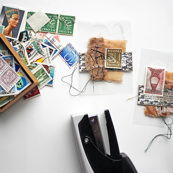
The postcard in the package inspired me to use postage stamps as a decorative element in the cluster. I used quite monotone Finnish stamps in each, adding a touch of color to the otherwise brown card this way. I rummaged through my stash of old stamps and picked six different ones, one to each card. Even though I was making a series, I wanted each card to have something unique about them.
The stamp set provided me with an idea to use sewn elements. I had these little fabric decorations ready made, so I added one to each card. The decorations are self-made out of dyed cotton, torn and sewn together. The white cotton in these is dyed using Just Walnut (CS25), by the way.
The third element to be added was a go-to thing - a used and dried teabag. I have a bunch of these ready to be used and whenever I need a delicate layer with a vintage tone, I reach and grab some. I just love the gauze-like material and then uneven dye!
To attach the layers to the card, I used my favorite way and just stapled them in place. This allows the layers to be a bit fluffy and loose, but still attached to the base. It also provides me an easy way to add something between the layers, if I want. As the elements are secured only from the center, I can alter the composition by adding layers and elements in easily just by tucking them between the existing layers! Sometimes I even leave the staples in plain view, but this time I mainly covered them with the focal elements coming on top.
Then it was time to add the ladies in place. For them, I used foam tape to raise those characters from the background a little. As I did the clusters without thinking the specific character on top, just following my eye, I now needed to choose which lady to use to which card. I had the rough idea, but I now made sure that the over all composition would be nice. I tried to follow some kind of triangle in my placement, especially so that the higher side of the composition was towards their back, not their face, so they wouldn't look caged. I also added the tiny text labels in using double sided tape.
After adding all the layers, the cards seemed still quite bare. I mean I love to add little details for the viewer to study and find. I had the postage stamp, I had the different textures and the loose flowing threads, but still the look was quite monotone and flat. Luckily the name of the stamp set offered a solution - Buttons 4 (B4EZ). Buttons!
I rummaged through my stash of old buttons and matched the button to the color of the postal stamp. Well, I did have a couple of exceptions as the bag I had at hand didn't have any red ones, but otherwise I used green for green and blue for blue. To highlight the fact that this is a set of cards, I used a vibrant pink thread to sew each button. It also added another touch of color to the cards with the red stamps and white buttons.
Sometimes I add the stitches to the buttons before adding them to the project with a drop of glue. That's an easy way so you don't have to sew through paper and if you are making a piece on top of a sturdy base, it might be the only way. This time, however, I in fact wanted the buttons to be sewn in and used just the thread to secure them in place.
After sewing the buttons in, I was happy with what I had created! A set of of six transparent ATCs with a vintage cluster on top! Three of them have the masked heart in the background and three are with the stenciled one. When writing this, I noticed that I've managed to mix and match the elements so, that the same lady is on a masked and stenciled background. That wasn't my goal or even on my mind when creating, but it does make a lot of sense and balances the set.
As you can see from the photo below, I used three ladies on the cards - the ones sitting. I had hoped to use all of them, but as I mentioned earlier, the dresses of the ones sitting hid too much of the others. I tried to cut them out, but they just looked weird as it wasn't just the skirt that was hidden but their hands, too.
Even though I used the same ladies twice in the set, I wanted to make each card unique. One of the ways I used was the added speck of color, but the other one was the little word label. While choosing which word goes to which card, I tried to study the expression and stance of the character in the card in question. For example the lady in the green cards "Needles" and "Sew" seemed more stern and older to my eye than the two others. The lady in the red cards "Thimble" and "Pins" then again appeared more alert, while the "Lace" and "Button" lady was more meek.

What I find interesting in these cards is the juxtaposition of the modern and old. The modern, plastic background and the vintage feel of the other layers. Now thinking about it, I guess one of the reasons that the embossing powder seemed more appropriate for the focal points, might got to do with bringing something from the background to the foreground. I'm talking about the shiny plastic! While the photo itself is old, with added brown to highlight the vintage air, the stamping medium is a modern finely ground plastic.
I also like the combination of the different materials, different textures. There's the sleekness of the plastic, the weave of the cotton, the smoothness of the paper, and the gauze-like softness of the tea bag.
You know another fun thing about these ATCs? I'm giving them away! If you want to receive one, please send me your mailing address via email. My address is rkovasin(a)gmail.com - just use an @ to replace the (a). We can swap, too, but that's not a requirement. I'm doing this in a "first come, first served" basis and only from the emails sent to me. I'll mail anywhere in the world, though there are a few countries where the transport connections are currently cut off, according to Finnish postal company. Should that be the case, I'll let you know.
Thank you for stopping by today! I hope you enjoyed reading the post - I enjoyed writing it!
Xoxo Riikka


.jpg)