Showing posts with label LPC046. Show all posts

Thursday, 14 September 2023

2023 Topic 9 : Lynne Perrella - Designer Focus {by Keren Baker}


Hi everyone, Keren here today with a post using a 'feels like home' designer. What do I mean by that? Some artists just 'speak' to you however you're feeling creatively and Lynne Perrella's stamps whilst not being traditionally modern and graphic (my comfort zone) are the ultimate in beautiful chameleon images; whatever style you're going for- somehow they manage to fit right in.

I tend to choose bright and rainbow colours, but I'm continuing in challenging myself to use colours I'd ordinarily shy away from. Ultimately that would be just be brown...but I've let myself go into this challenge gently and resurrected my old nemesis pal...purple!


This is what I ended up creating. I wanted to make a giftable brooch with packaging that hopefully added to the loveliness of the gift and you could use afterwards for a photo frame or other keepsake.


I had wanted to make 2 projects; one with a stamped brooch and the other, a longline brooch using a Vlieseline product called Decovil- but I ended up with only one, as once I'd stamped the female's profile, I just wanted to use it exclusively.


I chose a very simple selection of products (although I 'might' have snuck an extra image from another stamp set later on ;-). For me, this is an unusual selection, and limiting myself to a few colours forced me to be more creative. Having been inspired by the colour wheel topic a few times I knew that by using a brighter lighter green and adding the blue would give me options of a deeper green and different shades of Amethyst whilst still blending the other colours well.


For a fabric brooch...you need fabric! I've often talked about using mercerised cotton to get a really detailed crisp image. Depending on what kind of look you're after, you can get it from changing up the type of fabric. A more loosely woven (or rougher fabric- think loose linen or finer hessian) will give a softer less defined look). The tighter the weave, and higher thread count, the more detail will show. I always use a stamp platform for best results.


Stretch out the fabric well and it's a good idea to add as many magnets as possible and also to cluster them around the image as sometimes the fabric lifts when you pull the stamp away from the fabric. I used Versafine Clair in this instance but you need ink preferably permanent that won't run when you introduce water and paint. You'll probably need to stamp 3-5 times.

This next photo shows you the difference when using different types of fabric.


It was time to paint. Always add a little water to the area of fabric you're about to paint. The water helps the paint to blend and doesn't just soak the paint straight up like a sponge. The effect will surprise you; you can get really great results.


The wings on her head reminded me of a bonnet. I wondered if that was Lynne's plan all along. I wanted to create something more dimensional so re-stamped the wings, sewed around the edges adding in an extra piece of fabric and then turning out. Add some sewn details following the patterning of the image and then a few beads. Turn under slightly and sew directly to the head image.


The next bit involved a mistake on my part. I'd normally add in some wadding, a background fabric and turn it out. This shape would be challenging to find an area to turn out. Had I known, I'd have used some of the Decovil that I mentioned before, and secured the painted image directly to the products which has a built in heat activated bond.

Here's a photo of my little helper holding onto the sewn layers, before I turned it out (which took a very long time and involved a lot of puffing and panting!!).


So here's where I had got up to. I did add in a little red to the purple to help create a brown shade for her hair. The other downside to turning the image through, is the immaculately flat painted image was now a little 'papery' in texture. But if you were going for that look...then bonus!


That previous photo was taken before I sewed around the outline with black stitching. Again, on reflection I'd would not have over-sewn, as just look at the back of the brooch with black stitching showing (which was unavoidable as I needed black thread to match the black outline). Adding a piece of ribbon (that I'd sealed the edges with using a flame) to a safety pin made an easy brooch back as I didn't realise that I'd previously used up all of my brooch backs.


Here's where some of the problem solving came in. I needed to find a way of presenting the brooch as a gift. I'd come up with the idea of a looped banner that I could hang onto something. At this point she also seemed a little unfinished. The butterfly bonnet was giving me 'Regency' vibes. I had some green cotton lying on my desk which when I unravelled gave curls just like women of that era would have created with their hair. The pop of colour seemed to lift it (albeit that the colour is not in keeping with the period!!).


I decided upon a transparent box. Our theme this quarter has been 'transparency' so it tied in well. I adore acetate and came up with the idea of creating hollow cuboids that I could slot acetate into both vertical sides. First, I needed a stamped 'sheet'. Lynne Perrella images are wonderful for creating patterned sheets.


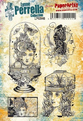
I also needed a base to add the brooch and banner to. Some book pages, grey ink and another of the images in the LPC046 stamp set were perfect. I also grabbed a stick of greenery from outside for later.


Now I needed to draw everything together and add some details.

It's easy to create the stamped cuboids using pieces scored at 1/2", 1, 1 1/2" and 2 and adding a tab then fold into a cuboid shape. I tried slotting the acetate into both columns. It felt a little bare though, and continuing on with the purple theme, I remembered I'd got Alison Bomber's set she's produced for the Fodder classes EABF and it contains a blackberry stamp.

I stamped one side with Stazon white Pigment ink and painted the opposite side with shades of Amethyst.

Once you've slotted in the acetate to each open cuboid, seal them with double sided tape and then trim two more to fit into the horizontal gaps.

You can see the stick, which I painted blue and trimmed to size and mounted onto the base.

To secure the frame you've created, I needed to create a hinge. The simplest way of doing it was using washi tape. A piece attached to both sides.


Now to add in other details such as little dots using a Posca Paint pen which is perfect for acetate or other slippery surfaces.


The other detail that needed 'fixing' was adding a piece of stamped cardstock to the ends as they were 'open' . An easy fix.


The end result was different to how I'd imagined but I love the keepsake element and the simple hinge is something I'll use again. Whilst the brooch is texturally interesting (loving the hair) if feels very home-made so I definitely want to explore making another with Decovil. I'm also going to use this stamp set to create a moth inspired brooch. How might you incorporate fabric into your projects? Have you tried painting on fabric yet? Hope you might try out something new in your next creative session.

Keren x


Tuesday, 16 February 2021

2021 Topic 2 A Pocketful of Dolls with LPC {by Leandra Franich}

 2021 Topic 2: A Pocketful of dolls {by Leandra Franich}


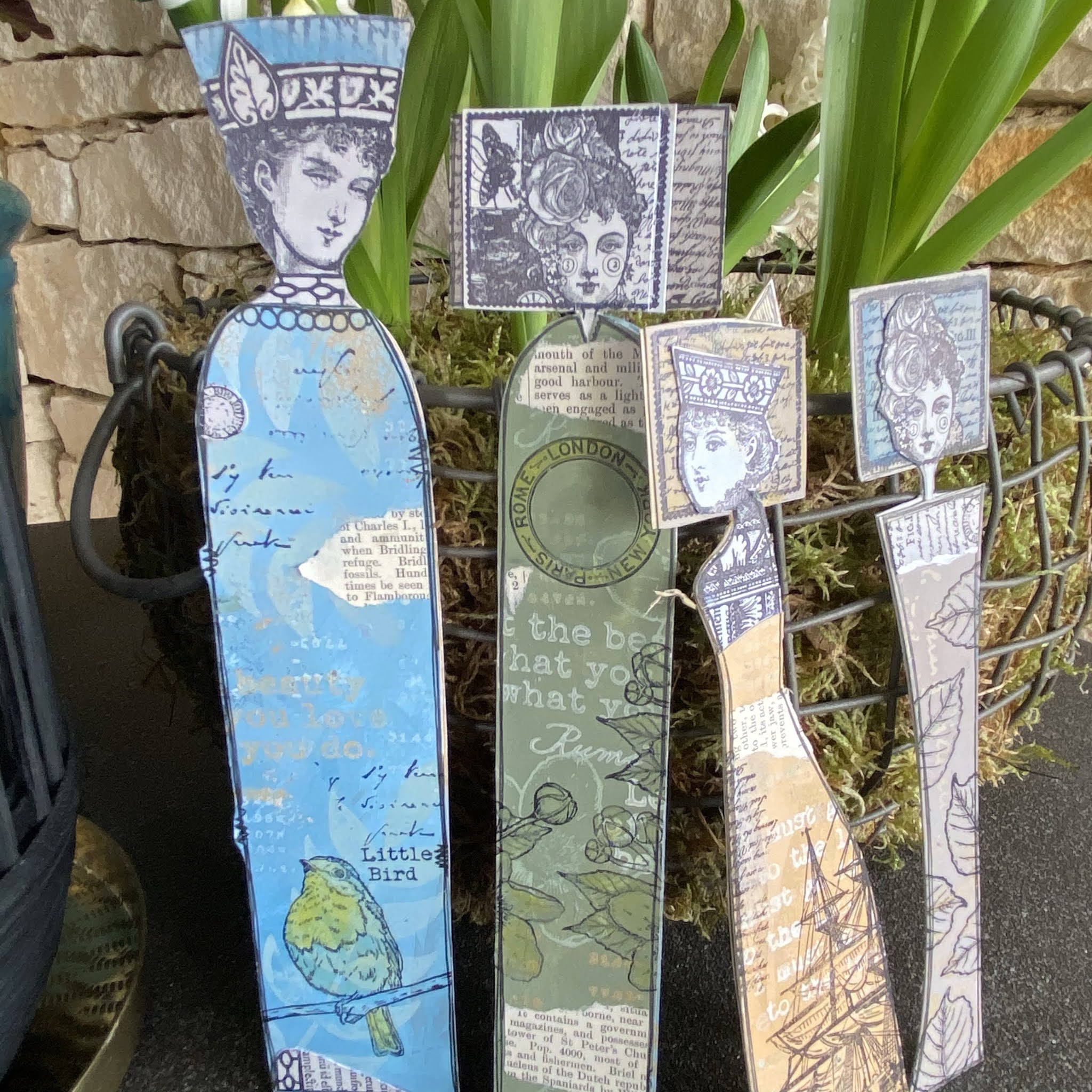
It's Leandra tonight with an actual blog post! Working with limited supplies and scavenged stamps from the 'spares' pile, she's pulled together a very tall booklet of pockets to house her Lynne Perrella ladies. There's a kind of regal feel to them. On a more practical level, these could be a selection of bookmarks, but maybe they are destined for bigger things...they might  eventually end up on a canvas on the wall! For now, they are safe in their pockets.

Hi everyone, really nice to be sharing some art with you today
 
I imagined this post when planning the blog topics last year. I had seen some of the stamps that Lynne Perrella was planning with us for 2021, and there is a big doll vibe, so I guess that has been on my mind thinking a lot about her release coming up in March. As a warm up, last week I was mucking about with this concept, albeit a bit more complicated than I've shown here today, for a new Hot Pick release we have coming up (next week!). And then, serendipitously, Instagram popped up with an IG live from @megan_whisner_quinlan (whose creative style I totally love) and lo and behold, she was also thinking along similar lines using Lynne Perrella heads with her scrap printed papers to make dolls for her journal pages - you should go check out her feed to see what she created. I watched some of Megan's live, it was pretty late here in Europe and I went to sleep thinking of my project. I woke up the next day super-inspired for a series of tall LPC dolls.


For this project I wanted to strip things back and go quite simple. Muted colours, neutral balance, and simple decoration details on the dolls. A lot of my stripped-back play is due to having zero craft stuff at my fingertips (not a bad thing) but ALL my stuff is still packed up in boxes until we have  redecorated and figured out where my craft space actually will be! So it's going to be a while... and lucky for me I can raid the pile of rejected stamps, half bottles of paints, and what more do you need right?! Anyway...these very posh looking ladies ended up double sided (mostly to ensure the necks were supported so the hardest part was getting the heads to work from both the front and the back.


I started out choosing a colour palette from the Fresco Paint Range ...
 
Grey Blues (Wolf Eye, Blue Smoke, Blue Jeans)


Neutrals (Taupe, Truffle, Eggshell), 
 
 
Grey Greens (Toad Hall, Khaki, Lichen),


...and a pop of warm (Caramel and Sand). 


I used eggshell constantly, to soften the tone back. At first I started with Eggshell and the lightest of each shade to make some backing cards, these I thought I would stamp the faces on. But I ended up stamping all the faces on the left hand sheet.
 

The stamps were from Lynne Perrella Sets....


There are plenty of Lynne Perrella stamps that work so well for this. I used really small faces, but there are many much larger options too!

For the bodies I followed the same background idea with the 2 darker shades...


... and over-stamped with the other lighter colours, allowing the colours to blend as I went so that the paints of each pallet were being used in a blended way on top of each of the backing papers.

 
I used a variety of stamps over the backgrounds, you might recognise some Sara Naumann and Scrapcosy stamps from the January releases. Follow those links for stockists.


From these scraps I drew bodies to fit on the stamped heads/ shoulders. I wanted the dolls to fit into tall narrow pockets - my pockets needed to fit within encyclopedia columns, so I was thinking VERY tall and narrow!
 
 
You can see I scribbled the shape and added scraps of book paper to tie in with the pockets, plus a bit of stamping in black here and there. These are double sided, so here is side A....
 
 
... and here is side B....really good fun and pretty sure I could have made a castle full of these, they do look quite regal!

 
Next for the construction of the 'doll holder'. Old book pages from an encyclopedia were glued together 2 high and 3 wide. They were pretty fragile, so I knew they needed doubling up somehow. 
 
 
It was clear each doll could perfectly fit in a 'column', so I made folds to pull a whole section up and then zig-zag across. It felt sturdier.
 
 
Last week the girls used a weird kind of pastry we have found here, i think it is called 'brick'. It's like a cross between filo pastry and normal, but is good for making spring roll shaped baked things that would have a savory or sweet filling. Once cooked it ends up crunchier than pastry but less flaky than filo. Anyway, in between each layer of these crepe looking circles is waxed paper! See-through waxed paper!!! I nabbed the whole pile to try out for gel printing (when I find my gel plates) but for this project they were also ideal to create see-through pockets! 
 
 
And yup, glue is also missing in a box somewhere, but a sewing machine is easier to find! And so stithces became my glue. I stitched rectangles into place, and numbers above each doll, and names for each doll too.
 
 
And I also stitched along each fold-edge to give a bit more structure
 
 
Here's the 'pocket' detail...
 
 
So now I just needed to slot the dolls in!


Here you can see the whole set up, and then I went on to decorate the 'cover'


It's fun when small stamps can become the beginning of  something bigger! And even the same face can look different if you mix up the box-background.


The cover was from used up scraps with another Sara Naumann stamp and I also used her new stencil with some Grunge Paste on the cover too!

 
A few close up details

 
Super happy with how the waxed paper worked for this project, it's nice to still see through each pocket!


Here's a better look at the front cover. I kept it understated, the dolls then taking centre stage once the 'door' is opened.

 
I really enjoyed this project, it fell into place from start to finish. And look, my tulips popped up just in time for the photo shoot!
 

Thanks for joining me today, 
 
If you want to share your 'pocketful' creations, head on over to PaperArtsy People, where we really love to see what you get up to or tag me on Intagram @PaperArtsy !
 
Stay safe
 
Leandra