Showing posts with label Karen Hayselden. Show all posts

Saturday, 23 April 2016

2016 #8 Pretty Awesome {by Karen Hayselden}

2016 Topic 8: White Space

Hi everyone (Kassa Hayselden) here, joining you this evening with a post with the theme ('white space') I loooooves 'white space' art as it allows colours to jump right outta the page as you can see here on my finished loose journal page.

Colour rocks my world, makes for what I call my 'happy art', this beautiful face from Clare Lloyd's ECL09 stamp set simply drew me in, tis those huge eyes, I couldn't wait to go crazy with colour and bring her to life...


Step One: So on artist quality smooth paper stamp out the face (I let the edge of the image hang off the page - only missing a little of her hair-do!) I set to with my colouring pencils and layered, layered, layered the colours...patience is the name of the game and not being afraid of colour!


Step Two: Around the bottom and left side edges I fingerpainted with a mix of PaperArtsy Fresco finish; Guacamole; Zesty Zing; Limelight; French Roast chalk paints - letting each colour dry brfore applying the next (carefully missing the face)


Step Three: Once the paint has dried, take your fav stencil, (I used a small various sized circles one here) and stencil some PaperArtsy Fresco finish Lilac chalk paint over the paint, into the centre of the white space and on the neckline too!

Step Four: Once dry paint gesso over the white space and over the coloured stenciled circles, apply more in the middle, top and right hand side, sprinkle a little talcum powder into the gesso as you paint it in....makes for a thicker coat where you can scribble and scratch random lines/words in! Just one thin layer of gesso is needed towards the face and over the lilac coloured stencil circles, so the details peep through!


Step Five: Again take a couple of your fav stencils and add texture paste through, adding more down the bottom and around the face/neck area (this grounds the face) do stencil the paste up into the white space to break it up, makes for more interest (along with the gesso'd scribbles) So your white space is still white space but with detail now!


Step Six: Finally I add little finishing details. flashes of uber bright paint on the hand drawn in eyelashes and a spot of aqua shiney foil too - makes for magical sparkley eyes! A couple of stapled on words from the quotes, softly and loosely re-define the stamped image with a black pencil and ink pen (add a few extra scribbles along the way) And I just had to finish with a few white splats and the stamped text.


I have loooved every minute of this challenge, tis the prettyiness of her face and WoWzers the size of the face (tis approx the size of the palm of my hand eeeeep!) so being a little different to the size of faces I normally stamp out has made this more fun and I feel easier...why not see for yourself...
mwah

Kassa xoxo


Wow Karen, we just love your girl, those splashes of colour just jump right off the page. You have transformed Clare's origina into much more than just a stamped image. ~Darcy 

The PaperArtsy blog challenge is an opportunity for you to play along with the ideas our bloggers present. The current topic is #:8 White Space. You can put your own twist on the ideas presented, share or try something totally new. As long as it fits the theme we would love to see what has inspired you! So please join in and link up your creativity HERE to your own blog post.

All links go in the draw to win a voucher to spend on products of your choice from the PaperArtsy online store. This link will close 19:00 (London Time) May 1st 2016


Friday, 11 December 2015

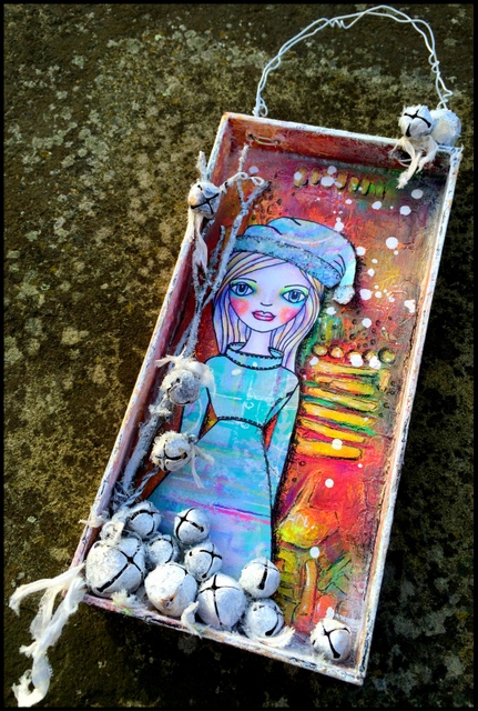
2015 # 23 Jingle Bells {by Kassa Hayselden}


                                        2015 Topic 23: Christmas Gifts and Cards

Hi there everyone, Kassa Hayselden here, joining you this evening with a (mixed media) post. I love mixed media art full of colour and yummy texture, I am drawn to creating 3d art incorporating totally different mediums and techniques, the fun is getting them to 'mash' together and look kool! And what a bonus cos I adore creating little mini pieces of Christmassy art like this diddy hanging printers tray filled with a joys of decking the tree and double bonus as I got to play with Clare Lloyd's new and very beautiful Christmas stamp!


Step One: Using Eclectica {Clare Lloyd} Collection (ECL08)  My first job after stamping out the 'face' image onto 'artist' quality paper was to colourise this most beautiful face with my colouring pencils, I went with a rosy-cheeked, fresh faced angelic look (the huge doe eyes inspired the angelic look)


ECL08

Step Two: I squirrel away leftovers from other projects all the time and I had the perfect piece of pre-painted dry wax deli paper for the dress and hat, all I had to do was simply stamp out the images.


Step Three: Before building the mini printers tray I applied Golden Fiber Paste -  through a stencil onto all the printer's inside panels (let dry then proceeded to build up) I then gave the whole of the printers tray a coat of Fresco Chalk Acrylic Paint in Stone , once dry, I applied a thin layer of Fresco Finish Crackle Effect with my spatula  and quickly dried this layer with my heat gun before applying a thick layer of a mix of the following paints to create my own bespoke coral colour: Fresco Chalk Acrylic Paint Claret and Tango  and Candy Floss I soooo love watching the crackles appear - I will never tire of this magical spectacle!


Once everything is bone dry I sanded over the paint and the white Golden Fibre paste stencilled patterns start to magically appear - love these PaperArtsy  Sanding Blocks - they get nicely into the nooks and crannies.  I dust all the debris away and paint in the 'now' white bits with Fresco Chalk Acrylic Paint  in Zesty Zing.


Step Four: Now being that I am a mixed media artist and being that I only had a limited number of these amazing PaperArtsy Fresco Chalk Acrylic paints (which I have now totally fallen in love with btw and NEED to get my hands on more more more!) I did the mixed media thing and decided to go with a 'mash-up' and oh boy did I enjoy 'mashing-up' my non chalky paints with the PaperArtsy Fresco Chalk Acrylic paints - everything jelled together like a dream, layer after layer of the various paints gave more and more depth and vibrancy - I especially love the PaperArtsy 'Translucent' Chalk paints for layering, they allow the colour you are covering to glow through perfectly! 


Step Five: Once everything is dry it is time to start popping everything together and add finishing touches, ie. A wire from a ring binder makes a pretty great loop to hang your tray with, ribbons and glitter are a must for christmassy cheer! One of my 'go to' touches is using the Golden Fluid Acrylic - Iridescent Copper fine fluid -  and the Golden Fluid Acrylic - Iridescent Bronze fine fluid you can see it in the picture below glimmering and twinkling away and a thin application with a paintbrush allows the paint colours sat beneath it to still glow through I totally love this very thin and fine fluid paint! 


Another finishing touch is dry brushing (a dry paint brush with a minute amount of paint on, wipe off excess) a thin coat of Fresco Chalk Acrylic Paint in Nougat  over the outer casing of the printers tray and the inner side panels pulling a little of the paint in towards the centre slightly, giving a dusty coat of snow which ties in the frosted jingle bells and 'twig' tree both also coated in 'Nougat' and glass glitter!


For that exta Va Va Voom 'PoP' we all adore and crave for (having already doodled with your favourite white and black or coloured water resistant ink fine liners/ball pens) why not like I have for your very final layer (I call it an extra 'cheeky' layer!) get out your Faber Castell Gelatos or Portfolio Oil Pastels to doodle with or rub in - it gives more body and depth makes your art simply come alive and sing (especially the bright hues in the Gelatos, they are like magic sticks!)


So if you would like to give this merging/mashing-up of paint colours a go then here are some pointers that may help: Whilst applying wet paints side by sideit is easier if the colour sit closeby/next to eachother on the colourwheel ie. reds, yellows, oranges, pinks etc are great to apply next to eachother cos if they smear/contaminate eachother they create pretty colours - if you sit blues and red tones next to eachother when wet they can create beautiful purples BUT say if you sit greens, purples, and orange tones next to eachother when wet this can result in a muddy mess when they smear and contaminate each other! (to be recovered from with a coat or 3 or 4 of whire paint/gesso when the muddy mess is dry) - So basically if the colours you want to use sit opposite each other on the colourwheel ie clash simply give each layer of paint a blast with your heat gun between layers to avoid the mud and a very thin layer of white paint (dry brushing) can almost seemlessly blend the contrasting colours together (again make sure the paints are dry before applying the white paint!) 

Hugs

Kassa Hayselden

Mwah xoxo
You can find me facebook
Also on Fb here too
I love to Instagram
Pinterest
Here is the home of my blog


Thankyou so much Karen, this is a wonderful way to use a printers tray. You are so right about the translucent paints, they add such a punch of vibrancy to the colours beneath. I adore that you call your final layer a 'cheeky layer' , such fun, and yes the blendable crayons add life, making this such a happy project.