Showing posts with label Blackcurrant. Show all posts

Wednesday, 23 July 2025

Butterfly Booklet with Sara Naumann Products {by Ann Barnes}

Hi everyone, nice to be back with you again. It is Ann (@aksbarchitect) here with you today.

This year on the blog, we have free reign to do a deep dive into a PaperArtsy product range of our choosing. For this post I have been exploring Sara Naumann's products. One of the things I love about the summer is watching the butterflies silently flutter through the air and alight upon the flowers. They always bring such a sense of peace. When I saw the Sara Naumann butterfly stencil and stamps, I wanted to create something that reflected this peacefulness that the butterflies bring.


Working with the beautiful PaperArtsy Infusions and various papers, I had an idea to use the stencil in a new (to me) way. I was hoping to achieve a dimensional page that would make you eager to look deeper. It took a few tries, but once I was able to make my vision become a reality, the remaining pages seemed to flow effortlessly.

I am looking forward to sharing my process for creating this with you.


For this booklet, I primarily used Sara Naumann Stamp Set 33 (ESN33) and PaperArtsy Sara Naumann Stencil 122 (PS122). I also used the gorgeous PaperArtsy Infusions Dye Stains Raspberry (CS24), Blackcurrant (CS09), and Violet  Storms (CS11).

Most often when I think of butterflies, my mind conjures visions of purples and pinks. The PaperArtsy Infusions created such gorgeous intense colored papers, I thought that using a yellowish base paper would complement it wonderfully. For this I chose PaperArtsy Fresco Finish Acrylic in Heavy Cream (FF203) and Ranger Industries Distress Ink in Antique Linen.


Knowing that I would be incorporating hand dyed papers made with PaperArtsy Infusions dye stains, I decided that creating those papers would be the perfect place to begin. Watching the colors spread onto the paper with the addition of water is so much fun! I like to use 100% cotton rag vellum because it accepts the colors easily, withstands a lot of water and also dries flat. Spritz the vellum paper with water, sprinkle the infusions randomly over the page and add more water. Then, layer another page directly on top and repeat the process. This allows you to add color to both sides of the paper efficiently. Once you have completed as many pages as you want, allow them to dry overnight. If there are any remaining crystals that have not dissolved, these are easily brushed off once the papers are completely dry. I also dyed some Bristol cardstock and tracing paper that I would put to use later, both in the booklet as well as in some of my collage art. Having a stash of these gorgeous and vibrant papers is always nice.


My original idea was based on creating a dimensional paper using the butterflies stencil (PS122). I was hoping to use a translucent vellum topper that would allow color to show through butterfly shaped openings. I tried multiple variations of layering and could not get this idea to work out. Frustrated, I then decided that perhaps the colors would only be seen within the booklet... 
It was when I allowed my creativity to guide me, that things began to head in a direction much more to my liking!


To create the cover, I laid the stencil onto my handmade paper and lightly traced the butterflies with a pencil. I moved the stencil around to create a pattern that swept across the page. It is not necessary to use all of the stencil cutout openings in your design, and you can easily make the design your own by changing the angles and positions of the different sized butterfly openings.


Using an Exacto knife, I cut around each of the butterfly wings that I had traced and intentionally left the central "body" section intact. This allows the wings to be folded upward while remaining attached.


Once all of the wing shapes are cut, gently erase the remaining pencil marks. You can then adorn the wings in any way you desire; I added some gilding.


Using the piece of Infusions dyed Bristol, I die cut two ornate butterflies. Then I traced the edge of the butterfly onto one half of a folded piece of cardstock and cut it out with scissors. This created a folding card where the top flap was in the shape of the butterfly and the base remained untouched. Using the butterfly quote stamp from Sara Neumann Stamp Set 33 (ESN33) I stamped repeatedly to create a background.


Using a blending brush and Distress Ink, I added color to the patterned butterfly shape.


This piece was then sandwiched between the two die cut pieces.


I inked a piece of vellum with Distress ink in Antique Linen, then created some tone on tone pattern using the butterfly image stamps from the set. Using the same Antique Linen Distress ink, I inked up my stamps and randomly stamped onto the colored vellum.


Since the images are stamped in the same color, they appear as a deeper shade of the background. I love the look of this, especially on the translucent vellum.


The sentiments that were intended to stand out, were stamped onto the vellum with Archival Ink.


When the butterfly flap sits atop the vellum pages, it creates an interesting and beautiful backdrop.


I wanted to create a similar sweep of the butterflies on the back page. To do this, first lightly sponge PaperArtsy Fresco Finish Acrylic paint in Heavy Cream onto the Bristol cardstock and allow to dry. Then using an ink blending brush, ink up a few of the butterfly shapes in the stencil creating the desired pattern.


Once the ink is dry, replace the stencil over the page and add metal leaf adhesive to random areas of the inked shapes. Gold leaf is then placed onto the adhesive and the excess is brushed off.

The final step is to assemble the pages and secure them together with a piece of sari silk to create a butterfly booklet.


I love the way this butterfly booklet turned out. As I turn the pages I am transported to the peaceful flight of the butterfly. Drifting amongst the flowers carefree.

Sunday, 18 December 2022

2022 Topic 16 : Splosh {by Renata Peley} with Nicci Battilana stamps


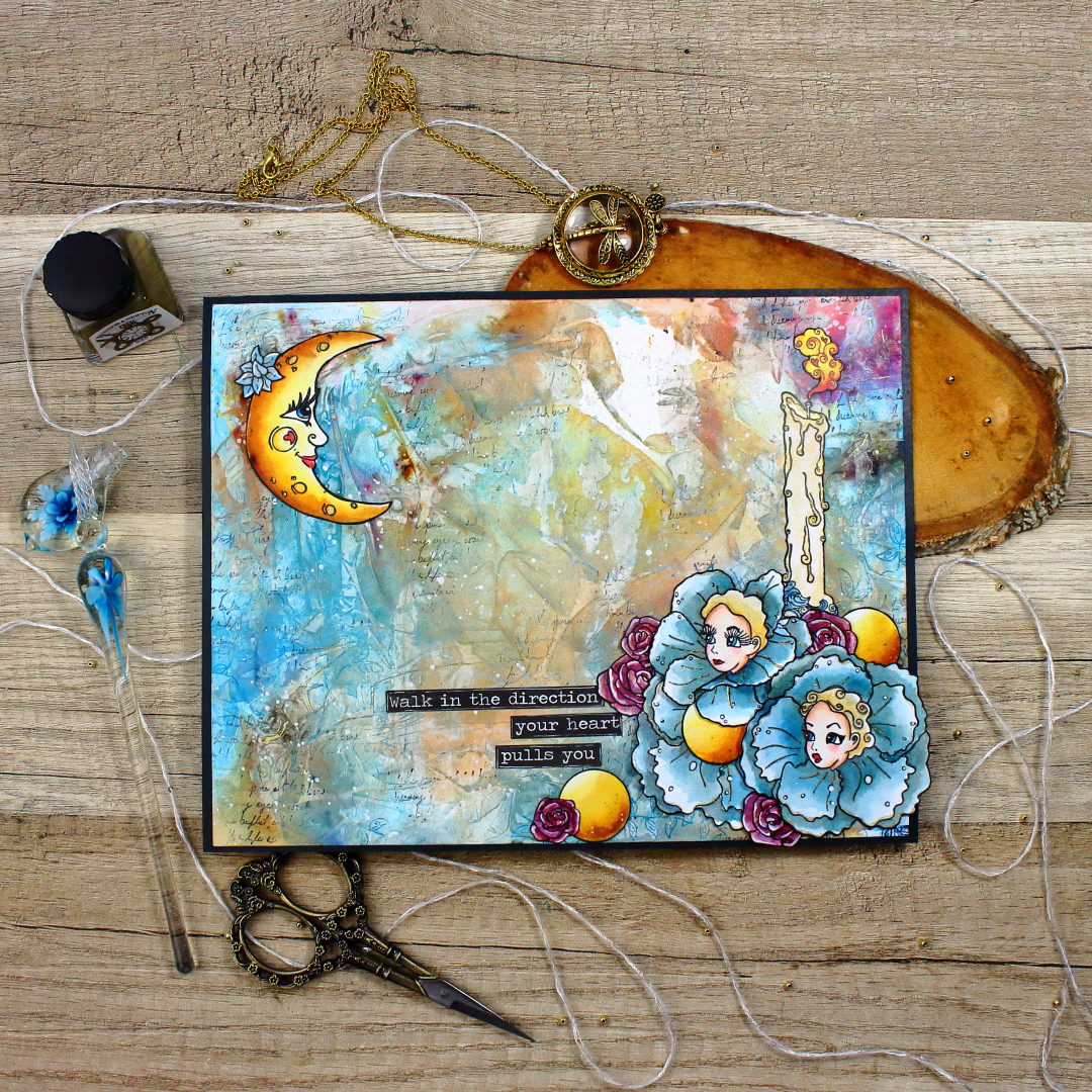
Hi everyone, it's Peley Renata with you today, and I'm here to share with you an art journal page I made using a selection of stamps from the latest release from Nicci Battilana.


If you read any of the previous blog posts on this topic, you know well by now that its main interest is exploring fluid media. Personally, I love working with liquid mediums as I enjoy the freedom and unpredictability of it. One of the most common liquid mediums that I tend to reach for is watercolors. Actually, watercolors are the first medium that I started working with at all. But after playing with them for a while, PaperArtsy Infusions were such a revelation. If you thought watercolors were unpredictable, then the Infusions are on a whole new level. Now going back to my idea, I thought what’s better to spice things up than to use watercolors and Infusions together on a single project.


For today’s topic I decided to start off with stamping my focal images first. I have chosen to work with two brand new stamp sets from Nicci Battilana, and I must say that these may be my favorite ones from her yet. Beside the design itself, what I really like about them is that if you take a closer look, you can notice that they both have a lot of stamps that could be really perfect focal images. But for my project I picked the moon and the candlestick from ENB13 and two flower girls from ENB15.


Here, my idea was to make my flower girls look in the direction of the moon, which I planned to put diagonally on the opposite side of my paper. But then I realized that the girls would look at each other and not at the moon. So how to solve this? I bet a lot of you already know this trick but for those who don’t let me explain.

I took the stamp of the girl that I wanted to rotate (mirror flip) and stamped it on a gel plate and from the gel plate I transferred the image to the paper. And voila! The girl is looking in the other direction. For this process I chose to stamp with Versafine ink as it is a pigment ink, doesn’t dry too fast and it is also safe for coloring with watercolors.


Of course, the transferred image is not so crisp as when you do direct stamping, as you can notice on the picture above, but that was easily remedied with a fine-liner. And after reinforcing the linework you can hardly tell the difference between the original and mirrored image.


I know the next obvious thing to do would be to color my stamped images, but I chose not to do that. As I already mentioned PaperArtsy Infusions are very unpredictable, and as I planned to use them for my background, I first wanted to see how it would all turn out before deciding on the color of my images. The reasoning behind that choice is that I love when my focal images and my background have harmonizing colors.

Now on to figuring out the background. First item that I reached for is the PaperArtsy Grunge Paste. This time I didn’t use it with any stencil, instead I spread it randomly over my paper with a pallet knife. Basically, I just wanted some organic textures where my paints would concentrate. This was a bit tricky to catch on the camera as it is a rather subtle effect, but I gave it my best shot.


When the paste dried, I went on to add some colors. As I wanted the blue color to be dominant, I first added some of it in the form of watercolor and mostly applied on either side of my page. But before that was dry, I also put some Infusions all over the page in the colors Sleight Blue and Rusty car.


At this point the appearance of my project was matching the topic name. It all looked like just a big splosh of color. Probably if I let it to dry just like that, it would still have had an interesting effect, but I didn’t want to leave it at this, instead I went to my kitchen and brought some transparent plastic wrap. I took a piece of wrap that was larger than my paper and put it over still wet paint while making sure to make as many wrinkles as possible.


If we are being honest this looks like a mess. And truth to be told at this point I started considering some other colors and techniques that I might use instead. But before I went on with that, I decided to give my colors a chance and wait for them to dry. And boy am I glad that I did.


Now it was just a matter of enhancing these beautiful results. There are multiple ways to go about it, but I decided to use a PaperArtsy Fresco Finish Acrylic Paint White Fire. This paint is just so beautiful and if put lightly it can be discrete and yet quite effective at the same time. This kind of effect is always hard to show on camera, but I hope you can see what I mean.


Even though this was looking really gorgeous, I still felt like I needed some more gold and shine. So, I went for the Winsor & Newton Gold Ink and my glass dip pen. I used a dip pen because it has a narrow tip and I wanted to put the ink only over the ridges and folds in order to enhance them even more. Oh, and how could I forget? How could the topic named “Splosh” go without some paint splatters! For that I used PaperArtsy Fresco Finish Acrylic Paint Snowflake.


When the background got done, it was time to color my focal images as well. In truth I went all out with this and made things more complicated than needed, but I just enjoyed the process. I will now explain it in steps using one of the flower girls as an example.

First, I put a light wash over the petals with blue watercolor. The second layer on the petals was made with a mix of the Sleight Blue Infusion and the same watercolor that I used for the first layer of color. I colored the face of the girl using Prismacolor Colored Pencils. For a smoother result, I blended the colors using a paper stump and odorless mineral solvent. As the next step, I added some white highlights and golden accents using Winsor & Newton Inks and a glass dip pen. After fussy cutting the images, I went all over the edges with a black brush pen.


The last two things I did were to adhere my images in the previously planned out layout, and to adhere my background to a black cardstock in order to give the whole project a nice, elegant frame and a more finished look.


When I look back, I realize that this project might seem somewhat complicated but actually it wasn’t so. For me it was a bit of experimenting that I ended up enjoying so much that I just couldn’t stop adding details. Also, you can try using this plastic wrap technique just with watercolors or just Infusions. For coloring, you can choose to use only one medium. Honestly it is only up to you and what you feel like doing. This time I was just in a very playful mood. Also, I’m so curious about how the whole thing would look like if I used silver ink instead of the gold one. If one of you tries it, please tag me and show me your results.

Since this is the last blog post from me this year, I would like to wish you all happy holidays!

Renata 💜


Facebook: Renata Peley
Instagram: @renata_artjournaling
Pinterest: @peleyrenata