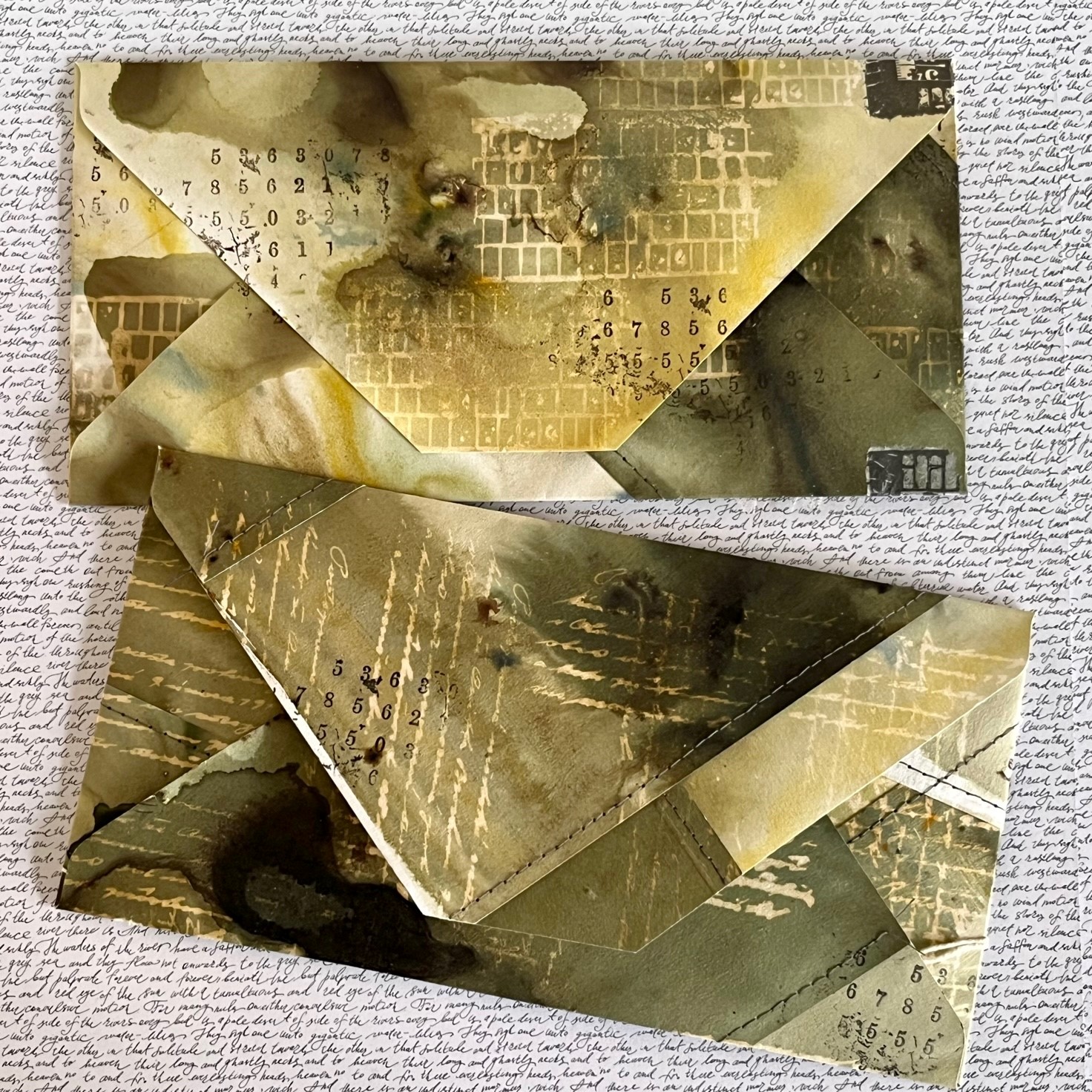
Hi everyone, it is Peley Renata with you today and this time, I was in a vintage mood. As you might know, I like to try new stuff, so a couple of years ago I tried creating junk journals. It was really fun and satisfying to do as I got to use up a bunch of old scrapbook papers, fabric pieces, threads, charms and paper scraps that I collected over the years. I remember watching a whole bunch of tutorials on YouTube on how to create your own journal, book binding and also on creating all those fun little pockets for journal cards and such. In a very short period of time, I created three journals, but sadly I didn’t create any new ones for at least a year now. So, this was a perfect occasion for me to go down memory lane and create mini versions of junk journals, but this time in a tag format!

This was one of those projects for me when you get so much dragged into your own thought process that you forget anything else like lunch, time, taking process photos and even to drink the coffee. But let me see if I can manage to draw you into my creative process and perhaps tempt you to try creating something like this as well.

The main topic for this project was tags, while the quarterly topic was typography and, in my mind, these two were easy to combine. I am one of those crafters who feels that a project isn’t complete without splatters and subtle text or numbers in the background. It is a perfect layer, perfect background interest which in my opinion goes well with almost everything. And I think that we all have at least one script stamp or stencil among our artsy supplies.
Anyway, with this topic in mind, I got inspired to use a couple of stamps from PaperArtsy Ink & The Dog A6 collection. All my chosen stamps featured either text, numbers or both within every image.

The stamp sets which I used and which you can see on the image above are: BG2 from the Backgrounds collection, PT2, PT3 and PT4 from the Pierrot collection, EA1 from Ephemera collection, then we have G3 from the Gentlemen and E3 from the Eclectic collection. They all belong to the PaperArtsy Ink & The Dog A6 Collection.
Now I knew what I am going to stamp, but just had to figure out on what to stamp. As I said previously, I did plan to create junk journal tag booklets, so I went digging in my stash of paper scraps. And that’s when the fun began!

The first step was to create a substrate and there were a couple of things to consider. First, it had to be in a tag format and second, it had to be a sort of a booklet. Also, I planned to create two tag booklets so that one of them would feature mostly text, while the other one mostly numbers. With that in mind, I decided to use the Art by Marlene Tag-Tastic die set. It cuts a very large tag with some other dies for hole reinforcers, a smaller tag which is great for inserts etc. Though I did modify it a bit so that both ends of the tag would be the same in order to close up nicely. Of course, you don’t really need a cutting die to create this, you just need a ruler, scissors and something to pierce a hole like a Crop-A-Dile or something like that.

Here you can see that I cut out four elements. Two of them as tag book covers and two of them as inserts. The paper that I chose was 200gsm mixed media paper as I didn’t want the cover to be too flimsy and also it should handle acrylic paints because the next step was to cover that big bright, white surface and make it look more vintage.
The first color that I applied was PaperArtsy Fresco Finish Chalk Acrylic Vanilla (FF65).

Of course, I didn’t want it too plain and simple, so I also added just a touch of PaperArtsy Fresco Finish Chalk Acrylics Khaki (FF177) and Toffee (FF74). By the way, I applied these paints on all four cut-out elements and on both sides.

As usual, I didn’t resist adding some splatters. For this, I used Toffee again but also PaperArtsy Fresco Finish Chalk Acrylic Buff (FF96). Later on, I will do some inking as well to age it a bit more, but at this point, I was happy with my base color.

.jpg)
.jpg)
.jpg)
.jpg)
With the base of the tag booklet complete and my selection of stamps on the ready, it was time for some rummaging around the house and my crafting closet.

After my little treasure hunt, I came up with some really fun goodies. First of all, I prepared a nice selection of book pages in various sizes, languages and aging stages. Oh, and in this pile, there were also a couple of tea dyed notebook pages and some old cardstock pieces as well.

And now the part that took me about 2-3 days: creating journal pockets. At start, I made some very basic ones, but that helped to jog my memory and I created a bunch of fun-looking pockets with windows and decorations and everything. Truth to be told, at this point, I strayed away a bit from my project and just had fun creating pockets in various styles, sizes and from different types of paper. If you ever want to try something like that, there are some amazing YouTube videos and blogs on this topic alone.
Anyway, I created about 30 pockets or more, but I will show you just a couple of them, mostly to demonstrate the styles and shapes that I made.

Another thing that I found in my treasure hunt was my old hand-made ephemera. There was a point some time ago, when I felt that I lacked inspiration and ideas to make a full project so instead, I decided to create some bits and pieces using really the smallest paper scraps. Some of them were free printables cut to small formats, some cut-outs from books or scrapbook papers while others I stamped. Anyway, I even got them organized by shape and size and now I was genuinely happy to put them to use. And as luck would have it, a lot of them had numbers or little text on them which was just perfect for my project where typography also was in the back of my mind as our quarterly theme.

With all these goodies gathered, I slowly started assembling my tag booklets and planning some layouts.

This first tag that I was creating was supposed to feature mostly numbers, so that’s something I tried to pay attention to when choosing the stamps from my selection to embellish the elements. Here, for instance, you can see that I chose a stamp with a big and bold number to decorate the little pocket that I created from tea-dyed notebook paper.

I didn’t only stamp numbers, I also stamped some other images. As you can see on the photo below. This picture in particular was supposed to be on the cover of my tag, but it felt a bit small so I decided to do some stencilling as well, using one of the super versatile and gorgeous PaperArtsy Mini Stencils PM026.

Working with this mini stencil inspired me to take a step backwards, and add more background interest with another PaperArtsy stencil featuring numbers: PS021. For inking, I used a Ranger Distress Oxide ink pad in Vintage Photo color, and while this ink was still in my hands, I also used it to darken the edges of my tag as well.


Of course, I was doing some more inking, stamping, paper folding and, in the end, my final layout looked something like this:

And from the other side:

As
you can see, I created three pockets which I filled with small papers of
different shapes and types, some of them premade, while others I cut out and
decorated using PaperArtsy stamps. Also, I made a little cluster of papers and
stitched them all together while leaving the threads for a bit messy look. What
else….oh, of course I used paper doily, a bit of washi tape, mini paper clip
and later on I will add a couple more details, but before completing this tag
booklet, I made another one featuring letters, so let me show you a bit of that
process too.

Ok, so now on to the second tag book. As you can imagine, most of the process was much the same but of course there were some details that I did differently this time around.
First of all, if I am being honest, I wasn’t 100% happy with my cover image for the previous tag. I stamped it with black ink, and even the print wasn’t ideal. But I learned from my mistakes and this time I used dark brown ink and a stamping platform.

This time, instead of numbers, I created background interest using a script stamp. This particular one is PaperArtsy Ink & The Dog A6 Backgrounds collection (BG2).

Next to the couple of premade ones, I also created a few new ephemera pieces using PaperArtsy stamps from the Pierrot collection.

The next step was planning out the base layout.

I am not the most organized person, so for me there was a lot of going back and forth between stamping, creating elements, planning layouts and realizing I have more pockets and not enough papers to fill them with, so once again I went back to stamping. Here you can see that I used tea-dyed paper and a PaperArtsy stamp from the Ephemera collection (EA1).

And then it was all about compiling these elements into one whole, binding the papers and making them into booklets.

For creating the holes, I used Crop-A-Dile, while for binding, I used jewelry cord, but any kind of decorative thread can work just as well.

As this project was coming to its end, I also filled the created pockets with previously mentioned ephemera pieces. Here I will show you a couple of images of how it all looked.


These two images above represent some of the pages from the tag featuring mostly numbers, but the next two the tag featuring letters.


As you might notice, I really tried to include the typography topic in my tags. Another thing that you might notice is some sewing that I did. When it comes to junk journals, I really enjoy including a variety of textures in them. That’s why some pockets were sewn in, others glued while I even stapled one of them. Also, there is such a lovely variety of papers included: old book paper, scrapbook paper, vellum, tea-dyed paper etc. And at the end, I feel like all these items came together so nicely, as if they were made for each other.

In a project like this, no one can guide you precisely from step to step. All of us will have a different range of stamps, ephemeras, sense of beauty and layout. When I create a project like this, I like using paper scraps, small cut-outs, but I also like a bit of stitching and sewing, I enjoy using different types and sizes of paper, I also prefer a bit of a messy look, imperfect stamping, clusters of paper, etc…If you try to create this kind of project, let yourself be inspired by other people’s work, but let your crafty supplies and scraps guide you through the crafty process. And if you do it like this, there are two things that I can promise you: you are going to have a lot of fun and a lot of mess to clean up around you crafting station. 😊
Renata 💜

Facebook: Renata Peley
Instagram: @renata_artjournaling
Pinterest: @peleyrenata
YouTube: renata_artjournaling