

We have been absolutely amazed at how you guys have enjoyed each Mattint release. When we first cooked up the idea, we thought we'd be doing 12 colours max, but we have a few more now, 18 to be exact! Can you find the 3 new ones in this pretty rainbow!

Leandra will be along to share with you LIVE to share these brand new products and ideas over in our Facebook Group, 'PaperArtsy People' shortly after this post publishes, and ... don't forget
These products are available EXCLUSIVELY from our approved stockists. Please check the list at the foot of this post to find a retailer online or geographically near you, it makes sense to order within your country where possible. Our retailers also endeavour to join the designer's live to share their direct shopping links - this makes it super easy for you to find a store with product in stock immediately.


Let's start with this beauty! I am OVER the moon with how cool this tissue is!!!

Framed

This had to go in one of our Vintage Frames! It just looks soooo good!

A bit of paint, some old book page, Ash Mattint and then the bird with subtle colour added , its deeelicious!
Crested

Again, going with the vintage vibe, this little guy's got some matching embellishments. It is so easy to make bespoke matting layers once you are in the groove!

Lynne Perrella stamps always find their way into my pieces! this time some little tags were ideal for extra interest

Vintage Portraits

I recently found some gorgeous vintage paintings at a brocante, they were fashion related plates, 2 matching with this colour combo of sepia and duck-egg blue.
Mark thinks I am bonkers when I buy these things, but we have to put something on the walls in our house!!!

So the colours and concept certainly inspired these 2, I just now need to somehow make some vintage style frames for them!

.png)
Fresco Mattints
Price: RRP €5.26 +VAT
Size:50ml (1.7 fl oz)
Transparent Matte Tint, Adhesive & Sealant
Let me introduce you to our 3 newest Mattints: Shadow, Bellflower and Foxglove

A beautiful blue-purple, this is going to scratch your lavender itch!

Shadow is super useful, an interesting grey, it certainly can easily knock back a background, but also, you may be aware how handy neutrals like this can be!

And finally Foxglove, it very much sits in the middle of The Pink and Jam.

Let's start off with a project that combines a few colours...
Pretty in Pink


A complete colour contrast from the samples above, something not so subtle, but it is cool to see you can spice these Printed Tissue birds up!

There was a layer of fabric in the mix here, that was painted with Glow Mattint.

The stamped frames are from a Scrapcosy release, and the tiny tags are JoFY stamps. In the background you can see Bellflower, and in the foreground, lots of Foxglove.

Songbird

Again, a combination of both the bright colours went onto the Printed Tissue. That is why the Foxglove merges into the Bellflower.

A bit of Nutty, Glow to tickle the feathers. I figured if the background was bright, not much point in making the bird bright too! So I didn't go too crazy!
Happy Chappy

This colourful chap is made from layers of Mattints printed onto blank tissue with the gellie plate. Another way to build a background, I just used Matte glaze to layer the pieces.
Triplets Trapped in Lace

Back to my Lynne Perrella stamps, and these beauties all have Mojito backgrounds onto which the 3 new colours were dropped. I knew this was going to work better for 2 of the 3 colours.
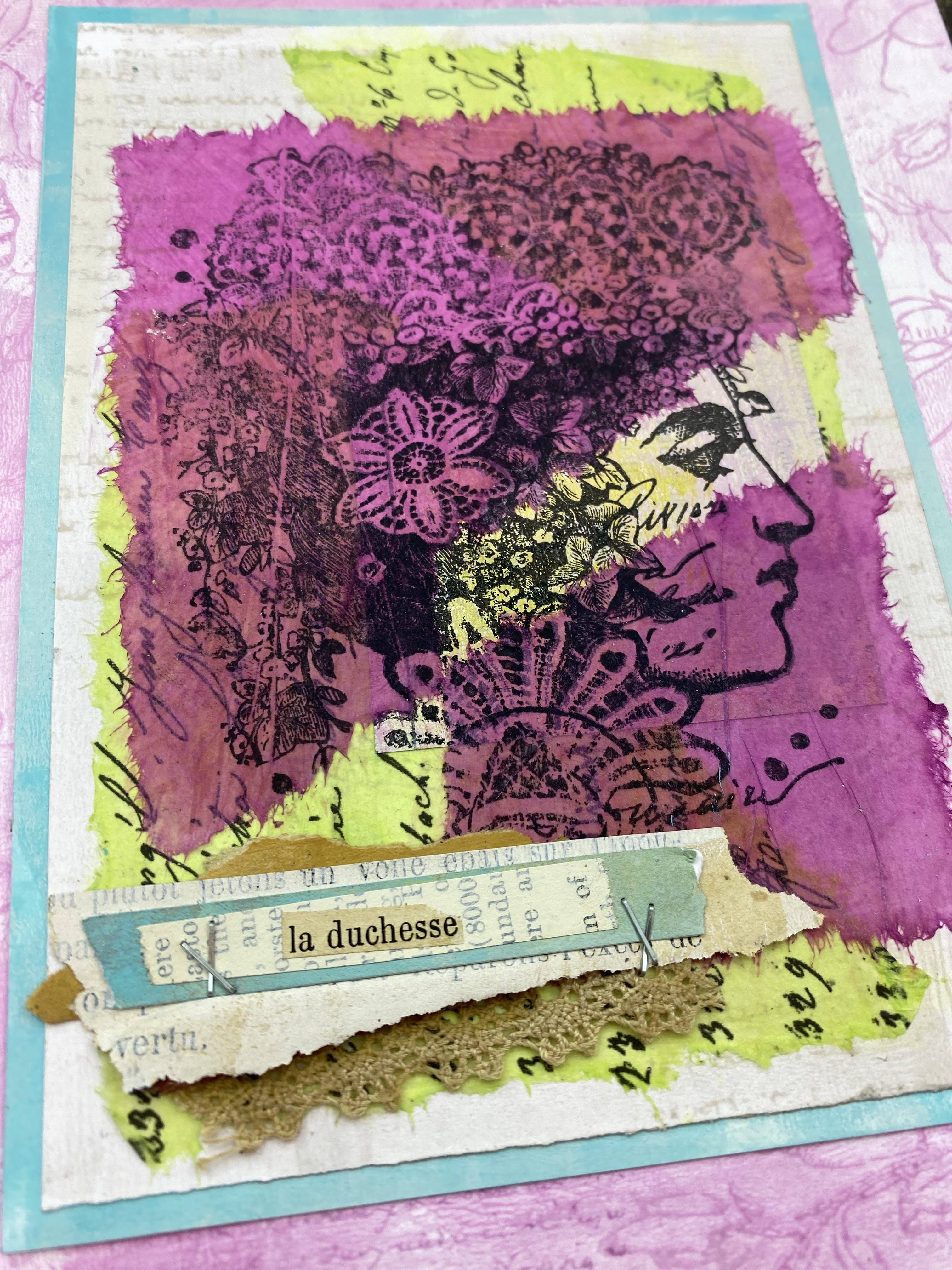
As you can see, the matting layer was also with the same main colour, Foxglove above, and Bellflower and Shadow follow below.


Dounia's turn, and she knocked it out of the park with this sample! Femme eyes (an original Ink and the Dog eyes stamp), was adorned with Tracy Scott Mattinited flowers!


But that's not all, I spy a nest, and a bird ...

....but this bird seems to have some extra feathers! Let's take a closer look ....

Yes he has certainly acquired a series of tail feathers from elsewhere!

Finally we finish with 3 more samples from Dounia showcasing the 3 new Mattint colours


It is quite incredible how blank tissue can be used to great effect for draping and dressing!
Thankyou for joining us again tonight, I hope you can find a minute to head on over to PaperArtsy People FB group where Leandra will share these samples live with explanations of all that is going on within!
Leandra
PaperArtsy Stockist List

Our stockists are your go-to source for all PaperArtsy products, and we suggest that you also use the PaperArtsy People Facebook group to source a retailer in your country. Many are members of our FB group and will happily share links to their online stores.
Australia
Bev's Cross Crafts, Spreyton, Tasmania bevscrosscrafts
Crafters Cupboard, Berwick, Victoria crafters cupboard
Hillbilly Scrappin, Nikenbah, QLD hillbilly scrapping
Memories on the Murray, Murray Bridge, SA memories on the murray
Natalie May Scrapbooking, Dover Gardens, SA natalie may
Scrapbook Superstore & More, South Penrith, NSW scrapbook superstore
Austria
Stempel Wunderwelt, Wilhering, stempel wunderwelt
Belgium
Cart N Scrap Art, Antwerp, cart n scrap art
Créatelier Caracolle, Liège, createlier caracolle
Canada
Boutique Scrapbook Tendance Inc, Quebec, Qc, scrapbook tendance
Clipper Street Scrapbook Company, Langley BC, Clipper Street Scrapbook Co
Glitter & Ink, Belleville ON Glitter & Ink
Paper Art Creations Inc, Leduc, Alberta, paper art creations
Re.defined, Kentville, NS, redefinedforyou
Scrapbook Centrale, Dollard Des Ormeaux, Quebec scrapbook centrale
Scrapbook Centrale, Dollard Des Ormeaux, Quebec scrapbook centrale
Scrap Addicts, Edmonton, Alberta scrap addicts
Scrap and Bean, Edmonton, Alberta scrap and bean
Scrapbooking Fairies, Drayton Valley, Alberta scrapbooking fairies
The Paper & ink Boutique, Calgary, Alberta paper and ink boutique
Denmark
Hobbyboden Scrapworld, Samso hobbyboden
Finland
Korttipaja, Istunmaki Heidin Korttipaja
Klemmarikellari, Turku Klemmarikellari
Piia Paper, Kittilä, Piia Paper
France
Emispheres Eurl Ruy Montceau,38300
Fée Du Scrap, Saint Sébastien-Sur-Loire, fee du scrap
Horizon Créatif, Ste Jalle horizon creatif
Katzelkraft, Ingwiller katzelkraft
Kerudoc Creation, St Yvi kerudoc creation
Le Grenier des filles, Pierre Benite
Page de scrap, Saint Pavace, page de scrap
Passion Scrap, Vieux-Conde, Passion Scrap
Scrap by Jo, Saint-Orens-de-Gameville, 31650 Scrap by Jo
Toutencolle, Dun sur Auron toutencolle
Germany
Papier & Feder, Owschlag, papier & feder
Stempeloase Munich, Munich stempeloase
Stempelfee Shop, Hilden stempelfee shop
Stempellaedle, Stuttgart, stempellaedle
Tue Was Di Liebst, Bayern, Tue Was du Liebst
Greece
Decoupage, Vergina
Italy
Pezze E Colori, Lissone, pezze e colori
Piccole Passioni, Siena, piccole passioni
Piccole Passioni, Siena, piccole passioni
Japan
La Wadao, Odawara, Kanagawa, la wadao
Tiny Dots, Funabashi-shi, Chiba tiny dots
Netherlands
De Hobbystudio, Genemuiden, de hobby studio
Doe@ding,Spijkenisse doe @ ding
Hobbycompleet de Duif, Leeuwarden hobby compleet
Stamptable, Roosendaal, Stamptable
Norway
Hobbykunst, Oslo, hobbykunst
Puerto Rico
Paper Boutique, Fajardi Paper Boutique
South Africa
Kcraft imports Ltd, Centurion 0014 kcraft
Spain
Cien por Cien Manualidades, Barcelona, 100 x 100 manualidades
Ideas 10 Manualidades Y Scrapbook, Bilbao ideas 10 manualidades/
La Sonrisa Creativa, Valencia, la sonrisa creativa
Les Coses de Raquel, Barcelona
Scrap & Papers Experiences, Barcelona, scrap papers experiences
United Kingdom
Art from the Heart, Harrogate, Yorkshire art from the heart
Crafts at The Malthouse, Herstmonceux, East Sussex, crafts at the malthouse
Countryview Crafts, Potton, Bedfordshire countryview crafts
Loobi Crafts, Leighton Buzzard, Bedfordshire, loobi crafts
Procraftynation Ltd, King's Lynn, Norfolk Procraftynation
Sir Stampalot, Peterborough, Cambridgeshire sir stampalot
Stampers Grove, Springbank, Lilliesleaf, Melrose,Scotland stampers grove
The Artistic Stamper Craft Store, Faversham, Kent the artistic stamper
The Forget me not Kraft Kabin, Rochford, Essex, The Forget Me Not Kraft Kabin
USA
Artistic Artifacts, Alexandria, VA artistic artifacts
Artistic Studio Creations, Fayetteville, Georgia Artistic Studio Creations
Craftiness, Chatsworth, CA, craftiness
Everything Scrapbook & Stamps, Lake Worth, Florida Everything Scrapbook & Stamps
Frantic Stamper, Oregon frantic stamper
Free Heart LLC, Denver, Colarado, free heart llc
Joggles, Coventry, Rhode Island, joggles
Messy Papercrafts, Temecula CA Messy Papercrafts
PaperCraft Clubhouse, Westbrook, Connecticut, papercraft clubhouse
Roadtique Boutique, Hilton NY
Runaway, Art & Craft Studio, NE Salem, Oregon runaway
Scrap-A-Latte, West Babylon NY scrap a latte
Scrapbook-N-Memories, Harrisonville, Missouri Scrapbook N Memories
Simon Says Stamp, Columbus, Ohio simon says stamp
Topflight Stamps, Irmo, South Carolina topflight stamps
If you are interested in becoming a PaperArtsy stockist contact Dounia@paperartsy.com for more information
PaperArtsy Links
Facebook Group PaperArtsy People
Facebook Page PaperArtsy
Twitter twitter.com/paperartsy
Instagram instagram.com/paperartsy
Pinterest uk.pinterest.com/paperartsyhq
YouTube youtube.com/user/PaperArtsy


