Hi friends, it's Victoria from Victoria Wilding Creates with you for another 'With 3 Things' post.
This feature on the PaperArtsy Blog is where 3 bloggers are sent 3 items in the post. We have no clue what PaperArtsy HQ is going to send us, there might be a slight variation (for example on this round we each were sent different stamps sets from the same release) but generally 2 of the 3 things will be identical.
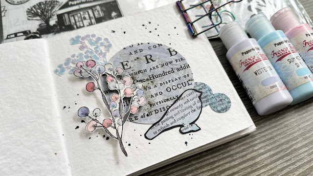
A recent blog topic was books and journals, so it seemed like a no brainer to dig out one of my favourite art journals and create a journal page. Let’s take a closer look…
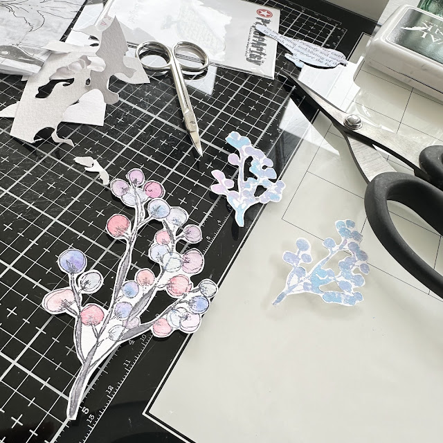
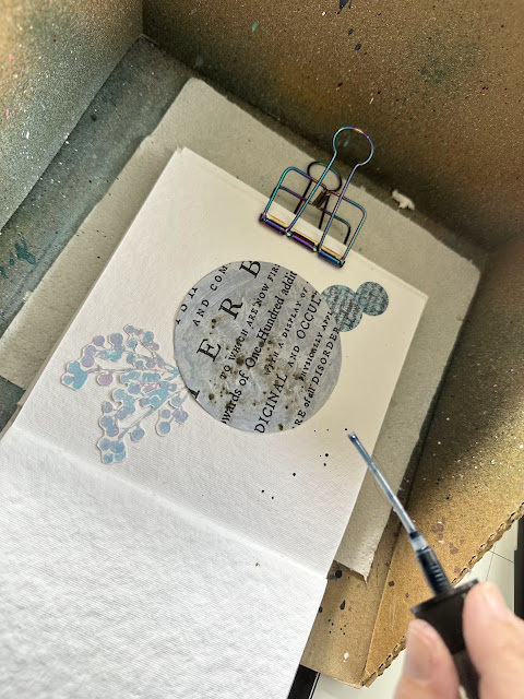
I was so excited when I opened the package and immediately knew I wanted to create lots of my own paper elements to create a mixed media collage.
I started out by stamping the largest berries stamp from France’s FP020 set and coloured them with watercolours.
Next I took out the small berry set and dabbed with Fresco Finish Acrylics in Candy Floss, Summer Sky and Wisteria.
I added some black backing paper to the die cut bird, to give it more definition and help it stand out against the large text circle, and glued it in place.
If you look closely you can see some of the shimmer from the watercolours that I used.
I love how the page turned out. I’m drawn to leaving white space on my pages, letting the eye walk across all the elements on the page. It works really well with this page and all those lovely pastel colours and the dark black ink of the text.
I hope you feel inspired to play with your PaperArtsy products. Try creating a handful of elements and then arranging to make your own page. I guarantee you won’t be disappointed!
Until next time, wishing you a happy, creative week.
Victoria x
Instagram: www.instagram.com/victoriawildingcreates
Facebook: www.facebook.com/victoriawildingcreates
Pinterest: www.pinterest.com/victoriawildingcreates


2 comments:
This is a lovely project and I appreciate it on the white square journal and It's something I hope to replicate in some manner. I tend to forget to use the tissue paper in the way you have and it makes the elements so interesting. Thank you
Gorgeous berries, and I love your Culpeper circle... beautiful composition altogether too.
Alison x
Post a Comment