Friday, 25 November 2016

2016 #22 Zinski Alcohol Blending {by Lauren Hatwell}

 2016 Topic 22: Alcohol Inks and Pens

Hi everyone Lauren here.

Tonight I'd like to share a post about colouring with alcohol markers and using alcohol solution to add texture and interest to your images and backgrounds.

I often feel that colouring in is slightly under-rated. Aside from the obvious relaxing qualities, adding colour to an image is what gives it life. It's the magic that gives a piece an identity. You can take the same image and give it a completely different purpose or feel just by treating it differently, which means your stamps work extra hard for you too. A good example is the sheep I made from a flower with a JOFY stamp recently. All it took was a change of colour and a few details to transform it:-


Of course, there are lots of ways to add colour to your stamped images, but for me, alcohol markers are the perfect colouring tool. They blend seamlessly and give a really clean, professional finish to your work without covering up the stamping lines. They are always the first thing I reach for when I'm playing around with images to see what I can do with them and they work beautifully alongside a lot of other mediums such as paint and pencils. Adding texture with Alcohol Blender is a great way to add interest to your colouring quickly and easily.


I've used some of ZinskiArt's fab little critters from sets ZA01 


plus ZA03  

and from the smaller Zini 04 (ZN04)


...to help me show you what I mean. Quite frankly, I can't get enough of them at the moment and they are just lovely to colour so any excuse is a good one. These techniques will work with alcohol markers or alcohol inks from a bottle.

Mr Eyeballs and Legs

Step One: Adding Colour If you were thinking these guys were only good for Halloween then think again. A slight wardrobe change and a seasonal background turns our monster into a snowball and all it took was a bit of doodling and some super quick one layer colouring.


Step Two: Bespoke Clothing Well I couldn't leave him all naked in the snow now could I.... Using his mouth as a starting point, I doodled a scarf and coloured it with red and green Copic Markers. Using some Surgical Spirit as my blending solution (you can also use nail varnish remover for this). I poured a little alcohol blender onto a flannel, fluffed up the fibres a bit and pressed it briefly over the colour to add texture and make it look more like fabric. This is also a good technique if you want to create the look of fur.


Step Three: Alcohol BG For the background I used a piece of glossy card swiped through some blue alcohol ink (I used Ranger's Denim shade mixed with a drop of blending solution). I love the smokey effect you get.


Step Four: Blending Fluid Reduction  To create the snowflakes I applied some blending solution on a cotton wool bud to one of Emma Godfrey's lovely snowflake stamps from EEG19 and stamped randomly over the piece of card. You need to move quite quickly as the alcohol will evaporate if you hang about. Your stamp also needs to be clean to do this or you will transfer ink onto your background. You can use your alcohol blender to clean your stamp before you start.


Step Five: Layering All I needed to do then was layer my image onto my background. I stamped it once straight onto the background with Memento ink in Tuxedo Black. Then I cut out and layered my coloured sections onto that image.  I added some torn paper to the bottom for snow, with a smattering of glitter glue for a bit of sparkle, before matting the whole lot onto a piece of black card. (Alcohol pens do tend to bleed through card but as I always layer my images before putting them onto a card blank, it's not usually a problem. I always put my cardstock onto a glass mat when I colour it in to ensure that all the ink stays on the piece of card I'm working on rather than bleeding into whatever is underneath. This should ensure that your pens last longer too.)


Rather than trim the card blank down, I repeat stamped one of Emma Godfrey's Christmas Sentiments from EEG12  ....


...(let it snow) down the side of the card.  Perfect!


Party Monsters

Step One: Mark Making It's a nice idea to keep a texture library and try out different mark making tools. Try more solution and less solution to see what the differences are. 


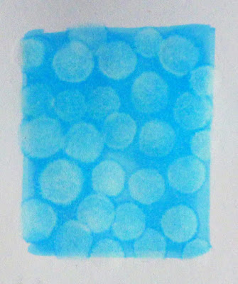
Even something as basic as a cotton bud dipped into alcohol blending solution will give you a variety of useful and interesting effects.


Step Two: Stencils This is alcohol blender dabbed through a stencil on a cotton wool ball. I finished halfway down the page and then used a flannel to blur the edges a bit. I really like the effect.


and I used it to make the card above…


Step Three: Layers images Note that you can also see on the clothing of these 2 that the technique using blending solution on a cotton cloth, like a looped flannel (face-washing cloth) is so effective to add dimension.

Step Four: Embellishments I love these two cuties from ZinskiArt Set 03 and Zini 04. They are such fun! Yes I DID cut out the snowflakes!


I hope that gives you a sense of what can be achieved. There are, of course, lots of different effects you can create using this simple technique and part of the fun is finding out what works best with your markers to add interest to your colouring projects.

I really, really love your Mr leggy snowball, and that texture with the flannel and blending solution is a brilliant idea. It's surprising that you get such a crisp image when stamping with it too!! Thanks so much Lauren! ~Leandra

All of our bloggers love to see your twist on their ideas, particularly if you were inspired directly by their post; so please spare a moment to comment or make your own creative item. They all love to see your feedback and what you can do more than you realise!


We would love to see how you interpret this Alcohol Ink and Pens topic by linking what you make to our 2016 Challenge #22: Alcohol Ink and Pens on this page HERE. The Alcohol Ink and Pens link will close 17:00 (London Time) Sunday, Nov 27th 2016. The winner will be announced 2 hours later at 19:00.

All links go in the draw to win a £50 voucher to spend on products of your choice from the PaperArtsy online store. 

Wednesday, 23 November 2016

2016 #22 Upcycled Plastic {by Dounia Large}

 2016 Topic 22: Alcohol Inks and Pens

Hello there!

I'm Dounia from France, so happy and honored to be back. This time I get to play with alcohol inks, treasure gold and plastic! I must warn you, this is quite an experimental post, focused mainly on the upcycling technique and its possibilities ... I did however make three cards to show different ways to use the resulting material.


I must confess I'm quite the magpie, I tend to never throw anything away and try to find new uses for pretty much any material or object I come across. 

Today I want to share my take on reusing clear plastic packaging to create a new versatile material. You will of course need lots of cellophane, the thin, clear, crispy plastic used to protect food, magazines or CDs. To spruce it up, we will be mixing alcohol inks and Treasure Gold wax, with just a bit of Fresco acrylic paint (just grab a mix of your favorites colors!). Stamping will add texture and interest, and I recommend focusing on abstract and bold « simple » patterns. It was just the right excuse to use stamps from one of my favorite designers, Ellen Vargo. An iron and baking parchment are also essential. With this bounty, we're ready to start experimenting!


Part A: The process step by step

  • You need to prepare the cellophane: remove all the glued/fused parts and open the packaging to a single sheet of plastic. You will need two (or more!) pieces of the same size, or a big piece you can fold in two. I recommend beginning with small pieces to familiarize yourself with the process and try different color combos or embellishing techniques quickly.
  • Now is a good time to to plug in your iron and set it to heat at the lowest setting, no steam.
  • One piece (at least!) of plastic is for alcohol inks, they will provide color for the finished piece. Pretty much any type of application works: drops, felt applicator, alcohol filled brush... You can pepper all your favorite colors on the same piece, or go for a more sedate tonal palette. Be as random or constructed as you want, parts may also be left clear.  Color saturation plays a big part in the final result so don't be afraid to try different things. I quite like saturated overlapping drops.
  • Another piece is for Treasure Gold. Again, the choice, quantity and repetition of colors is totally up to you. I chose metallic color to better differentiate the metallic effect from that of the alcohol inks, but the jewel (bright colour) treasure gold colors also work. The plastic being really smooth, the wax does not take as well as on paper or paint, especially in the softer tones, but don't worry, a little goes a long way!
  • It is time to make a sandwich ! Play with your pieces, superimpose, turn and rearrange them until you are happy the look of your pile. All inks and waxes must be inside the sandwich, with the exterior faces untreated cellophane. The minimum number of layers is therefore two (Inks and clear, inks and inks, inks and gold, gold and gold or gold and clear) but you can easily go up to five or six layers. The more layers, the more rigid the finish material will be.
  • Put your pile of plastic sheets between two pieces of baking parchment and iron it on both faces. Keep the iron moving, never staying long in one place, and don't neglect the edges. The layers should melt together and create a cohesive plastic sheet. If they stay separate despite several rounds of ironing, increase the temperature just a tiny little bit and carefully try again. The resulting piece should be mainly flat (some little creases may appear) and depending on the number and techniques within your layers, still quite translucent. Here are the two sides of my piece. The top only has Treasure Gold, the bottom only alcohol inks and in the middle the two are superimposed. I also partially folded the piece in two to show the effect of layering.
  • If you want to add some detail stamping, now, after ironing, is probably the best time. You can also do it before ironing but the flimsiness of cellophane can make it difficult, not to mention the probable creases!
For it to work on plastic, you need to use Stazon Ink or Fresco paints (my stamp is from EEV05).


  • If you keep on ironing your piece, raising the temperature, the plastic will shrink and bubble, forming very interesting textures and condensing the colors and metallic pigments. To better control the effect, only increase the heat a little and keep your iron moving. Also keep in mind that the plastic will bubble down, creating round textures on the underside.
  • If you keep heating after that, the plastic will start to break up and retract, forming holes in the raised areas and also loosing its shine.

Once you've played a bit with these basic processes above, here are some additional ideas to integrate more stamping!

Part B: Stamping with Paint
The idea is to use an opaque paint to contrast with the translucent plastic. Depending on the paint color you choose, the stamping can be part the main design or be seen softly through the transparency. I chose the pale Snowflake Fresco (white) with a stamp from EEV03...


...and inserted this simple layer inbetween the alcohol inks and the Treasure Gold layers. I heated the piece until it bubbled. The discrete resulting pattern is revealed when held in front of a light. This could be interesting to build candle holders or lamp shades.


Part C: Paint and Treasure Gold
This technique exploits the fact that paint (and especially chalky finish Frescos!) take Treasure Gold better than smooth plastic. A layer of cellophane is therefore stamped with paint. To illustrate, I used both a thin lined stamp from EEV07...


... and the bolder one from EEV05 with black paint so that it's very obvious! When the paint is totally dry, pick up some Treasure Gold with a brush then unload most of it on a paper towel before softly catching the stamped pattern with the brush. When working on the plastic, the brush must barely touch it so that the wax catches only the « toothy » paint. Keep a paper towel on hand to wipe off any Treasure gold that may be on the plastic.


Finding the right amount of wax and pressure may take a few tries but the result is worth it! You can then add this layer to a sandwich, remembering than only one side is golden, and the other is the color of your chosen paint!


Part D: Reverse Stamping
This technique uses Versamark ink to create a reverse pattern in the alcohol ink. For better effect, I recommend using bold stamps, with thick clear lines and lots of white space. For example, I chose two from EEV03. Prepare your layers as per usual. You will need (at least) one alcohol ink layer and one Treasure gold layer. 

Ink your stamp(s) with Versamark ink and stamp it on the Treasure Gold Layer (not the alcohol ink one!). You can do two impressions, from one inking but after that it's more effective to clean it and ink it up again. Once satisfied with the stamping, put the alcohol ink layer on top, with the ink in contact with the VersaMark and Treasure Gold then complete your sandwich as you like and iron it. I don't know why exactly but the ink shies away from the stamped areas, letting the Treasure Gold shine through. It is a great way to create faded and delicate patterns!


These are just a few ideas to create your own upcycled plastic material, I'm sure loads of other techniques are possible. I find the process fun and a bit addictive. I always say I need one sheet and end a session with a pile of pretty pieces ready to be used in all kind of projects!


Part E: The cards
Now what to do with this material ?

Well it can be die-cut, though it generally needs a couple back and forths through the machine if it is bubbled. Between the colors, the shine and the texture, one piece on a simple background can be all you need! 


You can also easily cut it by hand, smaller pieces bringing focus on the pattern or the texture. Additionally, when still hot from the iron, it can be shaped into 3D object like flowers, butterflies etc...


Once you have some experience, you can start planning bigger pieces to use whole, playing with the heat to mix textures.


I hope this gives you an idea of the versatility of this material. Personally, I like being able to create my own material that I can match perfectly to my project while salvaging something that would otherwise end in the trash! Hopefully you learn something new and are curious enough to try it!

It's nice to share with you again
Dounia

Wow I am mesmerised by this post Dounia! I know you are an avid re-cycler, and building the layers in this way is fascinating. So many possibilities I couldn't believe that you managed to keep the plastic layers flat by being careful with your iron and taking it gently, but the bubbles are awesome too! What wonderful inspiration! ~Leandra

All of our bloggers love to see your twist on their ideas, particularly if you were inspired directly by their post; so please spare a moment to comment or make your own creative item. They all love to see your feedback and what you can do more than you realise!

We would love to see how you interpret this Alcohol Ink and Pens topic by linking what you make to our 2016 Challenge #22: Alcohol Ink and Pens on this page HERE. The Alcohol Ink and Pens link will close 17:00 (London Time) Sunday, Nov 27th 2016. The winner will be announced 2 hours later at 19:00.

All links go in the draw to win a £50 voucher to spend on products of your choice from the PaperArtsy online store.

Monday, 21 November 2016

2016 #22 Dreams Are Whispers From Your Soul {by Jennie Atkinson}

2016 Topic 22: Alcohol Inks and Pens


Hi everyone Jennie here and tonight I would like to share with you this little altered pin tin which actually started out as a small book but I got rather carried away!
Experimenting with Yupo paper recently I realised that it was pretty well indestructible (have you tried to tear it!) so I thought it would make a perfect substrate for a small mini book. Having recently got rather hooked on the alcohol ink resist technique I decided to combine the two in a small book. I then decided the book needed to be "in" something, hence the tin makeover!


I have used a number of Ink and the Dog stamps for my project.Clocks 1Letters 6Mini 74Buttons 4

Step One: I started by using a combination of Denim and Stonewash Alcohol Inks on the Yupo. It doesn't matter which side of the Yupo Paper you use and if you use both sides there is no seepage - it really is quite amazing stuff! I then stamped my image using Jet Black Archival Ink. At this point I use a piece of ordinary printer paper to blot the stamped image before rubbing the ink off with a soft cloth. I find that doing this first gives a sharper image. (I so love that stamp ....)


Step Two: Using different colours of Archival Ink results in a lighter or darker resist. The text was stamped with Shadow Grey Archival and once rubbed with a soft cloth is slightly lighter.


As a result you can layer stamps over the top of each other - this is one of the covers for the tin.


Step Three: I went through the same process for the pages in my book (folded in concertina style). But in addition I used some Alcohol Blending Solution through a stencil to "take out" more of the alcohol ink. The second photograph shows the reverse of the book pages - a slightly lighter blend of colours and better lifting out through the stencil.


Step Four: I had hoped to cover my tin in alcohol ink as well but the image was too bright. So it got two coats of Nougat Fresco Finish Paint instead.


Step Five: Finally it was time to decorate the pages and the cover of the book. I stamped the lovely ladies from Buttons 4 onto tissue paper with Black Archival Ink, tore around the edges and adhered her (very carefully) with as little multi medium as possible as it does discolour the alcohol ink. The metal flower and the pearl button were also coloured with Stonewash and Denim Alcohol Ink.


Stamping on tissue paper was the best option for this little book in order that the background was still visible. For the inside I have used a number of different vintage stamps, along with a quote from the Urban Snapshots Wrought Iron plate.


The addition of some very narrow lace around the edges of the tin and some muslin on the front gave a more tactile vintage feel.

This was a project which really did grow as I went along! I do love the resist technique and it works so well with the vintage stamps. The Yupo paper really is an exciting new substrate and it has made me want to use my alcohol inks which for a long while have sat in a drawer unused.
As always thank you for joining me tonight!
Jennie x

Wow Jennie, you aced that technique, it works perfectly in the background. Even more so with these stamps as the background looks like a memory of the focal stamps. The stencil technique really added depth and texture, who would have thought that removing colour would do that! ~Darcy

All of our bloggers love to see your twist on their ideas, particularly if you were inspired directly by their post; so please spare a moment to comment or make your own creative item. They all love to see your feedback and what you can do more than you realise!

We would love to see how you interpret this Alcohol Ink and Pens topic by linking what you make to our 2016 Challenge #22: Alcohol Ink and Pens on this page HERE. The Alcohol Ink and Pens link will close 17:00 (London Time) Sunday, Nov 27th 2016. The winner will be announced 2 hours later at 19:00.

All links go in the draw to win a £50 voucher to spend on products of your choice from the PaperArtsy online store.