
Hi everyone, it's Riikka from Paperiliitin blog here and I'm sharing a fun stencil project with you today! I say a project, but in a way it's three projects as I made three tags! All three are created using the same stencils, mediums and steps.

Stencils are so handy! While the way I mostly use them is just adding paint or medium through them, there's so much more you can do with stencils. You can use them partly or the whole design, you can layer them to make up new patterns, you can add them under a material and rub the pattern, you can run them through an embossing and die cutting machine... And the amount of mediums you can use with them! Watercolors, acrylics, texture pastes, alcohol inks, crayons... Well, you get the idea!
My intention in this project was to use stencils in multiple ways, make different elements using them and also using them to create the focal point, not just as background tool. Doing these tags I re-visited some ideas I used in a stencil-intensive series of posts I made as a member of Seth Apter's Creative Team.


I started the project by making a selection of elements to be put together later. First I started to make a collage sheet. For that I used white tissue paper, wax crayons and two Tracy Scott stencils, (PS087 and PS089). They both are a set with stencil and mask and worked perfectly with the technique I had in mind. Their fine lines and detailed patterns worked splendidly with frottage. The name aside, I think you know the technique very well. Most of us have used it as a kid to make play money or other fun things - placing an item underneath a sheet of paper and then rubbing with a pencil or a crayon.

I decided to use wax crayons as the medium as I wanted to collage the sheet and didn't want to risk the medium bleeding. But depending what you're after, you can use water soluble crayons, too. I put the sheet aside for later and turned my attention to another element.
I have a degree from polytechnic for clothing design and sewing and have been working in theaters since graduating. So I have a thing for fabrics. The love for textiles raises its head every now and then and such an occasion was with this project. I used another Tracy Scott stencil (PS208) to pattern a piece of white cotton. I used two Fresco Finish chalk acrylic paint colors for the patterning - Summer Sky (FF150) and Vintage Lace (FF18). I used a sponge to add the paint through the stencil. I chose this number pattern as they fit to any project and while patterning the fabric I knew I would have extra pieces to use to other makes later.


I chose the pale blue and beige color combo for two reasons. One, the combination of blue and brown seems to be my "go to" at the moment and two, I thought the light colors fit the spring theme nicely. The combo also goes well with vintage details.
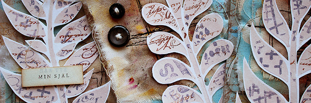
I now had two elements going, but I needed the focal point, too. As I mentioned in the beginning, I wanted the focal point to be made with a stencil. For that I picked a gorgeous leaf one from Tracy Scott line, (PS226). I stenciled the pattern to a piece of white cardstock using Fresco Finish chalk acrylic - Vintage Lace (FF18). That gave me a nice, neutral background to layer upon. As these were going to be the focal point, to be cut out from the sheet, I left some room around them rather than stenciling the pieces too closely together.


To add some interest to the focal points, I then used stamps to add visual texture to the leaves. While I could have stamped straight to the sheet, I wanted the stamping to stay strictly on the leaves. In comes the stencil! I laid the stencil back on top of the leaves and then stamped the patterns through it. I used a Tracy Scott set (TS065) which has a great selection of different marks. There's more modern designs like the bunch of plus signs but also something with a vintage twist like the script piece. And there's also numbers and letters that fit any project and go so well together with the number stencil. I used two inks to stamp the patterns, Ranger Archival Ink - Hydrangea and Sepia. These went well with the color palette I had going; blues and browns.

As I used an ink suitable also for sleek surfaces, it stained the stencil, too. To me this is not a problem, my stencils are tools and they can show marks of use, but in case you want to keep your tools without colorants either use a watersoluble ink or then use a cleaning medium to make your stencil squeaky clean again!

Now I had multiple elements going, but I of course needed a surface to add those elements onto! So, it was time to turn my attention to the actual tags, to the backgrounds.
I used three sturdy chipboard tags as my backgrounds. To give them a layer of color, I added some Fresco Finish chalk acrylics on top. I didn't want a perfectly colored surface, but instead a bit of a grungier look. So after the painting, there's still some of that chipboard color peeking through. The key is to use a dry brush in places. The colors I chose for the backgrounds are Buff (FF96) and Summer Sky (FF150). The same blue I had used previously but a bit darker and colder tone of beige than I used in the focal points.

Next I used the same Tracy Scott number stencil (PS208) I used earlier to add a pattern to the background. I was thinking about the medium, but chose to go with the crayons I used to frottage so the collage sheets would blend in seamlessly. To keep the color scheme also cohesive I used a baby blue, white and a brown crayon. I was able to use crayons to add the pattern as the openings in this particular stencil are big enough for the bulky crayons. If I'd used a more delicate stencil, I would have needed to think about the medium more carefully.
To define the edge a bit better, I also used a brown ink to ink around the edges of the tag. This, in my mind, always adds a little vintage or worn look to the project. Like there would be some staining around the edge.

Next I added the collage sheet on top of the tag. I tore the tissue paper in smaller pieces and collaged them on top of the tag. I used clear gesso as my collaging medium. This gesso is acrylic based and works as a collaging medium to light items like tissue paper. By using gesso I got two birds with one stone - an adhering and grounding medium at the same time.

One of the elements used, two to go! I then turned my attention to the fabric I had patterned. I first tore it to smaller pieces and layered two or three pieces on top of each other. I then took those stacks to my sewing machine and secured the pieces together with some stitches. I used both straight stitch and zigzag in combining the pieces together. I also chose a black thread so that the stitches are quite visible and look ornate.
To make the pieces more grungy and aged looking, I then added some Infusions dye stain on top. I used color Rusty Car (CS17) to keep it cohesive with the color palette. Also the tone echoed rust dyeing in the pieces. As Infusions are a dye, the acrylic paint resisted the colorant wonderfully bringing the pattern more visible.
I wet the pieces with black tea, then sprinkled the Infusion crystals on top and added more moisture with a water mister. After activating the crystals I then dried the pieces with a heat tool. If you want to do similar pieces and use a heat tool to dry, make sure that you use cotton thread in the sewing machine as polyester thread might start to react to the heat of the heat tool.

I also cut the leaves out of the stenciled sheet, ready to be used as the focal points.

While the tissue paper added a lovely lot of lines to the backgrounds, I felt that something still was needed before I could add everything together. I tried not to add any stamping to the background, but simply couldn't do it! They needed a little bit of contrast. The other way of achieving it might have been to collage some book paper to the backgrounds. But I took one of the stamps from the Tracy Scott stamp set (TS065), the script one and added a border to each tag. I tore a piece of printing paper and used that as a mask when stamping. I also added some stray stamped lines of writing after removing the mask to break the pattern.
I also added some splashes to the background using the lighter tone of beige, the Fresco Finish chalk acrylic paint - Vintage Lace (FF18). Adding the same color to the background and foreground of the piece always brings elements nicely together!

Now I had all the elements ready! The tag bases, the fabric pieces and then the focal point of leaves. The combining thing in each part is the color scheme and also some repeating mediums and patterns. Like the stamping I added to the edge of the tag and how it's repeated on the top layer, on the leaves. As with the colors, adding such a detail usually brings a project together nicely.

I used some pieces of a cardboard box to adhere the fabric layers to the tag. This not only added some dimension to the piece, but also supports the soft fabric, gives it some structure. I then paired each tag with a leaf, too.

As a finishing touch I added some buttons to each tag and also a little sentiment from an old book. I chose black buttons as they added another contrasting detail and also repeat the color of the stitching.
I used a cotton twine to make it look that the buttons were sewn in place. I just added the stitching to each button separately and then glued them in place. I used three buttons in each tag and arranged them on opposite sides of the leaves. Like a little visual triangle. Because of the contrast, the buttons catch your eye and then bring it to the leaf.

The sentiments I used in each tag are from a book of poems by my favorite poet, Edith Södergran. She was a Swedish speaking Finn, so her poems are written in Swedish. The sentiments in the tags are titles of her poems and read "Day Cools Down", "My Soul" and "The Road to Happiness". I love to use such words in my pieces, that leave room for thought and may inspire future makes and stories.


So there they are, my "Mainly Stencils" tags. I hope I have inspired you to look at stencils in another way! While using stencils to make background layers and adding mediums through them is fantastic, they are a more versatile tool that can do elements ranging from background to foreground.
I'm especially happy about the fabric embellishments. What I like about them is that you tend to have an abundance in one go and then have a stash to be used in future projects! So, while they may seem a bit job heavy, you only need to do it every so often and then enjoy the fruits for a longer time. I also love how the fabric embellishments add another material, another texture to the projects.
Xoxo Riikka

Facebook: Paperiliitin
Twitter: @paperiliitin
Instagram: @paperiliitin
You are welcome to join me in a FB live at "Crafting Together with All Brands" group (link) on the April 23rd! I'm creating an art journal page then, using some PaperArtsy products in the project. More about the live on my blog on April 21st.