
It was also, however, one of the most troublesome creative processes of my entire crafting life (okay, so my crafting life isn't that long but...). As you'll see, it changed direction on several occasions, sometimes because of me, and sometimes because of stuff that happened as we went. So I'm afraid this final make is going to live up to my reputation for l-o-n-g posts!
I started with a rectangle, cut from the PaperArtsy Greyboard, and some Tando circles made of the same stuff. If I had a circle die, I could've cut them myself from some more Greyboard.

I tore some pages out of an old German book (gotta love that Gothic font), and glued them onto one side of my shapes.

Rather than trim it with scissors (I never get a completely clean edge when I'm cutting curves), I sanded away the excess using an emery board (a.k.a. a nail file!).

For extra shabby chic points, I used a tip from Linda Coughlin - spreading sellotape onto the book and then ripping it off, to leave a great distressed effect on the text.

I'm sure there's a use for these leftover bits of sellotape, but I haven't worked out what yet. Next it was out with the Snowflake Fresco paint to give them a coat of whitewash.


They also got a touch of white-washing.

I mopped quite a lot of the paint up as - at this point - I wanted a shabby chic look for them. Things change, as you'll see later! I love the weathered look from such a simple step.

I'd
worked out that my baubles (yes, they're going to be Christmas baubles,
if you hadn't already worked that out from the post title) would hang
in pairs, so that each large bauble would have a smaller one to go with
it. I was going to need lots of images - Lynne Perella Christmas stamps
galore!


I
planned to put one main image on the front of each large bauble, so I
stamped them up onto Smoothy White Stamping Card using Sepia and Coffee Archival Inks,
and cut them according to the sizes needed.

On
each "partner" bauble, which would hang on the reverse side, I stamped a
partial stamping of the image from the front, and inked around the
edges. You can see I'm in my Neutrals zone at the moment...

However,
here was where fate intervened for the first time. I decided I wanted a
really glossy, hard surface for my little baubles, so I decided to give
them a coat of UTEE (Ultra Thick Embossing Enamel - like embossing
powder but larger crystals so you get a thicker coat).

However,
I'd forgotten that it can substantially change the appearance of the
colours underneath (something to do with the concentrated refraction of
light through the glossiness, I seem to remember). I didn't like
the new colour nearly as much as my faded shabby browns.

But
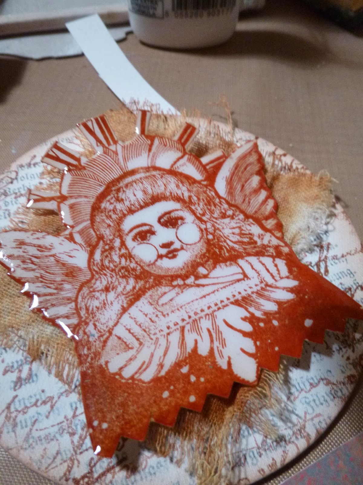
I decided to persevere, and carried on creating nice glossy baubles. By the way - if you end up with a mottled surface (as with the girl on
the left), it's just because you didn't have quite enough powder on.
You just need to pop a second coat of UTEE on, and you'll get a nice
smooth surface like the one on the right.
By
now, I was starting to have doubts about how the front side was
developing too. I'd added some script stamping and was planning to
layer the images up with some scraps of the leftover rusted muslin (see my November projects!) and maybe some lace, but it wasn't really working for me.

See
- I was even ready to thread some ribbon through the little jump rings
to replace the garlands I'd cut off. I thought that maybe adding a
little frosty edging of contrasting Antarctic and Ice Blue might help,
so I did both the fronts...

... and the little glossy ones for the back. I did quite like this effect of the brush strokes on the glossy surface.

But I still didn't like what was emerging. So I decided to leave it for a while and go and do something else instead.
You may remember, way back in June, France Papillon created a Grunge Paste butterfly embellishment.
Well, I'm afraid I gave in immediately to the new holly leaf stencil
from Tim Holtz, and I decided to try something similar to create myself
some holly leaves to adorn my baubles - if I ever finished them.

I
started by applying the Grunge Paste through the stencil onto
greaseproof paper but, I think because it was too thin, it wrinkled with
the moisture and I ended up with corrugated leaves - cute, but not what
I was after.

As
a second go, I decided to use Crunchy Waxed Kraft Paper, since it's a
little more substantial. I tried to apply the Grunge Paste quite
thickly, even though it's not a particularly thick stencil. Much
better... now I'd just have to wait for them to dry to see whether
they're strong enough to survive off the wax paper!

Back
to the bothersome baubles. Nope... even with a bit of lace added, I
still didn't like them. The glossiness didn't work with the shabby chic
idea, making all the stamping too vibrant for a rustic look.

What
I did like were the frosty blues - especially against the glossy
finish. Time for a rethink, and a re-stamp. Rather than going straight
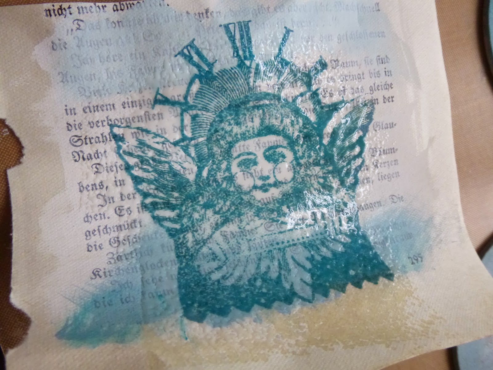
for the baubles, I used - in a first for me - a tester page, adding
some whitewash to one of the book pages, as well as some shading with my
frosty blues, so that I could try out different colours. Watering Can
came close...

...
but I decided to go with the Archival Cornflower Blue (though still not
ecstatic about it), and this time I remembered to check it under glossy
conditions too...
Just
as well I did, as this time the whole tone seemed to change to a much
more turquoise-y teal-y type colour, which meant changing up the paint
colours for the frosting too.

I'd
already added Lake Wanaka to the Antarctic and Ice Blue, so that I
could add darker shading at the bottom of the baubles. And now Inky Pool started to get a look-in too.

On the front, I hadn't yet stuck anything down, but I dithered for a while about whether to stick new book pages over and start again there too, because I had that bothersome brown script stamping all over the place. In the end I gave them a couple of extra coats of whitewash and decided to carry on - a decision I came to regret.

But there was no going back now - not with a coat of Rock Candy Crackle Paint in place... oh, yes, if we're got small glossy baubles on the back, we need some glossiness on the front too. Rustic shabby chic is out, glassy sparkliness is in!

But look, already you can see I should've put on fresh book pages. I'd forgotten (again) that Distress Inks have a tendency to "run" under Rock Candy Crackle Paint. See her there on the left - that yellowish tinge around the edge...

Grrr! Nothing for it but to grit my teeth and let the Crackle Paint get on with cracking up (a bit like me by this stage...) Back to the little baubles, to do the partial image stamping and double coats of UTEE all over again. At least, because of my tester pages, I was ready for the colour change... I mean, look!

On the right, stamping in Cornflower Blue. On the left, stamping in Cornflower Blue covered with UTEE - whole different kettle of fish, wouldn't you say? Still, finally (the next morning by the time the crackle had fully cracked) I had a full set of redone baubles.

And yes, still annoyed by the brown script...


I'd
worked out a way of going for a sort of pale teal mercury glass look...
so the next step was to use some Pewter Fresco paint on top of all that
lovely crackle.

I
put it on with my fingertips, and then dabbed most of it away with a
baby wipe, leaving it in the cracks and with a slight sheen on the top.

I love this because it gives you there "now you see it, now you don't" effect with the images underneath.

In
some lights, they virtually disappear but, trust me, if you get them at
the right angle, they're still there. You can play "balloon, what
balloon?" with the bauble on the far left in the photo above - but look
at the photo below... there it is!

And
now there's a sense of dimension to the bauble, with the image looking
as though it's deep inside. To add extra dimension to the little
ones, I added (again) the ring of brushstroked paint around the edges of
the glossy UTEE.

To
make up for the missing rectangle, I'd decided to do one smaller bauble
with no images at all ... and let's face it, it was also there as a
further tester fallback - try everything with this one first, so as not
to wreck the main ones with the images! Again, I added some Inky Pool
to the mix so that the shading is darker at the bottom of the bauble.

Okay, onto the reverse of the large baubles. I bet you'd forgotten all about that embossed whitewashed wax paper, hadn't you?

The
plan was for it to be glued to the backs, and then the smaller bauble
would sit on top of that. I also needed something with which to
hang up the baubles. So I gave a touch of Pewter Treasure Gold to a few
Idea-ology Memo Pins, and glued those in between the layers.

I
also added some Pewter Treasure Gold to the tops of the crackle while I
was at it, and some Limited Edition deep turquoise Treasure Gold to the
bottoms for good measure!

I gave the embossed surfaces a bit more paint so that we were no longer so shabby but a bit more chic.

And then, since we were heading firmly towards sparkle, I gave them a hit of Perfect Pearls mist for extra shimmer.

And
- why not?! - some of the Limited Edition Treasure Gold. The one on
top hasn't had its dose yet... look how lovely the one underneath is
with the added depth and glamour.

Nearly there, I promise... Had
you also forgotten about those Grunge Paste holly leaves... well, here
they are. They'd set nicely, but were a little brittle.

I thought I might be able to help with that. I added a shading of the Limited Edition Treasure Gold.

And then the thing which I think helped to make the leaves a little more flexible: a coat of Pearl Glaze.

It
also made them very pretty, I think! Yup, managed to get them all off
the wax paper (well, nearly all), with the careful use of a thin-bladed
knife.

And, with a couple of glittery flower buds as holly berries, I glued them to the tops of the baubles.

Phew...
It was a rollercoaster make, and a very long post, so I won't keep you
much longer - just a few photos of the results. Mind you, they didn't
stop being bothersome even for the photos. I had to abandon this first
display idea - a kind of icicle mobile - pretty quickly.

You've
already seen how tricky the lighting is when you've got this much
gloss, sparkle and crackle... and while I was very grateful for a little
window of sunshine, it was bitterly cold and very windy! So this was pretty much impossible to capture, even in the couple of brief seconds when the wind dropped.

In
the end, I decided that - in any case - they worked best where baubles
are meant to be... hanging in a fir tree (okay, a lopped off branch
that's leaning against the fence, if you insist).


Well, I think this time I really may be in danger of outstaying my welcome, so I'm going to love you and leave you.
It's
been an absolutely brilliant few months, and I'd like to say a huge
thank you to Leandra and Gillian, and of course to all of you who have
been so supportive, and especially to those who have played along. It's
amazing seeing how you fly with the inspiration each month, and I can't
wait to see what you get up to with these. I certainly hope they're
less bothersome to you than they were for me! Thank you so much for
having me, and a merry Christmas to you all!
Leandra Says: Alison your projects have been inspirational this semester, thank you for sharing your creativity and techniques. The images behind the crackle are the perfect wintery touch to these babubles. I'm sure you won't be a stranger to the PA family. x
Gillian Says: Alison it has been an absolute pleasure watching you create this semester, and what a finale project you have left us with. The beautiful icy tones and crackle effect make these baubles simply shine. Thank you for sharing such wonderful techniques and glorious photography during your time as GD. Look forward to seeing what you create in the future. x


