Showing posts with label 2016 Topic 24. Show all posts

Saturday, 17 December 2016

2016 #24 Glittering Up The Mailbox {by Darcy Wilkinson}

2016 Topic 24: Mail Art


Hi everyone, Darcy here with a crazy,glittery package, soon to be winging its's way to a friend. I love this topic, I have sent many decorated envelopes and postcards in the past, but never a package. So as it happens I have a Christmas parcel to send out, so I decided to let the festive silliness take over and go to town on the parcel paper. 


I wrapped my box up in a double layer of brown parcel paper. Try and get the edges neat if you plan to wrap your design around the whole parcel. 


Next I marked out where the address and postage will go. It really is best if these are left plain so that the address is clear and the postage stamps actually stick. 


I then slipped the parcel out of the paper ( I had left one end open) this meant I could flatten it a little to make stamping easier. 
I added more doodling around the address area. 


Next I went to town using my Christmas stamps from EDY 16

EDY 16
Plus the wings and circle border from EDY17

EDY17

I quickly coloured my images using sharpie markers. 


Don't forget the back of the parcel, here I added the leaping reindeer and trees from EDY16 and the hanging baubles from EDY04 i love this set, the snowflakes are so useful and I have lost count of the times I have used the holly. ( The text inside the holly leaves is from old fashioned Christmas recipes)

EDY04

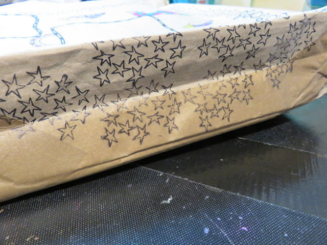
The edges need stamping too..these stars are from EDY08


Now for some bling, using my snowflake stamps from EDY04 I stamped using Cosmic Shimmer Flake and Glitter glue and then added metallic flakes. The snowflake stamp is perfect for these. 


To the stars I added a dab of Stickles in Silver. 


Enough bling already? heck no, get some more on there, it's Christmas! 

I added flicks of Gold Fresco, and then some Snowflake. 


This is bling central, I hope it makes the postman smile.


All it needs now is the address and a trip to the postoffice. I wonder if I can manage to keep a straight face when I hand it over the counter?


I hope you enjoyed that, it definitely was fun to make. 
Have a wonderfully happy Christmas everyone. 
Darcy 

All of our bloggers love to see your twist on their ideas,  particularly if you were inspired directly by their post; so please spare a moment to comment or make your own creative item. They all love to see your feedback and what you can do more than you realise!

We would love to see how you interpret this Mail Art topic by linking what you make to our 2016 Challenge #24: Mail Art on this page HERE. The Mail Artlink will close 17:00 (London Time) Sunday, Dec 18th  2016. The winner will be announced 2  hours later at 19:00.

All links go in the draw to win a £50 voucher to spend on products of your choice from the PaperArtsy online store.


PAPERARTSY ANNUAL SALE ON NOW

Once your order SUB-TOTAL exceeds each threshold, the discount will be activated.

Spend £50 get 5% off
Spend £100 get 10% off
Spend £150 get 15% off
Spend £200 get 20% off
Spend £250 get 25% off

Friday, 16 December 2016

2016 #24 Bespoke Envelopes {by Roxanne Coble}

2016 Topic 24: Mail Art


Oh hi there! Roxanne Coble here again, and tis’ the season for envelopes! Well okay, not exactly – but it is the season for unique gift-wrap and packaging of all kinds. I’m all about the details when it comes gift giving, and nothing says ‘detail’ like a hand-painted envelope. 
So for today, I’m using PaperArtsy’s Fresco Finish Chalk Acrylic paint to transform plain envelopes into something festive and fun… 


Step One: A little secret I would like to share with you: I’m a very lazy artist. The less cutting, tracing, or prep work I have to do, the happier I will be. So to begin, I’m starting with a standard white envelope that I’ve gently taken apart. Don’t stress too much about some envelope scraps sticking to flaps or wrinkling – the paint ends up covering up a lot of these minor mishaps! Of course, if you want a perfect or totally handmade envelope, you can use this dismantled envelope as a template to create your own with Bristol paper. 


Step Two: With my envelope dismantled, I now want to choose three colors of Fresco Finish Chalk Acrylic paint. Two of your colors should be opaque, and your third should be a translucent shade (I’ll explain why in a few steps!). Choose colors that you like or that maybe have a high contrast (contrasting colors will really make things pop!). You’ll see for this sample, I’m using the shades ‘Sherbet’, ‘Bora Bora’, and ‘London Bus’. 


Step Three: Starting with one of your opaque shades, paint the envelope entirely. This coat will act as your background color. Be sure you’re painting the outside of the envelope and not the interior. 


Step Four: When my background is dry, I now want to move to my second opaque shade of paint. Paint on a very large and simple pattern. The pattern should be simple enough to paint directly on with no sketching….we want to keep things easy right?! As you’ll see on my envelope I’m using ‘Bora Bora’ and applying it as a large leaf-like/oval pattern. 


Step Five: With my opaque paints applied, I can now add in my translucent or semi-opaque paint color. Using the same pattern shape I painted with ‘Bora Bora’, I will apply the translucent paint so that it overlaps with both my background and pattern. In overlapping the translucent color like this, it creates a screen-printed sort of look. It also gives you a two-tone effect, as the translucent color looks different when applied on top of different opaque shades. So for this example, I’m layering ‘London Bus’ on top of my pattern in ‘Bora Bora’ and background done in ‘Sherbet’. 


Step Six: Once your paint is completely dry, assemble your envelope back together using a glue stick. If you are experiencing any warping of the paper, just sandwich your envelope in between some wax paper and put it under a heavy object or book. 


Feel free to embellish your envelope with fun washi tape, maybe doodle on it with pens, or add some festive calligraphy. The possibilities with these bad boys are really endless! 


Needless to say after completing this DIY, I went on a crazy envelope-painting spree! I just think they are the coolest way to add flair to a gift, card, or letter. GASP! And just imagine if you painted matching wrapping paper?! *Swoon* 

Happy holidays and happy mail everyone! 

xo Roxanne Coble (a.k.a. BUN) 

Blog/Website:bybun
Instagram: bybun 
YouTube: bybun
Facebook: bybun

Thanks Roxanne, those envelopes look fabulous, and yes imagine wrapping paper! The screenprint/overlap is such a great technique, so simple to achieve but really effective. I wouldn't mind the leaf one as wallpaper actually, 3 full rolls should do it! ~Darcy


All of our bloggers love to see your twist on their ideas,  particularly if you were inspired directly by their post; so please spare a moment to comment or make your own creative item. They all love to see your feedback and what you can do more than you realise!

We would love to see how you interpret this Mail Art topic by linking what you make to our 2016 Challenge #24: Mail Art on this page HERE. The Mail Art link will close 17:00 (London Time) Sunday, Dec 18th  2016. The winner will be announced 2  hours later at 19:00.

All links go in the draw to win a £50 voucher to spend on products of your choice from the PaperArtsy online store.


PAPERARTSY ANNUAL SALE ON NOW

Once your order SUB-TOTAL exceeds each threshold, the discount will be activated.

Spend £50 get 5% off
Spend £100 get 10% off
Spend £150 get 15% off
Spend £200 get 20% off
Spend £250 get 25% off

Wednesday, 14 December 2016

2016 #24 Golden Letters {by Alison Bomber}

 2016 Topic 24: Mail Art

Hello all, it's Alison here from Words and Pictures.  I've not managed to put in much of an appearance here at PaperArtsy this year, so I'm delighted to be able to offer up some inspiration for the Mail Art theme... an appropriate topic since I've been dashing all over the place this year, but I'm afraid I haven't been sending anything this arty home to friends and family!

I sort of had a vision in my head of letters being sent from a very exotic location - "the golden towers of Samarkand" was the phrase which kept wandering around my brain - so that's what I was trying to capture on my envelope... which ended up being three envelopes with different levels of golden experimentation!


I started with some simple smooshing and dipping with Distress Inks.  As you can see, my envelopes were made of pretty cheap paper, wrinkling up with the moisture, which caused a couple of hiccups as things progressed.


My golden towers are formed by the fabulously detailed Lynne Perrella stamp from LPC012, and I've used postage-themed stamps from LPC026 and LPC030 too.


 LPC012
LPC026
LPC030
My first idea for golden-ness was to use some gilding flakes.  Overall, I'm pretty impressed by the detail the flakes got me... I was thinking it might be more along the lines of a silhouette, but with some careful scrubbing with the special foam you get all those lovely arches and windows coming through.


Next, I thought I'd go for some embossing powder.  I could have sworn I had some fine detail gold powder, but I couldn't track it down, so this is the standard Queen's Gold by Ranger, used over Versamark stamping.  Love the texture of this and (as you'll see later) the fabulous shimmer in the sunlight.


Finally, just for a comparison really, I went for a plain ink stamping - your slightly rustier gold - done in Sepia with touches of Coffee to darken the edges and add some extra depth in places.  There's not much doubt about which one wins on detail, but I'm not sure it wins on the magical gilding front!


I layered in some more Lynne Perrella stamps, focussing on ones with a postage theme. So you have the lovely woman on her tiny script-adorned envelope from LPC026, hovering subtly in the background, stamped in first and second stampings of French Ultramarine Archival on each envelope.  And there are multiple stampings of the postmark stamp from  LPC012 too, sometimes in Olive, sometimes in French Ultramarine.


And since mail art isn't really mail art until it's been stamped and addressed, I've used Olive Archival with one of the gorgeous postage stamp images from LPC030 on the top right of each envelope, and added handwritten address directions which keep the options very much open and in the realm of the fantastical.


The backs feature the same postage stamp image over the dappled ink, and I've edged all the way around with Coffee Archival for extra definition.  I had to press the envelopes overnight which got rid of some of the wrinkles, but they definitely still have a distressed look to them.


As promised, I'm finishing with a couple of shots of the most golden pair shimmering in the sunlight.  It really is quite a magical effect though, as usual, hard to capture on camera.


Thanks so much for stopping by today.  Let me know which of the gilding methods you prefer.  I did try a stamping with White Fire Fresco paint too but, although it was lovely, it was too pale to show up properly over the blue-green inks.  I might give that a go on a kraft envelope to see what I get.  I'll just carry on playing!  I hope you'll also be inspired to play with some mail art this fortnight.

Thanks so much for dropping in today, and do come and see me over at 
Words and Pictures and on
Pinterest too.

Alison x

Great to see you again Alison, fabulous cards, those shimmering areas look beautiful. A few wrinkles add more character, I keep telling myself that haha! The Lynne Perrella stamps add a sort of authenticity to these correspondence pieces. Great to see your experiments with gilding and embossing. ~ Leandra

All of our bloggers love to see your twist on their ideas,  particularly if you were inspired directly by their post; so please spare a moment to comment or make your own creative item. They all love to see your feedback and what you can do more than you realise!

We would love to see how you interpret this Mail Art topic by linking what you make to our 2016 Challenge #24: Mail Art on this page HERE. The Mail Art link will close 17:00 (London Time) Sunday, Dec 18th  2016. The winner will be announced 2  hours later at 19:00.

All links go in the draw to win a £50 voucher to spend on products of your choice from the PaperArtsy online store.

PAPERARTSY ANNUAL SALE ON NOW

Once your order SUB-TOTAL exceeds each threshold, the discount will be activated.

Spend £50 get 5% off
Spend £100 get 10% off
Spend £150 get 15% off
Spend £200 get 20% off
Spend £250 get 25% off

Monday, 12 December 2016

2016 #24 Monster Mash {by Wendy Mallas}

2016 Topic 24: Mail Art


Hi everyone! Wendy here, joining you this evening with a post about creating unique postcards. I began with mono printing, added some stamped monsters, two of my most favourite things, then turned them into a one-of-a-kind set of postcards. I'm a 40-something-year-old illustration graduate with two very grown up children and severe empty nest syndrome. I love colour and play and varied techniques, but I'm happiest when I'm mixing it all up and the messier it gets, the better.


Step One: If you're a regular visitor to the PaperArtsy blog, you'll be familiar with monoprinting techniques. I used a simple brayer technique on a 5"x7" Gelli plate with combinations of Teresa Green/Caribbean Sea, Midnight/Buff, Mahogany/Terracotta and Bougainvillea/Tango, brayering one colour onto each end and lightly blending where they met. Then I pressed each 4"x6" blank postcard (cut from heavyweight Smoothy card) onto the plate, reapplying paint between each pressing. I repeated the process but, this time, removed paint by pressing the small, patterned (non-character) stamps from ZA01, ZA02, and ZA03 sets which I then stamped onto the other postcard from the same colour combination.

ZA01,

Step Two: Whenever I'm monoprinting, the reverse side of my chosen surface inevitably gets marked by paint or ink and this was no exception. I created a clean reverse side by cutting lightweight Smoothy card into 4"x6" cards, the same size as the printed side, and I doodled a whimsical postcard onto it using a black 0.1 Pigma Micron pen. I guess the only rules would be to use the general postcard layout, i.e. spaces for message, address and a stamp. Other than that, relax and have fun drawing it. I glued each of these onto a finished image later. 


ZA02
Step Three: I stamped each monster character onto tissue paper to help me to decide on the combination and layout. You could also use tracing paper but it's more expensive and will most likely end up in the bin. If you're not a confident stamper, run a fine wet paintbrush around the image on tissue and then carefully pull the image away from the surrounding paper. This can then be adhered and sealed into place with gel medium and the tissue will appear to disappear! 


Step Four: I stamped my chosen images onto the printed card using black Archival ink. I used ZA04 and ZN04, 

 ZA04
 ZN04,

Step Five: I used coloured pencils to colour the images, gradually building up layers and blending as I went. You could use any medium you wish, but water-soluble media can be tricky as it's invariably too translucent. The exception to this is the Stabilo Aquarellable All pencil in black, which I used as shadow and ground for the wee monsters. 


Step Six: As you come to each new postcard, before colouring, look closely to see if anything resembles something else and change it, where appropriate. This makes your project even more unique to you and can add a bit more fun to the mix too. I saw swimming pool tiles, butterfly hearts, deely bopper eyes and a very strange looking caterpillar. Also, other additions like eye-contact between your characters can be subtly amusing. They might be small changes, but they create a narrative to your work. 


I had great fun with this project, as I always do when I use Gelli plates. Elena Zinski's stamps are just the right amount of playful with a hint of mischief. Have a look through your own stash and see what you can alter to add more fun and games to your projects. Try mixing techniques as well as the media and see what surprises you come up with. These techniques can easily be transferred to art journals or ATCs, or even to a mixed media canvas. In future, I think I'd be more inclined to keep my backgrounds muted and definitely paler. It can be difficult to colour on top of darker shades without using gesso or opaque paint. But it's not impossible - things rarely are. 

Love and peace,
Wendy x
Blog: wendymallas
Twitter: Wendywitwoo
Pinterest:wendymallas
Instagram:wendywitwoo

Thanks for sharing your process with us Wendy, these are fabulous postcards. How much would it be to get monsters through the post! I love how you gave them even more character by staging them and having them 'make eye contact' So clever. ~Darcy

All of our bloggers love to see your twist on their ideas, particularly if you were inspired directly by their post; so please spare a moment to comment or make your own creative item. They all love to see your feedback and what you can do more than you realise!

We would love to see how you interpret this Mail Art topic by linking what you make to our 2016 Challenge #24: Mail Art on this page HERE. The Mail Art link will close 17:00 (London Time) Sunday, Dec 18th 2016. The winner will be announced 2 hours later at 19:00.

All links go in the draw to win a £50 voucher to spend on products of your choice from the PaperArtsy online store.


PAPERARTSY ANNUAL SALE ON NOW

Once your order SUB-TOTAL exceeds each threshold, the discount will be activated.

Spend £50 get 5% off
Spend £100 get 10% off
Spend £150 get 15% off
Spend £200 get 20% off
Spend £250 get 25% off

More Posts to Enjoy