2017 Topic 17: Shades of White

When you build textures, and apply some white paint to soften, everything looks gorgeous! Add some Lynne Perrella stamps into the mix, and Chris has a truly lovely interior decor piece!
Hi everyone, it's Chris Cresswell from loopsandlines.blogspot.co.uk with you today, and I'd like to share with you my triptych canvas, Ladies of the Forest, using a few of Lynne Perrella's fabulous stamps designed for PaperArtsy.
I must admit that this was a huge challenge for me. I usually work with a lot of colour and bright colours too! I generally shy away from neutrals and monotones although I really admire those artists, like Lynne Moncrieff, who prefer to work within a minimal colour palette. However, as soon as I brought Lynne Perrella's images into the mix, ideas began formulating. Now, I am very much a 'process' person. I have a vague idea of what the final result should look like but I generally don't plan beforehand how I'm going to get there. Sometimes the end result is a bit of a surprise - as this was!
I must admit that this was a huge challenge for me. I usually work with a lot of colour and bright colours too! I generally shy away from neutrals and monotones although I really admire those artists, like Lynne Moncrieff, who prefer to work within a minimal colour palette. However, as soon as I brought Lynne Perrella's images into the mix, ideas began formulating. Now, I am very much a 'process' person. I have a vague idea of what the final result should look like but I generally don't plan beforehand how I'm going to get there. Sometimes the end result is a bit of a surprise - as this was!

My
first intention was to create some 'white on white' Christmas cards,
but as I started collecting various products in different shades of
white (for someone who loves colour, I seem to have a surprising
amount), a mixed media project was increasingly calling out to me. Then I
came across a long piece of cardboard packaging and I knew that would
be perfect for the base. After that, everything just fell into place.
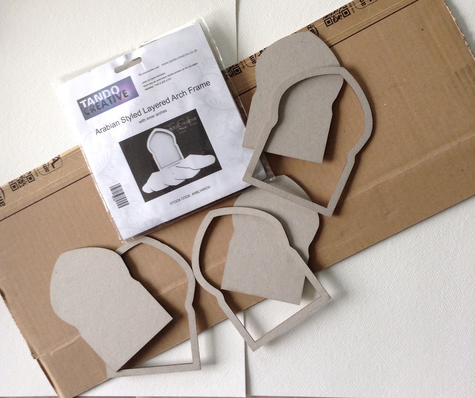
A lover of the rule of three found me rummaging through my stash of wooden arches to find three that would be the right shape for the stamped images I knew that I wanted to use and also be large enough to spread evenly across the base.
A lover of the rule of three found me rummaging through my stash of wooden arches to find three that would be the right shape for the stamped images I knew that I wanted to use and also be large enough to spread evenly across the base.
What followed was a series of process steps, some of which proved entirely unnecessary; such is the problem of not having a clear plan in mind! I tend to make decisions as I go along and invariably find myself thinking, "Oh I didn't need to do that". However, I do find myself following a similar pathway as I approach each project: gesso, collage, paint. One clear plan, however, was to keep to different shades of white and introduce metallic silver at different points for gentle contrast. As this would be a Winter scene, there would also be added glitter!

I covered the entire base and (quite unnecessarily as it transpired) the arches with an assortment of delicious papers and tissue stock from my stash, gluing and sealing everything with gel medium. As the final layout would essentially be white, I wanted elements of the collage to peek through the various white layers at the end. I started by painting over this collage base with a very watered-down Snowflake Fresco Chalk paint in order to make it more translucent. However, I realised that this was too bright for the more 'vintage' feel I was after, so this was quickly followed with a layer of Nougat Fresco Chalk paint, similar to an Antique white. Perfect. Now, an idea of where this was going began to take shape in my mind.

I had no problem choosing three stamp images for the arches as these are my all-time favourites: LPC008, LPC018, LPC028.


This is an example of having taken an unnecessary prior step as I now changed tack and decided to stamp the images onto the top, thin layer of a silver and white, snowflake-patterned serviette. The images were embossed in silver as I wanted them to be quite subdued. However, the faces were not prominent enough so I 'borrowed' an idea from Lynne Perrella herself (True Colours, Somerset Studio publication, p.14) and stamped the faces onto PaperArtsy Smoothy card, again in silver, cut out the faces, and glued them on top of the first images. Much better. The frames were first painted with Pewter Fresco Chalk paint then stamped on top using Encore Silver ink by Tsukineko.

Creating
the focal images and adorning them with beading and Ranger's Liquid
Pearls was relatively easy, especially as the pattern on the serviette
added interest behind each figure. I spent much more time deciding how
to compete the space between and behind the arches, rifling through my
stash for inspiration.
The
result was a mixture of corrugated board, beads, ceramic 3D balls
(Powertex), lace, voile and texture paste through a stencil. I painted
over everything, first with a thin layer of gesso, then another layer of
Nougat. I was liking it more and more but it somehow felt 'empty'. I am
used to crowded, busy, colourful scenes. This was too tranquil!

The
little wooden trees were painted with DecoArt Metallic Silver and I
have added DecoArt Snow-Tex to the arches and the twig/trees. Three word
tiles were added to the frames before adding final touches with
'Treasure Silver',( to highlight the texture paste) and lots of Ranger's
Crystal Stickles!
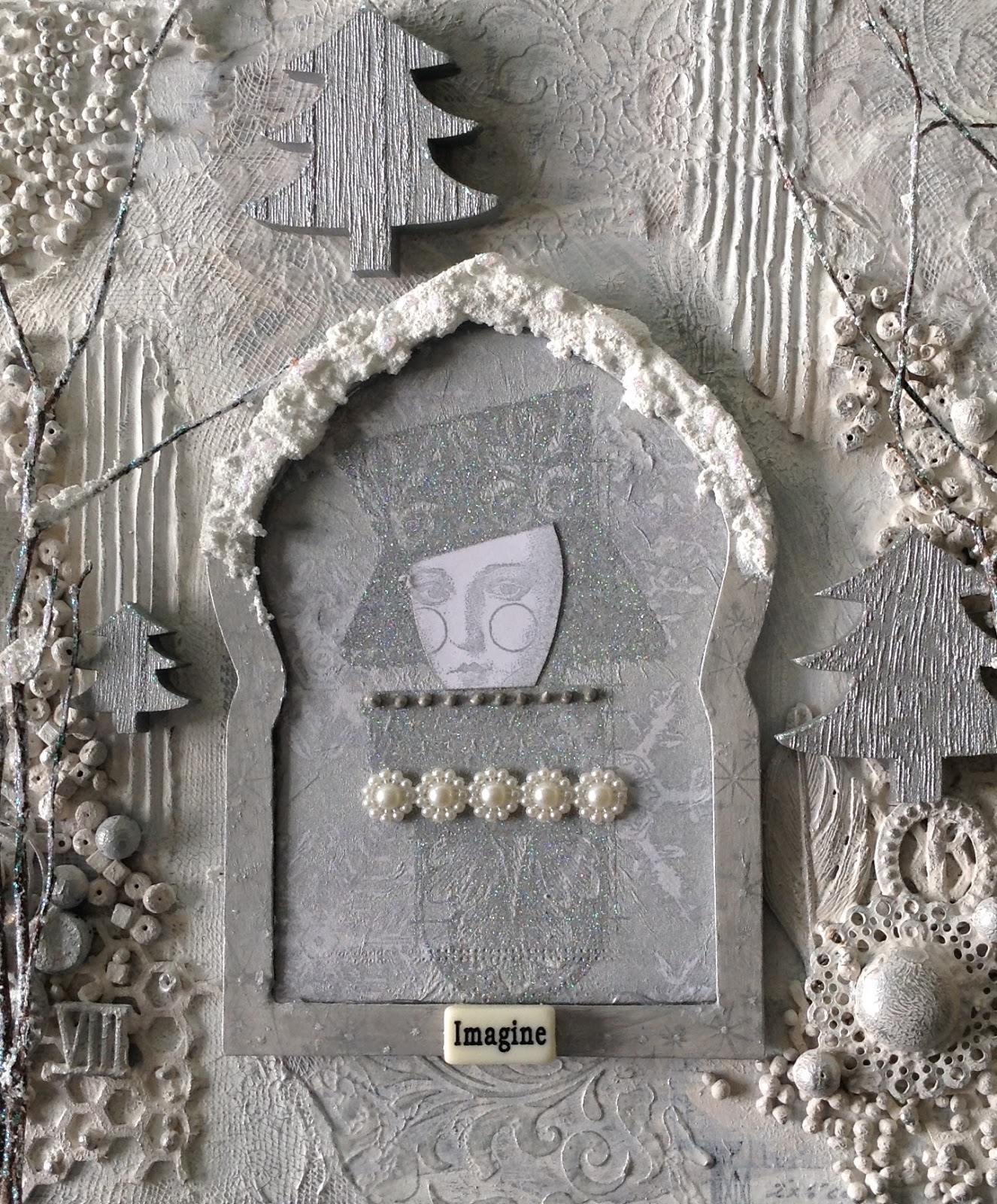
I
also added Treasure Gold in Silver (Connoiseur Art Studio) to the
larger beads and glass domes that I had previously painted over with
Nougat. The 'Trees, though lovely and twinkly with snow and glitter
along the 'branches' needed something trailing through them. I
deliberated about hanging little stars from them before finding a lovely
string of pearls (courtesy of a Goodie Box from Artful days)
that I was able to wind through and around the 'branches', resembling
little fairy lights. Now it was looking magical. My ipad camera doesn't
do justice to the pretty effect of this as the nylon 'string' is very
fine.

Blog: www.loopsandlines.blogspot.co.uk
Facebook: Chris Cresswell
Twitter: artmadnana
Instagram: artmadnana
Pinterest: Chris Cresswell
Facebook: Chris Cresswell
Twitter: artmadnana
Instagram: artmadnana
Pinterest: Chris Cresswell
Oh my, this looks fabulous! Thank you so much for sharing your small details that bring it all together! I love the textures in between the each of the frames too and the glitter and silver accents are stunning! What a lovely wintry project! Superb! ~ Leandra
We always hope that you learn something interesting from our blog.
Our creative team love to read your comments so much, so please take time to let them know you've been inspired!
Why not join our 2-weekly challenge by blogging your create response to the current topic and link it here?
Our creative team love to read your comments so much, so please take time to let them know you've been inspired!
Why not join our 2-weekly challenge by blogging your create response to the current topic and link it here?
The current topic link Topic 17: White will close 17:00 (London Time) Sunday, 26th November 2017, and the winner will be announced 2 hours later at 19:00.
All links go in the draw to win a £50 voucher to spend on products of your choice from the PaperArtsy online store.
All links go in the draw to win a £50 voucher to spend on products of your choice from the PaperArtsy online store.


19 comments:
Wow ! Just Wow !
Corrie x
I think this is just beautiful, Chris!! Very different to your usual bright colourful projects, but it looks amazing.
What a stunning project, Chris. I just love Lynne Perrella ladies in this wintry and pearl-studded setting. It's breath-taking. xx
Smashing whitey wintry project Chris. Love all those extra bits and bobs, loads of interest. I bet this would look great with a candle on each side to pick up the silver elements within your creation. I would keep this out all winter time and admire every day, a piece to gaze in to and loose yourself in!!
Very striking working in such a minimal palette. Adore the texture. Tracy x
Completely stunning! Well done, Chris.
This is exquisite and perfectly captures a magical, wintry feel. No one could every have guessed that you stepped outwith your comfort zone, in fact, it appears that this is well within your comfort zone, it is so perfectly executed and I love the textures you brought to the panel yet none detracting from the focal images. Stunning!
I was touched that you would give me a shout-out, thank you so much.
Wishes
Lynne
Oh this is magnificent triptych and mixed media art. I just love the way you put all those elements together with great techniques and idea. xx
A wonderful triptych, Chris!!!
Gorgeous Chris!!!!
Thank you everyone for your lovely responses! And Thankyou Lynne Moncrieff for such an encouraging comment. I love your work. I'm so touched by your response xxx
Absolutely stunning, this would looking amazing for any Christmas display xxx
This is lovely, Chris - all those textures are amazing, and I love the twiggy trees.
Alison x
Stunning project Chris - this is amazing!
Great tutorial Chris. Another one to step away from the colour and triumph. Looks like you had great fun with the textural background. It's fabulous! Xx
Magical and beautiful and love how you are a process crafter and creator..Such a wonderful project and lots of inspiration...Thank you x
Absolutely stunning Chris. So much detail and texture and so many bits and bobs you have used that I love like the filament trailed through the trees and tiny strips of beading to adorn the ladies. You have reminded me of several things I have in my stash that I never think to use so thanks for the inspiration, it's wonderful!
Hugs
Lesley Xx
WOW!! love this. Well done Chris
Absolutely wonderful inspiration Chris. As a die hard #1 fan of LP images, this really melts my crafty heart! What a stunning composition, so elegant in your limited palette, with incredible texture. A winning design overall. Hugs, Autumn
Post a Comment