
2017 Topic 12: Hybrid Inks

Hi everyone, it's Jennie (Live the Dream) with
you today, and I'd like to share with you some experiments using the
wonderful new Distress Oxides and PaperArtsy Fresco Acrylic Paint.
Many of you will know how much I love the Infusions and that I find I have a far greater control over the colour and saturation levels when I give the cardstock a coating of Fresco Acrylic Paint. So .... I decided to experiment in a similar way with the Distress Oxides and have been very pleased with the results, especially when combined with Scrapcosy's wonderful new Autumn stamp release.
Many of you will know how much I love the Infusions and that I find I have a far greater control over the colour and saturation levels when I give the cardstock a coating of Fresco Acrylic Paint. So .... I decided to experiment in a similar way with the Distress Oxides and have been very pleased with the results, especially when combined with Scrapcosy's wonderful new Autumn stamp release.

I will start with the experiments so you can see what I am talking about! I love using PaperArtsy Smoothy Cardstock as it really does hold the ink and water well. Using some ATC sized pieces I splodged the following Distress Oxides on my craft mat and spritzed them with a little water.

This
was how the ordinary cardstock picked up the colours - very nice and I
like the effect but you know me, I always want to get something a little
softer!

But look at the difference when the cardstock has been primed with Chalk Fresco Finish Acrylic Paint .... a much softer colour which sits on top of the paint instead of being absorbed into the cardstock.

Seeing
the experimental pieces side by side it doesn't seem possible that I
have used the same colours. But I have to admit to liking the softer
version which sits better with my vintage style.
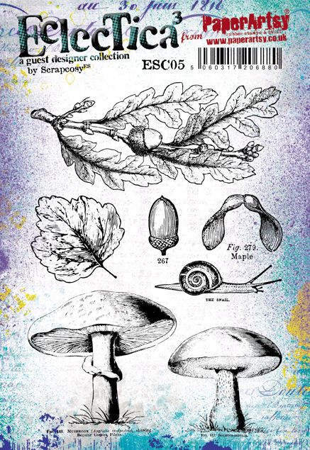
I wanted to create a soft vintage Autumnul postcard using Scrapcosy's Autumn stamp set ESC05 and stencil PS065 from her release back in June. The stamps are just so gorgeously detailed and there are so many lovely elements on the stencil.


For the postcard itself: before using any inks or stamps I primed my piece of 6" x 4" Smoothy Cardstock with Chalk Fresco Acrylic Paint again
in order to maintain the same colours for my base. I picked up a
minimal amount of colour from my craft mat this time, just enough to
hint at a watery autumnul day. I blended some Vintage Photo Distress
Oxide lightly through the stencil and stamped text here and there as a
second generation inking. Just keeping everything as light as possible.

I went
in a bit heavier with colour for the toadstools as I wanted some
brighter colours. I managed to find the "best" bits stamping with Archival Black Ink.

These were then cut out and layered onto the postcard - I just love those gorgeous random splotches of colour and watermarks!

From the pieces which were left over I stamped some acorns .....

..... and then used Grunge Paste through the stencil to create a small sentiment which hides the messy cutting at the feet of the toadstools!

I do hope this gives you some ideas as to how you can lighten bright colours to give them a more muted vintage hue by priming the cardstock first. I have to admit to getting through a huge amount of Chalk Fresco Acrylic Paint - I use it as a base for so many projects as it really does give a very different finish to Gesso, but doesn't overpower the project with a base colour.
As always thank you for joining me and here's hoping that the Autumn doesn't arrive just yet!
Jennie x
Live The Dream
I love how you figured out how to soften the oxides to suit your personal preferences Jennie! This has turned out fabulous, the stamp details really pop beautifully!!
We always hope that you learn something interesting from our blog.
Our creative team love to read your comments so much, so please take time to let them know you've been inspired!
Why not join our 2-weekly challenge by blogging your create response to the current topic and link it here?
Our creative team love to read your comments so much, so please take time to let them know you've been inspired!
Why not join our 2-weekly challenge by blogging your create response to the current topic and link it here?
The current topic link Topic 12: Hybrid Inks will close 17:00 (London Time) Sunday, Sept 3rd 2017, and the winner will be announced 2 hours later at 19:00.
All links go in the draw to win a £50 voucher to spend on products of your choice from the PaperArtsy online store.
All links go in the draw to win a £50 voucher to spend on products of your choice from the PaperArtsy online store.


13 comments:
what a gorgeous effect, perfect colours for the mushrooms as you say! Really enjoyed your experiment.
Those mushrooms are so pretty in pink! Lovely to see the softening effect of the Fresco undercoat - a great inspiration post, Jennie.
Alison x
Thank you Helen and Alison. Just to let you all know that there is a problem with the link to my blog at the end of the post. I don't want anyone to get into any internet "difficulties"! so perhaps don't click it! Jennie x
Fab use of the D.Oxides! And well done for winning the Eileen Hull Designs challenge Jennie!
Fabulous project. Great result to these experiments and beautiful colours. The card is really lovely!! xx
Beautiful Jennie... Love the subtle tones you have achieved and wonderful design x
Beautifully soft autumnal piece Jennie and great use of those beautiful stamps!
The colour tones you achieved are just gorgeous, loving the mushrooms! Great tutorial too! xx
lovely! I really love the background that you stamped on. Such cute mushroom stamps!
Kate
These experiments are inspiring and I love those mushrooms.
Great results with your experiments Jennie. Love your work. Xx
gorgeous effect Jennie
Fabulous!!!!!!!!!!
Post a Comment