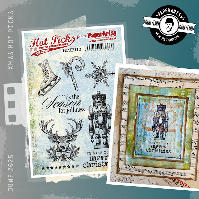
Every year we notice most stamp brands issue Christmas stamps in June (if not before!!) and we think nahhh, let's wait until September, well this year we have gone and done it, what a shock to the system creating Christmas samples in 35+ degrees of SW France heat! Hence the warm colour palette! Regardless, they are really nice classic images to use, and I am sure you will have some fun with these too!
Red Rubber Stamps (A5 set)
As is often the case, i started out by making a bunch of gel printed backgrounds. I think Rusty (a Seth Apter colour) is fast becoming my most favourite colour because it seems to go with any other colour so easily! You can see the numbers (a deconstructed 25) are in rusty paint.
Price: RRP €23.00 +VAT
Size:5" x 6" (13 x16.5cm)
All stamps are individually trimmed onto cling foam, with a laminated storage/index sheet.
This set has one focal stamp, but lots of embellishment stamps, making it a handy one to have. From tags and banners to name plates and greetings, this one will be useful for tags, wrapping paper as well as cards.
Hot Picks Xmas Set 10 (HPXM10)
Bugsy Tree
We have a neighbour here in France, who owns what we affectionately call a 'Bugsy' car. It is an Alvis 1920's or 30's car, black and the focal of this stamp set reminds me of it a lot! It's a nightmare for him to drive as the accelerator and brake are in opposite positions, if he had the courage to drive it to the garden centre to get a tree at Christmas, this is eactly what is could look like!
As is often the case, i started out by making a bunch of gel printed backgrounds. I think Rusty (a Seth Apter colour) is fast becoming my most favourite colour because it seems to go with any other colour so easily! You can see the numbers (a deconstructed 25) are in rusty paint.
The car in this sample was 'Mattinted' in Pink ..which kind of made the car look deep purple on top of the black ink. Which led to the reindeer postal stamp also getting pinked!
Xmas set 11 is certainly a card makers delight. Classic emblems of Christmas
Hot Picks Xmas Set 11 (HPXM11)
Wreath
This wreath was struggling to pop off the background, but once I added some Mattints and red paint to the berries, it all came to life beautifully.
Oh Christmas Tree
I somehow figured out a way to do splotchy gel prints, and after making a whole sheet of splotchy splatty prints, I started on overstamping with images. Unfortunately my favourite part of the sheet was wasted because the ink pad needed re-inking, but I'm still happy with hoe this turned out!
I think we left the best for last, allthought we are not supposed to have favourites.... but there is a lot to pick from on this set!
Nutcracker
Who deosn't love a nutcracker .... well I do! A little bit of whimsy, they could make great place names at the Christmas table
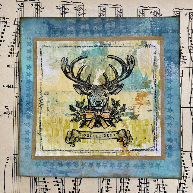
Antler Alert
Tagged
The smaller elements (candy cane, snowflake, ice skate) are going to be useful for tags. I had a lot of fun adding other stamping from the numerous embellishment stamps too
PaperArtsy Stockist List
Our stockists are your go-to source for all PaperArtsy products, and we suggest that you also use the PaperArtsy People Facebook group to source a retailer in your country. Many are members of our FB group and will happily share links to their online stores.
Australia
Bev's Cross Crafts, Spreyton, Tasmania bevscrosscrafts
Crafters Cupboard, Berwick, Victoria crafters cupboard
Hillbilly Scrappin, Nikenbah, QLD hillbilly scrapping
Memories on the Murray, Murray Bridge, SA memories on the murray
Natalie May Scrapbooking, Dover Gardens, SA natalie may
Scrapbook Superstore & More, South Penrith, NSW scrapbook superstore
Austria
Stempel Wunderwelt, Wilhering, stempel wunderwelt
Belgium
Cart N Scrap Art, Antwerp, cart n scrap art
Créatelier Caracolle, Liège, createlier caracolle
Canada
Boutique Scrapbook Tendance Inc, Quebec, Qc, scrapbook tendance
Clipper Street Scrapbook Company, Langley BC, Clipper Street Scrapbook Co
Glitter & Ink, Belleville ON Glitter & Ink
Paper Art Creations Inc, Leduc, Alberta, paper art creations
Re.defined, Kentville, NS, redefinedforyou
Scrapbook Centrale, Dollard Des Ormeaux, Quebec scrapbook centrale
Scrapbook Centrale, Dollard Des Ormeaux, Quebec scrapbook centrale
Scrap Addicts, Edmonton, Alberta scrap addicts
Scrap and Bean, Edmonton, Alberta scrap and bean
Scrapbooking Fairies, Drayton Valley, Alberta scrapbooking fairies
The Paper & ink Boutique, Calgary, Alberta paper and ink boutique
Denmark
Hobbyboden Scrapworld, Samso hobbyboden
Finland
Korttipaja, Istunmaki Heidin Korttipaja
Klemmarikellari, Turku Klemmarikellari
Piia Paper, Kittilä, Piia Paper
France
Emispheres Eurl Ruy Montceau,38300
Fée Du Scrap, Saint Sébastien-Sur-Loire, fee du scrap
Horizon Créatif, Ste Jalle horizon creatif
Katzelkraft, Ingwiller katzelkraft
Kerudoc Creation, St Yvi kerudoc creation
Le Grenier des filles, Pierre Benite
Page de scrap, Saint Pavace, page de scrap
Passion Scrap, Vieux-Conde, Passion Scrap
Scrap by Jo, Saint-Orens-de-Gameville, 31650 Scrap by Jo
Toutencolle, Dun sur Auron toutencolle
Germany
Papier & Feder, Owschlag, papier & feder
Stempeloase Munich, Munich stempeloase
Stempelfee Shop, Hilden stempelfee shop
Stempellaedle, Stuttgart, stempellaedle
Tue Was Di Liebst, Bayern, Tue Was du Liebst
Greece
Decoupage, Vergina
Italy
Pezze E Colori, Lissone, pezze e colori
Piccole Passioni, Siena, piccole passioni
Piccole Passioni, Siena, piccole passioni
Japan
La Wadao, Odawara, Kanagawa, la wadao
Tiny Dots, Funabashi-shi, Chiba tiny dots
Netherlands
De Hobbystudio, Genemuiden, de hobby studio
Doe@ding,Spijkenisse doe @ ding
Hobbycompleet de Duif, Leeuwarden hobby compleet
Stamptable, Roosendaal, Stamptable
Norway
Hobbykunst, Oslo, hobbykunst
Puerto Rico
Paper Boutique, Fajardi Paper Boutique
South Africa
Kcraft imports Ltd, Centurion 0014 kcraft
Spain
Cien por Cien Manualidades, Barcelona, 100 x 100 manualidades
Ideas 10 Manualidades Y Scrapbook, Bilbao ideas 10 manualidades/
La Sonrisa Creativa, Valencia, la sonrisa creativa
Les Coses de Raquel, Barcelona
Scrap & Papers Experiences, Barcelona, scrap papers experiences
United Kingdom
Art from the Heart, Harrogate, Yorkshire art from the heart
Crafts at The Malthouse, Herstmonceux, East Sussex, crafts at the malthouse
Countryview Crafts, Potton, Bedfordshire countryview crafts
Loobi Crafts, Leighton Buzzard, Bedfordshire, loobi crafts
Procraftynation Ltd, King's Lynn, Norfolk Procraftynation
Sir Stampalot, Peterborough, Cambridgeshire sir stampalot
Stampers Grove, Springbank, Lilliesleaf, Melrose,Scotland stampers grove
The Artistic Stamper Craft Store, Faversham, Kent the artistic stamper
The Forget me not Kraft Kabin, Rochford, Essex, The Forget Me Not Kraft Kabin
USA
Artistic Artifacts, Alexandria, VA artistic artifacts
Artistic Studio Creations, Fayetteville, Georgia Artistic Studio Creations
Craftiness, Chatsworth, CA, craftiness
Everything Scrapbook & Stamps, Lake Worth, Florida Everything Scrapbook & Stamps
Frantic Stamper, Oregon frantic stamper
Free Heart LLC, Denver, Colarado, free heart llc
Joggles, Coventry, Rhode Island, joggles
Messy Papercrafts, Temecula CA Messy Papercrafts
PaperCraft Clubhouse, Westbrook, Connecticut, papercraft clubhouse
Roadtique Boutique, Hilton NY
Runaway, Art & Craft Studio, NE Salem, Oregon runaway
Scrap-A-Latte, West Babylon NY scrap a latte
Scrapbook-N-Memories, Harrisonville, Missouri Scrapbook N Memories
Simon Says Stamp, Columbus, Ohio simon says stamp
Topflight Stamps, Irmo, South Carolina topflight stamps
If you are interested in becoming a PaperArtsy stockist contact Dounia@paperartsy.com for more information
PaperArtsy Links
Facebook Group PaperArtsy People
Facebook Page PaperArtsy
Twitter twitter.com/paperartsy
Instagram instagram.com/paperartsy
Pinterest uk.pinterest.com/paperartsyhq
YouTube youtube.com/user/PaperArtsy


.png)

