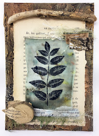
2020 Topic 11: Calming Colours
Hi everyone, Keren here!
There is a psychology behind colour and how it affects us. Pablo Picasso was quoted as saying 'Colours, like features, follow the changes of the emotions.'
Most
people would say that the 'cooler' colours on the spectrum (the
blue-toned blues, purples and greens) are more calming and restful in
the effect they have upon us. Many would also plump for pastels being
the ultimate in calming hues. However, there are strong pigmented
colours that can give a wonderful tranquil effect in our creativity and
we're going to explore some of the diverse colours to soften our moods. Many
moons ago, some of the ancient cultures used chromotherapy; the power
of colours to heal. Whilst it's probably a therapy most of us won't have
heard of, we can attest to the effect of colour in our homes upon our
moods. We'll
link each image with a suggested palette of current PaperArtsy Fresco
Finish Chalk Acrylic paints to give you some inspiration for this gentle
topic.
Some
of these schemes are personal choices; we all have colours that feel
more restful to us than others, but hopefully there's a colour in two
here that have you beginning to exhale more slowly!
Jennie Atkinson is a sure-fire winner when it comes to serene and sophisticated schemes. This is a rather lovely piece using Scrapcosy stamps and stencils.
Jennie Atkinson is a sure-fire winner when it comes to serene and sophisticated schemes. This is a rather lovely piece using Scrapcosy stamps and stencils.
Alison Bomber uses blues and lavenders with some of her soothing sentiments and merges them with lovely Kay Carley images.
Lastly,
from our trio of PaperArtsy inspiration is a piece by Lynne Moncrieff.
Is it using natural elements that calms, or the colours themselves ?
She's used Infusions to blend into a soft background to set the piece
off.
This
piece has colours on the 'colder' end of the spectrum- lots of greys,
blueish purples, blue greens and dark greens. The brighter pink is a
great contrast but it still maintains a pacifying mood.
This art piece transitions through calming colours leading your eye through the piece at the same time.
These vintage darning spools are a wonderful collection of composed colours. Delicate colours with vintage styled spools.
These
sublime symmetrical pieces are in fact tiles on the side of a yardhouse
in London. It must be a beautiful building to wander past, and contains
some wonderful colours.
Such a beautiful tag below, full of texture of soothing colours. Delicate blues, soft greys and some hints of creams and brown.
We've
mentioned about cool colours- but darker colours, even with a little
warmth, can be surprisingly calming. Calming or cosy? Relaxing or repose
inducing? You decide.
Maybe
calming colours are the ones linked to natural colours. Being
surrounded by nature has the capacity to induce calm in many. This next
image has a soothing green with grey undertones and some lovely wood
inspired colours.
There are similar colours in this next room, but adding in soft pinks, gold and eucalyptus add another dimension.
Some
art is just relaxing and calming to lay your eyes upon. Perhaps it's
the waves lapping at the shore, or maybe it's just the collection of sea
inspired colours.
This
next image contains a lovely colour collection; full of colours we can
pluck from the current PaperArtsy collection. Newer Fresco Colours like
Iceberg, Wolf Eye, Blue Smoke, Blue Jeans and other colours like Tinned
Peas. Check out this blog post to see all the new colours and in their new colour families.
Hoping that you're sufficiently relaxed to want to make some calming art of your own.
IF you are wondering what the entire Fresco range looks like these days, all 174 colours, then take a look at this blog post where you can see the colour swatches of all the colour families.
If you want to create along with us, please share on our social feeds so we can see what you get up to. The best places are Instagram @paperartsy or post in PaperArtsy People Group on Facebook. Make sure you tag us in your contributions, we love to see what you get up to in your creative world!


Think this is a theme we could all do with! great inspiration.
ReplyDeleteGreat topic. I'm really looking forward to this!
ReplyDeleteI'm positively relaxed already. Nice theme.
ReplyDeleteLove this = hope you continue to do this! It's great color theory for beginners!
ReplyDeleteBeautiful samples colours scheme and so gorgeous Fresco line. x
ReplyDeleteGorgeous inspiration Keren.. I am doing a post on this theme.. I am stuck a little... this gave me new inspiration.. to go for colours I myself feel as calming and not what other say about it..
ReplyDeleteA fabulous post! and thank you for the lovely comments x
ReplyDeleteA lovely presentation Keren. Xx
ReplyDelete