Hi and servus everyone!
It's Claudia here with you today and I am so happy you're taking some time to stop by!
PaperArtsy's quarterly theme is "Typography". Combined with the current topic of "Tags" got me hooked right away as I love to use both these design ideas a lot in my art.
When I use text - stamped, collaged or sometimes even handwrittenscribbled - it does not always have to have meaning. Sometimes I just like the texture that a book page (preferably one from a vintage dictionary) adds to a piece, but at other times I like the messages that stamped or collages can offer in a slightly different way than a 'quote'. Single words added here and there are more open in meaning - so there is plenty of room for extra interpretation, making the words thought-provoking to the spectator.
When I found the PaperArtsy Days and Months Hot Pick Xtra stamp set, the single "days" and "times" on it immediately spoke to me, as they made me reflect on my last years, having been dealing with hormonal chaos and chronic migraine that made planning everyday life almost impossible. I never knew what kind of day would await me when waking up in the morning. I often had to cancel planned activities (and I thank all my friends who have not turned their backs on me in these days from the bottom of my heart). When that all started, there was of course the idea and hope that that would just be a phase that you had to go through...so I tried to hang in there, waiting for it all to end, so I could turn back to normal.
Of course it didn't. And I adapted a habit of waiting. Waiting for a better day when I would feel less tired, in pain or exhausted. Waiting for my day long migraine attacks to pass - only to find the intervals in which they returned got shorter and shorter. And one day I woke up to finding myself not having a life at all, but just passing time. Some of it being "acceptable'", some just trying to survive pain or brain blur. Of course none of it felt like "life".
Gladly by now most of the gigantic hormonal chaos is gone and done. Sadly migraine has turned out to have become a part of my life with a lot of symptoms that I had thought had been connected to the hormonal issues. So I am now forced to accept it as a part of me and deal with it. Sounds hard - I know. But I found that once I had accepted it, I could move forward. I am now getting a monthly medication that helps reduce length and pain of my attacks significantly - so I feel I am getting my life back. And I realised how much time I had lost "waiting" and that I would never wait again, but get the best out of the time and energy I have. Waiting made me miss out - only because I went by that "all or nothing" attitude. Actually, it is a quite stupid attitude.
So my project is one that is meant to remind me of how fast time flies by and how quickly tomorrow comes and is gone even before you realise that it has been a "now" at some point when you are going by that waiting habit. And if the actual "now" is a time that forces me to care for myself by holding still until there is some energy left that is not needed for coping with pain, then so be it. That is not "waiting" or counting days for me anymore, as it now feels like important quality time being spent on something that is good for me and helps me heal. It no longer is "lost time".
And I have promised myself to never forget that in order to never lose time again by "waiting". This project is all about that.
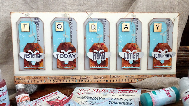
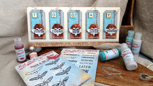
I love the symmetry of the repetitive design a lot. It has such a calming, soothing effect, hasn't it? Visual order also creates order of the mind. And yet there are still the five "meaningful words moths" that are about to soar and rise up into the sky - what a powerful message that is!
To prevent the design from getting too static though - and therefor boring - I also added some tiny details that break the clean and static design. You will learn about these a little later in this post.
I liked the designs of the moths stamps a lot, but my goal was to only use the cutting die that comes with the Moths Hot Pick Stamp & Die Set (HPSD01) and instead combine that with the words from the Days and Months Hot Picks Xtra stamp set (HPXT08EZ). This way the stamped words would also work as the wings' design and I was afraid that might look confusing as the words of course are not mirrored as butterflies' wings usually are. But I found that as long as the words were in the exact middle of the moths' bodies, that looked totally fine.
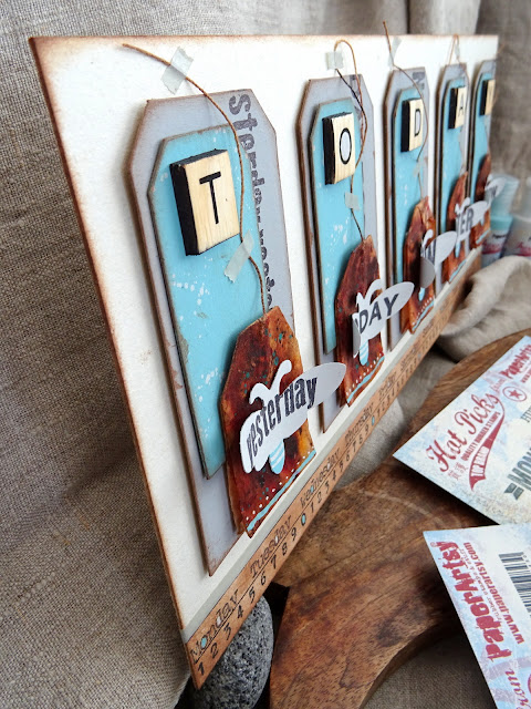
I picked some soft grey and beige tones for the tags' backgrounds to form the perfect stage for the contrast couple of turquoise and rusty orange: PaperArtsy Fresco Finish Acrylics Concrete (FF63), Koala (FF141), Lake Wanaka (FF69) and Jade (FF97) together with PaperArtsy Infusions Dye Stain - Rusty Car (CS17). I went for a quite "calm" design and colour scheme so nothing would draw any attention off the stamped words on the moths' wings.
My plan was to layer three tags to form an interesting base with some depth for the moths to sit on, so I needed three different sizes of tags. Two I die cut from old packaging envelopes using some of my Sizzix tag cutting dies. I made sure they went together well with the used, dried and emptied tea bags I wanted to add. I also die cut some tiny sized tags to use up any cardboard left overs even though I wasn't sure at that point if they would go on my project. But sometimes having stuff like this ready at hand can spark really cool ideas for finishing touches. The substrate I was going to mount this all onto was a sturdy grey board back from an old calendar that I had cut to size.
I quickly die cut a moth from a random text paper scrap, using the gorgeous moth cutting die that comes with the PaperArtsy Hot Pick Stamp & Die Set - Moths (HPSD01) so I could play with all the components to find the perfect lay out for the tag bases.
Honestly I already liked the raw design with that random paper scrap moth and the untreated card tags (maybe I will go for that idea in a future project). The picture below already shows the tags and moth in the final design.
Time to prepare the tea bags! I sprinkled on some PaperArtsy Infusions Rusty Car (CS17) and thoroughly misted the tags with clear water from the spray bottle. I then heat dried the tags and sealed them with a matte acrylic spray sealant to prevent the Infusions to get reactivated by any moisture and bleed out. You could of course as well use a sealant that gets brushed on.
I also painted the largest tags using PaperArtsy Fresco Finish Acryilc Koala (FF141) and the smaller ones with PaperArtsy Fresco Finish Acrylic Lake Wanaka (FF69).
Once all the prepared tags had dried it was time for the first lay out test. That showed me which final size I needed for my back panel. It is always better to test (or at least re-test) a lay out with already painted elements as the colours added make a visual difference and kind of change how we observe dimensions and proportions.
I didn't want my moths' bodies to be a plain cold white, so I painted the card I was going to use with PaperArtsy Fresco Finish Acrylic Concrete (FF63) before I stamped my five days from the Days and Months stamp set (HPXT08EZ) onto it using black archival stamping ink.
Then I made sure to very exactly position the moth cutting die so all the words were well centred. I fixed the cutting die into place using some Washi tape before I ran that through my die cutting machine.
In the meantime the sealed teabags had dried, so I could add some sprinkles of PaperArtsy Fresco Finish Acrylic Jade (FF97).
The darker turquoise helps fuse in the teabags with the rest of the design as it echoes the brighter Lake Wanaka (FF69) that I had used on the smaller cardboard tags without repeating it (which would look a bit boring).
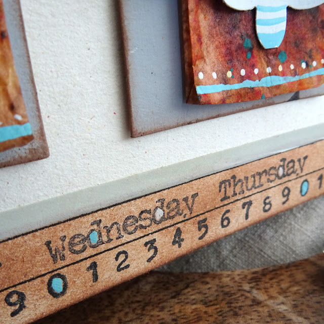
I then sprinkled some Concrete (FF63) onto the smaller tags to add some depth and texture and also break the tidiness of the layout by creating some visual interest. I also added some intentional smudges when inking the tags' edges with brown archival stamping ink for that purpose. For some additional depth and to repeat the moths words I stamped the same day words I had used on the wings on the according grey tags in a repetitive way to form a kind of typography stripe design. I found I also needed a text border at the bottom of the background panel, so I stamped one using the typewriter numbers and week days from the Days and Months stamp set (HPXT08EZ). I finally used brown archival stamping ink to blend the bottom border, before I fixed everything in place using thick double sided sticky tape.
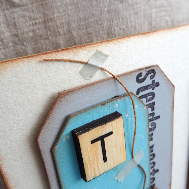
Time to add some finishing touches! I used thin Washi tape to fix the loose tea bag threads in place. I tried to make that look quite randomly - another means to break the static design of the composition. Finally I added some playful lines and dots here and there with a fine tip detail brush as well as some scrabble tiles that form the word "today".
I also added colour to parts of the stamped weekdays and numbers to repeat the colour scheme and visually fuse the bottom border with the rest of the design.
Luckily the natural colour of the thick grey board panel was a perfect match for my chosen colour scheme, so I left that untreated. The wood colour from the Scrabble tiles formed a soft contrast to the beautiful Lake Wanaka turquoise of the tags and the colour of the Washi tape forms a kind of visual link between these.
In the end I find that for me this is an unusually clean and straight project and design, but I feel that it had to be this way as the make is all about getting clarity on what has been going on in those last years filled with chaos and the impossibility of planning daily life properly. I have also picked an unusually bright colour scheme, but I think that reflects the lightness that I have regained and spreads an optimistic vibe. It tells me to live in the moment and today the best that I can and never get lost in waiting again. That said I hope you are having your best possible time at any time possible! Stay safe and take care!
Claudia
Facebook: https://www.facebook.com/amelie.dronten/
Instagram: https://www.instagram.com/vonpappe2/
Pinterest: https://www.pinterest.at/vonpappe2/



Well this is a gorgeous project Claudia. It is different for you but I really love it and it makes sense given your story. I especially like the Rusty Car infusions on the teabags against the blues. I am so sorry to hear of your health issues but I am glad that some have been resolved. I hope you find an answer to your migraines soon, they can be quite debilitating. Take care my friend.
ReplyDeleteClaudia, I'm so sorry that you've had a rough patch over the last few years. I'm glad you're beginning to find a bit of normalcy again. I hope that your situation continues to improve.
ReplyDeleteSecondly, I love your project. The colors, the details, and the design are all wonderful. I've always loved the Moth stamp and die set. Mine dates from when they weren't sold as a set!
Yeah, it's quite a "clean" make for me, isn't it? Guess I kind of needed the visual clean look and order, given the circumstances. I am sure my messy side will come out again, once I feel "safe" and less exhausted (which may take a while, but I am on my way).
ReplyDeleteThanks so much for your kind words and the wishes! You stay safe and healthy too!
Claudia xxx
This is a fabulous project Claudia! I love the teabags. I recently tried out Infusions on teabags and I really like the effects. It's a good idea to seal them, thanks for the tip.
ReplyDeleteHope your health is back to normal soon, it's not fun having a chronic illness.
Alison x
LOVE your project Claudia, take care my friend! I know what migraines and hormones can do to one's life.
ReplyDelete