Orange - Neutral
Main Colour: Dirty Orange
Complements: Yellow Beige, Pink Stone
Type: Twist - One colour is neutral ( FF Stone)
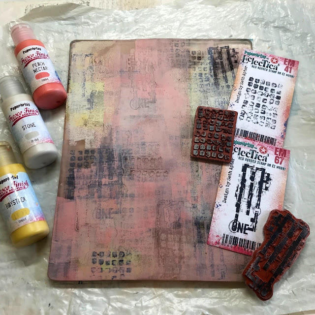
Created from Frescos: Haystack, Peach Nectar, Stone
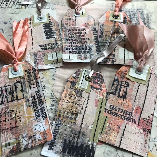
Hi everyone, it's Floss (flossworkshopart) with you today, and I'm here to share how I used layers to create a set of matching (but non matching) mixed media tags using split complementary colours with you.
How can they be matching but not matching at the same time I hear you cry...take a look below and you'll see that by creating a 'master board' first it naturally lends itself to become an un-matching set.
I really love to incorporate texture, fabrics and collage within my art...mix that in with some stitching and embossing and it makes me one very happy girl. So when Seth Apter brought out his new range of mini stamps I was literally jumping for joy when they arrived in the post and I just could not wait to get into my workshop and start using them!
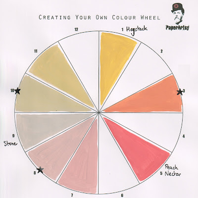
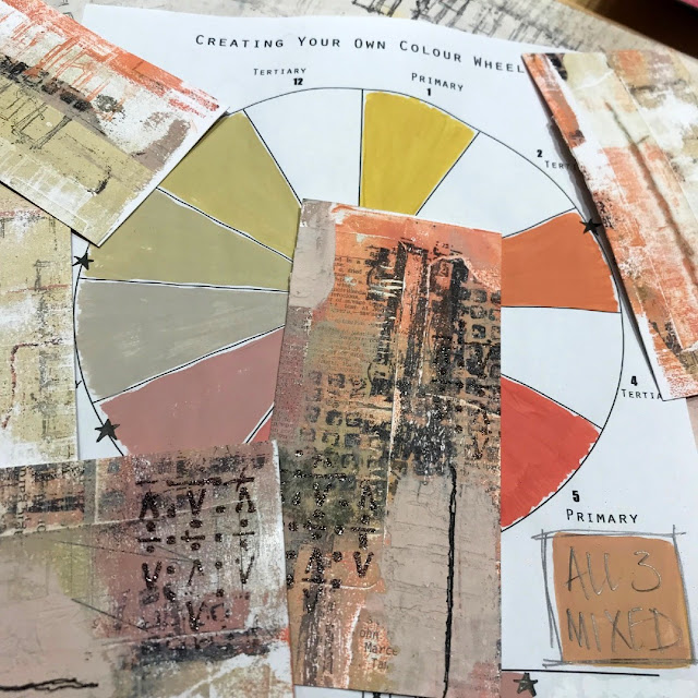
I started by creating a colour wheel with the beautiful HAYSTACK, PEACH NECTAR and STONE fresco finish colours with the idea of layering these colours together to make a set of mixed media tags incorporating fabrics and eyelets.
You can create your own colour wheel by using the PaperArtsy blank found at https://www.facebook.com/groups/paperartsypeople/files. I found this sheet particularly useful to check my colours throughout the making as I wanted to limit my palette to the three mixed colours and didn't want variation in my mixing.
Here comes the theory bit...if you need clarification to understand the split complementary colour process...or you missed Keren's introduction a few days ago...I hope you find my explanation clear...please do jump straight ahead to the next bit** if you already have a good understanding of what split complementary colours are.
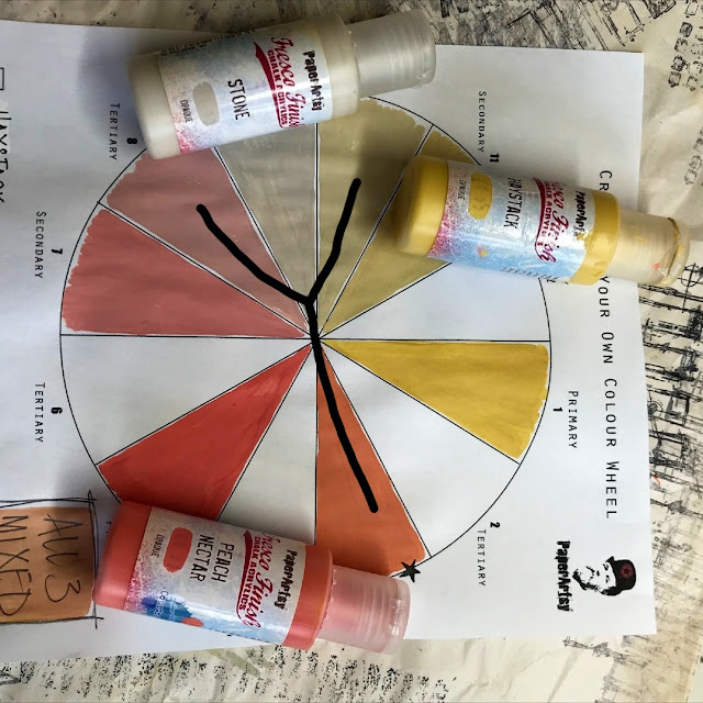
The position of a letter Y is helpful in finding which mix of paints you'll be using on the colour wheel. First of all mix equal amounts of your two chosen primary colours together to make your secondary colour. In this case because it's a twist on the standard colour wheel I used Haystack and Peach Nectar to create my 'dirty orange' (secondary) shade seen on the down stroke of the Y. The complementary colour of the dirty orange is Stone. As it is 'split' complementary you'll be using the tertiary colours either side of the stone shown below with the two upper V strokes of the Y to create your art. You mix these tertiary colours which I will call pink stone and yellow beige by mixing equal amounts of the mixed secondary colours (Stone with Peach Nectar and then Stone with Haystack) with stone.
**Using the split complementary colour combination is a fun way to explore how colours really go together well. You'll notice there is a little box beneath the colour wheel with 'all 3 mixed' written inside it. I often use a mix of all my colours that I use on one piece, I find it brings them all together and harmonises my art. I added this box as a force of habit without even thinking, however, I did not use this mix on the tag project this time as I wanted to stick to the three colours shown with the Y.
Prior to using my new colour palette I used some old book papers with different sized text and fonts, with some old maths papers to collage onto a sheet of 300gsm white card. I like to collage different size/font style text over another as, for me, I'm not trying to read the text but use the it as a form of textured marks. I also like to rip rather than cut the pages as I prefer the raw look rather than a clinical/stark edged feel to my art.
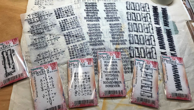
To begin building my coloured layers I used Ranger's black Archival ink with one of Seth Apter's gorgeous new rubber stamps (EM67 - available now from PaperArtsy Retailers) with an older one of my favourites EM41, to stamp some textures onto my 10 x 8 gel plate and let that dry. Remember what you put down first onto your gel plate will be on the top of the pulled print.
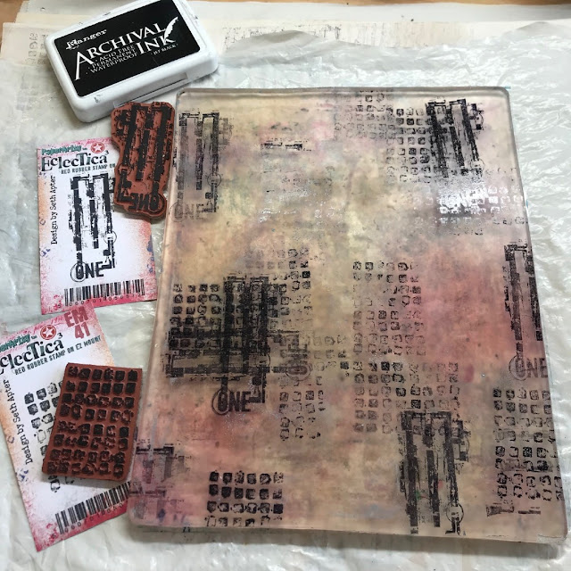
Notice how I have created + crosses by using the EM67 'ONE' stamp portrait and landscape over each other, and layered the 'ONE' stamp over the EM41 multi boxes stamp to make the texture my own...you may prefer to make x crosses. Seth did say "make it your own" in his introduction blog post...and that's what I love about these new mini stamps; they have so many options to truly go bonkers with a multitude of different textures in the way you use them, so do have some fun...Try using different pressures when applying the stamps to the gel plate or don't renew the ink each time you stamp to give you a variation on shades too. I started mixing my colours to use on the gel plate whilst the ink was drying. I found it useful to have the colour wheel to hand to check my mixing to keep the continuity in the colours.
I started with applying the lightest colour first, yellow beige, (made by mixing Haystack with Stone then mixed with Stone again) and only covered parts of the plate. I didn't want to pull a flat colour print (which would have happened if I'd covered the whole plate) and left that to dry. I loved the way the paint 'pickled' a little leaving tiny bubble circles within the colour; I hoped the next shade would show through when I pulled it. I let this dry too.
I was actually itching to see how this was going to come out as the layers were looking so beautiful on the gel plate, and as you know, you never really know what that pull is going to be like when it comes off so I had my fingers crossed it would all be ok and I wouldn't have to re collage a sheet...although...the way I looked at it was that if it all did go wrong I'd just have a bit more play time...so that's not a bad thing!
I then used the pink stone colour, (made by mixing Peach Nectar with Stone then mixed with Stone again) and covered the remaining parts of the plate. Before pulling the print I used the EM41 and EM67 rubber stamps again, this time pressed into the paint to take areas of paint off and also stamp the paint elsewhere on the plate too. By doing this I am not only creating more texture but allowing different colours to show through the layers. I used the collaged sheet to pull the print.
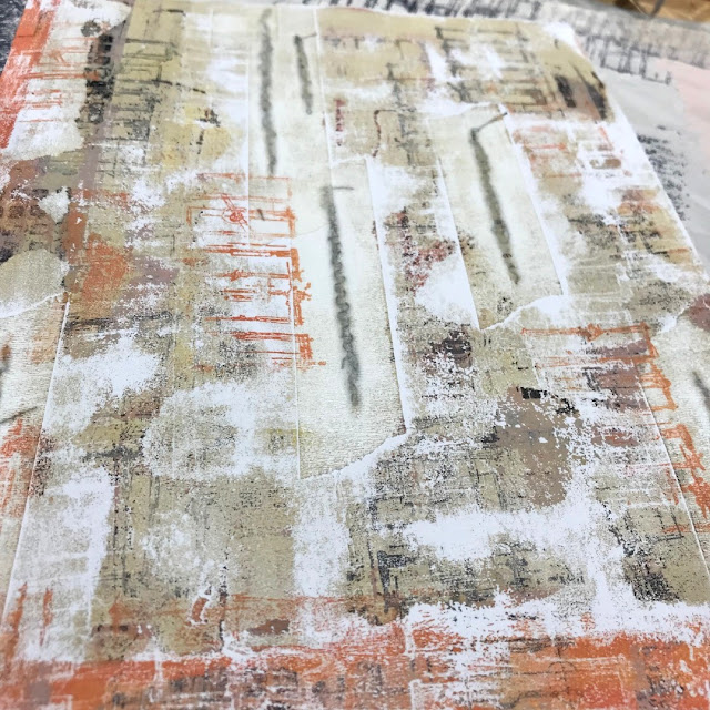
Look at the way the edges of the collage have left fabulous marks on the gel plate ready for a fun second pull. Using collage on the pulled print not only leaves those edgy marks on the gel plate ready for the next pull but gives you interesting lines within the print where there are different levels of paper.
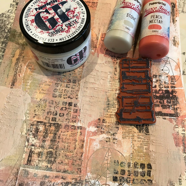
To add solid blocks of texture I mixed my 'rose stone' with some
grunge paste and used a palette knife to spread a thin layer of this over parts of the now collaged printed card. I was aware that the colour was slightly lighter than the three I was trying to stick to, but gave myself permission to run with it as I wanted the solid grunge texture block. I then used
EM70 to press the rectangle textures and
EM72 zigzag textures into the grunge paste whilst it was still a little damp. If you try to do this whilst it is very wet it will give you a very smudged/stippled appearance rather than the clean lines of the stamp. Maybe do a test piece before you apply it to your master sheet if this process is new to you. If you need the image to be a little softer then wait for the grunge paste to dry and sand it back. By sanding it, it can also give you the option of some interesting high and low areas.
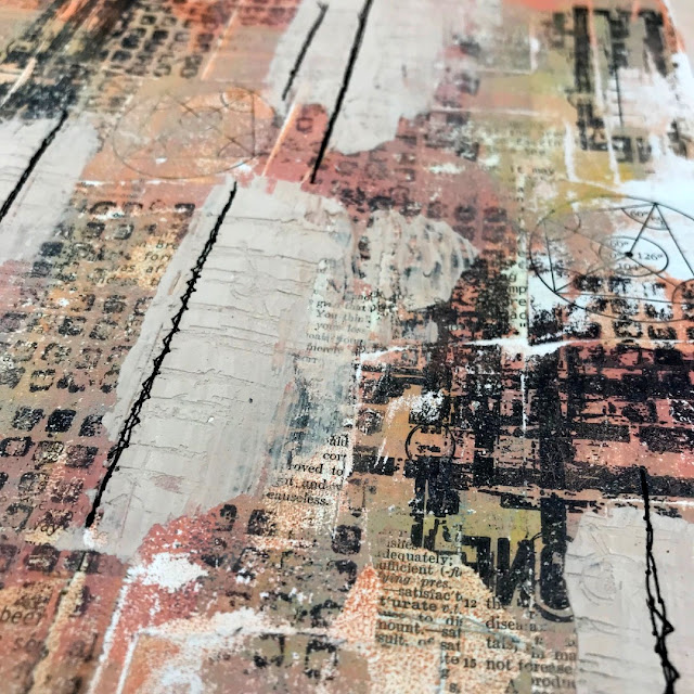
I ran the whole piece through the sewing machine using black thread for contrast. The lines of the collage and grunge paste gave me a hint of where to sew. I used six random lines as there would be six tags. I made sure some of the lines crossed where the master sheet would be cut and so where each tag would be separated from one another. On the reverse, I put masking tape over the stitched lines. This was to secure the stitching ,especially where it would be cut mid line but also to add to the texture.
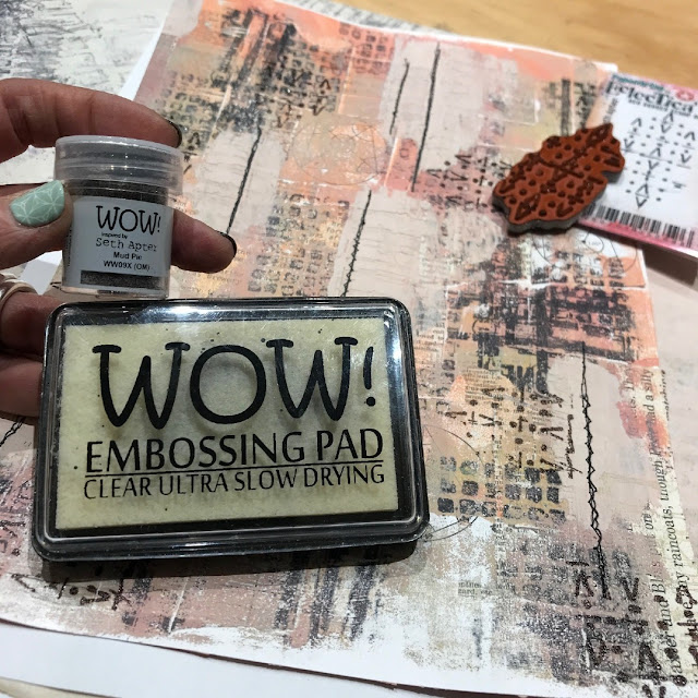
Rubber stamp EM69 just sang to me to be embossed using the new Mud Pie WOW embossing powder. It has a very slight metallic shimmer to it but it's not too 'glitzy'. I am not a glittery sparkly kind of girl at all but I quite like a little metallic shimmer from time to time. I decided to use only a small section of the stamp so as it was not too overloaded and just gave it a slight accent.
I used a similar method for gel printing on the reverse but without stamping black ink onto the gel plate first. Instead I chose to use the stamp EM70 in the paint on the plate after I rolled it to give more stamp definition in the contrasting colours.
I then chose to divide the A4 sheet into six. The first cut was in half making two A5 sheets then each A5 into three so each piece measured 105mm x 70mm. You may choose to make your tags a different size...whatever works for you and what you will use them for...
I was happy with my colour swatching! The colour wheel really did prove helpful with mixing consistently!
I like corners taken off as triangles so measured 16mm in from each edge along the top and 30mm down the sides and snipped them off using scissors. Once you have done one you don't really need to measure any others as you have made your template with the first one...measure twice cut once to be sure before you cut. You may prefer a rounded tag top or one that is cut using a scalloped punch.
I thought I'd use Seth's "more is more" approach as I was using his stamps so stamped a few acid free white tissue paper sheets with EM41, EM66, EM69, EM70 and EM72 and collaged these tissue paper bits over the sewn tags using a matte medium.

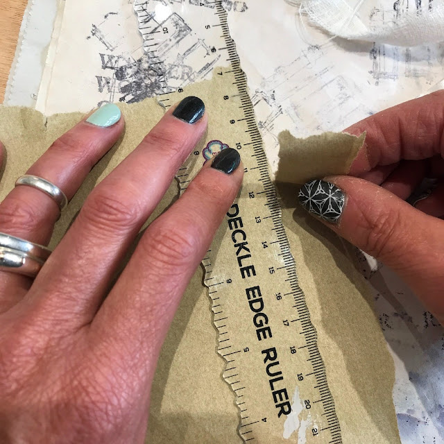
To make the tags more sturdy where the ribbon is attached I decided to use remnants of natural linen and bits of old parcel paper where the eyelets were to be punched. I tore the paper to have a fairly rugged edge using a deckled edge ruler and rough cut the linen remnants. You may prefer to cut the paper rather than tear it, especially if you cut your collage right at the start to match that.
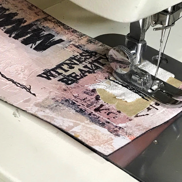
I machine stitched some of the added linen and parcel papers for more textured detail again using black thread. I often use a combination of straight and zigzag stitching over one line.
Again I used the colour wheel to swatch/colour match my ribbon/threads. I could not believe my luck in that I actually had a very near match to the 'dirty orange', 'pink stone' and the 'yellow beige' in ribbons that I collect from odds and ends.
Thread and tie your ribbons/threads through the eyelets, if you chose to use them and enjoy what you have achieved.
The reverse being a little less detailed allows space for you to add messages, quotes, phrases, words of kindness or whatever you choose to add...or not.
I thoroughly enjoyed making these tags and the gel print pull for me was both exciting and nerve wracking at the same time with the not knowing if it would work. I definitely had an ohhh yesss!!! moment when I revealed the amazing textures that the collaged lines had left behind as well as added to the pull. Its definitely a technique I will use again. Let me know in the comments below if this is something you have already done or if you are eager to try it.
I love the way these colours work together and painting the colour wheel has proved to be a good step to use if you are unsure of your colour mixing/matching choices. I personally can see a pile of these growing in my workshop as I explore more combinations.
I think looking at the tags now I may even go back to them and add some hand stitches over the zigzag stamped prints or some of the other lines, but I will look at them for a while first before I make that final decision...If you are more of an ATC kind of person maybe this technique may inspire your next batch?
Until next time, enjoy your art time and I'll see you again soon...
Much love
Floss 🌸
If you live near me (East Sussex UK) and fancy joining me doing this project in my
workshop then I will be holding in-person classes of up to six persons over the next few coming weeks. You can find a link to this and all my other mixed media workshops on my website at www.flossworkshopart.com













OMG, this post needed an editor. The correct term is complEmentary colors, not not not complimentary. Jeez. Please at least get the terminology right.
ReplyDeleteHi! Thanks for your comment. We’re always happy to adjust things- which we have now done. Complementary is one of those words that often gets autocorrected and as many of our blogger pool have English as their second language it’s also doubly tricky.
DeleteWe appreciate you taking time to comment and hope you have a lovely day.
Love the use of these colours together and the tags are just beautiful!
ReplyDeleteThank you Helen, I'm glad you like them...I hope you'll have a go at making this project.
ReplyDeleteOh Floss these tags are fabulous! Definitely not a colour combo I would have thought of but boy does it work well - noted and will be used in future! xx
ReplyDeleteThese are amazing! Wish I could take your class, but I’m in the US. Looking forward to giving it a go using your steps for guidance.
ReplyDeleteI really enjoyed seeing your process for creating these fabulous tags. I love these stamps and love the unique colorway you've chosen. Awesome inspiration, thank you!
ReplyDeleteAutumn
Fabulous tutorial Floss. These tags look AMAZING xxx
ReplyDelete