Pages

Sunday, 31 January 2021

2021 Topic 2: A Pocketful of ... {Topic Intro}

 2021 Topic  2 - A Pocketful of ...

 
Hi everyone, Keren here.

A pocketful...of rye? For Agatha Christie fans, that might be your first thought; a pocketful of a mysterious item. The other thing that leaps to mind is the actual nursery rhyme.. 'sing a song of sixpence, a pocket full of rye, four and twenty blackbirds baked in a pie'. I always thought that that rhyme was somewhat dark!
But what does it mean artistically? Well, where do you start. How big is a pocket and what can you stuff into it. Could it be a junk pocket, a fabric pocket, an envelope? Let's see what we found from a sift through of the inspiration online on the PaperArtsy blog.

Kicking off with a pocket, but fabric based. Don't you love the way that Darcy Wilkinson has painted, stencilled and added illustrations too.


Lin Shields is up next, using some Lynne Perrella stamps and a folio just full of pockets, tags and textures. Look at that beautiful embossed pocket.


Etsuko has produced pockets within a pocket type folder. So many lovely details with those perfect little inner pockets!


We start off exploring with this super simple idea. Little vellum pockets that look printed but you could stamp or heat emboss on some home made pockets. They make lovely treat containers.


The next 3 projects are along a similar theme. Over the past few years there has been a trend that some of you might have indulged in; loaded envelopes. They are often swapped and filled with paper-craft goodies for recipients to use.


This could be a loaded pocket, but its actually a multi pocket album. Imagine sifting through all the little tags and items, reminiscing and reading favourite memories?


I know we're just past Christmas, but can you ever be too organised?! The idea of having a bunting type calendar (some people do countdowns to weddings or significant birthdays) is a simple one. I do love the fact that each pocket is entirely different, perhaps you have a load of Christmas paper scraps in your stash to do something like this!


Using a pocket as a base to decorate for something decorative doesn't come more simpler than the humble envelope. Kraft envelopes can take so many colours and this mixture of stamping and ephemera is so truly beautiful.


Pockets can be pared back and made from recycled ingredients. I love this handmade receptacle, sewn together with fibres and as it's transparent you'll never have to wonder what is contained inside!

Art Craft Crazy

A pocketful of inspiration is in evidence here. Love the carefully placed elements with the collage sheets.

Redleadpaperworks

Going more literally; how about a pocket full of painted art. Recreate your favourite artist on the rear of your favourite jeans. This would be a great idea for stamping and painting your favourite PaperArtsy images!


Sometimes more is most definitely more, and there are a plethora of pockets here. The limited colour palette and use of different lace and ribbons in cream and white stops the project from becoming overly busy.


I've included this project, which although similar to Darcy's opening project, is different because it uses just the pockets. I thought it might be a wonderful idea in different coloured pockets or perhaps stencilled and bleached denim.


This journal / mini album has an interesting technique for inserting tags and envelopes. Using diagonal pockets also is a great design tool for leading the eye onto the next page.


Many mini albums use a version of pockets. Why not attach together some pockets or envelopes and add a simple spine or rings. 


The way that pockets can be opened is a design decision and this clever zip idea could be used in a myriad of ways.


Pockets could be created out of paper bags. This pretty and delicate set of pockets are demonstrated in this video.


Junk journals are an obvious direction when considering this topic.This project looks anything but 'junky' and has so many clever ways of incorporating both pockets and inclusions.


We end up this topic with a bright and fun pocket full of paper-crafted elements. I've included this last one for the glassine styled pocket and because it looks like a celebration. With all the stresses of current life, getting down to creating some fun art and finding new ways to add pockets into your creating sounds like the perfect way to wile away a few hours.


If you want to create along with us while we explore this topic, please share your makes on our social feeds so we can follow along. Instagram @paperartsy or why not join us and post in the PaperArtsy People Group on Facebook. Make sure you tag us in your contributions, we love to see what you get up to in your creative world!

Friday, 29 January 2021

NEW PaperArtsy Products: Fresco Paints {January 2021}

Fresco Finish Chalk Acrylics
January 2021 New Product Announcement
 

Finally, after what seems like months and months we finally can announce the last paint family from our restructure that started in July 2019! Whew. 
 
We have 22 colour families of 6, plus we have 3 glazes, Pearlescent and Metallic sparkle glazes, Frosting Glaze for on acetate or glass, Drying retarder, Crackle Effect  4 metallic paints and then of course the Tracy Scott (bright colours x 20) and Seth Apter (subdued colours x 24) Series too! Toot Toot!

That's 132 colours in the Core collection + 44 from Seth and Tracy = 176, plus the 12 extras is 188 all together. I never thought when we released the first 12 we would end up with this many.
 
These minty greens are fresh and crisp. They are perfect with the purple blues we announced in October 2020, but also look marvellous with Corals, which is the main direction I have taken for this post! 

Here is the close up shot of the newest family

I've created a few projects to share with you, and as some new stamps also dropped this week (you might have noticed) I thought I would pull a few of those out too! It would be rude not to!
 
1. Collecting Shells
 
I loved Raquel's new stamp set which is a journaling background, which sat perfectly on this 8x8" card. I smooshed it into watery puddle of Verdigris on my Craft Sheet, and stamped it 4 times around the edge of the card.IT can be used as one big block, or trimmed or stamps and then trimmed to use the words/ numbers as you wish.
 
 
Then the leftover paint was blended in the middle and Peppermint stencilled through Raquel's new square stencil.
 
 
Grunge Paste was scraped down one side quite thin, and the Sara Naumann stamp, was gently tapped onto thinly smeared splat of Forest Paint on the craft sheet, then pressed into the GP. You need to set that aside to dry for some time before sanding it back, and then the words become clearer and sharper.


The shell was stamped onto Frosty Painted card, which also had the script above stamped in snowflake on it.
 
 
It's nice to have a bit of stamping in the background too. I have to keep things vertical and horizontal..it's just how I like it to be! The dots are from the new Sara Naumann stencil. I applied them Sara's way, rubbing GP through the stencil with my finger!
 
 
Here's a close up of that GP detail. Love it!


2. Fleury-Fly

With this being Raquel's first release in a year I had to paly with her stamps. I only intended to make one sample, but by the end of a relaxed afternoon of playing I had 4! Not bad for me!


Again, from my same Verdigris puddle I made another background directly onto Heavy Smooothy, this time with Sara's stamp from ESN49 (shown above). I kind of wanted some structure, so I kept printing it until I had the look I wanted. And yes I had some left over GP from the sample above, so that go used up too!  It's a pretty cool effect...
 
 
I painted up some green and coral card scraps, and stamped the flowers and leaves a bunch of times. I could have done it again and layered the flowers again in side these -that is what they are designed to do after all! But I didn't ! No clue why!
 
 
The little butterfly on the green frame looks so cute as an embellishment. A little bit of gentle card bending adds a bit of life.
 
 
I just love the texture that Grunge Paste gives, smooth, rough, tinted, or not. Perfect.


 3. Tweet Tweet
 
Again, that watery puddle made quite a few backgrounds! It is interesting how crisp the stamped image turned out too! I find it is abut how you loosen the paint, not too wet, not too thin, and you want the paint to look right on the rubber too. Shiny not sloppy! 
 
 
There is a knack, but once you find the right consistency it is easy.  I stamped the word block in Verdigris, and the flowers at the edges in Forest. 


Then used the same colours to edge the card the same way you would with Distress Ink. (using up the dregs again) This was another 8x8" sample.
 
 
For the birds I stamped them on Frosty painted card in Verdigris, then added colour with the various shades. It was a bit of a hit and miss approach, but chose to ink up in black and stamped over again once dry to add the details. If you look closely you can see that it didn't line up perfectly, but I really wasn't bothered. Cut out and stuck down.
 
 
Added the Little bird words onto one of the frames, and the butterflies at the top to finish.
 
 
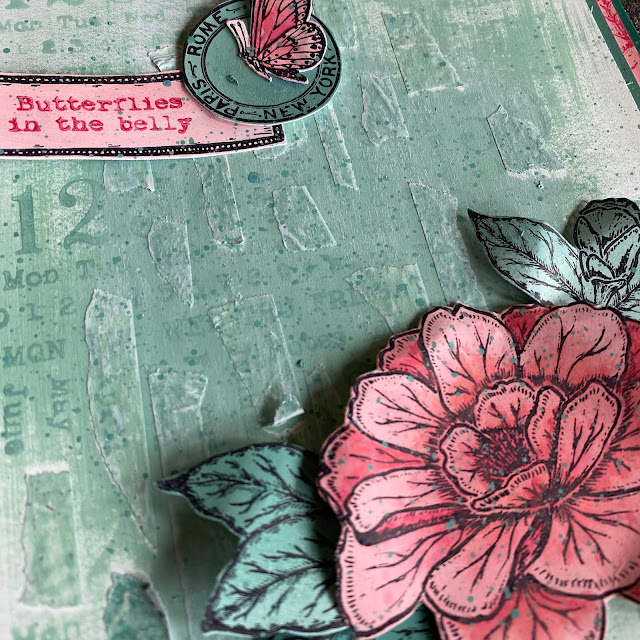
4. Butterfly Belly
 
I was using washi tape for a repeat stencilling thing, and so rather than throw it away, I kept tearing it and arranging it onto a piece of card. I painted over it with Mouse Ears, and the block stamp fitted 3 times perfectly from top to bottom.


To make the washi pop a bit, I dry brushed Frosty sand then Peppermint over the texture and it just caught it nicely. A few splatters in the mouse ears too

 
The elements I had stamped and cut our earlier were arranged very simply on top.
 
 
Sometimes it nice to just play with a few stamps and kind of do the same thing slightly differently each time. These cards were all super simple just watery painty play, using up every last drop, and having the lovely focal points to go on top made finishing off so easy. I could sit and make simple backgrounds like this all day every day!!

So now that we have the last family done, we can see the entire Fresco Chalk Range like a rainbow!

Let me remind you ...

1. Bright Turquoise Blues
New: Aquamarine

2. Grey Turquoise Blues
New: Waterfall, Calypso

3. Grey-Green Blues
New: Blue Moon, Marbles, Paua Shell - Jan 2020
Tweaked: Lake Wanaka (barely)

 4. Grey Blues
New: Ice Berg, Wolf Eye, Blue Smoke, Blue Jeans
Tweaked: Surf's Up

5. Bright Clean Blues
New: Summer Sky
Tweaked: Blue Oyster, Smurf, China (Barely), Twilight (noticeably)

6. Purple Blues
New: Cloudy, Crispy Blue, Pool, Azure, Electric - Oct 2020
Tweaked: Blueberry (not much)

7. Blue Purples
New: Periwinkle, Forget-me-Not
Tweaked: Wisteria, Purple Rain (not much)

8. Purples
New: Mauve, Globe Thistle, Grape - Jan 2020
Tweaked: Moonlight (barely)

9.Pink Purples
New: Taro Milk Tea, Byzantium
Tweaked: Sugar Plum, Sour Grapes

10. Bright Pinks
New: Professor Plum (returned colour)
Tweaked: Orchid

11. Soft Pinks
New: Sorbet
Tweaked: Blush, Cherry Blossom, Rose (barely)

12. Coral Pinks
New: Peachy Keen, Scottish Salmon, Blood Orange (returned colour)

13. Bright Warms
New: Cayenne, Red Lipstick

14. Rustic Warms

15. Browns
New: Cloud 9, Sand

16. Neutrals
New: Truffle

17. Greys
New: Elephant (returned colour)

18. Khaki Greens 
New: Lichen, Khaki - Jan 2020

19. Mint Greens
New: Peppermint, Frosty, Verdigris, Front Door, Mouse Ears, Forest - Jan 2021

20. Clean Greens
NEW: Willow, Celery, Spring, Pistachio, Beanstalk, Gumboots - March 2020

21. Fresh Greens
New: Lawn
Tweaked: Teresa Green, Hyde Park (barely), Guacamole, Granny Smith (a bit)

22. Yellow Greens
Tweaked: Chartreuse, Hey Pesto (noticeably), Tinned Peas (barely) 


Here are Seth's 24 colours as they stand, lets put them in a rainbow.


And of course the existing 20 shades in Tracy's line...


All of the new paints are available to purchase now from our approved stockists. We do not put these items on our website, so if you need to find them, the fastest way is to do a shout out on our FB group, PaperArtsy people (link at the foot).