Pages

Saturday, 31 December 2016

PaperArtsy Blog Summary of Topics 20-22 {Curated by Leandra Franich)

Blog Summary: Grids, Alcohol Inks, Bleach, Mail Art. 

Well here we are, the final day of the year, and the final summary post what our bloggers did for us all in 2016 here on the PaperArtsy Blog.
One of the biggest blog challenges this year was to 'spot the word' within Gabby's creation above. See this blog post for more
2016 seems to have been a year of international tragedy, unrest, and confusion, we have experiened a year of unexpected turmoil and change. We also seem to have observed an  unprecedented level of celebrity deaths, many way too soon. In among the chaos that was 2016, I feel our little blog has hopefully offered a haven of positivity and encouragement.

The year ahead will no doubt hold as many surprises at that which has just passed. We may not be able to control the outside world, but we do have some significant choices we can make about our own lives, how we choose to use our time, who we choose to spend quality time with, and what we do for our own pleasure. Crafting is often a welcome escape from the realities of the rest of the world, but it is also a wonderful way to express deeply-felt emotions on any scale or topic.

I hereby challenge us all to make more art, find our happy place, take time for yourself, absorb, marinate and pickle yourself in the process of learning or doing something new. Somehow it always seems to give you some perspective, and joy.

Here's to the year ahead!
Happy New Year! 

So it's me again today (Leandra),  remembering with you the final days of our blogging year. And boy has it flown by! Today we look at the final topics of 2016, and the great ideas expressed within! Let's take a look!

Topic 20: Squares and Grids

One of the first stamping techniques I learned was the 'grid technique' ...using Post it notes to mask off a grid line, then apply colour direct to paper with Adirondack Inks by Ranger... and that whole method of working with structure has always continued to appeal to me. I like the structure a grid offers, and working with squares is such a great way to isolate focal points too.

My first pick is This flower 'grid' by Helen Chilton. Helen always seems to turn an idea on its head with ease! Her bright colurs and pops of white really make this grid so cheerful.


Jennie Atkinson seems to have morphed into an infusions guru this year. Her natural Vintage crafting style is perfectly suited to Infusions. I love how our first ever stamp collection released in 2004 (Ink and the Dog), works perfectly with our newest 2016 product release: Infusions!  (something old, something new). See here for more.


A typical Emma Godfrey masterboard turned from this...


...into this. Framed it looks amazing!  I love how Emma seems to strip back and make things look simple, when actually there is a lot more to it than meets the eye!


And finally, Ingrid stamped into texture to highlight patterns for this topic perfectly. Lovely rusty layers and textures within!


Topic 21 : Typography, Fonts, Quotes

I do find that words and numbers are such useful elements when building up backgrounds. For example, a script stamp is utterly indispensible, but so are number and alphabets stamps, no matter what font or size, they are very handy to have in your stash! In fact I'll let you into a little secret... one of our first releases of 2017 fits this category PERFECTLY... I wish I could share more!!! Guess what!? You will find out more tomorrow! I promise!

Claire Snowdon created this dreamy background using words and quotes with gesso to soften. The layers of paints and inks in pinks and blues is highlighted by infusions on top. I loved this, so simple and effective!


In a similar vein, Tricia started with Newsprint under her typographical imagery, and made her Tracy Scott stamps pop in the process!


Sanda showed us the entire process of her journal page with words and numbers in her background, it is always amazing to see other people's method of creating up close like this!


One to remember for next year! Keren's Christmas wreath made from a numbers mini stamp!


Topic 22: Alcohol Inks and Pens

I might be handy when it comes to gin recommendations, (here is my latest find, Nordes). I'm certainly not as competent when it come to alcohol INKS! Particularly pens. So I am fascinated by the posts for this topic! Very useful info! No I won't be tinting my gin!

My first pick is Kay Carley showing her wonderful skill with Alcohol ink markers. Just the daintiest touch of colour hits the spot!


Lauren shared the mind-blowing blending solution on a flannel for texture tip in this post! (I did not know that) She's another closet copic guru. See here for more... 


Jennie did a simple technique here, but oh my how cool does it look!!


Topic 23:  Bleach
 
The end results from some bleach techniques, can be very similar to alcohol inks (resists in particular), but as ever, the bloggers come out with a load more crazy-good ideas with a household available (craft) ingredient!!

For example, Corrie bleached out denim with a bold flower stamp so effectively! Details here.


Hazel had a blast using infusions with bleach! Oh and she got some numbers in there too!. bold stamps seem to be the stamps of choice here!

 
Nikki used bleach splats and more in this post. It's very elegant!


 Topic 24: Mail Art

Our final topic of the year, Mail Art, which was appropriate considering the postal service was somewhat overloaded at the time! Sadly we could only fit in 1 week of this topic, but we still saw a lot of loveliness! As Christmas was imminent I expect many of you missed out seeing these posts.
 
Roxanne (by Bun) enjoyed exploring her new love for Fresco Paints! Lots of awesome tips within her post too!


One of the HUGE reasons we put so much effort into our blog content year after year, is so that you are inspired to play along. Even though the mail art challenge came at the worst time of year as far as people's busy lives go, I was blown away with the challenge entries. This is what is is all about, sharing with us what you create in response to the blog. We LOVE to see that. Let me share a few with you...

For example in response to Mail Art, look at this from Pavla!!


Helen who is one of our most ardent blog followers, and she really should be called the most senior on high PAtwit (haha), killed 2 birds with one stone, and made some Christmas gift envelopes for her niece and nephew! I think she must have entered every challenge this year!


Claire used her EEA stamps for this gorgeous idea


Well there you have it people the final 4 topics of the year and only a smattering of the gorgeous posts highlighted. It's been an utter pleasure!

We hope you continue to follow us in 2017, and be aware, we have sneaky peeks starting TOMORROW of our imminent new releases.

Our sale ends today too, so be quick for that!

All the best for a safe and happy New year Celebrations

Leandra

Friday, 30 December 2016

PaperArtsy Blog Summary of Topics 16-19 {Curated by Alison Bomber)

2016 Blog Summary: Jewellery, Making Marks, Leaves & Die Cuts


Today's curator is Alison Bomber and she is looking back on Topics 16-19: Jewellery, Making Marks, Leaves, Die Cuts. I love how Alison weaves a post together, so make sure to read between the pictures! You are in for a treat!

Leandra

Hello everybody.  Alison here from Words and Pictures to share some projects which really caught my eye from a selection of the inspirational topics offered up here on the PaperArtsy blog throughout 2016.  I had a year of work which took most of my attention, so I missed a great deal of what went on in Craftyblogland.  This summary post was a great opportunity to catch up with some of the amazing pieces from the PaperArtsy designers, as well as the creations offered up by the challenge participants inspired by those themes.

It's been a strange year for me creatively, as I've had to spend so much time away from my craft desk, often travelling with quite a limited craft stash.  It's not true to say there's been no creativity.  I'm fortunate enough that my "day-job" is also creative, but it's in the sphere of words and performance rather than physical/visual creativity, and it does take up most of my energy, physical and mental, so I've definitely been missing the crafting side of things.

Still, it was interesting to see what supplies made the cut for the travel stash (bearing in mind luggage limitations on aeroplanes).  Amongst other things, I travelled with a couple of small journals, so art-journalling featured quite often, and Come What May was one of the page spreads which got me into the zone, even though I was stuck in a fairly soulless hotel room.


Being away from home for long periods, crafting became a solace and a retreat.  It was very clear that, when I did get a chance to play, my crafty mojo kept leading me to my happy places... blue/brown or blues/greens, crackle and texture, the play of light, and elements of nature. So that was a different sort of learning, telling me something about where this crafty journey wants to take me.

Given all the travelling, it's appropriate that my Wanderlust Travel Journal from back in January was one of my favourite creations this year - making my own marks, travelling in new ways with some of my much-loved elements - but I never really got a chance to follow it up at the time.  I'm hoping that this coming year I'll get a chance to develop that understanding in new ways.  


After the tumultuous political events of 2016 and with the uncertainty of what's to come in 2017, I think my engagement will have to be with the natural world not the political world if I'm to keep my sanity.  I'm more than ever inclined to retreat to my craft room and stay there so, with luck, there'll be more crafting creative time for me this year... we'll see!

Topic 16: Beads, Jewellery, Dangles, Charms

After a fabulous inspiration post from Darcy, this was one of the themes I really wished I'd been around for, if only to try something really different.  I always love working in 3D, as well as creating things which have some sort of movement to them, and this topic really brought those elements to the fore.  There were great projects all around from the PaperArtsy designers and the players.

I really love these Textured Lockets by Dounia Large.  The tiny book text in the background really appeals to me, and it was fascinating to see the results of Dounia's trial experiments with layered glazes over the Grunge Paste flourish. The final finish looks just like an ivory relief.  I also love the illuminated manuscript colours of the triangular niche in the second locket.  Together they look like old medieval jewellery - a brilliant "time-travel" project.


As I said, I really enjoy pieces which have light and movement built in, and these Dellow Dangles by Lauren Hatwell certainly hit the mark on that front.  The painted acetate means there's a glowing translucence which must be lovely as the dangles move.  I love the teal/green colours, and those tiny sparkly glitter accents are a perfect touch to just provide a bit of colour contrast and an extra zing.  So from the medieval to some very up-to-date quirky jewellery!


As well as the inspiration from the PaperArtsy designers, there were so many delightful and inventive creations from the challenge participants.  Do check out this fabulously sculptural mobile from Tapeva, and Deb Wainwright's shimmering paperclay heart, but the project I've chosen to highlight here is Etsuko's gorgeous divided hanging.  I simply love how she's used her paperclay beads to create a space within the layered collage - brilliant!


Topic 17 : Making Marks

Making my own marks is something I have done more of in 2016, starting out with inspiration from the Everything Art Wanderlust course (though the handmade book I shared above was almost the only thing I managed before work/travel went bonkers), and something I'm determined to continue developing in 2017, so this was a fascinating topic for me.  It's a real leap of faith, I find, to dare to put your own mark into the artwork.  Kudos to all those brave enough to share their mark-making for this theme!

There was a stunning masterclass in mark-making with "tools" from nature from Ruth Mescall as she created her Inky Cards.  Just take a look at the array of grasses, feathers and twigs she used to create her backgrounds.  There's such energy and spontaneity in the inky markings, and the combination of that with Sara Naumann's stamps works just perfectly.


I was blown away by the Abstract Flower Garden created by Anneke de Clerck, from that initial application of Grunge Paste to the whole page - so smooth and perfect, and then brilliantly textural once she started making marks (yes, those background flowers are carved into the Grunge Paste) - to the zing of the foreground flowers contrasted against the subtle tones of the textured background.  A really amazing page spread.


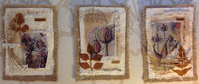
Again, there were many, many great contributions from the challenge participants.  Don't miss Sue the Iron's uplifting happy page or Sarah Anderson's wonderful layered florals, but if I have to pick only one project to highlight it would have to be this fabulous pair of ATCs from Saraccino.  They have texture and depth, and I love that she's included her own handwriting, for that really personal mark-making touch.


Topic 18 : Leaves/ Autumn

Another glorious inspiration post from Darcy and another topic I wish I could have been around for.  The colours, shapes and textures of autumn leaves are art in themselves... taking that inspiration from nature resulted in lots of fabulous projects.

This Birdhouse by Bracken Sparkes is charming.  I love how she's created the whirl of leaves spiralling around the house - so clever - and the layered wood slices make the perfect base for the birdhouse.  And in this photo you can just see the addition of the cute hedgehog snuffling around the bottom of the steps - such fun!


Sue Carrington created the perfect autumnal vintage frame with her Sculpted Leaves.  The tissue paper stamping provides such great detail on the frame itself, and then the layers of colour built up over it and those incredibly beautiful textured leaves give this piece a really haunting atmosphere of autumnal melancholy and nostalgia - simply brilliant!


There's another array of fabulous leafy work to choose from amongst the challenge participants for this topic.  I enjoyed the real leaves decorated by rsgmutticreates, and I loved Craftyfield's gorgeous real-leaf-stamping, but whittling down to one, it has to be the glorious colours and movement of Pavla's wonderful journalling page.  The Infusions give the perfect illusion of autumn mists and forest foliage.


Topic 19: Dies Cuts/ Masks
 
I definitely go through phases with die-cutting.  I'll go for months without thinking of using them and then I'll have a sudden flurry where I simply can't do anything without them!  There was lots of inspiration during this fortnight for making use of your die-cutting machine all the time.

And if it's inspiration you're after, how about this jaw-dropping dimensional Time Machine from Darcy?  Seriously, my jaw dropped!  I love the painty layers and mark-making on the layered die-cuts, and the bird-stamped acetate creating a window pane in one of the frames, and the construction reminds me of one of those extraordinary Heath Robinson contraptions.  Simply outstanding!


There was also a glorious piece from another of PaperArtsy's stamp designers.  Jo Firth-Young knocked it out of the park with the layered leaves and florals of this joyous Seedhead Triptych in uplifting shades of pink and orange.  As well as making great use of the die-cuts, her post was also full of tips about colour-combining and gelli-printing ideas.  Inspiration galore!


Perhaps unsurprisingly, there were lots of challenge entries for this topic, and again it was almost impossible to single out favourites from the wealth of skill, imagination and beauty on offer.  I recommend a trip to see Irena's charming patterned acorns, and Sam21ski's perfectly composed page, but the project I fell head over heels in love with was this trio of beeswax panels from Hazel Agnew - the texture and subtle beauty of these entirely won my heart.


It's been a real pleasure to catch up with just some of the extraordinary artwork filling these blog pages in 2016.   And thanks to all this inspiration, I do have a project bubbling which combines all four of these topics - but I confess that time has got the better of me again.  You'll just have to keep your eyes peeled over at Words and Pictures for that creation to make its appearance!

Thanks so much for stopping by today, and I hope you've enjoyed this retrospective of personal favourites.  Honestly, I could have showcased hundreds more!  Huge thanks to Leandra and Darcy and everybody who contributes so much to offering up this incredible resource of ideas, tutorials, tips and techniques.  Long may it continue, and happy 2017 everybody!
Alison xx

Thursday, 29 December 2016

PaperArtsy Blog Summary of Topics 13-15 {Curated by Debs Wainwright)

Blog Summary: Colour Mixing, Paper Piecing, Patchwork

This picture from Nederhoff in the introduction of topic 15 patterns, captures all three techniques nicely!

Today's curator is Deborah Wainwright (Debs) and she is looking back on Topics 13-15.

We are fortunate to have such wonderful bloggers who share stunning ideas. They constantly surprise us all with their creativity, Debs is going to share with you a few of her picks form this Autumnal  period.

Leandra

Hello all, Debs here from ArtZone and I'm so happy to be sharing some of my highlights from three of the PaperArtsy 2016 themes with you tonight.

This year for me, has been a great one for learning! I have been fortunate in being able  to try out many new products which always excites and inspire me, as well experimenting with different techniques.  Teaching a journal class monthly has really helped me think about what I'm going to create, and how I'm going to use the products, whereas, non teaching creations start with no intention and move towards finish pieces by listening to my intuition, the results are not always pretty but they are what they are...

Recently I have been playing with my art digitally; taking pieces I have drawn or painted into apps on my iPad and producing different composite art pieces. Layering up different pieces this way also helps me with composition and colour in my non digital art, as the skills are so transferable.

I was so pleased to be able look back at all the wonderful creations under the three topics below, not just because of the fabulous works of art I'm going to share with you, but because these topics mean so much to me in my own creative journey. It was hard to choose which projects I favoured as they were all fabulous, so I picked those that spoke to me when I reviewed them for this post.


Topic 13: Paper Piecing/ Patchwork

First let's introduce topic 13 which was a new concept for me, I had played with Paper but never realised what fabulous art could be made (I have learnt so much from all the artists who create on here). Here is one of mine I completed, inspired by this challenge. All the details can be found here.


My first favourite in this topic is this gorgeous canvas board Owlandish by the lovely  Lesley Ebdon which captures the topic wonderfully with all the different elements. A real fun looking piece, which makes me smile with all the coloured houses which the little owls live in. Such a pretty place too with flowers and sun that always shines.


And then this lovely Delft Tiles By the very talented Liesbeth Fiddler I loved the colours Lisbeth used they are so just right! It was just fabulous to see how Liesbeth thought outside the box with this one, creating the tiles was ingenious and then topping it with the Teacup woman  as Liesbeth calls her, just tied it altogether. You could almost imagine being in a Dutch kitchen drinking tea.


And lastly in this topic we have the lovely Lin Brown with a charming Journal Cover I chose this because I just love how Lin interpreted the topic by using fabric as a piecing technique. Look how wonderfully the fabric has been stamped with the different colours using a mix of complementary colours as well as those that contrast.


Topic 14 : Colour Mixing

This topic is very close to my heart, as I love mixing colours and of late I've been using a very limited palette and mixing the colours I need.

For example, in this piece I used only the Four colours from Seth Apter's range and mixed up the colours I wanted to use. I think when I counted them there was 21 colours.


Now onto my 3 favourite projects, the first by the lovely Ingrid Vichova  whose Complementary Canvas I fell in love with, as soon as I saw it. What an amazing way to showcase this topic. I loved how all the colours blended so well together, over all the luscious texture, and then the few places of rust just popping off the canvas, finished it wonderfully!


It was difficult to choose my favourite pieces as all the topics had such amazing pieces to choose from but this one by Alison Hall, really caught my eye. I just loved the contrast of mixing the infusions for the background and the topped with the black and white,  gives another fabulous way to show what can be achieved. 


And last in this topic I'm sharing one of own  I chose this one because it shows several ways to mix colours. I deliberately chose colours which do not mix well together wet, as they will make brown. (mixing together the three primary colours in any combination will make brown). However putting them side by side when dry gives a nice contrast.


Topic 15 : Patterns

The last topic Patterns, is another fascinating one as there are so many ways to make and use them in your creations. I have added the pic below to show how you can mix your creations with digital technology to create something different. The sample shows a journal page I completed using JOFY stamps which I then took into an app called  Capture by Adobe, this can be printed out, and used anyway you want to create a unique piece. Or you could use your favourite stamps and then create a pattern, print it and then colour it. To see the original and what I did with the pattern Paper please follow this link


Now onto my favourites, I loved this Botanicals Tag by Katy Leitch which showed how using part of stamps to create your pattern is really effective. Like Katy says in the original post it doesn't matter what stamp you use as you will not see it in its entirety. For example, Katy used a clock stamp.


My next choice is by the fabulously talented Julie Ann Lee whose 
Trinket Goblets really caught my eye. I love how Julie Ann used inspiration from nature, and as she says, patterns are all around us in nature if you look for them. Her beautiful faces peeping out from the leaves certainly have a story to tell!


And lastly, but of course not in any order, is this gorgeous Giftbox, Tag and Card from Chris Cresswell, who has showed with some colour and simple stamping, you can created the boldest patterns. I love this little coordinated set which was created with a Gelli plate, stamps and lots of doodles from Chris. This clearly demonstrates how you can use the fabulous stamps from any of Paper Artsy's Designers and make them your own by using doodles. 


Okay, I hope you like my choices. As previously said, it was difficult to choose and a big responsibility, so thank to Leandra for giving me this opportunity. It was actually a pleasure to go back and really read the posts; all too often I skip over them, because I'm too busy with other stuff, that I miss how well written they are. It also reminds me I love to read, which I do not do nearly enough.

I hope my choices of projects has inspired you to get out in the craft room and play, it certainly has me! I leave you with Happy, Creative New Year, hugs Debs xx